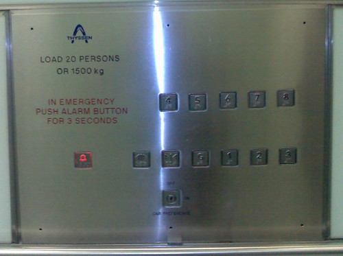
Designing the bleedin’ obvious
How hard can it be to design something as simple as lift control panel.
The specifications are as follows: buttons for eight floors, hold door open, door close, alarm and key slot for manual override.
I’m sure that most people would logically take advantage of the users mental model of the way lifts work – i.e. up and down and posiiton the button for the eighth floor on the top and the button for the ground floor at the bottom. That is bleedin’ obvious isn’t it? (I believe that 90% of user centred design is the bleedin’ obvious). Sadly, some people don’t get the bleedin’ obvious and all too often they design things that we use every day. Like whoever designed this lift control panel. Vertically positioned buttons with the most frequently used button [ground floor] hidden in the middle of the bottom row of buttons. I have to think to find it.

(I also have to think “how sad am I” to notice such a thing, take a photo and blog about it. S’pose that is why the world needs interaction designers, to state the bleedin’ obvious.)
You are not alone! The world is full of things that are designed pretty badly. A quick search on Google Images reveals that there are people with sense of humor when it comes to lift buttons.
Like this one: http://www.kleptography.com/images-stockpile/elevator/crw_7428.jpg Ok, so there are three columns, but where the hell is level 1, 2 and 3?
I personally like color-coded levels: http://blog.zszaiss.com/wp-content/elevatorButtons.jpg
Anyway, there is a great book out there. “The design on everyday things” written by D. A. Norman. It’s a great read and highly recommended not only for people in IT. http://www.amazon.com/gp/product/0465067107/sr=8-1/qid=1150724167/ref=pd_bbs_1/104-0436100-4361544?%5Fencoding=UTF8
Although probably not so in this particular case, “the bleedin’ obvious” is very often culturally biased. Something taken for granted and thus seen as bleedin’ obvious in Japan may not be so in in Australia for example.
To Dushan Hanuska:
The color coded levels has too many colors in my opinion. It becomes distracting; to the eyes so many colors is almost the same as a single color. On the up side, I guess it works when you use it everyday and always go to a particular floor.
The book “DEOT” is a great book. I happen to be taking a course using this book. In fact, I came upon this blog when researching for an assignment.