The customer is not always right
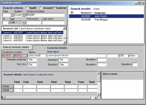
I was recently working with a financial services client, rationalising their systems to have a “single view of the customer”. This demanded a single user interface rather than the 13 or so current UIs that they use in their daily business. As we were coming up with ideas one of the consumers of the new system showed us an old system – “make it look like this” she said, “that’s what we want”.

My initial reaction to a screen like that is a nervous twitch. Eugchhhhhhhh!! Hold my breath. Count to ten. Repeat the mantra “RANA”. Relax, be Aware, be Non-judgemental, and Allow… RANA, RANA, RANA.
OK.
So when a customer asks you for something that in your gut feels wrong; if it feels wrong, it might just be wrong. The challenge is to get the customer to feel your feeling. Do not to just do as the customer says but probe and question and ask why.
This UI was built by developers to manifest data from the database. Not something we wanted to repeat. So we started by asking what is it about that UI that she likes? Some gentle probing uncovers that she likes the ability to have everything in one place. She can rapidly perform searches and see the results in the same place. Taking this as our cue, we probed what information on the screen was important to her and what was not – in the context of her usage. If we took each individual field one by one and asked “is this important”, she would answer “yes”. By asking about frequency of use, criticality and importance we were able to discount most of the fields. At the same time we were able to identify a number of fields that were critical and frequently used, but not displayed on this screen. We soon had a framework for a new search / results screen. Then we broached implementation.
Talk of a browser based solution filled her with fear and loathing. She perceived this to mean having to enter a search criterion, and then wait for the page to refresh / results to return. She’d experienced this with other applications and did not want to go there again. She was pointing at the Fugly screen again. “Build me that” she says, pointing at the screen shot. Yes but….
In an enterprise solution, performance, speed and accuracy are the most important criteria. Yet the Web 1.0 paradigm of query – response via a refreshed page is just not fit for purpose. AJAX overcomes this. She could have her cake an eat it.
The result was nothing like what the customer had asked for. We’d listened to her (and others like her) and probed her on her goals. We used scenarios to talk through the context of usage and came up with something that was fit for purpose and IMHO delighted her. The take away is this. Don’t always believe what the customer says, often they are constrained by their narrow view of the world and their current reality. If we are doing our jobs properly we are opening them up to the art of the possible. To a new reality a world apart.
To play devil’s advocate (read “corporate shill”)…
If you had made your suggestions but built it to the spec the customer had asked for, they’d be paying you to refactor it into the system that you had originally envisioned.
oooh! I want to see what you ended up with! 🙂
Who knows.. it may turn out to be more innovative than what we can think of, being from the traditional textbox-and-label UI’s our minds tend to be bound to.