Information Architecture

Orange website search

Take a look at the Orange website. Who are you? What is your motivation for visiting it?

I’m an Orange customer and I’m looking for information on thier phone insurance. I’m a Googler, I don’t browse, I search. I enter my query in the search box…

google search box

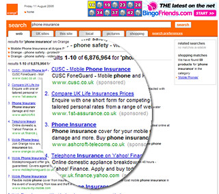
And I get these results:

orange search results

Eh?

Compare UK Life Insurance prices??

Why would I want to search the web via the Orange website?

I thought we’d moved beyond the Portal concept. Customers generally “jam jar” their experiences. If they want news, they will go to a news provider – bbc.co.uk. If they want search they go to Google..

Clearly their strategy is to move Orange beyond being a provider of phones and tariffs, to become an integral part of their customers life. Regardless of channel you get the same consistent and compelling experience. And if that experience is sufficiently sticky, they’ll drive revenue off the back of it. That’s the motivation. Yet sadly they have forgetten about the simple things. They’ve forgotten about the most of us who want simplicity from our phone provider.

The Orange search box is a good example of a brand that has great aspirations that look great on Customer Strategy PowerPoints (“We’ll be our customers information gate, regardless of channel”) but overstretches itself by forgetting what customers actually want (“how much will phone insurance cost me”).

Shoot the wizard! Designing a real world form

The web has created some clunky metaphors that suit the limitations of the code rather than supporting the intentions of the user. Forms are a great example of something that has a direct “real world” analogy, yet rarely mirror what happens in the real world.

I sit at my desk and I complete my tax return. Half way through I hear my two month old daughter screaming. I take a break from the form and feed her. When I return it is still on my desk in the same state I left it. Yet my online experience? I get timed out and anything I have done on the form has been lost. Unless I saved the form at that point.

And then there is the wizard. A linear step processes that dictates I complete one page before continuing to the next. Usually the wizard has a step indicator or progress monitor through the form; yet this is rarely a true monitor of progress through the work completed, rather page x of y. Probably this step indicator will not be clickable – if I am on page 3 I’ll be lucky if I can hyperlink back to page 1 and almost certainly I will not be able to hyperlink to page 5.

Forcing me to follow the wizard, down a clearly defined route to complete the form has a number of inherent issues.

  • Clearly it is inconsistent with my real world experience of form filling. When I get my tax return through the post I flick through it. I get a feel for it. Maybe I fill out the boxes that I am comfortable to answer now, leaving others till later. I jump around the form in a way that is rarely possible on on-line forms. I don’t have to “register”. I don’t have to “save”. The form is there. I’m in control to do what I want to do with it, not what the form designer wants.
  • The wizard is not only inconsistent with my real world experience, it is also inconsistent with my expectations of the web. I browse the web. Yet I cannot browse the form before I complete it. The one, consistent point of reference I have with my experience of the internet is the back button. Yet in many web applications this is removed. Or it behaves inconsistently; i.e. you’ve got two back buttons that behave differently (browser back button moves you to the previous page, back buttons on the page direct you to the previous page in the process).
  • With a wizard pushing me down a pre-determined route, I am more likely to feel lost, trapped or unable to complete the form – when I reach a barrier my experience necessarily ends. You need my national insurance number? I don’t have it to hand. I click “next” and an error message appears. “Please enter your national insurance number”. I can hear an exasperated sigh.

There is an alternative to this “command and control”, imperative programming approach. It is a behaviour driven, declarative approach. Ditch the prescriptive wizard and adopt a “hub and spokes” structure to the form. The user navigates around the form, completing it according to their own preferences. With AJAX we no-longer have to post the form on each page transition, this can be done at the field completion level. Dependencies on the form can be dynamically driven rather than being prescribed up-front. There is no need to register first, the user name and password can be anonymous (and stored via a cookie) until the user decides to reveal their identity to us. The user takes control away from the designer. The metaphor for the form becomes the off-line form with the web technology providing enhancements to the experience rather than the limitations seen in so many forms you see today.

I declare! Rich internet applications

One of the problems of many internet applications is that they are constrained by the “command and control” approach of imperative programming. This results in a sequential, step driven behaviour that allows little freedom for the user to work efficiently. Contrast this with the declarative approach to programming which is very much user-behaviour driven.

Think of your on-line banking application. You want to pay a bill. Your natural behaviour may be “I want to make a payment from account to beneficary on or around date for the value of amount.” Yet typically this will be handled imperatively; a payment wizard forcing you down the route of account-beneficary-date-amount, with each step being a new page. I do not have the flexibility with such an approach to change my mind or to do things in a different order: “I want to make a payment for the value of amount on or around date from account to beneficary“.

Think of a spreadsheet; you would enter all the fields on the same sheet. Make changes to one field and other fields can be simultaneously updated. This would be impossible to achieve if your web application is linear and step driven.

The declarative approach to programming allows such flexibility being data or behaviour driven rather than process driven. With the constraints of implementation process removed we can build user interfaces that better address user goals and intentions. Rich Internet Applications (RIA) are an excellent example of the declarative approach. Ajax enables RIA to a degree, but Macromedia Flex and the opensource cousin Laszlo take it one step further. Take a look at this demo – a truly awesome (IMHO) flight checker application (click on the Search Now button to see the functionality).

The main issue with RIAs that are built in Laszlo or Flex (or indeed extensive Ajax) is those of compatibility and accesibility. By forcing users to have Flash downloaded are you likely to exclude users who don’t want, or can’t have Flash? And accesibility – I’m not sure to what extent this is addressed by them. However if resonable alternatives are provided (i.e. a “text only” version with little rich client side functionality) this ceases to be a problem.

3 of 3
123