interaction design

Consistency when things are poor

Call it a pattern, a heuristic or a rule of thumb. A fundamental one of those to ensuring usability is consistency. This may be external consistency – for something behaves in the software in a similar way elsewhere. A good example might be the ‘x’ button in the top right hand side of an open window. It is universally a call to action to close the window. If the designer created a button labelled “C”, and placed it on the left hand side this would result in confusion. It is not consistent with the users’ expectations from using other applications. The second type of consistency is internal – do things behave in a consistent manner throughout the application? This may be both in behaviours (e.g. buttons with the same titles perform the same action), and in look and feel – a website has a visual identity and coherence, assuring a continuity of experience.

There may be examples of where internal consistency is not possible. For example a brochureware site that uses a third party for fulfilment or payment. Paypal is a good example of this – the user is taken out of the shopping experience and into a paypal experience. This can be successful if there is clear signposting and use of the paypal imagery on the shopping site to assure the user.

So what happens when you have a large, legacy website that you acknowledge to be pretty poor in the usability front and want to introduce new functionality, or want to rebuild it. If you play the consistency card too strongly you may continue to be consistent with the old design and behaviours. This begs the question, is it better to introduce something that is internally inconsistent, but fundamentally better? This becomes even more an issue when you look to rebuilding your site in an incremental fashion.

As an information architect I can help you design your site architecture – the look and feel, navigation structure, user journeys etc., but this will probably be in its entirety. To build this new site will take time, and assumes a “big bang” whereby a completely new site will be (re)launched. Yet there are probably business imperatives to fix specific areas. If we build in an incremental fashion, and take the agile approach of focussing upon delivering business value, we are not going to have a fully redesigned site to go live with. We are probably going to have (for a short while at least), some parts of the site that are new and some that are old.

Going back to my original question, we can either build this to be consistent with the old site, or do something tangentially better. If we do the later it will probably be significantly inconsistent from other parts of the site, or the original parts of the site. It is in this scenario that I am inclined to throw away the consistency pattern. You may have internal inconsistency if you have a clear roadmap to throwing the old and the new functionality / design is proven to be usable, accessible and intuitive. With this the case, the interaction behaviour and visual identity of the new functionality must become the benchmark to which future functionality is consistent with. And you must clearly signpost to the user what is going on; customers will generally be forgiving if they understand that the changes are in their interests.
Confirmation – undo

The traditional pattern for the on-line banking “make a payment” GUI is:

  • What you are about to do (text)
  • Select “From account”
  • Select / enter “To account” (Beneficary)
  • Enter Amount
  • (Optional) enter “when” (you want payment to be made
  • Confirmation (“you are about to pay this amount from this account to that account. Are you sure?”)
  • Post process confirmation (“You have paid this amount to that account from this account”)

So here is a question. Are those confirmation screens really necessary. What if you made your payment, hit the “OK, make the payment” button and it is done. An alert appears (like when you do something with google) that says what you have just done with an “undo” call to action (“I’ve made a mistake, I don’t actually want to make that payment afterall”). The assumption there is that the user knows what they are doing – we assume a happy path with the opportunity to go back rather than placing “confirmation” barriers to completion which are probably unread anyway. There will be considerations of when the payment is actually made; does it hit the clearing systems when the user hits the pay button (not that it ever does anyway). Does the undo option disapear after a period of time (i.e. five minutes), or when the user navigates away from the page the alert appears? But let’s leave the implementation to one side.

I like the idea of undo instead of confirmation. However, I have a hunch that it will not fly when we show it to customers, because people are so ingrained with the “confirmation” dialog. I’m waiting for the response “I’m not sure I like that” from customers who use the current website, because it different, unexpected and is wholly inconsistent with what they have today. But what they have to day is based upon legacy technology and the immaturity of the platform.

So a suggestion. Let people undo. Tell them what they’ve done after they’ve done it (positive feedback), with the opportunity (in the banking environment in a time boxed period) to rectify their errors or change their minds. Do away with confirmation dialogs. Everywhere. (Do you want to save this document? – instinctively I say “no”. It is only later that I realise my mistake…) Here’s to a web that places minimal barriers to task completion.

Does content need a home?

We like to classify things, put them in homes. Information Architects design controlled vocabularies and taxonomies; ultimately labeling where things should go. Things may live in more than one place; we may use a faceted classification, but essentially that is a roadmap to the same unique, indivisible place. On the web this typically means an unintelligible URL with lots of random characters rather than something that is human readable. And that is just not nice. So you want a Robbie Williams CD (not that I’m sure why you’d want such a thing) – your journey may take you down any route:

Adult contemporary > Male Vocalists
Popular artists > Q-T
Pop > Dance Pop
British acts > Male Vocalists
Award winners > Brits > 2005

Whatever the route, chances are they’ll take you to the same page; “robbiewilliams.htm” with a unique URL (more likely than not it will be a dogs dinner of characters and symbols thrown up by the content management system).

The drawback of each journey terminating at the same place is that it lacks context. For example, a music store might have a campaign around specific artists. They may choose a different flavour to the branding in the campaign, a different look and feel. The “Brits” pages are different to the “Dance pop” pages. But as soon as the user is directed to a specific record they will served up the standard artist page. Any context of the journey in a breadcrumb will be lost (or in Amazon repeated to show where the product “lives” according to the different classification hierarchies).

Yet what if the product’s classification was truly faceted, was not indivisible, but lived wherever it was sought? Should the URL of “Robbie Williams” not be how the user has found it, the URL becoming the breadcrumb?

store.com/popular artists/Q-T/robbie.htm
store.com/britishacts/solo/male/robbie.htm
store.com/awardwinners/brits/robbie.htm
Store.com/search/robbie.htm
store.com/tags/robbie/robbie.htm

The page may be (almost) the same, served up (mashed /meshed up) with the context in which it was sought. Related links would be specific to the URL rather than generic (other Brits awards winner in the Brits context, other male vocalists in that context). Yes, there maybe multiple versions of the same page on the site, but from a findability perspective this is little different to a conventional faceted classification system.

OK, this is all well and good, but doesn’t it hinder search engine optimisation? Well no, Google handles duplicate content quite nicely thank you very much. So bring on the tidy URLs and content living nowhere and everywhere.

Accesibility is a distraction

A while ago Jeff Veen wrote that he “[didn’t] care about accessibility”.

It is exhilarating working with ThoughtWorkers who have a similar approach. It is not unusual for them to state blankly when the client starts talking about DDA. “Arrrrr” they will say when the acronym is explained. Disability discrimination Act- make it accessible? It is what we do. If what we build is not accessible we have not written good code – we have failed. Accesibility is a distraction – it should be a by-product of good development practices. They’ll wax lyrical about progressive enhancement and well structured mark-up and not only will it be inherently accessible but will work on mobile devices or any devices and off they go on a roll….

Virgin sloppiness

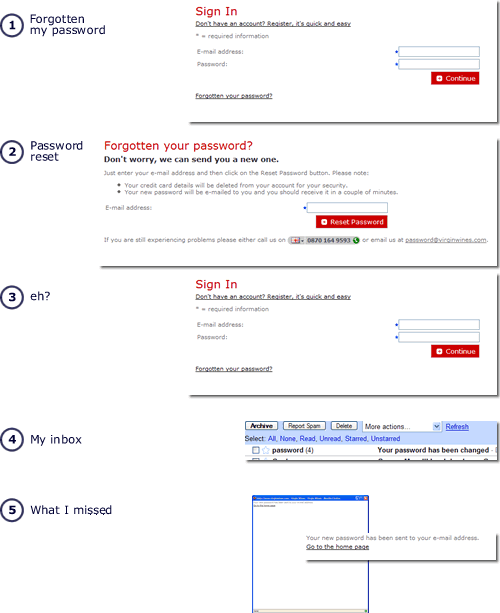
Here is an example of sloppy execution of a simple process. Logging into Virgin Wines and (1) the user has forgotten their password. They click the forgotten password link and (2) are invited to enter their email. They hit the reset password button and (3) the login screen appears. there is no apparent feedback that anything has happened. So the user repeats the process. It is now that they read the instructions and see that an email has been sent. (4) multiple times. What is missing from the process is any feedback, feedback that the password has been reset and a new password has been sent to the user. Only it has – (5) as a pop-up window, that because the user was visiting the site for the first time had been blocked by the browser pop-up blocker.

forgotten password process as virgin wines

Clearly the requirements were correct, just the implementation was sloppy. Had the requirements been supported by wireframes, or even just a basic illustration of the screen progression (rather than just a process flow) such a usability blunder would have been avoided.

The little things really do count

Ever since I saw Joe Walnes demonstrate it, every project that I find myself on which has a search requirement, it is never long before I am trying to convince the team that a “find as you type” search mechanism is the way to go. Usually everyone is in agreement, but occaisionally stakeholders try and de-scope it saying it is low priority “gold plating”.

Now look at the way that google finance and yahoo finance handle their stock ticker search. Over time, tell me which one you would prefer to use? Tell me that the Google search is just “gold plating”.
It gets worse for Yahoo; they treat tickers and stock names seperately, requiring different searches. As The Stawart states “the fact that Yahoo has its ticker search and its name search in separate boxes, after all this time, seems downright negligent.

“Let’s pretend” user testing

How do you test the usability of the software you’ve built?  At one end of the scale you could run full usability tests with a sample of users, given them a scenario and let them loose, trying to realise pre-set goals.  On the other you could do guerrilla usability testing, just grabbing people and informally doing a usability test at your desk.  You could get the experts in to do a usability review.  They’ll typically use a bunch of usability heuristics and provide you with a report critiquing the application against the heuristics.  But what if you don’t have the budget for usability testing, can’t get hold of any representative users, don’t want to wait for some experts report?  How about playing “let’s pretend”?  Remember playing doctors and nurses as a child?  Well do it again, only this time be Users and Computers.  And you’ve got the role of the user.

Create a persona, a pen portrait of your customer.  Think in your mind how they act, behave.  Maybe you know someone like them, seen someone like them in the supermarket.  Now ask yourself some quetions:

How do they behave in their daily interactions with others?
What does their life look like?
What experience do they have with using computers, with using products like yours? How much time have they got? How are they feeling?
Why are they using your product?

Spend a few minutes internalising the persona.

Now turn to your application and imagine you are the persona, using it for the first time.  Give yourself a task to complete (make sure the task is something real that your persona would look to achieve, not a goal you think the application will help him achieve – there is a subtle difference).  Try and forget all you know about the application (easier said then done) and be the novice user.  Walk through the process, speaking aloud (in your head will do).   Focus upon I not “the user”.

I’m looking for this, I’m looking for that.  I do this, I do that”.  I can’t find this; I don’t think that makes sense”

I want to check my balance.  Hmmmm, there are three “balances” here; I’m not a banker, what’s the difference between Running balance and Cleared balance?

I owe my mate some money for the golf holiday, he’s given me his bank account details, I want to transfer some money into his account… huh?  I can’t do that.  What do I do?  Pay a bill?  He’s not really a Bill is he… Etc etc.

You don’t need heuristics for this – many of issues the heuristics would help uncover should come out using this method anyway (speed, ease of navigation, speak users language etc).  If your persona is having difficulty you can probably multiple the usability issues for a real user.

This approach works for a quick and dirty review of an application’s usability.  And if you document your experience make sure you preface it with a description of your approach.  Someone who is close to the development of the application, reading your first person critique, is rightly likely to think you are an arrogant so and so.  I speak from experience.

Let the UI drive the requirements

Conventional approaches to building software applications start with a Big Idea. Someone needs (to define an application) “a program that gives a computer instructions that provide the user with tools to accomplish a task“.

Someone picks up the big idea and breaks it down into a smaller list of “requirements”, things that the application must do to fulfil the Big Idea. In conventional waterfall development Business Analysts will spend a while documenting the list of requirements in some detail – in agile approaches they will do it as they go in a far more “lightweight” manner. Maybe a technical architect will draw up a blueprint design of the solution. Regardless, soon the developers will start writing code. With either agile or waterfall the user interface usually only starts to emerge at this stage. Until then, everything is coded in words (and maybe some boxes and arrows showing flow).  Only late in the process does the UI emerge.

Returning to that definition of an application, IT development seems to spend most of its time in the “a program that gives a computer instructions” world, and often looses sight of “provid[ing] the user with tools to accomplish a task”.

How about a different focus. Start with the user interface. Take the Big Idea and illustrate it. Draw pictures of what the tools will look like, how the user will interact with them. Sketch storyboards, wireframes, lo-fi prototypes, paper mock-ups, call them what you will. Use this as the primary requirements document, supported by explanatory text and detail where we required. These may be stories or use cases, but let the visual representation of the big idea drive the requirements rather than it being almost an afterthought.  Start with the UI and specify the functionality from that rather than the other way round.  After all, it will be the UI that the user uses to accomplish their task, not the computer instructions.

4 of 8
12345678