Me-too brochureware banking
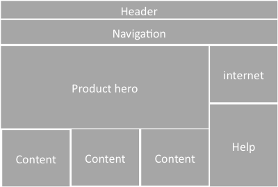
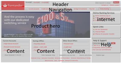
Take a look at this template. Header and navigation at the top, large hero to the left, with three product panels beneath. Log-in to account is on the right with information on security and help beneath. If you want to be an information architect for a bank, it would appear this is all you need. This is your cookie cutter to success.
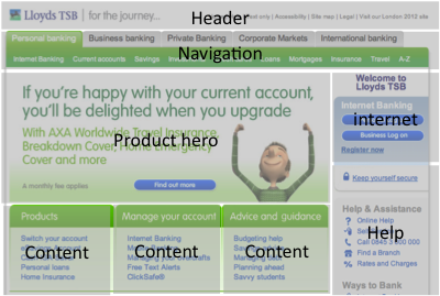
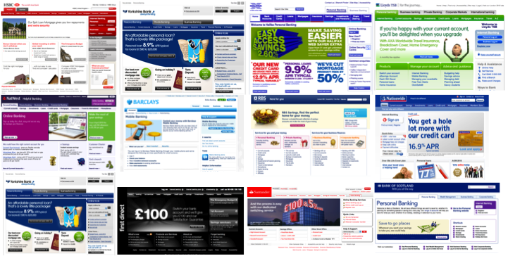
Don’t believe me? Start with Lloyds TSB.
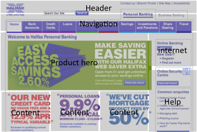
Yep, that seems to fit. how about Halifax. Almost the same grid being used there.
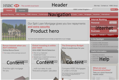
Can’t be coincidence can it? Let’s look at HSBC… There’s the hero again. And the three content boxes. And internet banking on the right.
This is getting a bit repetitive. What about Santander?
There’s a pattern going on here. Looks like they are all at it! Does any other industry segment from such ‘me-too’ism? If it was the right model to be using it wouldn’t be so bad, but their consistency is around consistency of what they do. No-one is really thinking about the customer and what they want. Barclays gets close, but there’s little in the way of understanding customer needs and goals. Little to support customer journeys. It’s all about the Bank, with Products and Services. And Access your accounts on-line! (And ‘We’re so complicated we need help on our home page’). And if everyone else does it obviously we are doing The Right Thing. Does this matter? Isn’t there a better way to design a bank’s brochureware pages? I’m looking for examples. I fear I’ll be looking for a while.
