Where’s the call to action?
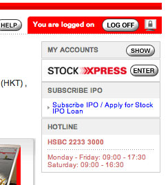
On logging in to your HSBC Hong Kong personal bank account the customer gets a brochureware spashpage promoting HSBC products (why no account summary?). To access their accounts (the reason the customer has gone to the trouble of logging in) the primary call to action is in a box on the right hand side of the screen. It’s the <Show> button next to gray-on-gray text “My Accounts”. The strongest call to action is to the ‘new trading site’ Stock Xpress. It’s a small point, but a call to action as important as account access should more prominent and be the focal point, not an easily missed button.

