Design

Design vision

Don’t be fooled into thinking that you don’t need to do any design when you adopt Agile.  Agile development strives to deliver business value early and often, focusing on getting working software to market as soon as possible rather than dwelling in documentation and ‘analysis paralysis’.  But let’s be clear, “business value” and “working software” are not the same thing.  You can quite easily get something into production that fails to generate revenue, decrease costs or whatever other yardstick you use for ‘value’.  What differentiates the two of them is design.  I don’t mean big up front design that details all the features and provides a concrete spec, I mean a design vision that articulates what the product goals are and a roadmap for getting there.  And what is a design vision?  A short statement of intent is a good place to start, and soon after a user interface mocked up in pen and ink.  It is cheap and easy and helps bridge the path from idea to execution.

What is the story?

One of the problems with IT development is that it is tactical and piecemeal in its approach. Functionality is added in response to competitor or broader market activity. Expect to see an increasing number of brands doing something ‘social’ (and tactical) on the web, but don’t expect these new initiatives to be (strategic) seamlessly integrated into the existing digital channel offering.

This piecemeal approach extends to larger initiatives as well. In refreshing the website or developing new digital channels such as mobile and TV, IT will typically build out features and functionality prioritised upon their perceived individual business value regardless of what the sum value of the proposed release is. (Focusing all your effort of building functionality that delivers to your bottom line will seldom be as successful as you predict if it is not supported by features that meet the customers needs).

So when it comes to thinking about new features and functionality, where’s the best place to start? I’d suggest collaboratively, thinking around the customer. Collaboration is important to ensure that everyone starts with the same vision. It needs to be shared it with the broader audience, the product teams, IT; anyone whose day to life life will be touched by the project when it starts. I’d argue that you cannot start this soon enough. You don’t need to spend time doing analysis, interviewing all stakeholders individually, coming up with a document that is circulated and reviewed and re-written (with all the delays and waste that such a process incurs). Start the process getting all those stakeholders off-site for an afternoon and get the thoughts out on the table.

Commence with a presentation that introduces thinking in terms of customers and customer journeys. The below SlideShare presentation does this for the airline industry, addressing a new customer experience across channels. I acknowledge that it is pretty simple and doesn’t touch on half the ideas that airline executives may have. That is the point, it is just enough to get people thinking about different customer types and their touchpoints without getting bogged down in detail. This is what we want the participants of the off-site to share.

[slideshare id=912224&doc=airline-deck1-1231817842408345-3&w=425]

Once we’ve been through the presentation we break out into small groups a, each taking an individual customer (or persona) and build up a story; a day in the life of… (It is important not to forget the internal users of the system). These breakouts last 15-20 minutes with ten minutes for the team to play back their findings. As they build out a richer picture of the customer interactions they are asked to sketch out what the user interfaces may look like. The process is rapid, intense and iterative, but always focussing upon the customer journey; how will the customer realise their goals. When the teams tell their stories an analyst captures the essence of the requirements on index cards. The final exercise is to lay all these cards on the table and ask the team to group them into similar areas then prioritise them according to their perceived importance. In an afternoon you will have achieved four things. Firstly, you will have captured a vision for the new product in less than a day, with all stakeholders understanding not only the vision itself, but also the process that developed it and the concerns and issues that different parts of the business have with it. Secondly you will have an initial prioritised roadmap for its development. This will change, but it is a good strawman to circulate. Thirdly you will have introduced all the stakeholders together – projects succeed or fail based upon the strength of relationships and getting people engaged from the start will go a long way to creating shared ownership. And finally you will have generated energy, engagement and traction; to do the business case and to get the project started, recognising that just one part of the business having a vision is not going to bring it to the life that they dream.

Are you experienced?

“For you who have had the experience, no explanation is necessary. For you who have not, none is possible.”

I’m going to attribute that saying to Ram Dass, a Harvard professor who via psychedelic experiences ended up a spiritual teacher in the Eastern Tradition.

The problem with too much software/web design is that it is produced by people who have just not had the experience, or do not see the experience as relevant to their organisation or domain. They just don’t “get it”.

(“For you who have an apple product, no explanation is necessary, for you who have not, none is possible?” Cue “it’s an enterprise application we’re buiding, not a ****ing iPhone”).

If we want to build memorable and compelling products, we need to focus upon the experience. To dwell on the feature list or functional requirements is to build mediocrity. Nothing wrong with mediocrity if you don’t want to delight your customers or increase the performance of your workforce. Without considering experience you will miss innovation and added value.

So how to focus upon experience? Get your team to undertake different tasks to get under the skin of what customers go through.

Telco product?
Spend time in a retail outlet and watch different customers buy phones
Go into all the phone shops on the high street and ask the rep “hello, I want a mobile phone”. Suspend all your knowledge about phones and tariffs. How do they sell?
Leave your blackberry at home for a day (how dies it feel? How does it change what you do?)
Download instruction manuals from different phones from manufacturers websites

Travel product?
Go into a travel agents and ask for a holiday “somewhere hot and cheap in February”

Credit card product?
Ask to borrow money from someone you don’t know (how does it feel?)
Apply for a credit card at another bank
Collect all the Credit Card / loan direct mail and emails that you and you get sent over a week, photo / scan all the credit card advertisements you see in a week
Go into a car sales room and look to buy a car on credit

Supermarket product?
Get behind the till for a day (In the UK, at least a few years ago, all senior executives in both Tesco and Sainsburys spent time in the stores over the Christmas period)
Ask a shop assistant to help you find an obscure product that is not in stock
Go into a store with a shopping list and a single bank note, (no credit cards)
Go to the pharmacy when it is busy and ask to buy the morning after pill

Extend your team
Bring in representatives from completely unrelated parts of the business to participate in brainstorming sessions. Building a “youth” social networking website? Get someone from legal or corporate finance to join in. (Get’s you thinking along the lines of extreme characters – here and here [pdf]). Working on a complex exotic financial instruments? Get a few PAs to join in. You may learn something (that your product is too complicated and even you can’t explain what it really is).

I’m sure you can come up with better exercises. The object is that with this collection of experiences and related emotions new ideas can be brought to the table. They can offer insights from another, different perspective, providing more chance of business innovation being realised. More importantly, if you have an emotional attachment to the product you are building through real experience, you are more likely to build a better product that will fullfil the needs of and goals of the target audience in the way they want. The day your enterprise application team all have iPhones will be the day you start building better enterprise applications. For them, no explanation will be necessary. They’ll just “get it”.

A new page

This blog was getting tired in its design so I’ve given it an overhaul, including introducing some widgets.  (What an awesome piece of software WordPress is).  I’ve also added a new page with a bunch of published papers.  some classics in there (if I do say so myself) such as “Heat stress in night clubs” and “Occupational disorders in Ghanaian Subsistence farmers” !!.  The rest of the dancingmango site was not built using wordpress, so to update it all in one go would be time consuming and of little value.  OK, so there is inconsistency across the site and as a UI guy that hurts, but it is one of the trade-offs that needs to be made.

Where are the missing floors?

Lift panel with numbers missing

It is fairly standard practice in Hong Kong for buildings to have no thirteenth or fourteenth floors. They are considered unlucky numbers. Not sure what happened to the first, second and fifth floor here. And back-to-front button numbering that is neither in the telephone format nor the phone format. There’s a couple of lessons to learn here; when designing human-technology interactions consider cultural norms and existing design stereotypes. (Sorry, its the Human Factors conditioning in me that notices such things).

Where’s the vision

Experience suggests that a project without a vision is like a rudderless ship. A clear vision from the start is essential to the success of a project. It is like the corporate mission statement. It is not the project objectives (objectives are generally SMART – you shouldn’t be looking to measure the vision), rather an articulation of how the end goal of the project will touch the lives of it’s ultimate recipients; the customer or the user. What the project will do for them (not the business, not for IT, but the customer, consumer or user).

The first step then is to get the vision agreed on. Luke Hohmann’s innovation games such as product in a box are a good way of distilling the vision. Next step is to keep it live and visible. Don’t just have it buried away in the project Wiki, but have it stuck on the walls where the team work. And then use it as a frame of reference when those difficult questions arise around scope and priorities.

Why is this important? (Via Leisa Reichelt), Peter Merholz shows how Google started out with a vision for their calendar.

The vision…

The google calendar vision

And what it meant for the product when it went to market…

Google didn’t start with a bunch of features of functionality (“Drop dead simple to get information into the calendar” – that’s hardly a requirement any BA would be proud of), but by having this vision, a statement of what the product would mean to the end user, and referrring back to it when scope or design decisions had to be made, they ensured that the end product delivered real quantifiable value.

The scourge of Document Driven Design

Documents, or rather words are the scourge of product design. Because words can never convey the true meaning or emotion of what is really required. All to often, software development projects are driven by the documentation – agile projects can be equally guilty of this- driven by words on paper (or card) that convey what the requirement is. Issue #1. Developers don’t read!

Except for a few exceptions, software is all about a user interacting with a system in order to accomplish a goal. Trying to describe that premise in terms of features and functionality is fundamentally flawed as it will be nested in the language of technical implementation, not in the user interaction. “Find” becomes “search”, “buy” becomes “shopping cart”, “check” becomes “validation” and so on. Issue #2. The desired outcomes become lost in a smog of technical jargon.

Solution: Picture Driven Design. Up front. Yeah! I’m all for up front design! A picture tells a thousand words. It has the power to remove ambiguities, clarify the vision, showing what the journey to realise outcomes look like. Start with a day in the life of… scribble out the flow, the user journey. Nothing complicated, boxes and arrows. Then scribble out what the user interface might look like. Done. That’s your up front design. That’s your documentation. That’s your scope. What you do next is up to you, write loads of documents that describe it and produce the software in a waterfall way if you want. I’d prefer you were more lean and adopted agile practices, but whatever you do, start with the picture. I’m convinced it will save much pain later on.

I am not a target in a campaign

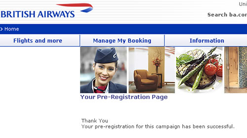
Marketing may be a touchy-feely occupation, but the language that marketeers use is far from it. Campaigns, strategy, tactics, targets… all out of the military handbook. That might be OK within the organisation, but it shouldn’t be exposed to your customers. An email sent by BA inviting customers to register to a special deal results in a page informing the customer; “Thank You, [name] Your pre-registration for this campaign has been successful”. Now what is that all about? They’ve spent so much time creating the campaign, how it fits into their overall strategy that they’ve overlooked the details around what really matters – fullfillment, wording and how the customer feels about BA at the end of the process. I feel a little cooler than when I clicked on the promotion.

BA pre-registration page

Real world forms

In the real world, when I get an application form I’ll flick through the pages and have a look at what is required. I can choose which fields I complete in whatever order I like. If I want to take a break half way through I can. I can complete it when I like and how I like.

So why aren’t web forms like that?

The usual format for a web form starts with some copy that describes the form (which people skim through at best). The user clicks to the next page and the form commences. There may be a step indicator showing progress through the form, but almost certainly progress through it will be linear. You have to complete each page before progressing to the next. If you are lucky you’ll be able to click to previous completed steps. But the experience is nothing like a real-world form. And when was the last time a real-world paper form “timed out” half way through, demanding the user to start over again if they left it idle for ten minutes?

The web forms we see today are a relic of their tecnological past. There is no reason why they must be linear, (and if there is logic in the form, there is no reason why the user can’t explore the different routes – you do that with a paper based form). There is no reason why the user can’t click to whatever page in the process they like (just like with the paper form). There is no reason why a page must be completed before progressing to the next. There is no reason why the form should time out and forget everything the user has entered. Fields can be saved as they are completed against an anonymous user, until the user wants to provide personal credentials.

Bottom line – the web has moved on. Instead of reflecting technical constraints of yesterday, it can adopt more real-world metaphors. But do we have the courage to start introducing new paradigms? Are users, information architects and usability experts so ingrained with broken web metaphors that they will shun a new model, (a real world model) of completing a form?

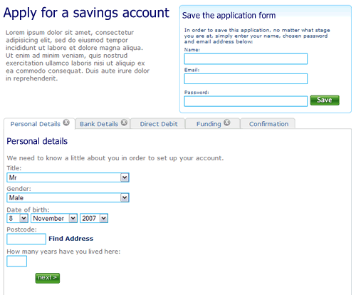
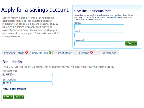
So here’s a rough example. It’s an application form for a savings account. Ignore the content, field labels etc, it is more the model that is illustrated.

1. The user can move between the sections (tabs) to see the fields that are required. There is clear feedback on each tab that it has not been completed. The “Direct Debit” section is optional hence no indicator. The ability to save the application is seperate.

Application form, step 1, nothing filled out

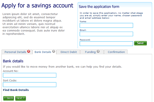
2. The user selects “Bank details”. They’ve not filled out all the fields on the first tab “Personal details”, but it doesn’t matter. There is clear feedback that this tab is yet to be completed.

Second tab on the application form, the first tab has not been completed

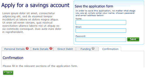
3. The user clicks right through to the confirmation tab. There is nothing to confirm so the page remains blank, with a prompt to fill out other sections.

Step 3 of the application form

4. When sections are completed the indicator on the tab changes to show completion. Here the user has completed step two ahead of step one.

almost there

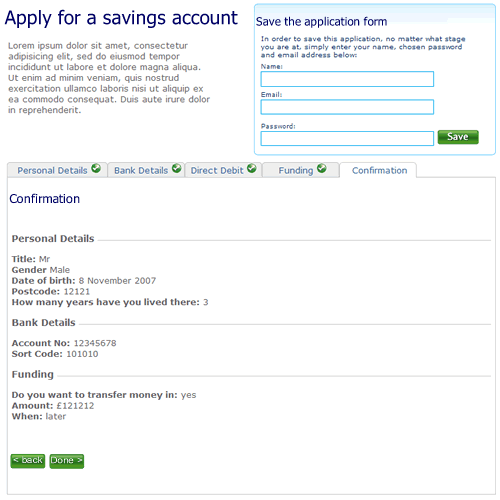
5. Finally, when all sections are completed the user can review the entire form.

Confirmation screen

I’m not saying this is perfect, it’s a start. A start to re-thinking the way we design forms on the web and think about modelling them on real world behaviour instead of technical constraints of the past.

Cultural differences in toilet walls

US executive toilet gap legs and all

What do you see? Depends on who you are. In the US it’s just a row of toilet cubicles. Elsewhere in the world it is “what’s with the huge gap between the floor and cubicle wall? A gap large enough to see the legs of the person in the cubicle next to me!”

Apologies for dragging this blog to the level of the toilet, but there is a point to this observation. Things that are normal in one culture may not be quite so normal in other, even the most mundane. On distributed projects with off-shore teams it is not enough to ensure you have robust processes and open channels of communication. You need to ensure that cultural differences are understood and respected. Don’t assume everyone shares your design of toilet.

2 of 2
12