Real world forms
In the real world, when I get an application form I’ll flick through the pages and have a look at what is required. I can choose which fields I complete in whatever order I like. If I want to take a break half way through I can. I can complete it when I like and how I like.
So why aren’t web forms like that?
The usual format for a web form starts with some copy that describes the form (which people skim through at best). The user clicks to the next page and the form commences. There may be a step indicator showing progress through the form, but almost certainly progress through it will be linear. You have to complete each page before progressing to the next. If you are lucky you’ll be able to click to previous completed steps. But the experience is nothing like a real-world form. And when was the last time a real-world paper form “timed out” half way through, demanding the user to start over again if they left it idle for ten minutes?
The web forms we see today are a relic of their tecnological past. There is no reason why they must be linear, (and if there is logic in the form, there is no reason why the user can’t explore the different routes – you do that with a paper based form). There is no reason why the user can’t click to whatever page in the process they like (just like with the paper form). There is no reason why a page must be completed before progressing to the next. There is no reason why the form should time out and forget everything the user has entered. Fields can be saved as they are completed against an anonymous user, until the user wants to provide personal credentials.
Bottom line – the web has moved on. Instead of reflecting technical constraints of yesterday, it can adopt more real-world metaphors. But do we have the courage to start introducing new paradigms? Are users, information architects and usability experts so ingrained with broken web metaphors that they will shun a new model, (a real world model) of completing a form?
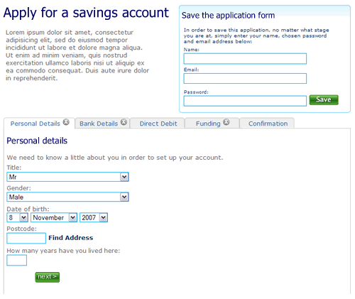
So here’s a rough example. It’s an application form for a savings account. Ignore the content, field labels etc, it is more the model that is illustrated.
1. The user can move between the sections (tabs) to see the fields that are required. There is clear feedback on each tab that it has not been completed. The “Direct Debit” section is optional hence no indicator. The ability to save the application is seperate.
—
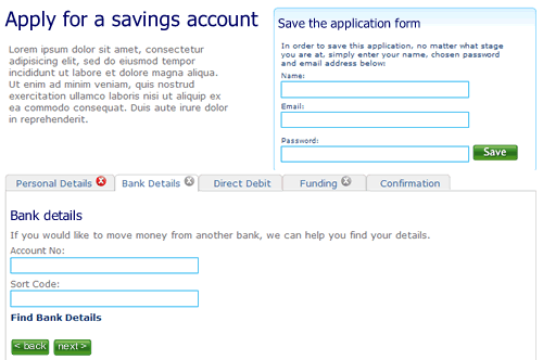
2. The user selects “Bank details”. They’ve not filled out all the fields on the first tab “Personal details”, but it doesn’t matter. There is clear feedback that this tab is yet to be completed.
—
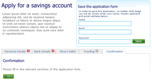
3. The user clicks right through to the confirmation tab. There is nothing to confirm so the page remains blank, with a prompt to fill out other sections.
—
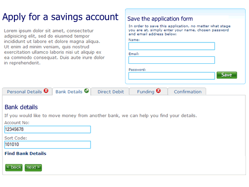
4. When sections are completed the indicator on the tab changes to show completion. Here the user has completed step two ahead of step one.
—
5. Finally, when all sections are completed the user can review the entire form.

I’m not saying this is perfect, it’s a start. A start to re-thinking the way we design forms on the web and think about modelling them on real world behaviour instead of technical constraints of the past.
We did this in another TW project see Dan Bodart’s blog http://dan.bodar.com/2007/10/06/3/ (under heading No Session State just persistent documents). He has some very strong ideas on the above.
It does work: it also has the added bonus that when a user comes back after a period of time greater than the session expiry, once logged back on they still preserve their form.
Hi there Marc,
Your take on web forms is refreshing to me on many levels. The only point I’m not too sure about is when a user’s identity in the system is created. I think it should be done up front but minimally – something like a username and password but that’s about it.
Now that I’m thinking about it though, I don’t think I’d have the user fill out the entire form in one shot. S/he should only be asked to provide whatever info. is required to continue the current flow if you know what I mean. The direct debit may only be filled in at such a time that a client would like to setup direct deposit for wages as an example.
Maybe the paradigm you borrow from the real world isn’t all that great either. I think webforms could do one better.
Thanks for your thoughts.
G’day Marc,
We come across this desire all the time – it should be a lot less effort but seems to be more than anyone likes.
Are you using a framework for this, like RIFE or Spring WebFlow?
TurboTax uses this exact model. Their approach is very intuitive, supports a non-linear approach to entering personal, income, deduction and account information and it is wildly successful.
[…] No Session State just persistent documents) and has a similar usability concept as described in Marc McNeill’s blog. Initially our model had discreet objects, and their complex relationship between them. We soon […]
[…] are introducing web 2.0 interactivity to introduce more fuzzy searching to find what you want. Forms can be more like their real-world brethren. Rather than the “command and control” approach of imperative programming that drives a […]