functionality

Pillars of a compelling experience

Pillars of a compelling experience

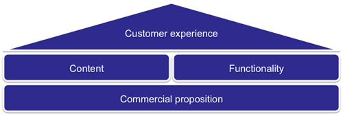
This is a model I often see in organisations when it comes to their web presence.  A product owner comes up with a commercial proposition, marketing work up the content, IT build the functionality and it is goes live.  With this model, no-one actually owns the customer experience.

Worse, this little temple model is repeated across different commercial propositions so you end up with something that is not very joined up.  I’ve blogged about this lack of joined up thinking before.

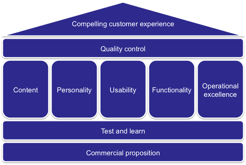
Now let’s construct a model where the roof of the temple is a compelling customer experience.

What are the ingredients of this new temple model?  It is still going to be founded upon commercial propositions, but they are going to be overlaid by a culture of test and learn.  That is a willingness and ability to experiment; to realise that what you have developed is never final and is always evolving.  It is about taking the learnings of experiments to inform and improve the experience, or to rapidly refine or kill propositions that just do not work.

Then we have the five pillars.  I describe these in a paper I wrote ages back (pdf here, google books here).

Unfortunately these pillars tend to sit within organisational silos; content and personality are ‘owned’ by  marketing, functionality by IT, and operational excellence (that’s all about fulfilling on the customer promise and beyond) is a mixture of IT and operations.  Usability is a ‘funny one’ in that might sit alone, sit in marketing or sit in IT.  But ultimately it is best placed to direct the horizonal filter of Quality Control.  Quality control is not an additional layer of bureaucracy, rather a cultural component that all the pillars feed into.  It is about ensuring consistency and meaningfulness of the experience.  It is about balancing the commercial needs of the product, with the marketing needs of the message and the delivery capability of IT.

Photo credit: K. Dafalias

A picture tells a thousand words. So prioritize pictures not words

Draw pictures to illustrate outcomes, design the user interface first and use that to prioritize requirements rather than working with written requirements.

In a single image you can convey a simple concept, an idea, a need or a desired outcome far quicker and more accurately than writing it in a sentence.  This is especially so in developing software which more often than not is visually manifest as a user interface.

When we captured requirements in agile, we are effectively conveying a simple concept, idea, need or desired outcome as a requirement.  And we do it in words.  Those slippery things that are so often misunderstood.  Things get really slippery when we try to prioritize those words against each other.  Stories are laid out on the table and the team spend as much time discussing what each story actually means, as giving them priority.  And because they are supposedly independent, you loose the inter-depedencies between them.  Jeff Patton has written some great stuff on this.

So prioritization with stories can be flawed, especially when you are working with a large volume of requirements, say at the outset of a programme of work, and what you really want to do is get an idea of what a first release should be.

Throw out the stories.  It’s too early to be writing words.  Muda.  Create illustrations of widgets and features and functions.  Sketch out on post-its illustrations of the simplest implementation of the concept, idea, need or desire.  On flip chart paper create blank screens that illustrate the interfaces that the requirement will be manifest on.  Identify the stakeholders who will interact with the requirements.  For example the retail website, the operational support application, the finance system.  Now ask the team to stick onto the screens the sketches.

The challenge is to strip back to the minimal functionality that they really need for that first release.    Let them draw extra functionality if they like, but everything must be on post-it notes.  Now pull the post-it notes off, one by one.  What if we removed this? What would happen if it wasn’t there?  Is there something simpler we could do?  Something more elegant?  Is an operational function required to make the website function work? The exercise may be extended with pictures of legacy applications and data elements, again, stripping them back to the bare necessities for that first release.

That didn’t take long did it, and it looks like an initial release candidate. We’ve defined our scope in a way that we do not believe we can cut any more.  Any less functionality would not be a meaningful release.  Now we can get down to writing the stories, focusing our effort on something we are agreed looks right.  We’ve prioritized pictures, outcomes over words; Picture Driven Design.

Where’s the vision

Experience suggests that a project without a vision is like a rudderless ship. A clear vision from the start is essential to the success of a project. It is like the corporate mission statement. It is not the project objectives (objectives are generally SMART – you shouldn’t be looking to measure the vision), rather an articulation of how the end goal of the project will touch the lives of it’s ultimate recipients; the customer or the user. What the project will do for them (not the business, not for IT, but the customer, consumer or user).

The first step then is to get the vision agreed on. Luke Hohmann’s innovation games such as product in a box are a good way of distilling the vision. Next step is to keep it live and visible. Don’t just have it buried away in the project Wiki, but have it stuck on the walls where the team work. And then use it as a frame of reference when those difficult questions arise around scope and priorities.

Why is this important? (Via Leisa Reichelt), Peter Merholz shows how Google started out with a vision for their calendar.

The vision…

The google calendar vision

And what it meant for the product when it went to market…

Google didn’t start with a bunch of features of functionality (“Drop dead simple to get information into the calendar” – that’s hardly a requirement any BA would be proud of), but by having this vision, a statement of what the product would mean to the end user, and referrring back to it when scope or design decisions had to be made, they ensured that the end product delivered real quantifiable value.