Information Architecture

Test Driven Design

I recently worked with a client where one of our deliverables were wireframes that illustrated how pages would be laid out and how the UI would work.  We were quite pleased with the results, there was some quite complex AJAX based functionality that provided a really immersive, goal orientated experience that looked like it would make finding products easy and enjoyable.  Testing the initial wireframes with users was an enlightening exercise, and demonstrated that the wireframes we had developed were not yet ready – users were not able to fulfill the goals they were set.  More worrying, some of the complex functionality we were introducing just did not work (some of the navigation, filters and sorts were confusing, just presenting information on a single page would suffice).

Usability testing often gets discussed and is a good intention but all too often budgetary or time constraints mean it never happens.  The user testing I refer to here impacted neither.  We did our testing in a meeting room, the customer sitting at one end with a facilitator, and the team watching on the projection screen in the same room.  We used a talk-aloud protocol walking through the static powerpoint wireframes that were linear in their presentation according to the ‘happy path’ to realise the customer goal.  Someone took notes as we went through the wireframes (in the notes section at the bottom of the PowerPoint deck).   It was quick and dirty but produced results.  After a couple of sessions things that we, too close to the design, had missed.  Changes to the wireframes took a few hours and allowed retesting the following day.  Indeed we made some quite significant changes to the user interaction model.  When we re-tested the wireframes the improvements were evident.  The feedback was more positive; there were fewer blank faces, less confusion and “I’ve no idea what to do next” was never uttered.  This was true iterative design in cycles that took a few hours.  Compare this to the days if code was involved.

Where does this fit into the agile way of delivering software?  In the agile/ lean zealot’s passion (and impatience) delivery, and their (dogmatic?) assertion that anything but code (working software) is waste, they loose focus upon what is really important, that of overall product quality.  Product quality is not only zero/ minimal defects and meeting the business requirement, but also delivering something that is usable and delightful to use.  Developers may do Test Driven Development, but this is based on assumptions that what they will code is right.  TDD should start earlier in the process, Test Driven Design.  It takes time to write your tests up-front, but we know it to be a good thing.  So why not design the user interface (wireframes) and test that up front?
Personal branding is more than stoking your ego

It is easy to knock social media and building a prescence and profile on the web as little more than stoking the ego.  “I’ve got more Twitter followers than you”, “I’ve got more facebook friends, more subscribers to my blog, more linkedin contacts…”  But there is more to it than that.  The way you use social media should be about building you as a brand.

Take a look at David Armano’s excellent presentation on Brand U.0.  Celebrities have brand, and with that comes influence.  Similalry people like you or me who develop their brand start to have influence.  And that influence gets you places.  At ThoughtWorks we are recruiting for a new Information Architect role.  Rather than describing the role in terms of skills and competencies, the starting point has been ‘we need a person “like that”‘, pointing to to both particular people within ThoughtWorks, and also on the broader web, looking at LinkedIn profiles, blogs etc.  If you have a brand you have already made yourself stand out.  In these challenging times your profile is not about your ego, it is about your future.

What’s a URL?

Do you know what a URL is and what to do with it?  It sounds like a stupid question, of course you know what a URL is, everybody does! But you’d be wrong.  Having observed countless users interacting with websites, it is striking how many people enter the URL into their search engine.  My hypothesis is that the URL bar in the browser is something technical and best left alone.  But don’t just take my anecdotal evidence for it, look at the top 500 search engine keywords– in the top 20, four are URLs that could have been typed into the browser address.  Look at the keywords in your web analytics, almost certainly (if yours is a B2C proposition), your URL will come in the top ten keywords for your homepage.

Lesson number one: people are not as tech savy that you think they are.  If they don’t know how to use URLs, what other assumptions are you making about your customers in the product you are developing?

Lesson number two: your URL is not as important as your ability to be found in the search engines.  It is refreshing to see an increasing number of companies not giving any URL in their print or TV advertising, rather “search for us on google using <insert term>”.  But before you go off engaging SEO snakeoil merchants, the basics of optimising your website for search engines (SEO) are hardly rocket science (especially if you are an already trusted brand), and Google let’s you in on a lot of their secrets which is 80% of what any SEO company will tell you.  Only google give it to you for free.

Shoddy web experiences are still too common

Imagine the Vodaphone shop on the high-street is open for business, the phones are on display but there are no sales staff around. You wait a few minutes, call out (thinking there might be someone “out back”) but nothing. Nobody there. It’s the same thing everyday, the shop is open for business but no-one to help you buy. Or maybe there is a sales person, but anytime you ask them about the hot product you want, the iPhone, they respond to you with nonsensical gibberish. It’s hard to imagine the high-street outlet doing this, but on the web this kind of thing is still sadly common place. Take a look at Donna M’s recent rant. Because it is a website (probably within the constraints of some dated CMS), a shoddy experience is permissible.

Real world forms

In the real world, when I get an application form I’ll flick through the pages and have a look at what is required. I can choose which fields I complete in whatever order I like. If I want to take a break half way through I can. I can complete it when I like and how I like.

So why aren’t web forms like that?

The usual format for a web form starts with some copy that describes the form (which people skim through at best). The user clicks to the next page and the form commences. There may be a step indicator showing progress through the form, but almost certainly progress through it will be linear. You have to complete each page before progressing to the next. If you are lucky you’ll be able to click to previous completed steps. But the experience is nothing like a real-world form. And when was the last time a real-world paper form “timed out” half way through, demanding the user to start over again if they left it idle for ten minutes?

The web forms we see today are a relic of their tecnological past. There is no reason why they must be linear, (and if there is logic in the form, there is no reason why the user can’t explore the different routes – you do that with a paper based form). There is no reason why the user can’t click to whatever page in the process they like (just like with the paper form). There is no reason why a page must be completed before progressing to the next. There is no reason why the form should time out and forget everything the user has entered. Fields can be saved as they are completed against an anonymous user, until the user wants to provide personal credentials.

Bottom line – the web has moved on. Instead of reflecting technical constraints of yesterday, it can adopt more real-world metaphors. But do we have the courage to start introducing new paradigms? Are users, information architects and usability experts so ingrained with broken web metaphors that they will shun a new model, (a real world model) of completing a form?

So here’s a rough example. It’s an application form for a savings account. Ignore the content, field labels etc, it is more the model that is illustrated.

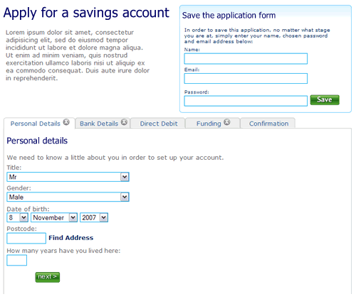
1. The user can move between the sections (tabs) to see the fields that are required. There is clear feedback on each tab that it has not been completed. The “Direct Debit” section is optional hence no indicator. The ability to save the application is seperate.

Application form, step 1, nothing filled out

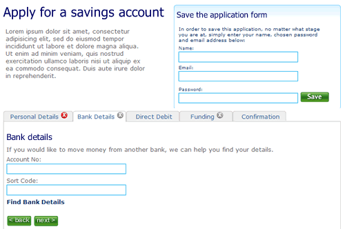
2. The user selects “Bank details”. They’ve not filled out all the fields on the first tab “Personal details”, but it doesn’t matter. There is clear feedback that this tab is yet to be completed.

Second tab on the application form, the first tab has not been completed

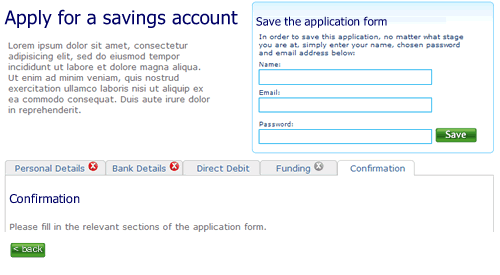
3. The user clicks right through to the confirmation tab. There is nothing to confirm so the page remains blank, with a prompt to fill out other sections.

Step 3 of the application form

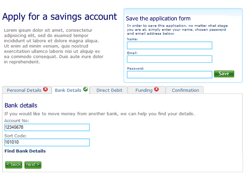
4. When sections are completed the indicator on the tab changes to show completion. Here the user has completed step two ahead of step one.

almost there

5. Finally, when all sections are completed the user can review the entire form.

Confirmation screen

I’m not saying this is perfect, it’s a start. A start to re-thinking the way we design forms on the web and think about modelling them on real world behaviour instead of technical constraints of the past.

Consistency when things are poor

Call it a pattern, a heuristic or a rule of thumb. A fundamental one of those to ensuring usability is consistency. This may be external consistency – for something behaves in the software in a similar way elsewhere. A good example might be the ‘x’ button in the top right hand side of an open window. It is universally a call to action to close the window. If the designer created a button labelled “C”, and placed it on the left hand side this would result in confusion. It is not consistent with the users’ expectations from using other applications. The second type of consistency is internal – do things behave in a consistent manner throughout the application? This may be both in behaviours (e.g. buttons with the same titles perform the same action), and in look and feel – a website has a visual identity and coherence, assuring a continuity of experience.

There may be examples of where internal consistency is not possible. For example a brochureware site that uses a third party for fulfilment or payment. Paypal is a good example of this – the user is taken out of the shopping experience and into a paypal experience. This can be successful if there is clear signposting and use of the paypal imagery on the shopping site to assure the user.

So what happens when you have a large, legacy website that you acknowledge to be pretty poor in the usability front and want to introduce new functionality, or want to rebuild it. If you play the consistency card too strongly you may continue to be consistent with the old design and behaviours. This begs the question, is it better to introduce something that is internally inconsistent, but fundamentally better? This becomes even more an issue when you look to rebuilding your site in an incremental fashion.

As an information architect I can help you design your site architecture – the look and feel, navigation structure, user journeys etc., but this will probably be in its entirety. To build this new site will take time, and assumes a “big bang” whereby a completely new site will be (re)launched. Yet there are probably business imperatives to fix specific areas. If we build in an incremental fashion, and take the agile approach of focussing upon delivering business value, we are not going to have a fully redesigned site to go live with. We are probably going to have (for a short while at least), some parts of the site that are new and some that are old.

Going back to my original question, we can either build this to be consistent with the old site, or do something tangentially better. If we do the later it will probably be significantly inconsistent from other parts of the site, or the original parts of the site. It is in this scenario that I am inclined to throw away the consistency pattern. You may have internal inconsistency if you have a clear roadmap to throwing the old and the new functionality / design is proven to be usable, accessible and intuitive. With this the case, the interaction behaviour and visual identity of the new functionality must become the benchmark to which future functionality is consistent with. And you must clearly signpost to the user what is going on; customers will generally be forgiving if they understand that the changes are in their interests.

Does content need a home?

We like to classify things, put them in homes. Information Architects design controlled vocabularies and taxonomies; ultimately labeling where things should go. Things may live in more than one place; we may use a faceted classification, but essentially that is a roadmap to the same unique, indivisible place. On the web this typically means an unintelligible URL with lots of random characters rather than something that is human readable. And that is just not nice. So you want a Robbie Williams CD (not that I’m sure why you’d want such a thing) – your journey may take you down any route:

Adult contemporary > Male Vocalists
Popular artists > Q-T
Pop > Dance Pop
British acts > Male Vocalists
Award winners > Brits > 2005

Whatever the route, chances are they’ll take you to the same page; “robbiewilliams.htm” with a unique URL (more likely than not it will be a dogs dinner of characters and symbols thrown up by the content management system).

The drawback of each journey terminating at the same place is that it lacks context. For example, a music store might have a campaign around specific artists. They may choose a different flavour to the branding in the campaign, a different look and feel. The “Brits” pages are different to the “Dance pop” pages. But as soon as the user is directed to a specific record they will served up the standard artist page. Any context of the journey in a breadcrumb will be lost (or in Amazon repeated to show where the product “lives” according to the different classification hierarchies).

Yet what if the product’s classification was truly faceted, was not indivisible, but lived wherever it was sought? Should the URL of “Robbie Williams” not be how the user has found it, the URL becoming the breadcrumb?

store.com/popular artists/Q-T/robbie.htm
store.com/britishacts/solo/male/robbie.htm
store.com/awardwinners/brits/robbie.htm
Store.com/search/robbie.htm
store.com/tags/robbie/robbie.htm

The page may be (almost) the same, served up (mashed /meshed up) with the context in which it was sought. Related links would be specific to the URL rather than generic (other Brits awards winner in the Brits context, other male vocalists in that context). Yes, there maybe multiple versions of the same page on the site, but from a findability perspective this is little different to a conventional faceted classification system.

OK, this is all well and good, but doesn’t it hinder search engine optimisation? Well no, Google handles duplicate content quite nicely thank you very much. So bring on the tidy URLs and content living nowhere and everywhere.