airline

Follow fast

I’ll pick on a random industry. Let’s say you are an airline. Part of your digital strategy includes a refresh to your website (maybe you were inspired by this presentation I did a while ago on digital for airlines!). You’ve built a business case and secured funding for the project.  First things first, you get a design agency in and set them to work.

Some sort of competitor analysis is performed that proabably includes features and functions that “we like”, (for example ‘the tactile sliders in kayak.com. We like!  And an iPhone-like coverflow, got to have one of those…)

The information architect takes these ideas away and starts building wireframes and the creative team produce designs that bring these wires to life.  The team come up with lots of new, innovative ideas.  This is after all a ‘refresh’, and ‘innovation’ was probably one of the words in the brief.  The creative is fresh and ‘of the moment’, the IA has developed some new interaction models that are unique and compelling.  The business is sold on a new, innovative way of interacting with their customers, something that no one else does and will blow all their competitors away.

I’ve been bouncing ideas around with Luke Barrett (and because he doesn’t blog, I’ll write them down for him) around this approach; specifically the value of innovation against ‘follow fast’.

Luke reminded me of a project we worked on together many years ago. Before we started designing webpages we did usability testing. We did usability testing of the competitors, and of sites that were getting a lot of press as ‘innovative’.  This was at a time that boo.com had just started and the client were talking about how cool an avatar would be on their site, just like boo. We put people in front of boo.com and watched them suffer. Clearly the avatar was an idea good on paper, terrible on execution.  So we killed it.  Not on our site.

We observed what worked and what didn’t on a multitude of sites with real users. Then, like magpies, we took what was good and worked. Nothing particularly innovative, (let other people do that), we took the best of what existed and delivered on that.

So back to our airline. How about a different approach where they start by usability testing their competitors. Ask participants to book tickets on competitor websites. Understand what interaction elements work, what don’t.

Those kayak sliders, cool for geeks (maybe), but how about the target audience that flies and buys online with you?  It may not be cutting edge design, but Does a drop down work better?

The coverflow may be cool on your iPhone, but how successful is it for people seeking a holiday?  A static list has worked for websites till now (and it wasn’t so long ago that horizontal scrolling was the Great Taboo), just because Apple do something that looks cool for a particular purpose on their products, doesn’t mean you have to follow by scrapping your navigation.

There are no prizies for (design) innovation (other than for some award that the design agency may covet). The only metric that counts is conversion rates and the ability of the website to deliver the business case. Leave others to do the crazy innovation stuff, let others go through the dip when they launch new features, make sure you have got the platform and expertise right and be ready to follow fast.
Who would turn off the wrong engine?

In designing user interfaces there’s a lot we can learn from systems where failure to consider human factors has resulted in terrible consequences.

On 8th January 1989 British Midland Flight 92 crashed whilst attempting an emergency landing. There had been a fire on one of the engines which led to its malfunction. The captain reacted by shutting down the engine.  Only he shut down the wrong engine. With no power, approaching East Midlands airport the captain manged to glide the Boeing 737-400 to avoid Kegworth village but crashed short of the runway.  47 people died.

The investigation into the Kegworth air disaster identified engine malfunction (the engine used in the aircraft was an upgrade of an existing engine and had not been field-tested) as causal factor, however the report concentrated upon the failure of the flight crew to respond accurately to the malfunction.  Human error was the primary cause.

The truth is a little more complicated than that.  Why does a captain with over 13,000 hours flying experience and a first officer with over 3,000 hours experience shut down the wrong engine?

A number of human factors contributed to the disaster including organisational issues (refer to this paper for discussion of the role of managerial failures in disasters) and cognitive overload.  But of equal importance (and indeed buried in the appendices of the Investigation Report appendices) is the issue of design. Around 50% of accidents and incidents in the aircraft and nuclear industries have a root cause in design (source).

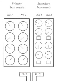
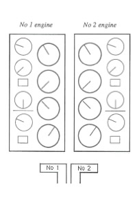
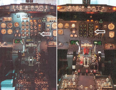
Take a look at the cockpit controls (taken from the investigation report). The left image is for the earlier 300 series and the right for the 400 series aircraft on which the captain had only 23 hours experience after a one day training course.

The actual cause of the engine malfunction was a broken turbine, itself the result of metal fatigue caused by excessive vibration (source).  Had the Captain noticed the Vibration Warning display he probably would not have made the wrong decision.

The Vibration Warning display on the new 400 series was in a different place to the 300 series, but more critically it was designed to be significantly smaller “the dial on the vibration meter was no bigger than a 20 pence piece and the LED needle went around the outside of the dial as opposed to the inside of the dial as in the previous 737 series aircraft” (Source: Wikipedia).  Take a look at the arrow on the left hand image, the display dials on the 300 series use mechanical pointers. On the 400 series they were redesigned with short LEDs rotating around the numbers. These, as the investigation report noted “are much less conspicuous than mechanical pointers, acting more as scale markers, and providing less immediate directional information).

The report criticised the layout of the instrumentation and helpfully suggested an improved layout.  The layout was (and as far as I can tell, remains in 737s) split into primary instruments and secondary instruments.  The issue with this layout is that the dials are not spatially aligned with their associated power levers.  If the pilot is focussing upon the primary instrumentation, the secondary instrumentation is in peripheral view.  This layout will lead to attention based around specific instruments rather than engines.

Compare this to an alternative design that the report provides where the dials are aligned to their associated power levers.  The report recognises the design trade-offs here but concludes that to break the left-right mental association with the engine position was probably not the most optimal solution.

This paper describes the issue well:

The 737 involved in the East Midlands crash had flight deck engine information that lead to confusion under mental pressure. Placing the secondary information sets for both engines to the right of the primary set broke the implied rule set by all the other engine information, that the left engine had left hand controls and indicators (and vice versa). If one assumes that the optimum positioning of indicators is the one that requires the least mental processing then a simple symmetry about the aircraft centre line seems appropriate. The actual positions required a mental spatial transposition of one set of dials to the other side… The readability of the indicators had been reduced by the substitution of electro-mechanical readouts with electronic readouts, but which simulated the old design. Possibly the redesign to electronic readouts should have taken the opportunity to use a rather different layout, possibly with linear indicators rather than rotary ones.

OK, so lots of words, but what is the point of this to what I usaully blog about?  The issue is one of design and layout and who’s responsibility is it.  In designing user interfaces UCD is often seen as a luxury, developers believe that they can design a GUI as well as anyone, and stakeholders (especially on internal projects) will question the value that a UCD person can bring to the project.  Does a developer or an engineer by training and instinct stop to ponder the human factor and the human consequences of the GUI layout? What are the consequences of this?  As can be seen from Kegworth, seemingly minor changes to the control layout can have a signficant impact on the safety of a complex system.

Experience let down by a jobsworth

I flew back into London early on Monday morning from Singapore on a Qantas codeshare with British Airways.  The in-flight BA experience was flawless, after thirteen and a half hours in the air we touched down fifteen minutes early.  No problems with passport control and then I hit baggage collection.

The baggage carousels weren’t turning.  A number of arrived long haul flights were listed with an ‘awaiting carousel’ message.  Frustration was in the air.  I wandered towards the British Airways service counter interested to see how BA were handling this customer experience issue.  Not very well was what I saw.

“Look! just stop complaining and let us do our job” shouted the ‘Team Supervisor’ at an irate customer who had been waiting for almost an hour.  Rather than providing information, transparency and honesty, the face of BA was shouting at customers with a ‘jobsworth‘ attitude.  All that good work on the plane was lost.  A dozen or so customers witnessed the rude abuse that the employee was ranting.  This maybe acceptable if you are Ryanair and your brand is not built upon customer experience, but for BA it most certainly is not.

Stories of bad customer experiences are like viruses.  Ian McKee describes a study that suggests that “overall, if 100 people have a bad experience, a retailer stands to lose between 32 and 36 current or potential customers”.

Unfortunatly my phone battery was dead, otherwise I would have recorded the interaction for your viewing pleasure.  Then it would not have been a dozen people who witnessed the terrible customer service.  More than 366,000 people have viewed South West airlines seven hours on the tarmac (and google returns almost 19,000 results for “south west airlines 7 hours on plane tarmac“).  Employees need to understand that they are brand ambassadors, in a world where video cameras are ubiquitous poor customer service goes beyond the word of mouth, it now becomes viral.

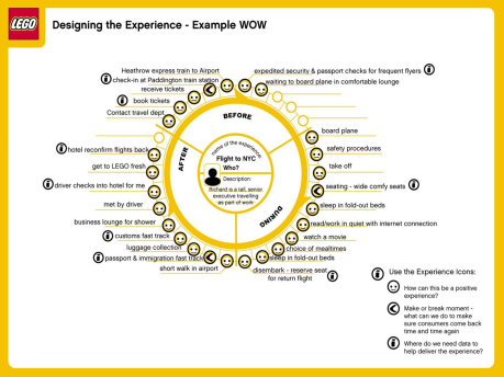
Bruce Temkin shows the below ‘experience wheel’ that lego use for designing customer experiences.  It is relevant as it touches the airline experience, mapping all the customer touchpoints, and what the make or break moments are.  This is a useful exercise that BA could learn from.  Delivering a compelling customer experience with your core services is no longer enough, anywhere that your brand touches customers must be excellent.

If software was an airline

All airlines are the same.  They fly the same planes to the same airports for (roughly) the same prices. What differentiates them?  Attention to detail.  It’s not just the functional detail – it’s the experiential detail that really makes the difference.

It’s the same with software.  If the application you are building was an airline, which airline would it be?  All to often developers focus on the plane, building something to fulfil the utility of getting people from A to B.  Yet the customer doesn’t care about whether it’s an Airbus A330 or a Boeing 777, what they care about, and what they remember is the experience they have.

(This can be a useful exercise at the outset of a new project, ask stakeholders to imagine their finished applciation was an airline, what brand would it be?  This helps anchor expectations; are you building a full service Singapore Airlines or a no-frills EasyJet?)

What is the story?

One of the problems with IT development is that it is tactical and piecemeal in its approach. Functionality is added in response to competitor or broader market activity. Expect to see an increasing number of brands doing something ‘social’ (and tactical) on the web, but don’t expect these new initiatives to be (strategic) seamlessly integrated into the existing digital channel offering.

This piecemeal approach extends to larger initiatives as well. In refreshing the website or developing new digital channels such as mobile and TV, IT will typically build out features and functionality prioritised upon their perceived individual business value regardless of what the sum value of the proposed release is. (Focusing all your effort of building functionality that delivers to your bottom line will seldom be as successful as you predict if it is not supported by features that meet the customers needs).

So when it comes to thinking about new features and functionality, where’s the best place to start? I’d suggest collaboratively, thinking around the customer. Collaboration is important to ensure that everyone starts with the same vision. It needs to be shared it with the broader audience, the product teams, IT; anyone whose day to life life will be touched by the project when it starts. I’d argue that you cannot start this soon enough. You don’t need to spend time doing analysis, interviewing all stakeholders individually, coming up with a document that is circulated and reviewed and re-written (with all the delays and waste that such a process incurs). Start the process getting all those stakeholders off-site for an afternoon and get the thoughts out on the table.

Commence with a presentation that introduces thinking in terms of customers and customer journeys. The below SlideShare presentation does this for the airline industry, addressing a new customer experience across channels. I acknowledge that it is pretty simple and doesn’t touch on half the ideas that airline executives may have. That is the point, it is just enough to get people thinking about different customer types and their touchpoints without getting bogged down in detail. This is what we want the participants of the off-site to share.

[slideshare id=912224&doc=airline-deck1-1231817842408345-3&w=425]

Once we’ve been through the presentation we break out into small groups a, each taking an individual customer (or persona) and build up a story; a day in the life of… (It is important not to forget the internal users of the system). These breakouts last 15-20 minutes with ten minutes for the team to play back their findings. As they build out a richer picture of the customer interactions they are asked to sketch out what the user interfaces may look like. The process is rapid, intense and iterative, but always focussing upon the customer journey; how will the customer realise their goals. When the teams tell their stories an analyst captures the essence of the requirements on index cards. The final exercise is to lay all these cards on the table and ask the team to group them into similar areas then prioritise them according to their perceived importance. In an afternoon you will have achieved four things. Firstly, you will have captured a vision for the new product in less than a day, with all stakeholders understanding not only the vision itself, but also the process that developed it and the concerns and issues that different parts of the business have with it. Secondly you will have an initial prioritised roadmap for its development. This will change, but it is a good strawman to circulate. Thirdly you will have introduced all the stakeholders together – projects succeed or fail based upon the strength of relationships and getting people engaged from the start will go a long way to creating shared ownership. And finally you will have generated energy, engagement and traction; to do the business case and to get the project started, recognising that just one part of the business having a vision is not going to bring it to the life that they dream.

A pat on the back

Listening to your customers is not just about understanding how you can improve, it should also be about recognising when you do good. Especially if you are a people business, do you have a mechanism for enabling your customers to thank a member of your staff for outstanding service?

In your IVR do you have an option at the end of the call to let the customer give positive feedback on the representative who handled the call?

How about on your website? Do you have a form like British Airways does to enable a customer to simply “thank a staff member“? And if you do, do you have the process to ensure that the staff member will learn of the feedback, that it will feature in their review process and will be recognised for being what your brand should be all about, delighting your customers?

Let common sense prevail

Me: “Hello, I’d like to book a flight back to London on Thursday please”.

BA: “Certainly. BA 28. Midnight Thirty Five.”

And that was it. No friendly warning, so close to doing this again.

If I ask for a flight on Thursday, common sense suggests that the fact that the plane is scheduled to depart 35 minutes into Thursday, and I need to be at the airport at 10pm on Wednesday, then it really isn’t a Thursday flight. Not being explicit and clear with this is rude business.

I am not a target in a campaign

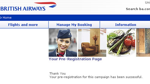
Marketing may be a touchy-feely occupation, but the language that marketeers use is far from it. Campaigns, strategy, tactics, targets… all out of the military handbook. That might be OK within the organisation, but it shouldn’t be exposed to your customers. An email sent by BA inviting customers to register to a special deal results in a page informing the customer; “Thank You, [name] Your pre-registration for this campaign has been successful”. Now what is that all about? They’ve spent so much time creating the campaign, how it fits into their overall strategy that they’ve overlooked the details around what really matters – fullfillment, wording and how the customer feels about BA at the end of the process. I feel a little cooler than when I clicked on the promotion.

BA pre-registration page