Design

Smart meters. What will happen Vs. what could happen

Smart meters. What will happen Vs. what could happen

Smart meters are the Next Big Thing at the Energy companies.

Over the next 11 years every household in Britain will receive Smart Meters, one for gas and one for electricity. This project will be one of the largest infrastructure projects to have taken place since the Second World War.

So says NPower.

I’m going to get a Smart Meter? Whoppeeedo!

Whilst the idea is compelling to the companies themselves, I don’t see them answering the question “so what” in a particularly compelling way.  They try, talking about “providing you with much more information on your energy consumption allowing you to be more fuel efficient and save money”, but really. So what?

(This calls to mind a quote from Jurassic Park where the Jeff Goldblum character says “Yeah, but your scientists were so preoccupied with whether or not they could, they didn’t stop to think if they should”.)

Just because I can control my boiler from my iPhone when I am away from home…. well why should I? What is the point? What is the customer need that smart meters are fulfilling?

That is not to write off smart meters. But what else could they do? What new business models could they inspire?

How about introducing gamification to the way people monitor their energy consumption.  What if the customer could win recognition as being the most energy efficient in their street?  What if gamification could be used as a reward for more energy efficient behaviour?  What if it enabled people to trade their energy usage within their social network?

Lot’s of big ideas but I don’t hold my breath so see anything innovative coming to market anytime soon. Marketing departments may dream of such things but I don’t see them gaining traction when IT are tasked with rolling out functional requirements for mundane, pedestrian and unimaginative use cases.

Yet might there be a different way?

Dear Energy Provider. What if you carve out a niche within the larger smart meter project to build a test and learn capability? A capability that can rapidly develop ideas and take them to market as experiments, product betas. A place where technology is less of a concern than the idea. Many of the usual non-functional requirements can take a back seat as you take the concept to consumers. a place where the idea has to prove itself cheaply for real, or fail fast.

An interesting aside, the way that Mumsnet have developed a community site that attracts 25k per day:

Essentially, we started with a blank piece of paper, viewing ourselves as a platform provider, with the understanding the site had to be developed in collaboration with mumsnetters at every stage.

The most important factor has been letting the community direct progress and listening to what they want – almost all innovations, new site and product developments at Mumsnet are derived from members suggestions.

This happens on a day-to-day basis: we view the site as an ongoing beta or focus group. Most recently this has led to our ‘Off the Beaten Track’ section, covering sensitive issues which which users’ requested not to be indexed by Google. Their feedback and suggestions have also been instrumental to the design of our soon-to-launch mobile app.

What if, instead of rolling out Smart Meters to customers and extolling the virtues of how good the pedestrian things they do are, what if the energy providers derived new product innovations based on the smart meter technology through their customer suggestions.

And thinking more radically, what if they unlocked their data that the smart meters provide and let the community develop innovations (as with the UK government’s Open Data initiative).  There’s lots of new business models, new ways of working. But again, I don’t hold my breath for anything inspiring anytime soon.

Image credit: Todd Smith

Rout me a parcel

Graham Charlton wrote a great blog on eConsultancy a couple of days ago on how on-line retailers are managing customer expectations. (Or not as the case may be). He takes it as far as the check out, but what happens next?

The ability for customers to track parcels and delivery is becoming increasingly common.

The requirement is simple. Take the package tracking status (that we have already) and display it to our customers.

The execution of this separates the customer led from the IT led. The former will take the internal codes and language, ditch the codes that mean nothing to the customer and translate the status into words the customer understands. The latter just display the internal codes and status verbatim.  Both deliver the same functional requirements, one delights, one confuses.

Compare the following:

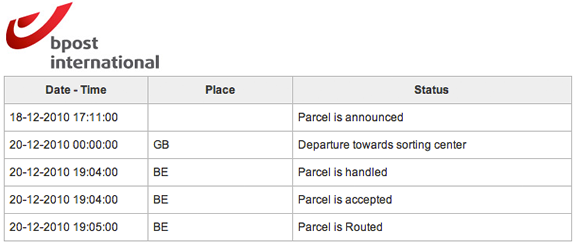
1. BPost: what does “parcel is routed” mean?

status from bPost

2. Royal Mail: “We received item xxxxxxx at [Placename] DO on the 2010-12-22. The item is now ready for delivery.”

3 For exactly the same package at the same time, Amazon track its status as “Latest event: Out for delivery – Dec 22, 2010 4:34:51 AM”

As you’d expect, the eCommerce website does eCommerce the best.

Letting go is the hardest thing

Tim Brown from IDEO gave the audience at his TED Talk a simple exercise. He asked the audience to draw a picture of the person sat next to them. He gave them a minute to do so. He then asked them to show their pictures. “Sorry” was the stock reaction as the sketches were revealed. They had an inhibition on showing their work. When it comes to creativity, as we move beyond childhood we take on board inhibitions and feel more uncomfortable sharing our creative efforts unless we perceive them to be ready or any good. Getting a visual designer to share her work in progress is a challenge. We fear what others will think if our “deliverable” is not ready, is not finished or polished. We fear setting expectations, we fear disappointing, we kill our creativity with fear.

So we are uncomfortable at letting others into our personal creative process. Now take this to the organisation, to the enterprise and creative genocide is abound. Like the Head of Digital who had 130 different stakeholders to socialise the Organisation’s new website designs with. Enter the HiPPO. The Highest Paid Person’s Point Of view. And with a few of those on board you get design by committee and design mediocrity. Or the client who refuses to engage with customers or end users in the early stages of the design process in fear of what they might think. A fear of setting expectations, a fear that their competitors might see what they are up to. Killing their creativity with fear.

Letting go is the hardest thing. But it can also pay great rewards.

On 27th October people coming out of arrivals at Heathrow airport were greeted by singers and dancers and general merriment. As an ad campaign for T-Mobile by Saatchi & Saatchi it was inspired, creative but not without risk. All the members of the public filmed had to sign a release form, agreeing to their being used in the ad. What if they didn’t? But they did. Whilst meticulously planned, the success of the ad is in the general public. T-Mobile got over any fear they may have had of the unknown and let go of the product to let the crowd create. It’s an uplifting piece, and successful too; their youTube page has had over 5.5 million views. And to the bottom line? The ad saw a 12% rise in sales the week after airing.

Is success best measured by tickboxes or delight?

Product owners get hung up on the features, a shopping list of requirements rather than considering what is actually important to their customers.

Imagine it is 2007, there is no Apple, you are a new entrant developing a product that will go head to head with Nokia’s flagship phone the N95. You are the product manager who is responsible for the success of the product. You are focused upon beating Nokia; you’ve made it your business to intimately know the N95, you can recite the list of features it has from memory. You have a meeting with your design team and they break the news. They tell you the spec they have come up with.

“Let me get this straight” you say. “You are telling me that the phone you are proposing we take to market will have no Card slot, no 3G, no Bluetooth (headset support only), no decent camera, no MMS, no video, no cut and paste, no secondary video camera, no radio, no GPS, no Java…”

“Yup” the team say.

How do you feel?

Ditch the feature list that you’ve fixated upon in your quest to beat your competitors flagship product?

Only the brave would avoid the tick box mentality and strive for feature parity as a minimum requirement. Would you really throw out 3G, GPS and a decent camera; the real innovations in the market place?

The first generation of iPhone was released in June 2007, three months after Nokia’s flagship handset the N95. On paper, when you compare the phone features side by side, it is a sorry looking list. As a product manager would you rather have the iPhone or the N95 on your resume?

Below and here [SlideShare] is the story in pictures.

The tyranny of nice

My first English lesson with Mrs Sullivan aged nine. She was one of those teachers you remember. An awesome teacher.

Nice” she told the class, “nice is a word you will not use”.

The word “nice” was forbidden in her classes. And woe betide anyone who described their weekend as nice, or their birthday present as nice (probably an Action Man or Scalextrix or if you were really lucky a Raleigh Chopper or Grifter).

It is a lesson I learned and kept close to my heart today:  Nice is mediocre, saccharine, inoffensive, meaningless, ordinary, without passion, expression or meaning. “Nice” is a faceless word. “Nice” is something that the left brain aspires to and the right brain shuns. Nice is an anathema to the artist, to the designer. Nice doesn’t provoke, it doesn’t inspire. Nice is instantly forgettable.

“Have a nice day”.

Shit NO! (this deserves swearing – see the passion that Mrs Sullivan infected in me; what a teacher!) That’s “have an ordinary day”. It’s not a differentiated day. I don’t want to just have a nice day. I want to have an awesome day, a magical day, a memorable day!!

And the same with experiences and products.

Disneyland isn’t nice; it’s memorable and magical (despite the fact that you spend most of your day there queuing). Do you think that Steve Jobs would be happy if someone called the iPhone ‘nice’?

Nice is for Microsoft. It is for engineers to aspire to. Nice is not art, nice is not design, elegance, simplicity or beauty. Nice is dull mediocrity.

And yet nice is something that corporate software doesn’t even begins to strive for. There’s no place for nice in software methodology. Think Scrum; nice is rarely even a nice to have (it’s gold plating). Tell me Scrum Masters, in your zeal to deliver “business value”, ship the “minimal viable product”, I bet you’d be happy with what you deliver being considered nice.  F@@k that. Your projects fester in a world of mediocrity,  in a quagmire of backlog; picking off stuff to do, focussed on features and functions rather than customers goals and a desire to delight.

Bring it on Mrs Sullivan. Nice has no place in the English Language. Bring it on, Agile + Experience Design. Nice has no place in software development.

Can you banish nice from your lexicon; go beyond nice and seek delight?

I don’t want to have a nice day, I want to have a memorable day.

I don’t want to have a nice product, I want to have an awesome product.

I don’t want to have a nice experience. I want to have a memorable experience.

…And if I’ve designed an experience and the only word you can use to describe it is ‘nice’ then I consider myself a failure.

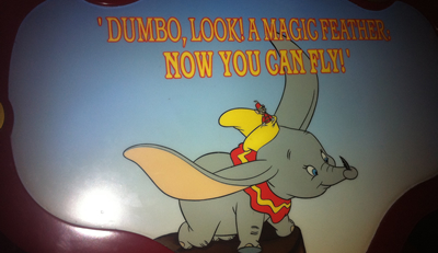
The Dumbo ride at Disneyland; it delights, people will queue up for it, even though there is nothing special about the ride itself.  Carousel rides are nice enough but forgettable, the Dumbo ride is memorable and an experience to enjoy

Usability and the $1 trillion mistake

Is this a case of fat fingers, a usability flaw or poor design that enabled a Citigroup trader to have placed an order to sell $16 billion, instead of $16 million? P&G shares plunged by 23% because of this individual erroneous trade. What followed was the algorithms kicked in and automated trading saw the Dow loose a tenth of its value in less than half an hour. (And Accenture dropped to 4 cents down from $42!)

Before we go blaming human error, questions should be asked why that error occurred. How can someone make such a simple mistake so easily? Was it a case of entering two many 0s? (Don’t stop to look or think, answer the question as soon as you’ve read it – how many zeros are there in this number? 160000000. Same thing again, how many zeros are in this number 12,000,000. That’s a bit easier isn’t it. Only an ‘N’ separates the B from the M on a qwerty keyboard, in a hurry, easily mistaken?)

I’d start by looking at human factors and experience design, and question why (assumption here) the IT team who implemented the system didn’t have before a UX designer on the team to think about the human factors. Could this be the most costly example of poor design?

Article: Big drop, was it all a mistake?

Critiquing the critics (usability rant part 1)

Michael Winner may be a good food critic, but if you were looking for someone to cook you the finest meal for your budget, I doubt he would be your first choice.Same with film critics, they may be able to write an insightful and critical review, but would you want them directing a film for your budget? Would you want Jakob Neilsen, who is essentially a usability critic, to design your website? I mean, take a look at his site!

When you are building a product, you get a usability company in because you know that usability is a good thing that you want to have. If usability companies are the critics, what are you expecting?

The first usability test I ran was in 1991. I’ve set up usability labs, I’ve observed hundreds of people interacting with technology and products. My passion has always to do things at speed, turn around results ASAP and engage all stakeholders in the process.  But I’ll talk about that in a later post.  For now I’ll draw on experience of working with organisations that have commissioned usability companies to review their products.  I’ll breakdown the process I have often observed from usability testing vendors, considering both the elapsed time and the actual ‘value added time’ taken.

Day one

The client (usually the business) engage the usability company to audit the usability of the product that is being developed. The consultants will come in and understand the user tasks, roles and goals; the target audience will be identified for recruitment. ‘Value added time’ = 1 hour.

Day two

The team go away and produce a test plan and a recruitment brief for a research agency to find participants. They promise to get it back to the client in a couple of days. They contact their preferred agency who set about recruiting people (let’s assume this is a simple brief for a retail website targeted at young mothers).  Produce test plan (value added time = 3 hours). Send to client for review.

Day three

Client return test plan with a few comments. Update test plan. Value added time = 30 minutes.

Days six-ten

Twelve usability sessions, each an hour long, they do three a day, that is four days of testing. Value added time = 12 hours

Days eleven – thirteen

The team spend three days analysising and synthesising the results, pull supporting video clips and produce a detailed report. Value added time – 15 hours

Day fourteen

The client sees the report for the first time. (Value added time = 2 hours). Interesting results. (IT representation were not invited, they did not commission the report, the product owner wants to see the output first before sharing it with IT).

Day sixteen

The product owner informs the dev team of the changes that need to be made in the light of the usability report. Project manager sucks air through his teeth and says “you’ll need to raise a change request for those items… ha! quick wins they say? hardly… Hmmm, OK, change the labels in the field, we should be able to do that…”

Value added Vs. Elapsed time

The usability company has delivered and their engagement is complete.  From the start of the process to the recommendations hitting the developers who must ultimately action these, for this not-too-fictitious scenario sixteen days have passed, of which only four were spent on value-added tasks, actually doing stuff.

Day n

The product goes live. The usability company are aghast that so many of the changes they reccomended have not been implemented. They place the blame fairly and sqaurely at the door of the developers and reinforce their belief that IT just doesn’t listen, or worse, care about usability. The critics have critcised from their armchair, like the pigs and chickens they are the chickens, participated not committed.

Usability rant part 2>

Follow fast

I’ll pick on a random industry. Let’s say you are an airline. Part of your digital strategy includes a refresh to your website (maybe you were inspired by this presentation I did a while ago on digital for airlines!). You’ve built a business case and secured funding for the project.  First things first, you get a design agency in and set them to work.

Some sort of competitor analysis is performed that proabably includes features and functions that “we like”, (for example ‘the tactile sliders in kayak.com. We like!  And an iPhone-like coverflow, got to have one of those…)

The information architect takes these ideas away and starts building wireframes and the creative team produce designs that bring these wires to life.  The team come up with lots of new, innovative ideas.  This is after all a ‘refresh’, and ‘innovation’ was probably one of the words in the brief.  The creative is fresh and ‘of the moment’, the IA has developed some new interaction models that are unique and compelling.  The business is sold on a new, innovative way of interacting with their customers, something that no one else does and will blow all their competitors away.

I’ve been bouncing ideas around with Luke Barrett (and because he doesn’t blog, I’ll write them down for him) around this approach; specifically the value of innovation against ‘follow fast’.

Luke reminded me of a project we worked on together many years ago. Before we started designing webpages we did usability testing. We did usability testing of the competitors, and of sites that were getting a lot of press as ‘innovative’.  This was at a time that boo.com had just started and the client were talking about how cool an avatar would be on their site, just like boo. We put people in front of boo.com and watched them suffer. Clearly the avatar was an idea good on paper, terrible on execution.  So we killed it.  Not on our site.

We observed what worked and what didn’t on a multitude of sites with real users. Then, like magpies, we took what was good and worked. Nothing particularly innovative, (let other people do that), we took the best of what existed and delivered on that.

So back to our airline. How about a different approach where they start by usability testing their competitors. Ask participants to book tickets on competitor websites. Understand what interaction elements work, what don’t.

Those kayak sliders, cool for geeks (maybe), but how about the target audience that flies and buys online with you?  It may not be cutting edge design, but Does a drop down work better?

The coverflow may be cool on your iPhone, but how successful is it for people seeking a holiday?  A static list has worked for websites till now (and it wasn’t so long ago that horizontal scrolling was the Great Taboo), just because Apple do something that looks cool for a particular purpose on their products, doesn’t mean you have to follow by scrapping your navigation.

There are no prizies for (design) innovation (other than for some award that the design agency may covet). The only metric that counts is conversion rates and the ability of the website to deliver the business case. Leave others to do the crazy innovation stuff, let others go through the dip when they launch new features, make sure you have got the platform and expertise right and be ready to follow fast.

Who would turn off the wrong engine?

In designing user interfaces there’s a lot we can learn from systems where failure to consider human factors has resulted in terrible consequences.

On 8th January 1989 British Midland Flight 92 crashed whilst attempting an emergency landing. There had been a fire on one of the engines which led to its malfunction. The captain reacted by shutting down the engine.  Only he shut down the wrong engine. With no power, approaching East Midlands airport the captain manged to glide the Boeing 737-400 to avoid Kegworth village but crashed short of the runway.  47 people died.

The investigation into the Kegworth air disaster identified engine malfunction (the engine used in the aircraft was an upgrade of an existing engine and had not been field-tested) as causal factor, however the report concentrated upon the failure of the flight crew to respond accurately to the malfunction.  Human error was the primary cause.

The truth is a little more complicated than that.  Why does a captain with over 13,000 hours flying experience and a first officer with over 3,000 hours experience shut down the wrong engine?

A number of human factors contributed to the disaster including organisational issues (refer to this paper for discussion of the role of managerial failures in disasters) and cognitive overload.  But of equal importance (and indeed buried in the appendices of the Investigation Report appendices) is the issue of design. Around 50% of accidents and incidents in the aircraft and nuclear industries have a root cause in design (source).

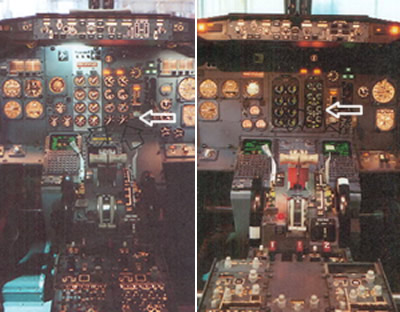
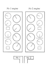
Take a look at the cockpit controls (taken from the investigation report). The left image is for the earlier 300 series and the right for the 400 series aircraft on which the captain had only 23 hours experience after a one day training course.

The actual cause of the engine malfunction was a broken turbine, itself the result of metal fatigue caused by excessive vibration (source).  Had the Captain noticed the Vibration Warning display he probably would not have made the wrong decision.

The Vibration Warning display on the new 400 series was in a different place to the 300 series, but more critically it was designed to be significantly smaller “the dial on the vibration meter was no bigger than a 20 pence piece and the LED needle went around the outside of the dial as opposed to the inside of the dial as in the previous 737 series aircraft” (Source: Wikipedia).  Take a look at the arrow on the left hand image, the display dials on the 300 series use mechanical pointers. On the 400 series they were redesigned with short LEDs rotating around the numbers. These, as the investigation report noted “are much less conspicuous than mechanical pointers, acting more as scale markers, and providing less immediate directional information).

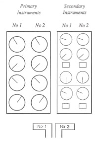
The report criticised the layout of the instrumentation and helpfully suggested an improved layout.  The layout was (and as far as I can tell, remains in 737s) split into primary instruments and secondary instruments.  The issue with this layout is that the dials are not spatially aligned with their associated power levers.  If the pilot is focussing upon the primary instrumentation, the secondary instrumentation is in peripheral view.  This layout will lead to attention based around specific instruments rather than engines.

Compare this to an alternative design that the report provides where the dials are aligned to their associated power levers.  The report recognises the design trade-offs here but concludes that to break the left-right mental association with the engine position was probably not the most optimal solution.

This paper describes the issue well:

The 737 involved in the East Midlands crash had flight deck engine information that lead to confusion under mental pressure. Placing the secondary information sets for both engines to the right of the primary set broke the implied rule set by all the other engine information, that the left engine had left hand controls and indicators (and vice versa). If one assumes that the optimum positioning of indicators is the one that requires the least mental processing then a simple symmetry about the aircraft centre line seems appropriate. The actual positions required a mental spatial transposition of one set of dials to the other side… The readability of the indicators had been reduced by the substitution of electro-mechanical readouts with electronic readouts, but which simulated the old design. Possibly the redesign to electronic readouts should have taken the opportunity to use a rather different layout, possibly with linear indicators rather than rotary ones.

OK, so lots of words, but what is the point of this to what I usaully blog about?  The issue is one of design and layout and who’s responsibility is it.  In designing user interfaces UCD is often seen as a luxury, developers believe that they can design a GUI as well as anyone, and stakeholders (especially on internal projects) will question the value that a UCD person can bring to the project.  Does a developer or an engineer by training and instinct stop to ponder the human factor and the human consequences of the GUI layout? What are the consequences of this?  As can be seen from Kegworth, seemingly minor changes to the control layout can have a signficant impact on the safety of a complex system.

Thinking about value in terms of advantage and benefit

A product rarely sells itself.  What sells a product is the advantage it brings and the benefits it delivers to the customer.  It is the benefit of the product that sells rather than the product itself. What is the advantage of the requirement you are stating, and what is the benefit it will bring the customer?

Let’s start with a product.  Think broadband.  It’s dull.  Put 10MB in front of it and it is still dull.

Now think about the advantage that 10MB broadband brings.  The advantage is that it is fast.  Lightning fast.

Now think about the benefit which that advantage brings.  The benefit is that you can download an MP3 tune in seconds rather than minutes with your old dial up connection.  You are no longer selling broadband, but the experience that it brings.

Let’s consider IT requirements to be products.  A dull list, a thick document gathering dust. How do you prioritise one requirement over another?  What is more important?

Agile introduces ‘stories’ as the requirement product.  They are written in the format ‘As a <role>, I want <a feature>, so that <some benefit is achieved>’.  It is the ‘So that’ which is usually the hardest part to articulate, yet it is the most important part of the story.

Liz Keogh describes how prompted by Chris Matts her preferred narative reads:

In order to <achieve some value>
As a <role>
I want <some feature>.

Applying the marketing thinking to how the story will “achieve some value”, don’t just define that value in the advantage it will bring, rather also consider the benefit it will deliver to the user.  The two are different.  There maybe a business advantage to delivering some feature, but if the benefit to the end user can’t be articulated, it’s real value must be questioned.

1 of 2
12