Web design

Me-too brochureware banking

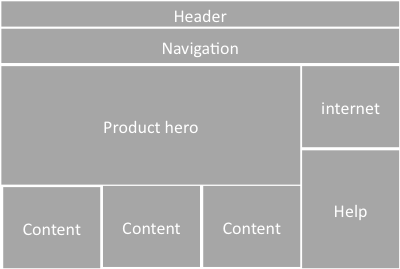
Take a look at this template.  Header and navigation at the top, large hero to the left, with three product panels beneath.   Log-in to account is on the right with information on security and help beneath.  If you want to be an information architect for a bank, it would appear this is all you need.  This is your cookie cutter to success.

Webpage tempalate

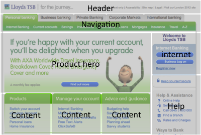
Don’t believe me?  Start with Lloyds TSB.

Lloyds TSB homepage with overlay

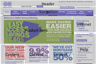
Yep, that seems to fit.  how about Halifax.  Almost the same grid being used there.

Halifax with template overlay

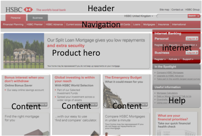
Can’t be coincidence can it?  Let’s look at HSBC… There’s the hero again. And the three content boxes. And internet banking on the right.

HSBC homepage with overlay

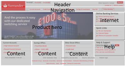
This is getting a bit repetitive.  What about Santander?

Santander homepage with overlay

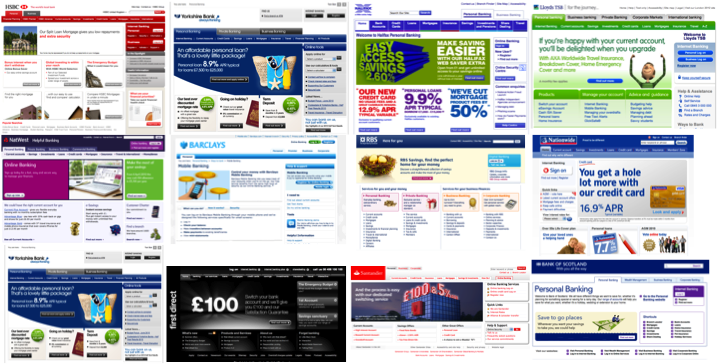
There’s a pattern going on here. Looks like they are all at it! Does any other industry segment from such ‘me-too’ism? If it was the right model to be using it wouldn’t be so bad, but their consistency is around consistency of what they do. No-one is really thinking about the customer and what they want. Barclays gets close, but there’s little in the way of understanding customer needs and goals. Little to support customer journeys. It’s all about the Bank, with Products and Services. And Access your accounts on-line! (And ‘We’re so complicated we need help on our home page’). And if everyone else does it obviously we are doing The Right Thing. Does this matter? Isn’t there a better way to design a bank’s brochureware pages?  I’m looking for examples.  I fear I’ll be looking for a while.

Bank home pages all the same

Just ignore what they say

What customers say they like and how they behave are not the same thing. Don’t always trust what you are told, use data and real insights to drive decisions that have major commercial implications.

So there was a skyscraper, banner and numerous MPUs across the website.  A survey panel was set up and the results came back.  The agency briefed the team, “Your customers really don’t like all the ads you have on the page”.  The message was reiterated in focus groups.  Ditch the ads.  This would be a painful decision, despite customer’s not liking them they were still delivering reasonable revenue.

The organisation was striving to be more customer-centric; if the advertisements were degrading the customer experience then removing them would be a price worth paying.  And so they were switched off.

The result?  Nothing.  Except lost revenue.  Analysing the data, customer volumes remained the same.  There was no difference in the successful completion of customer goals.  Switching the ads off had no impact on customer behaviour on the site; when asked customers said they didn’t like them, but what they said and what they did were different things.

The moral: if you are going to use emotion and what customers say to make commercial decisions, consider A/B testing with real data before making wholesale changes.

Put some fun back into your business

Litter bins on the street aren’t the most interesting of objects.  The design is pretty standard, with variations on a couple of themes – cylindrical or rectangle and colour being the primary tool of differentiation.

“To throw rubbish in the bin instead of onto the floor shouldn’t really be so hard. Many people still fail to do so. Can we get more people to throw rubbish into the bin, rather than onto the ground”

One answer is to make it more fun.  Check out The FunTheory for other ways of improving mundane products by making them fun.

Now think about that mundane product of yours.  Maybe it is your on-line retail bank.  It is getting tired and it is time for a technology refresh.  You’re going through a process of capturing requirements.  How about playing an innovation game, but base it on the concept of fun.  What could you introduce to your product that would make people smile?  What would make people laugh?  OK, so after a while the bin would no longer be fun.  What makes it fun is the element of surprise.  Again, what could you drop into the product that would surprise people.  What would a ‘fun’ internet bank look like?  Focus on fun and surprise and you might uncover a nugget of inspiration that will make the final product.

Test Driven Design

I recently worked with a client where one of our deliverables were wireframes that illustrated how pages would be laid out and how the UI would work.  We were quite pleased with the results, there was some quite complex AJAX based functionality that provided a really immersive, goal orientated experience that looked like it would make finding products easy and enjoyable.  Testing the initial wireframes with users was an enlightening exercise, and demonstrated that the wireframes we had developed were not yet ready – users were not able to fulfill the goals they were set.  More worrying, some of the complex functionality we were introducing just did not work (some of the navigation, filters and sorts were confusing, just presenting information on a single page would suffice).

Usability testing often gets discussed and is a good intention but all too often budgetary or time constraints mean it never happens.  The user testing I refer to here impacted neither.  We did our testing in a meeting room, the customer sitting at one end with a facilitator, and the team watching on the projection screen in the same room.  We used a talk-aloud protocol walking through the static powerpoint wireframes that were linear in their presentation according to the ‘happy path’ to realise the customer goal.  Someone took notes as we went through the wireframes (in the notes section at the bottom of the PowerPoint deck).   It was quick and dirty but produced results.  After a couple of sessions things that we, too close to the design, had missed.  Changes to the wireframes took a few hours and allowed retesting the following day.  Indeed we made some quite significant changes to the user interaction model.  When we re-tested the wireframes the improvements were evident.  The feedback was more positive; there were fewer blank faces, less confusion and “I’ve no idea what to do next” was never uttered.  This was true iterative design in cycles that took a few hours.  Compare this to the days if code was involved.

Where does this fit into the agile way of delivering software?  In the agile/ lean zealot’s passion (and impatience) delivery, and their (dogmatic?) assertion that anything but code (working software) is waste, they loose focus upon what is really important, that of overall product quality.  Product quality is not only zero/ minimal defects and meeting the business requirement, but also delivering something that is usable and delightful to use.  Developers may do Test Driven Development, but this is based on assumptions that what they will code is right.  TDD should start earlier in the process, Test Driven Design.  It takes time to write your tests up-front, but we know it to be a good thing.  So why not design the user interface (wireframes) and test that up front?

What is the story?

One of the problems with IT development is that it is tactical and piecemeal in its approach. Functionality is added in response to competitor or broader market activity. Expect to see an increasing number of brands doing something ‘social’ (and tactical) on the web, but don’t expect these new initiatives to be (strategic) seamlessly integrated into the existing digital channel offering.

This piecemeal approach extends to larger initiatives as well. In refreshing the website or developing new digital channels such as mobile and TV, IT will typically build out features and functionality prioritised upon their perceived individual business value regardless of what the sum value of the proposed release is. (Focusing all your effort of building functionality that delivers to your bottom line will seldom be as successful as you predict if it is not supported by features that meet the customers needs).

So when it comes to thinking about new features and functionality, where’s the best place to start? I’d suggest collaboratively, thinking around the customer. Collaboration is important to ensure that everyone starts with the same vision. It needs to be shared it with the broader audience, the product teams, IT; anyone whose day to life life will be touched by the project when it starts. I’d argue that you cannot start this soon enough. You don’t need to spend time doing analysis, interviewing all stakeholders individually, coming up with a document that is circulated and reviewed and re-written (with all the delays and waste that such a process incurs). Start the process getting all those stakeholders off-site for an afternoon and get the thoughts out on the table.

Commence with a presentation that introduces thinking in terms of customers and customer journeys. The below SlideShare presentation does this for the airline industry, addressing a new customer experience across channels. I acknowledge that it is pretty simple and doesn’t touch on half the ideas that airline executives may have. That is the point, it is just enough to get people thinking about different customer types and their touchpoints without getting bogged down in detail. This is what we want the participants of the off-site to share.

[slideshare id=912224&doc=airline-deck1-1231817842408345-3&w=425]

Once we’ve been through the presentation we break out into small groups a, each taking an individual customer (or persona) and build up a story; a day in the life of… (It is important not to forget the internal users of the system). These breakouts last 15-20 minutes with ten minutes for the team to play back their findings. As they build out a richer picture of the customer interactions they are asked to sketch out what the user interfaces may look like. The process is rapid, intense and iterative, but always focussing upon the customer journey; how will the customer realise their goals. When the teams tell their stories an analyst captures the essence of the requirements on index cards. The final exercise is to lay all these cards on the table and ask the team to group them into similar areas then prioritise them according to their perceived importance. In an afternoon you will have achieved four things. Firstly, you will have captured a vision for the new product in less than a day, with all stakeholders understanding not only the vision itself, but also the process that developed it and the concerns and issues that different parts of the business have with it. Secondly you will have an initial prioritised roadmap for its development. This will change, but it is a good strawman to circulate. Thirdly you will have introduced all the stakeholders together – projects succeed or fail based upon the strength of relationships and getting people engaged from the start will go a long way to creating shared ownership. And finally you will have generated energy, engagement and traction; to do the business case and to get the project started, recognising that just one part of the business having a vision is not going to bring it to the life that they dream.
Let common sense prevail

Me: “Hello, I’d like to book a flight back to London on Thursday please”.

BA: “Certainly. BA 28. Midnight Thirty Five.”

And that was it. No friendly warning, so close to doing this again.

If I ask for a flight on Thursday, common sense suggests that the fact that the plane is scheduled to depart 35 minutes into Thursday, and I need to be at the airport at 10pm on Wednesday, then it really isn’t a Thursday flight. Not being explicit and clear with this is rude business.

CAPTCHA: a barrier to entry

When a customer starts completing an application or registration form it demonstrates they are committed. It therefore makes sense to pay attention to the usability of that form. But how often is the content of the form considered? Are there content barriers in the form that prevent customers from completing it?

Marcelo Calbucci (Via Luke Wroblewski) describes a barrier that everyone assumes just has to be there so it is not tested: The CAPTCHA. When the team removed the CAPTCHA from the Sampa.com registration form they recorded a 10% increase in conversion rates. Marcelo writes “we created a set of tests and rules that will make us not display a CAPTCHA about 99% of the time” (interestingly when I looked at the page I got the CAPTCHA). A 10% increase in conversion is not insignificant, and probably more than outweighs the additional effort to implement an alternative solution.

Does enterprise IT know what Google is?

Imagine an investment bank, a trader has a requirement for a tool to screen stocks. The requirement is to select stocks based upon different parameters, so for example find companies with a market capitalisation between a selected range, and a P/E ratio, Dividend Yield and Net Profit Margin between other selected ranges. And maybe the ability to add additional parameters.

Typically the process will be for these requirements to be captured by the Business Analyst who acts as the conduit to the development team. Nowhere is the user interface explicitly referenced – it will almost certainly be articulated in the reality of the current systems; what the BA knows and understands. Despite the iterface being delivered through a browser, the developers are not web developers. Inevitably the finished product will be functionally correct, it meets the requirements, but it will be clunky: select parameters > search > results… because it reflects the requirements as the trader put them “I want to do this and this and this, press a button and get a list back“.

So what are the chances of an internally developed investment bank application looking like Google finance’s Stock Screener? And what would your trader rather have?

I am not a target in a campaign

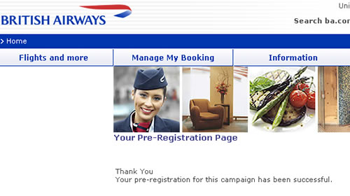
Marketing may be a touchy-feely occupation, but the language that marketeers use is far from it. Campaigns, strategy, tactics, targets… all out of the military handbook. That might be OK within the organisation, but it shouldn’t be exposed to your customers. An email sent by BA inviting customers to register to a special deal results in a page informing the customer; “Thank You, [name] Your pre-registration for this campaign has been successful”. Now what is that all about? They’ve spent so much time creating the campaign, how it fits into their overall strategy that they’ve overlooked the details around what really matters – fullfillment, wording and how the customer feels about BA at the end of the process. I feel a little cooler than when I clicked on the promotion.

BA pre-registration page

What about the non-functionals?

Non-functional requirements (NFRs) are the poor, ugly sisters to the functional requirements. They are often left out, or worse written in wooly and non SMART terms; “the website shall be available 24/7”. Is this what happened with HMRC? The website that allows UK citizens to complete their tax returns on-line has gone down, just as the deadline looms. I wonder if this is a case of the non-functional requirements around performance, scalability volumes etc being forgotten about or just not tested for. Inexcusable really.

1 of 2
12