usability

How will it make money?

How will it make money?

When was the last time you asked “how will it make money?”

What is the first question that you, as a UX expert, ask your client?

Maybe you start with the person whose life will be touched by the product you will design:

“Who is the customer?”

“Who is the user?”

“What is the context of usage?”

Maybe you’ll get a little more big picture:

“What (customer) problem are you trying to solve?”

“Why does the customer need it?”

These are all good questions, but there is a far more important question to be answered. One that I fear is not commonly asked by the UX community. To my shame, I never used to ask it.  That question is how will it make money?

In my career, I’ve worked with a number of Telco’s, designing and building experiences for both operators and aggregators.  I’ve spent time in stores observing off-line buying behavior, listened to sales call in contact centres, and sat in countless usability tests of on-line cellphone shopping journeys.  I’ve seen enough bad journeys, watched enough people struggling with plans, handsets, tariffs and acronyms to know what an awesome on-line buying process should look like.

One day I got the opportunity to prove I could help make this possible. With a great team I worked on a project to build a cellphone price comparison tool that had a single goal in mind. To take the hassle out of the buying process.  To enable the user to find the right phone on the right plan at the right price for their needs. Once they’d found the product that met their needs on this aggregator site, all the user need do was go to the provider site and fulfil on their shopping cart.  OK, so this part of the journey would be out of our hands, but we’d done the hard part, helping them find the right product.  No longer would the customer click on multiple phones and open countless tabs for each provider site that was linked to.

We’d done customer development. We’d carried out research. We prototyped. We ran usability tests. We were confident we’d delivered a fantastic product. The client agreed. It was a well designed, useful, usable product.

As consultants do, we moved on.  Another success for the resume.  But what happened to our well designed, useful, usable product?

A few months later the product was shelved.  It had been a failure.

The reason? The commercials.

But I believe this was also in part because we hadn’t asked that critical question: how will it make money?

How will it make money?

Product aggregators or price comparison sites make money by sending traffic to provider sites. As a consumer, you click on a link on the aggregators site and that takes you to the retailer. When you land on the retailer’s site, a cookie records the source of that link. If you buy a product from the retailer, the cookie recognizes the source and provide a commission to the aggregator for providing the lead.

As an aggregator, it is in your interest to drop as many cookies on retailer websites as possible.  Each retailer will have a different conversion rate; you want to maximize the chance that you will ‘get’ the sale. The fact that the end user experience is not perfect isn’t ideal from a UX perspective, but commercially, that’s the way it is.

When we created an aggregator site that directed traffic to a smaller number of retailers, we were lessening the chance of making a successful conversion, overly relying on a single retailers conversion funnel rather than spreading the chance of making a sale. Yes, we had increased the likelihood of the customer choosing the right product, but the hard numbers demonstrated that this wasn’t a business model that stacked up.

It seems crazy now, but we never really pressed on the question “How will it make money?”  By focusing so much on the customer experience, we neglected consideration of how the business model worked and how the proposition would generate revenue and profit. We just assumed that make it easy to find what you are looking for, link to the providers site to make the sale and job done!

I’m not saying that the right thing to do is to build a poor UX to make money (even Ryan Air are stopping doing that now).  The point I am trying to make is that if you take a moment to ask the question “how will it make money,”  you might find that your design decisions take on a different flavor, one that both delivers an awesome customer experience, and also drives financial growth that ultimately pays your bill!

How the retail banks are addressing customer experience

A few weeks ago I attended the Customer Experience Management for Banking and Financial Services conference, presenting on driving agility into your customer experience.  There were some great presentations, it is great to see the banks taking customer experience seriously. From my notes, what follows are some of the presentations and ideas that resonated with me.

Anthony Thomson, Metrobank

Anthony Thomson, chairman of Metro Bank was inspiring. Everything they do is from the customer perspective.

For everything Metro Bank do, they ask ‘why are we doing this?’ Is it going to make our lives easier, or is it going to give our customers a better experience? The second trumps the first every time.

Metrobank see that they (like all banks) are essentially a money shop who sell the same products as their competitors. The only real differentiator is experience and service. With the Vickers Report recommending “the early introduction” of a system that makes it easier to move accounts and that is “free of risk and cost to customers”, this is going to become increasingly more important.

Retail is detail is the old adage. Think about something as small as the pen on the counter. Chaining it down may suggest security, until you see a chain with no pen attached. Anthony questioned what is the cost of a pen? What is the value of having your branded pen in your customers’ kitchen? Talking of branding he showed a picture of a Metrobank van. Banks use vans all the time to transport the pens and stationary to the branches, but they are never branded. Is this security trumping marketing? A lack of joined up thinking? He commented on the press comments on Metrobank attitude towards dogs. Focussing upon the dog misses the point. Customers love their dogs, why shouldn’t they be allowed in the stores and be positively welcomed! By saying “no dogs” are you saying we care more about our carpets than our customers?

Another detail thing – how often have you waited outside a bank to open in the morning, or be hassled out because it’s the end of the day and is now closed. Metrobank have flexibility, they’ll open a little earlier if people are waiting outside and stay open till the last customer leaves.

A theme through Anthony’s presentation was of empowerment. Empowering staff, removing pedantic rules that get in the way of delivering a compelling customer experience. He told a story of how a customer had to wait longer for assistance than expected and incurred an £8 parking ticket. A member of staff wanted to refund the customer and suggested giving them £4. To which Anthony commented “and only half piss them off?”

Empowerment starts with recruiting good people. Only a fraction of the people who apply get to work for Metrobank. They understand that skills can be trained so they recruit for attitude. If someone whose job is to interact with customers on a daily basis doesn’t smile, they don’t get the job. When it comes to targets, they ‘measure what matters’. They incentivise on service not sales because with good service comes sales.

Rob Hawthorn, Barclays

Empowerment was a theme that ran through the presentation that Rob Hawthorne from Barclays gave. He’s taken a leaf out of the hospitality industry and borrowed from Ritz Carlton with their Credo Card, a single sided card that reminds their staff of the levels of service they should provide. Barclays corporate staff are empowered to fix the problem. Like Metrobank they strive for no stupid rules and put the customer first. For example a customer pays in £230.60 and only £230.20 is credited to the account. They now refund then investigate. By introducing this policy change they say a 65% reduction in customer complaints.

Everyday, in every Ritz Carlton hotel they have The Line-up. This is a fifteen minute meeting to review guest experiences, address issues and identify how they can improve service. It is an opportunity to tell stories, both top down (what’s going on in the company overall) and bottom up (what can we learn from individuals and their interactions with customers). Barclays corporate do this across the organisation. From the top down they have one version of the truth; what is happening in Barclays world, what is important and what are customers saying today?”

The fifteen minute meeting is a familiar concept within agile, known as the standup it’s a brief meeting where the team review what they did yesterday, what they are doing today and any issues or blockers they are facing.

“How often do you see your complaints data?” Asked Rob. What use is seeing it once a month? You should be seeing it every day. Better still (and this is something that I alluded to as well), walk in the shoes of your customer. Get out into the branches, into the call centre and see what is going on for yourself.

Richard Brimble, Veolia Water

Not FS, but Richard gave a view on customer experience from a different viewpoint.  He gave an engaging presentation that started by asking if you are a blue tit or a robin. Blank states from the audience, so he elaborated. After the first world war milk companies started sealing milk bottles with foil tops. Until then the bottles had open tops and both robins and blue tits would drink the cream from the top. With the foil tops the birds had to learn to peck through them. By the 1950s the entire blue tit population had learned this. Robins never did. Robins are territorial and solitary creatures, whilst blue tits are social. They may be scruffy compared to the elegance of the robin, but they are innate communicators. They share their learnings and copy each others successes. As an organisation are you a robin or a blue tit?!

Sean Gilchrist, Barclays

Is Barclays going all Lean Startup? Sean Gilchrist from Barclays told a story of their lean customer development approach to developing their mobile bank Barclays.mobi. The journey started in data; a significant minority of customers were accessing internet banking using mobile devices. A clunky experience at best. Rather than going the Big IT route they went lean and did some customer discovery. “What’s important to you?” they asked customers.  “Checking balance” they were told. “How about paying bills on your mobile?” they asked, “No, we just want to check balances” was the response. “How about a branch location finder?” to be told  “No, we just want to check balances”. In eight weeks and on a shoestring they built and launched their minimum viable product, Barclays.mobi. The product was instantly successful and gave the team leverage to continue development.

Sean told another story about the perils of just pushing something into production without thinking about how people behave on-line. To access account information on on-line banking the customer has to use a security device that displays digits that are then entered into the application. The digits were displayed in two blocks of four:

1234 5678

A decision was taken to replace the single field on the application where this number was entered into two fields that better represented the way the number was presented on the screen, i.e.

|1234| |5678|

The week they made this change they received over thirty thousand complaints about this change. When I’ve recounted this story to Barclays customers they can remember when this happened and what a pain it was. People who don’t touch type look at their keyboard, not the screen. They entered the number as one continuum, not in two blocks. Tabbing between fields is an ‘advanced’ technique. Suddenly the customer was unable to enter the number without having to use their mouse to move to the next field. A change that was suppose to reduce errors ended up causing more. The issue was fixed by have an auto-tab between the fields, but not before customer complaints. Usability testing (oe even having an experienced usability expert on the team) before going live would have picked this issue up.

Trent Fulcher, RBS

Finally Trent Fulcher from RBS presented on the customer experience and innovation work he has been doing at RBS. A key takeaway from his presentation was that at RBS they demonstrated a positive correlation between advocacy and revenue per customer. Not only are advocates more profitable, they also bring new customers to brand. RBS accepted that they will always have detractors to the brand and are happy to take a calculated decision not to focus upon changing their perceptions, rather focus on ‘passives’ and move them to advocates. He demonstrated how RBS modelled their customer journeys, understanding what customers value and expect from every touch point. What they discovered is that for some touchpoints they were overreaching on these expectations, enabling them to understand if they were focussing effort on the parts of the journey that Make A Difference.

Rout me a parcel

Graham Charlton wrote a great blog on eConsultancy a couple of days ago on how on-line retailers are managing customer expectations. (Or not as the case may be). He takes it as far as the check out, but what happens next?

The ability for customers to track parcels and delivery is becoming increasingly common.

The requirement is simple. Take the package tracking status (that we have already) and display it to our customers.

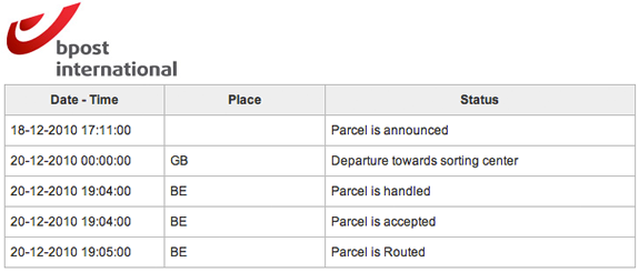
The execution of this separates the customer led from the IT led. The former will take the internal codes and language, ditch the codes that mean nothing to the customer and translate the status into words the customer understands. The latter just display the internal codes and status verbatim.  Both deliver the same functional requirements, one delights, one confuses.

Compare the following:

1. BPost: what does “parcel is routed” mean?

status from bPost

2. Royal Mail: “We received item xxxxxxx at [Placename] DO on the 2010-12-22. The item is now ready for delivery.”

3 For exactly the same package at the same time, Amazon track its status as “Latest event: Out for delivery – Dec 22, 2010 4:34:51 AM”

As you’d expect, the eCommerce website does eCommerce the best.

Silver surfers

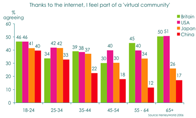
News this week was that Ivy Bean died aged 104.  A good innings, but there is more to the story than that, Ivy got on Facebook aged 102 and was a regular twitterer with more than 62,ooo followers.  One of my colleagues at work announced as he got off the phone with his mother that she had just upgraded the ram in her computer, herself.  My father has just got an iPhone and is hooked on apps.  Maybe they are late to the game, but the over 65s represent the fastest growth in take up of digital technologies.  Whilst mobile ownership for the 25-44 year olds remained static (saturated) between 2007-9, for the 65+ it grew by 17% (source: Ofcom Communication report 2009).  And internet adoption grew by 11%.  The 2007 Ofcom report found that the 65+ spend 42 hours a month online, four hours more than the most active users who are aged between 18 and 24,

It’s an old finding but the Henley Centre reported that the over 65s most felt part of a virtual community thanks to the internet; with the growth of Facebook that statistic is probably out of date, but still worth reflecting on.

I feel part of a community

The ‘silver surfers’ are not the techno-fearing, techno-illiterate luddites you may percieve them to be.  They are a segment of the market that cannot be ignored, and an opportunity that are craving to be served.  Do they figure in your plans? Do you have any personas for the over 65s? Have you tested your propositions with this demographic?  Is your design optimised for the 18-34 demographic who have less disposable income that the older demographic who have a greater propensity to spend?

I’m not sure where this quote is from so I can’t credit it, but it is worth reflecting on:  “The wealthiest generation in the history (and possibly the future) of the earth are in the process retiring. And they don’t intend to do it quietly”.

Thinking inspired by the Agile UX retreat

In the quest to get agile and UX to get along better, and following successful retreats in the US, last weekend Johanna Kollmann brought together a bunch of agile and UX folk for an Agile UX retreat in London sponsored by.  Giving up a weekend was hard, but was worth it, meeting a great bunch of people and sharing thoughts and experiences from the agile and UX camps.  So what did I learn.

Rethink what we do

Coming out of the retreat it is clear that the way we do UX today needs a fundamental rethink.  As UX professionals we have fought long and hard to gain credibility and traction in organisations for what we do, but we need to be ready to evolve and embrace the changing world around us.  A world where IT no longer needs to have detailed specifications signed off before development start.  We no longer have the need (or the luxury) to do the up-front research that we are used to doing.  We no longer need to sign-off detailed wireframes before handing them over the fence to the developers to implement.  Software today really is soft.  It is more about creativity than engineering (see below).  The serialisation of activities is inefficient and wasteful.  It is time to ask how do we focus upon doing what is needed and when, working in parallel and infecting the whole system with user-centric thinking rather than siloing it into the upfront design.  This after all is what systems ergonomics is about; a forerunner to UCD that we know today, thinking about the macro (a broad system view of design, examining organizational environments, culture, history, and work goals) as well as the micro (fitting the task to the human).

But I am digressing from what I wanted to blog about, the Agile UX retreat.  Some key takeaways for me included Anders Ramsey‘s analogies to the restaurant and the theatre.

Thinking analogies

Think of a restaurant.  We have the kitchen, the back room world that is focussed upon delivering consistency of servings.  Everything in the kitchen is utilitarian, serving the purpose to meet this goal.  At the front of the restaurant we have the dining room where the dishes (of consistent(ly good) quality) made in the kitchen are served.  The dining room is all about the ambiance.  Quality here is far more subjective, but a successful restauranteur will be as passionate about the dining room as she is about the food that is cooked in the kitchen.  This is the way that software is all too often built, with the kitchen and dining room being separate entities, however the way they are organised, paid for and owned, there’s little communication between the two.  To quote another Ramsey, Gordon, it is a Kitchen Nightmare.

Anders’ second analogy to consider was the Theatre.  An overly simplistic representation is that the director starts with a script.  From the script he iterates the production.  The producer’s role is to provide the director with what he needs to make the production successful.  Just be ready for the premiere which is on a fixed date.  In the lead up to the premiere the director assembles the cast, the crew and they rehearse.  They’ve got a strawman plan to work from – MacBeth, but how they implement it will evolve according to the stage, actors and artistic direction the director wants to take.  The producer does not care how or when they rehearse, she is only concerned with the success of the end goal.  As they rehearse they increase the fidelity of their performance until they premiere (go live).  but even then they are not done.  They are happy to accommodate changes to the performance, and if something different happens that clearly delights the audience they will happliy incorporate that into future performances (releases).  Sure, the audience is seeing a performance of Shakespere’s MacBeth, but it is a unique performance that has taken the initial plan and evolved as it has been created.

And so should we approach software development.  Not as an exercise in engineering, where our raw materials are fixed and highly stable, but as a creative artform, where our iterations are rehearsals for the premier and ongoing performances.

Thinking tensions

I’m sure there are more, but some examples of tensions that emerge when we try to work together:

AUX promotes rapid open communication and sharing but designers fear sharing.  (They worry early designs will be seized upon before they are ready)
AUX promotes visualisation and use of walls but corporate policies prevent this
AUX promptes doing just enough, just in time but a legacy of deliverable expectations gets in the way (research is rarely bought by the developers who will ultimately consume it).

Thinking people

At the end of the day, success comes down to people.  Agile zealots have done Agile no favours when they bang on about business value and see anything other than code as waste.  Good product design needs vision, it needs research to ensure you are building the right thing for the right people.  No one has the right to tell a UXer that testing ideas or building a prototype or undertaking research is waste if it is right for their context.  But it doesn’t need to take the time it does today.  The UX community needs to get out and spend time with the development community and understand how software is built today.  UXers need to start seeing developers as partners rather than consumers of what they do.  What if we aligned our teams around the products we build rather than the functional silos that the roles describe?  Bringing agile and UX together is more fundamental than arguing about the process (one iteration in front, washing machine cycles etc), it is about fundamentally changing the way we build software; see it as a team activity that works collaboratively rather than a factory production line with process gates and separation of responsibility.

More on the #auxretreat twitter feed

Usability and the $1 trillion mistake

Is this a case of fat fingers, a usability flaw or poor design that enabled a Citigroup trader to have placed an order to sell $16 billion, instead of $16 million? P&G shares plunged by 23% because of this individual erroneous trade. What followed was the algorithms kicked in and automated trading saw the Dow loose a tenth of its value in less than half an hour. (And Accenture dropped to 4 cents down from $42!)

Before we go blaming human error, questions should be asked why that error occurred. How can someone make such a simple mistake so easily? Was it a case of entering two many 0s? (Don’t stop to look or think, answer the question as soon as you’ve read it – how many zeros are there in this number? 160000000. Same thing again, how many zeros are in this number 12,000,000. That’s a bit easier isn’t it. Only an ‘N’ separates the B from the M on a qwerty keyboard, in a hurry, easily mistaken?)

I’d start by looking at human factors and experience design, and question why (assumption here) the IT team who implemented the system didn’t have before a UX designer on the team to think about the human factors. Could this be the most costly example of poor design?

Article: Big drop, was it all a mistake?

Hey usability dude, join the devs (Usability rant part 3)

The last couple of posts here and here have been critical of boutique usability companies that offer user testing services. In the final part of my rant, here’s an alternative approach.  Seed into the development teams someone with a usability background (probably with a psychology degree), someone who can create as well as critique.  Align them to Marketing (or ‘the business’) but physically locate them in IT.  To be successful they must be a passionate advocate for the business vision (hence business alignment), but unless they have a daily relationship with the developers (on hand to support immediate design decisions) they will fail.  (The only way to do this is for them to be part of the development team, same building, same floor, same location).

It is better than they Eschew the formal usability testing process for more informal guerilla usability testing.  In an agile project treat this as akin to the showcase.  Testing sketches and wireframes prior to the development iteration, and putting working software when it has sufficient UI coherence in front of users and well as business stakeholders, with the developers as observers in the process.  One person can cover multiple workstreams.  This is a far better use of a limited budget than commissioning ad-hoc reports too late in the day.

Usability reports (usability rant part 2)

Following on from yesterdays post about the usability process, today I’ll focus on the deliverables, the usability report and my contention that they are rarely grounded in any understanding of the project reality. Here are a couple of examples of usability findings from a (well respected) usability company’s report:

Finding: It was said that the ability to filter [the search results] would be important.
Recommendation: Add check boxes so the customer can choose between [result types]

“Add check boxes”.

That’s easy to say, three words “Add. Check. Boxes”. But what if the particular search engine the team are using does not allow such functionality?  Or such functionality will take significant effort to build.

Finding: When probed about the use of breadcrumbs on the site, 2 participants were confused by the structure that was displayed.
Recommendation: Consider using chevrons [for the breadcrumb] to better covey to the customer that these words show the journey they have been on [rather than ‘/’]

Let’s leave aside the basis of this recommendation; two participants commenting that they weren’t sure about the use of the ‘/’ (this sounds more like it is reinforcing the authors prejudice against the use of / in a breadcrumb and their preference for the ‘>’ symbol).  And let’s also leave aside the fact that it has taken three weeks to let the development team to know that.

It is presented on a powerpoint slide with a screen shot of the breadcrumb and a mockup of a preferred solution, e.g. “Home > UK > South East > News” (Rather than Home / UK / South East / News”).  I’d estimate this took twenty minutes elapsed time to produce this slide. It will take a further ten minutes to discuss when the page is presented to the product owner. And the product owner will spend ten minutes explaining it to the IT project manager who will take ten minutes to explain it to the developers to make the change…

Save your money

Usability testing is not a science. Investing in one or two formal usability tests is almost certainly money badly spent. The Cue reports give a good insight into this.  For example, they asked seventeen experienced professional teams to independently evaluate the usability of the website for the Hotel Pennsylvania in New York.

The teams reported 340 different usability issues. Only nine of these issues were reported by more than half of the teams, while 205 issues (60%) were uniquely reported, that is, no two teams reported the same issue. Sixty-one of the 205 uniquely reported issues were classified as serious or critical problems.

They go on to state…

The study also shows that there was no practical difference between the results obtained from usability testing and expert reviews for the issues identified.

This suggests getting a UI expert into the project team is probably money better spent than employing the usability company (and supports my assertion that usability testing is often just validating the work of a professional).  And when you do get a usability company to report back, as I’ve discussed above, don’t hold your breath for the quality or usefulness of the results:

They found that only 17% of comments in usability reports contained recommendations that were both useful and usable, and many recommendations were not usable at all [source]

So if the recommendations you get from one company are likely to be different to the recommendations from another; if the report is going to be full of recommendations that are impractical and not implementable; if an expert can pick up usability problems that usability testing can, why bother with the usability company testing at the back end of the project?  Indeed, why bother with the usability company at all?  Get an interaction designer on the project from the outset (call them an information architect, user centred designer ,UX person if you want), get them testing ideas and interfaces informally and regularly throughout, and truly embed usability into the project itself, not as an add-on process and report.

Usability rant part 3>

Critiquing the critics (usability rant part 1)

Michael Winner may be a good food critic, but if you were looking for someone to cook you the finest meal for your budget, I doubt he would be your first choice.Same with film critics, they may be able to write an insightful and critical review, but would you want them directing a film for your budget? Would you want Jakob Neilsen, who is essentially a usability critic, to design your website? I mean, take a look at his site!

When you are building a product, you get a usability company in because you know that usability is a good thing that you want to have. If usability companies are the critics, what are you expecting?

The first usability test I ran was in 1991. I’ve set up usability labs, I’ve observed hundreds of people interacting with technology and products. My passion has always to do things at speed, turn around results ASAP and engage all stakeholders in the process.  But I’ll talk about that in a later post.  For now I’ll draw on experience of working with organisations that have commissioned usability companies to review their products.  I’ll breakdown the process I have often observed from usability testing vendors, considering both the elapsed time and the actual ‘value added time’ taken.

Day one

The client (usually the business) engage the usability company to audit the usability of the product that is being developed. The consultants will come in and understand the user tasks, roles and goals; the target audience will be identified for recruitment. ‘Value added time’ = 1 hour.

Day two

The team go away and produce a test plan and a recruitment brief for a research agency to find participants. They promise to get it back to the client in a couple of days. They contact their preferred agency who set about recruiting people (let’s assume this is a simple brief for a retail website targeted at young mothers).  Produce test plan (value added time = 3 hours). Send to client for review.

Day three

Client return test plan with a few comments. Update test plan. Value added time = 30 minutes.

Days six-ten

Twelve usability sessions, each an hour long, they do three a day, that is four days of testing. Value added time = 12 hours

Days eleven – thirteen

The team spend three days analysising and synthesising the results, pull supporting video clips and produce a detailed report. Value added time – 15 hours

Day fourteen

The client sees the report for the first time. (Value added time = 2 hours). Interesting results. (IT representation were not invited, they did not commission the report, the product owner wants to see the output first before sharing it with IT).

Day sixteen

The product owner informs the dev team of the changes that need to be made in the light of the usability report. Project manager sucks air through his teeth and says “you’ll need to raise a change request for those items… ha! quick wins they say? hardly… Hmmm, OK, change the labels in the field, we should be able to do that…”

Value added Vs. Elapsed time

The usability company has delivered and their engagement is complete.  From the start of the process to the recommendations hitting the developers who must ultimately action these, for this not-too-fictitious scenario sixteen days have passed, of which only four were spent on value-added tasks, actually doing stuff.

Day n

The product goes live. The usability company are aghast that so many of the changes they reccomended have not been implemented. They place the blame fairly and sqaurely at the door of the developers and reinforce their belief that IT just doesn’t listen, or worse, care about usability. The critics have critcised from their armchair, like the pigs and chickens they are the chickens, participated not committed.

Usability rant part 2>

Follow fast

I’ll pick on a random industry. Let’s say you are an airline. Part of your digital strategy includes a refresh to your website (maybe you were inspired by this presentation I did a while ago on digital for airlines!). You’ve built a business case and secured funding for the project.  First things first, you get a design agency in and set them to work.

Some sort of competitor analysis is performed that proabably includes features and functions that “we like”, (for example ‘the tactile sliders in kayak.com. We like!  And an iPhone-like coverflow, got to have one of those…)

The information architect takes these ideas away and starts building wireframes and the creative team produce designs that bring these wires to life.  The team come up with lots of new, innovative ideas.  This is after all a ‘refresh’, and ‘innovation’ was probably one of the words in the brief.  The creative is fresh and ‘of the moment’, the IA has developed some new interaction models that are unique and compelling.  The business is sold on a new, innovative way of interacting with their customers, something that no one else does and will blow all their competitors away.

I’ve been bouncing ideas around with Luke Barrett (and because he doesn’t blog, I’ll write them down for him) around this approach; specifically the value of innovation against ‘follow fast’.

Luke reminded me of a project we worked on together many years ago. Before we started designing webpages we did usability testing. We did usability testing of the competitors, and of sites that were getting a lot of press as ‘innovative’.  This was at a time that boo.com had just started and the client were talking about how cool an avatar would be on their site, just like boo. We put people in front of boo.com and watched them suffer. Clearly the avatar was an idea good on paper, terrible on execution.  So we killed it.  Not on our site.

We observed what worked and what didn’t on a multitude of sites with real users. Then, like magpies, we took what was good and worked. Nothing particularly innovative, (let other people do that), we took the best of what existed and delivered on that.

So back to our airline. How about a different approach where they start by usability testing their competitors. Ask participants to book tickets on competitor websites. Understand what interaction elements work, what don’t.

Those kayak sliders, cool for geeks (maybe), but how about the target audience that flies and buys online with you?  It may not be cutting edge design, but Does a drop down work better?

The coverflow may be cool on your iPhone, but how successful is it for people seeking a holiday?  A static list has worked for websites till now (and it wasn’t so long ago that horizontal scrolling was the Great Taboo), just because Apple do something that looks cool for a particular purpose on their products, doesn’t mean you have to follow by scrapping your navigation.

There are no prizies for (design) innovation (other than for some award that the design agency may covet). The only metric that counts is conversion rates and the ability of the website to deliver the business case. Leave others to do the crazy innovation stuff, let others go through the dip when they launch new features, make sure you have got the platform and expertise right and be ready to follow fast.

1 of 7
1234567