Banking

How the retail banks are addressing customer experience

A few weeks ago I attended the Customer Experience Management for Banking and Financial Services conference, presenting on driving agility into your customer experience.  There were some great presentations, it is great to see the banks taking customer experience seriously. From my notes, what follows are some of the presentations and ideas that resonated with me.

Anthony Thomson, Metrobank

Anthony Thomson, chairman of Metro Bank was inspiring. Everything they do is from the customer perspective.

For everything Metro Bank do, they ask ‘why are we doing this?’ Is it going to make our lives easier, or is it going to give our customers a better experience? The second trumps the first every time.

Metrobank see that they (like all banks) are essentially a money shop who sell the same products as their competitors. The only real differentiator is experience and service. With the Vickers Report recommending “the early introduction” of a system that makes it easier to move accounts and that is “free of risk and cost to customers”, this is going to become increasingly more important.

Retail is detail is the old adage. Think about something as small as the pen on the counter. Chaining it down may suggest security, until you see a chain with no pen attached. Anthony questioned what is the cost of a pen? What is the value of having your branded pen in your customers’ kitchen? Talking of branding he showed a picture of a Metrobank van. Banks use vans all the time to transport the pens and stationary to the branches, but they are never branded. Is this security trumping marketing? A lack of joined up thinking? He commented on the press comments on Metrobank attitude towards dogs. Focussing upon the dog misses the point. Customers love their dogs, why shouldn’t they be allowed in the stores and be positively welcomed! By saying “no dogs” are you saying we care more about our carpets than our customers?

Another detail thing – how often have you waited outside a bank to open in the morning, or be hassled out because it’s the end of the day and is now closed. Metrobank have flexibility, they’ll open a little earlier if people are waiting outside and stay open till the last customer leaves.

A theme through Anthony’s presentation was of empowerment. Empowering staff, removing pedantic rules that get in the way of delivering a compelling customer experience. He told a story of how a customer had to wait longer for assistance than expected and incurred an £8 parking ticket. A member of staff wanted to refund the customer and suggested giving them £4. To which Anthony commented “and only half piss them off?”

Empowerment starts with recruiting good people. Only a fraction of the people who apply get to work for Metrobank. They understand that skills can be trained so they recruit for attitude. If someone whose job is to interact with customers on a daily basis doesn’t smile, they don’t get the job. When it comes to targets, they ‘measure what matters’. They incentivise on service not sales because with good service comes sales.

Rob Hawthorn, Barclays

Empowerment was a theme that ran through the presentation that Rob Hawthorne from Barclays gave. He’s taken a leaf out of the hospitality industry and borrowed from Ritz Carlton with their Credo Card, a single sided card that reminds their staff of the levels of service they should provide. Barclays corporate staff are empowered to fix the problem. Like Metrobank they strive for no stupid rules and put the customer first. For example a customer pays in £230.60 and only £230.20 is credited to the account. They now refund then investigate. By introducing this policy change they say a 65% reduction in customer complaints.

Everyday, in every Ritz Carlton hotel they have The Line-up. This is a fifteen minute meeting to review guest experiences, address issues and identify how they can improve service. It is an opportunity to tell stories, both top down (what’s going on in the company overall) and bottom up (what can we learn from individuals and their interactions with customers). Barclays corporate do this across the organisation. From the top down they have one version of the truth; what is happening in Barclays world, what is important and what are customers saying today?”

The fifteen minute meeting is a familiar concept within agile, known as the standup it’s a brief meeting where the team review what they did yesterday, what they are doing today and any issues or blockers they are facing.

“How often do you see your complaints data?” Asked Rob. What use is seeing it once a month? You should be seeing it every day. Better still (and this is something that I alluded to as well), walk in the shoes of your customer. Get out into the branches, into the call centre and see what is going on for yourself.

Richard Brimble, Veolia Water

Not FS, but Richard gave a view on customer experience from a different viewpoint.  He gave an engaging presentation that started by asking if you are a blue tit or a robin. Blank states from the audience, so he elaborated. After the first world war milk companies started sealing milk bottles with foil tops. Until then the bottles had open tops and both robins and blue tits would drink the cream from the top. With the foil tops the birds had to learn to peck through them. By the 1950s the entire blue tit population had learned this. Robins never did. Robins are territorial and solitary creatures, whilst blue tits are social. They may be scruffy compared to the elegance of the robin, but they are innate communicators. They share their learnings and copy each others successes. As an organisation are you a robin or a blue tit?!

Sean Gilchrist, Barclays

Is Barclays going all Lean Startup? Sean Gilchrist from Barclays told a story of their lean customer development approach to developing their mobile bank Barclays.mobi. The journey started in data; a significant minority of customers were accessing internet banking using mobile devices. A clunky experience at best. Rather than going the Big IT route they went lean and did some customer discovery. “What’s important to you?” they asked customers.  “Checking balance” they were told. “How about paying bills on your mobile?” they asked, “No, we just want to check balances” was the response. “How about a branch location finder?” to be told  “No, we just want to check balances”. In eight weeks and on a shoestring they built and launched their minimum viable product, Barclays.mobi. The product was instantly successful and gave the team leverage to continue development.

Sean told another story about the perils of just pushing something into production without thinking about how people behave on-line. To access account information on on-line banking the customer has to use a security device that displays digits that are then entered into the application. The digits were displayed in two blocks of four:

1234 5678

A decision was taken to replace the single field on the application where this number was entered into two fields that better represented the way the number was presented on the screen, i.e.

|1234| |5678|

The week they made this change they received over thirty thousand complaints about this change. When I’ve recounted this story to Barclays customers they can remember when this happened and what a pain it was. People who don’t touch type look at their keyboard, not the screen. They entered the number as one continuum, not in two blocks. Tabbing between fields is an ‘advanced’ technique. Suddenly the customer was unable to enter the number without having to use their mouse to move to the next field. A change that was suppose to reduce errors ended up causing more. The issue was fixed by have an auto-tab between the fields, but not before customer complaints. Usability testing (oe even having an experienced usability expert on the team) before going live would have picked this issue up.

Trent Fulcher, RBS

Finally Trent Fulcher from RBS presented on the customer experience and innovation work he has been doing at RBS. A key takeaway from his presentation was that at RBS they demonstrated a positive correlation between advocacy and revenue per customer. Not only are advocates more profitable, they also bring new customers to brand. RBS accepted that they will always have detractors to the brand and are happy to take a calculated decision not to focus upon changing their perceptions, rather focus on ‘passives’ and move them to advocates. He demonstrated how RBS modelled their customer journeys, understanding what customers value and expect from every touch point. What they discovered is that for some touchpoints they were overreaching on these expectations, enabling them to understand if they were focussing effort on the parts of the journey that Make A Difference.
Me-too brochureware banking

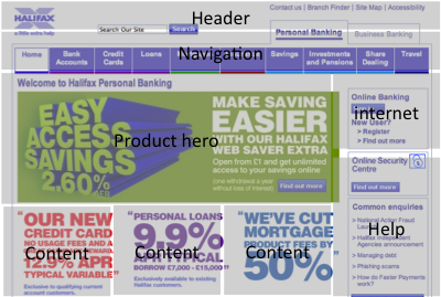
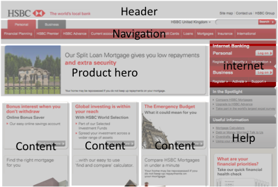
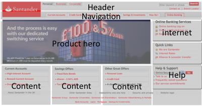
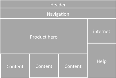
Take a look at this template.  Header and navigation at the top, large hero to the left, with three product panels beneath.   Log-in to account is on the right with information on security and help beneath.  If you want to be an information architect for a bank, it would appear this is all you need.  This is your cookie cutter to success.

Webpage tempalate

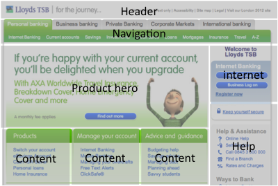
Don’t believe me?  Start with Lloyds TSB.

Lloyds TSB homepage with overlay

Yep, that seems to fit.  how about Halifax.  Almost the same grid being used there.

Halifax with template overlay

Can’t be coincidence can it?  Let’s look at HSBC… There’s the hero again. And the three content boxes. And internet banking on the right.

HSBC homepage with overlay

This is getting a bit repetitive.  What about Santander?

Santander homepage with overlay

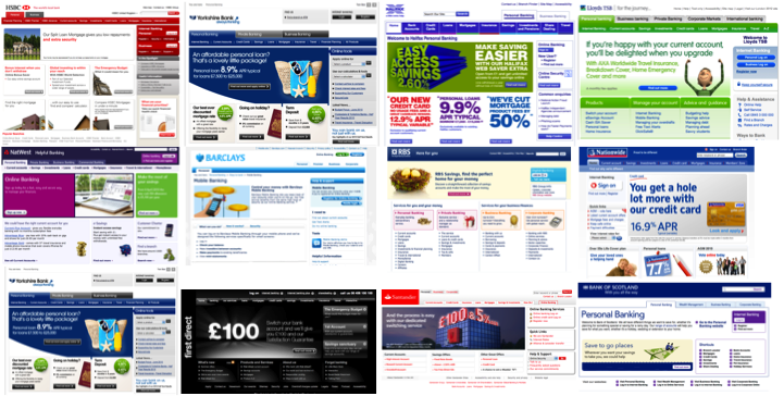
There’s a pattern going on here. Looks like they are all at it! Does any other industry segment from such ‘me-too’ism? If it was the right model to be using it wouldn’t be so bad, but their consistency is around consistency of what they do. No-one is really thinking about the customer and what they want. Barclays gets close, but there’s little in the way of understanding customer needs and goals. Little to support customer journeys. It’s all about the Bank, with Products and Services. And Access your accounts on-line! (And ‘We’re so complicated we need help on our home page’). And if everyone else does it obviously we are doing The Right Thing. Does this matter? Isn’t there a better way to design a bank’s brochureware pages?  I’m looking for examples.  I fear I’ll be looking for a while.

Bank home pages all the same

Usability and the $1 trillion mistake

Is this a case of fat fingers, a usability flaw or poor design that enabled a Citigroup trader to have placed an order to sell $16 billion, instead of $16 million? P&G shares plunged by 23% because of this individual erroneous trade. What followed was the algorithms kicked in and automated trading saw the Dow loose a tenth of its value in less than half an hour. (And Accenture dropped to 4 cents down from $42!)

Before we go blaming human error, questions should be asked why that error occurred. How can someone make such a simple mistake so easily? Was it a case of entering two many 0s? (Don’t stop to look or think, answer the question as soon as you’ve read it – how many zeros are there in this number? 160000000. Same thing again, how many zeros are in this number 12,000,000. That’s a bit easier isn’t it. Only an ‘N’ separates the B from the M on a qwerty keyboard, in a hurry, easily mistaken?)

I’d start by looking at human factors and experience design, and question why (assumption here) the IT team who implemented the system didn’t have before a UX designer on the team to think about the human factors. Could this be the most costly example of poor design?

Article: Big drop, was it all a mistake?

Invest in infrastructure not doggy bowls

Interesting times in the UK retail banking industry.  The public consider the banks to be pariahs; cue a number of new entrants to the market.  Virgin, Tesco, the Post Office, Metro Bank, the one thing they all share is the focus upon the customer experience that is perceived to be broken with the established players.

At Metro Bank, the customer is king and our goal is to reinvent British banking by building fans, not customers.”

The concept of a bank seeking ‘fans’ rather than customers is very ‘of the moment’, it speaks to the marketing buzz on all things social, to a world where ‘Facebook will rule the Web during the Next decade‘ (indeed where once all journeys started with google, now they are just as likely to start on Facebook with Facebook now surpassing google in daily traffic).

So what does it mean to strive for fans rather than customers?

Let’s leave aside the dictionary definition of a fan “an enthusiastic devotee, follower, or admirer of a sport, pastime, celebrity, etc.:” (an enthusiastic devotee of a bank? Now that’s a stretch goal) Or the fact that it’s origin is a shortened term for fanatic (what are the consequences for having customers with unquestionable loyalty when you evolve and want to do things different? Will MetroBank one day have a Glazer Manchester United moment?!)

Placing the customer at the heart of everything you do is more than just the shiny stuff at the front of house.   “A friendly welcome to dogs and their owners, with water bowls and dog biscuits on hand for man’s best friend – dogs rule at Metro Bank!” said the bank’s announcement.   It is more than paying lip service to a social media strategy (Rentokil thought they could get all social without taking their traditional PR along on the ride – see what happened).  It is about having the right infrastructure in place; robust systems and flexible processes.  It is about investing in the unsexy stuff that rarely sees the light of day, because if you don’t do this things will inevitably go wrong.  When the bank upsets a customer because the systems don’t allow the customer to do what they want, or make a mistake, perceived or otherwise, no amount of doggy bowls and seven day opening hours are going to get around that one.  Metrobank and the new entrants are well placed to avoid too many of the issues that the incumbents face when trying to be truly customer centric, but they will be doing themselves no favours if they don’t place as much emphasis on the back end systems that the marketing team don’t see or understand as much as the shiny stuff in the branches.

We didn’t build it because the business didn’t prioritise it

Agile software development is inherently democratic.  Choice over Prescription could be included in the Agile manifesto.  We give the customer the choice, the choice to decide what is most important to them, what will deliver the greatest value and build that first.  We do not prescribe that they must build a complex framework first- the software will evolve, You ain’t gonna need it (Yagni) until you need it.

The problem with this democracy, with this unleashed choice is that, if you don’t have the right mix of stakeholders, the (agile project) customer doesn’t always know what is best.  They are not always the best people to choose.

There is a difference between domain knowledge and what I’ll call ‘experience’ knowledge.  A banker may know the banking domain inside and out, they can tell you the difference between all the different types of balance and how (and where) they are calculated; closing balance, running balance, etc.  But unless they have done any research with customers, unless they have ‘experience knowledge’, when it comes to  a question such as which balance to provide as an SMS alert, their ‘domain’ knowledge is as good as your common-sense.

Imagine software were a supermarket store.  IT are responsible for the construction of the store, the basic layout, the signage, the checkout, the peripherals.  The business are responsible for what goes into the store, the merchanising, the planogram.  The business imperative is to fill the shelves and shift the product.  They want to spend their money to this goal, anything that does not directly support this will be of lower priority.  That is their domain and they will prioritise that over anything else.  If they could fill the store with nothing but shelves they’d probably be happy.

Now imagine visiting the store.  There’s no carpark, there are no shopping trolleys, there’s no emergency exits.  There’s no ramp for disabled customers.  The shelves rise to eight foot high (with no steps to reach the heights), the aisles are difficult to negotiate because of promotional displays between the shelves.  The business is happy, but what about the customer?

In the agile world, nobody is going to pay attention to this stuff unless it is prioritised.  “Sorry, we didn’t build any shopping trolleys because you prioritised building more shelf space over them”.

This sort of thing happens all the time; functional domain requirements trump experience requirements. Why? Because no-one brings experience knowledge into prioritization and planning sessions.

When stating their choice, your stakeholder wears a commercial hat, they are thinking about their targets and those are based upon shifting product.  They are living in thier operational business domain.  But cold commercials are not what shifts product.  It is the experience that does.  Now go back to the democracy of choice on an agile project.  Who is the ‘business’ specifiying requirements? Is it a balanced team? Is their an experience champion with an equal voice?  Is the voice of the customer recgognised?  If not, isn’t about time you got an customer experience champion onto the team.

I just want to talk to someone

I’ve got a query about an Account I opened with Alliance and Leicester.  I’ve got a letter that provides me with an account number and a phone number, it reads  “…if you have any further question [sp] please contact a member of the team on 0844 5619737“. So I ring the number.

“Please enter your eight digit ID number.  This is on your welcome letter, monthly statements, or internet banking ID.  It is NOT your account number.”

Hmmm. I don’t have any of those things to hand, they are not on the letter.  I’ve got my debit card, but that’s obviously on a different system.  I put the phone down and return to the letter, near the bottom, in bold it gives another number “if you would like us to send you information in the future in larger print…” I ring this number.  It doesn’t work.

So I go to the website and look for a telephone number.  I’m an existing customer.  I select my product and ring the number on the page.

“Please enter your eight digit ID number.  This is on your welcome letter, monthly statements, or internet banking ID.  It is NOT your account number.”

I don’t have that information to hand.  I choose another product.  Same message.  I’m getting frustrated.  There’s a page titled “Other enquiries“.  Lots of words, but no number.  I navigate to the complaints page, it has a number.  Hey! Kill two birds with the same stone, speak to someone in their complaints department, make a complaint about how my time is being wasted trying to find a number and get transferred to the relevant department.

I dial the complaints number, more IVR and the prerecorded message.

“Please enter your eight digit ID number.  This is on your welcome letter, monthly statements, or internet banking ID.  It is NOT your account number.”

Frustration turns to anger.  I find a number for new customers.  I get through the IVR and finally talk to someone.  “I need to transfer you to the relevent department” she says.  OK.  The line goes silent.  And then goes dead.  Lovely.  Stress.  I give up and start the motions of closing the account.

There’s nothing unique about Alliance and Leicester.  I hate to pick on them.  But this seems like a case of a lack of joined up thinking.  When you are designing processes or procedures, don’t just think about them from the business perspective, take a persona and test them with real people in roll plays.  What if someone doesn’t have what you expect them to have?  Customers do not always behave according to the expected happy path.  What are you doing about that?

If you say Log out, log me out

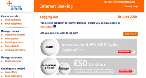
You’ve logged into your on-line banking checked your balance, paid your bills.  What do you do now?  Click on the logout button?

What do you expect will happen now?  Well given that you have actively chosen to log-out (it’s not something you are likely to click on my mistake), you’d expect to do exactly that.  Logout.  The next screen you get will probably be something that thanks you for on-line banking, with a cross sell for a product or two.

That’s what I assume most customers would expect.  So what are Alliance and Leicester thinking about with this screen?

The customer has clicked log-out but they are still logged in?

Why?

“You are still logged in to Internet Banking – before you go have a look at Your offers.”

Excuse me, I logged out, I don’t need to be logged in for you to show me offers.

Worse: “Are you sure you want to log out?”

OF COURSE I WANT TO LOG OUT!!! Why else would I have clicked the link.

Alliance and Leicester fail here in a fundamental usability rule, that of managing the customer’s expectation. In an application where security isn’t paramount this would be an error, in an application where customers expect their action of leaving their secure accounts will do exactly that… but doesn’t, is inexcusable.

Where’s the call to action?

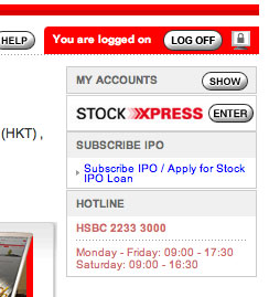
On logging in to your HSBC Hong Kong personal bank account the customer gets a brochureware spashpage promoting HSBC products (why no account summary?).  To access their accounts (the reason the customer has gone to the trouble of logging in) the primary call to action is in a box on the right hand side of the screen.  It’s the <Show> button next to gray-on-gray text “My Accounts”.   The strongest call to action is to the ‘new trading site’ Stock Xpress.  It’s a small point, but a call to action as important as account access should more prominent and be the focal point, not an easily missed button.

Are you experienced?

“For you who have had the experience, no explanation is necessary. For you who have not, none is possible.”

I’m going to attribute that saying to Ram Dass, a Harvard professor who via psychedelic experiences ended up a spiritual teacher in the Eastern Tradition.

The problem with too much software/web design is that it is produced by people who have just not had the experience, or do not see the experience as relevant to their organisation or domain. They just don’t “get it”.

(“For you who have an apple product, no explanation is necessary, for you who have not, none is possible?” Cue “it’s an enterprise application we’re buiding, not a ****ing iPhone”).

If we want to build memorable and compelling products, we need to focus upon the experience. To dwell on the feature list or functional requirements is to build mediocrity. Nothing wrong with mediocrity if you don’t want to delight your customers or increase the performance of your workforce. Without considering experience you will miss innovation and added value.

So how to focus upon experience? Get your team to undertake different tasks to get under the skin of what customers go through.

Telco product?
Spend time in a retail outlet and watch different customers buy phones
Go into all the phone shops on the high street and ask the rep “hello, I want a mobile phone”. Suspend all your knowledge about phones and tariffs. How do they sell?
Leave your blackberry at home for a day (how dies it feel? How does it change what you do?)
Download instruction manuals from different phones from manufacturers websites

Travel product?
Go into a travel agents and ask for a holiday “somewhere hot and cheap in February”

Credit card product?
Ask to borrow money from someone you don’t know (how does it feel?)
Apply for a credit card at another bank
Collect all the Credit Card / loan direct mail and emails that you and you get sent over a week, photo / scan all the credit card advertisements you see in a week
Go into a car sales room and look to buy a car on credit

Supermarket product?
Get behind the till for a day (In the UK, at least a few years ago, all senior executives in both Tesco and Sainsburys spent time in the stores over the Christmas period)
Ask a shop assistant to help you find an obscure product that is not in stock
Go into a store with a shopping list and a single bank note, (no credit cards)
Go to the pharmacy when it is busy and ask to buy the morning after pill

Extend your team
Bring in representatives from completely unrelated parts of the business to participate in brainstorming sessions. Building a “youth” social networking website? Get someone from legal or corporate finance to join in. (Get’s you thinking along the lines of extreme characters – here and here [pdf]). Working on a complex exotic financial instruments? Get a few PAs to join in. You may learn something (that your product is too complicated and even you can’t explain what it really is).

I’m sure you can come up with better exercises. The object is that with this collection of experiences and related emotions new ideas can be brought to the table. They can offer insights from another, different perspective, providing more chance of business innovation being realised. More importantly, if you have an emotional attachment to the product you are building through real experience, you are more likely to build a better product that will fullfil the needs of and goals of the target audience in the way they want. The day your enterprise application team all have iPhones will be the day you start building better enterprise applications. For them, no explanation will be necessary. They’ll just “get it”.

1 of 3
123