usability

Is good design to be equated with functional?

Is good design to be equated with functional?

Musings on my past, good design, functionality, ergonomics, customer experience, taps, light switches and a juicer.

Is good design to be equated with functional?

That was the question. For the next 40 minutes I scribbled the answer to the ‘A’ Level History of Art question.  Twenty five years later two things strike me. Firstly, that my answer must have satisfied the examiner because I got a good grade.  And that after all these years, that question still sticks in my mind.  (My answer, not so much).  It sticks in my mind because I’ve spent most of my working life addressing the inverse of that question. Is functional to be equated with good design? More often than not, the answer is a resounding no! Design is treated as an afterthought (if at all). The result is systems, products and processes that are hard and nasty to use.

What do you do?

“So what do you do?” I am often asked.

I pause.  My job title doesn’t describe what I do. “Customer Experience” is not an activity; it’s not something you “do”.  Customer experience is something I strive to make better.  It is not something I am, as in I might be a designer or a developer or a marketer or a salesperson. I am not a customer experience. My passion is to help lead teams to create and curate great customer experiences.

So what am I?

I’m thinking that I should answer with what I am qualified in.

I am an ergonomist.

What does an ergonomist do? To quote from the Egonomics Society:

Ergonomics is about making life easier for people.  This includes the products you use at home, at play and at work, the places in which you live and work… and the system that keep day-to-day life functioning properly.

“So what do you do?”

I am an ergonomist. I make life easier for people.

Why do I do this?

Twenty five years ago, with the question “is design to be equated with functional” rattling in my head, I stumbled across Ergonomics as a degree course at Loughborough University.  As a degree I couldn’t decide whether I wanted to do; something scientific, something social or something arty. Ergonomics (or human factors as it is often known as) covered all three.

In the first year at Loughborough we had an Introduction to Ergonomics and Design course that was attended by design students as well as the ergonomists. Assessment was through a team project.  The problem my team addressed was the design of bathroom taps (or faucets if you are reading this is the US).

The tap project

Is good design to be equated with functional?

At the time, the design vogue for taps was minimalist and that meant smooth.  With wet or soapy hands it could be hard to grip and easily twist the tap, especially a problem for the elderly or less dexterous amongst us. We set up a rig to adjust resistance and measure the force involved in turning different tap designs. We had control data to work against.  It was a great, multi-disciplinary team and we created an elegant new design that subjectively measured to be more pleasing to look at, and the data demonstrated that with wet or dry hands it enabled greater torque to be applied. It was easier to use.

It was obvious!

This is the way all products should be designed – get the user involved and use data to validate your assumptions.  It is only in the last few years that this thinking is becoming more widespread.

Finally (with the poster child of Apple) we are beginning to see Functional equated with Good Design.

Hot or not?

Like that exam question, the design of taps has continued to haunt me.

But why am I rambling on about taps? Because there is still some quite shocking tap design still out there! Or rather, I suspect that if you know how to use this design you don’t see the problem with it.

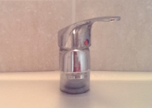
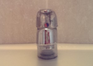
Tap centrally positioned

Take a look at the above tap.  Sorry for the quality of the picture. It’s a tap in a cheap hotel I stayed in a while ago.

Which way do you turn the tap to get hot water? Do you turn the tap to the right, fully exposing the hot circle (move tap right = lots of red circle = lots of hot water).

Tap with handle twisted to right

Or do you move the tap to select the hot circle (move tap left = red circle selected = lots of hot water). But all you can see now is blue which is cold!

Tap with handle twisted to left


Now I assume that if you have one of these taps at home, you have learned the behaviour of this design, it is second nature to you. It is obvious to you!  The ergonomist in me cringes every time I see one of these taps, and I still have no instinctive idea which way is hot and which was is cold.

When you are designing products, do you apply empathy and try and think like someone else? Listening to Dan Pink’s excellent book To sell is Human, he talks about role play; imagine selling an everyday product to an imaginary customer who has time travelled from the 17th century.  (For example, try explaining buying a hamburger from a drive-in MacDonalds to someone from the past! You can’t even assume the time traveller will understand the concept of the hamburger, let alone a car…)

Take a look at the post I wrote about let’s pretend user testing, but this time role play as though you come from a different place and time.

Now do you think your product is still easy to use?

Here’s another example.

Light switch

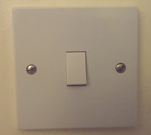
The humble light switch. Is it on or off? Trouble is, this is a cultural question. In the US it is on, in the UK it is off. (This picture is actually the light switch in my daughters bedroom. It was unintentionally wired the wrong way round.  She’s recently grown tall enough to switch the light on and off. When I asked her the question, away from her room, “which way is it to switch a light on?” “Daddy,” she said, “that’s easy. On is up and off is down”. Your view of the world is how you learn it).

Juicer Vs iPhone

Is good design to be equated with functional. 

alessi juicer

I started by stating that I couldn’t remember much of my answer to this question. I do remember drawing one object to back up my argument. The Alesi juicer.  Undoubtedly a beautiful object. But form and function? I think not. As a desirable artifact to have in your kitchen? Definitely. As an orange juicer? Definitely not.  Read the reviews; here’s a typical one:

A nice product to look at but rather difficult to use. I managed to get more juice down my front than in a glass!

It is good design, but on a functional level it fails. There are far better juicers out there that do not have the aesthetic, but are far more effective, cleaner in getting the job of squeezing out a citrus fruit.

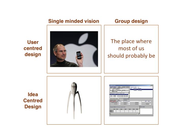
The Alessi juicer has something in common with the iPhone. Both are the product of visionaries. Both were driven by uncompromising individuals with a single minded design vision.  Both are products whose attraction ultimately lie in their design.  The difference between the two is that the iPhone is user centred whilst the Alessi juicer is idea centred. It delivers on the idea, not on the needs of the user.  One of the last times I met with Luke Barrett we talked about these products. If Apple and the Alessi juicer are driven by leaders for whom design is paramount, what about the other end of the scale. Products that are the result of design by committee. On a Wagamma placemat we sketched out the following matrix.

Quadrant

It was easy to fill the idea centred, group design box. You see this shocking design in almost all enterprise software. (“Enterprise software”. The term makes me shudder with unease. Because large organisations don’t call themselves enterprises.  It’s a label that has been applied by software vendors touting their software to be applicable to companies they perceive to be large, often unwieldy and the potential source of large revenue streams for them).

Is functional to be equated with good design? No, most certainly not! Because enterprise software is usually focused upon the functionality, the idea of what the user need is, and the how is not rooted in user centred design.

It is rare for a large organization to have a design visionary who passionately cares about the quality of the design in the same way that Steve Jobs did.  Go beyond the startup and design is almost inevitably going to be the responsibility of many people. Hitting that magic quadrant in the enterprise, the place where most of us should probably be, is going to be hard. It is, as this article suggests, the next UX revolution. I think we are getting close to this at Auto Trader. In the future I’ll write about it.


How the retail banks are addressing customer experience

A few weeks ago I attended the Customer Experience Management for Banking and Financial Services conference, presenting on driving agility into your customer experience.  There were some great presentations, it is great to see the banks taking customer experience seriously. From my notes, what follows are some of the presentations and ideas that resonated with me.

Anthony Thomson, Metrobank

Anthony Thomson, chairman of Metro Bank was inspiring. Everything they do is from the customer perspective.

For everything Metro Bank do, they ask ‘why are we doing this?’ Is it going to make our lives easier, or is it going to give our customers a better experience? The second trumps the first every time.

Metrobank see that they (like all banks) are essentially a money shop who sell the same products as their competitors. The only real differentiator is experience and service. With the Vickers Report recommending “the early introduction” of a system that makes it easier to move accounts and that is “free of risk and cost to customers”, this is going to become increasingly more important.

Retail is detail is the old adage. Think about something as small as the pen on the counter. Chaining it down may suggest security, until you see a chain with no pen attached. Anthony questioned what is the cost of a pen? What is the value of having your branded pen in your customers’ kitchen? Talking of branding he showed a picture of a Metrobank van. Banks use vans all the time to transport the pens and stationary to the branches, but they are never branded. Is this security trumping marketing? A lack of joined up thinking? He commented on the press comments on Metrobank attitude towards dogs. Focussing upon the dog misses the point. Customers love their dogs, why shouldn’t they be allowed in the stores and be positively welcomed! By saying “no dogs” are you saying we care more about our carpets than our customers?

Another detail thing – how often have you waited outside a bank to open in the morning, or be hassled out because it’s the end of the day and is now closed. Metrobank have flexibility, they’ll open a little earlier if people are waiting outside and stay open till the last customer leaves.

A theme through Anthony’s presentation was of empowerment. Empowering staff, removing pedantic rules that get in the way of delivering a compelling customer experience. He told a story of how a customer had to wait longer for assistance than expected and incurred an £8 parking ticket. A member of staff wanted to refund the customer and suggested giving them £4. To which Anthony commented “and only half piss them off?”

Empowerment starts with recruiting good people. Only a fraction of the people who apply get to work for Metrobank. They understand that skills can be trained so they recruit for attitude. If someone whose job is to interact with customers on a daily basis doesn’t smile, they don’t get the job. When it comes to targets, they ‘measure what matters’. They incentivise on service not sales because with good service comes sales.

Rob Hawthorn, Barclays

Empowerment was a theme that ran through the presentation that Rob Hawthorne from Barclays gave. He’s taken a leaf out of the hospitality industry and borrowed from Ritz Carlton with their Credo Card, a single sided card that reminds their staff of the levels of service they should provide. Barclays corporate staff are empowered to fix the problem. Like Metrobank they strive for no stupid rules and put the customer first. For example a customer pays in £230.60 and only £230.20 is credited to the account. They now refund then investigate. By introducing this policy change they say a 65% reduction in customer complaints.

Everyday, in every Ritz Carlton hotel they have The Line-up. This is a fifteen minute meeting to review guest experiences, address issues and identify how they can improve service. It is an opportunity to tell stories, both top down (what’s going on in the company overall) and bottom up (what can we learn from individuals and their interactions with customers). Barclays corporate do this across the organisation. From the top down they have one version of the truth; what is happening in Barclays world, what is important and what are customers saying today?”

The fifteen minute meeting is a familiar concept within agile, known as the standup it’s a brief meeting where the team review what they did yesterday, what they are doing today and any issues or blockers they are facing.

“How often do you see your complaints data?” Asked Rob. What use is seeing it once a month? You should be seeing it every day. Better still (and this is something that I alluded to as well), walk in the shoes of your customer. Get out into the branches, into the call centre and see what is going on for yourself.

Richard Brimble, Veolia Water

Not FS, but Richard gave a view on customer experience from a different viewpoint.  He gave an engaging presentation that started by asking if you are a blue tit or a robin. Blank states from the audience, so he elaborated. After the first world war milk companies started sealing milk bottles with foil tops. Until then the bottles had open tops and both robins and blue tits would drink the cream from the top. With the foil tops the birds had to learn to peck through them. By the 1950s the entire blue tit population had learned this. Robins never did. Robins are territorial and solitary creatures, whilst blue tits are social. They may be scruffy compared to the elegance of the robin, but they are innate communicators. They share their learnings and copy each others successes. As an organisation are you a robin or a blue tit?!

Sean Gilchrist, Barclays

Is Barclays going all Lean Startup? Sean Gilchrist from Barclays told a story of their lean customer development approach to developing their mobile bank Barclays.mobi. The journey started in data; a significant minority of customers were accessing internet banking using mobile devices. A clunky experience at best. Rather than going the Big IT route they went lean and did some customer discovery. “What’s important to you?” they asked customers.  “Checking balance” they were told. “How about paying bills on your mobile?” they asked, “No, we just want to check balances” was the response. “How about a branch location finder?” to be told  “No, we just want to check balances”. In eight weeks and on a shoestring they built and launched their minimum viable product, Barclays.mobi. The product was instantly successful and gave the team leverage to continue development.

Sean told another story about the perils of just pushing something into production without thinking about how people behave on-line. To access account information on on-line banking the customer has to use a security device that displays digits that are then entered into the application. The digits were displayed in two blocks of four:

1234 5678

A decision was taken to replace the single field on the application where this number was entered into two fields that better represented the way the number was presented on the screen, i.e.

|1234| |5678|

The week they made this change they received over thirty thousand complaints about this change. When I’ve recounted this story to Barclays customers they can remember when this happened and what a pain it was. People who don’t touch type look at their keyboard, not the screen. They entered the number as one continuum, not in two blocks. Tabbing between fields is an ‘advanced’ technique. Suddenly the customer was unable to enter the number without having to use their mouse to move to the next field. A change that was suppose to reduce errors ended up causing more. The issue was fixed by have an auto-tab between the fields, but not before customer complaints. Usability testing (oe even having an experienced usability expert on the team) before going live would have picked this issue up.

Trent Fulcher, RBS

Finally Trent Fulcher from RBS presented on the customer experience and innovation work he has been doing at RBS. A key takeaway from his presentation was that at RBS they demonstrated a positive correlation between advocacy and revenue per customer. Not only are advocates more profitable, they also bring new customers to brand. RBS accepted that they will always have detractors to the brand and are happy to take a calculated decision not to focus upon changing their perceptions, rather focus on ‘passives’ and move them to advocates. He demonstrated how RBS modelled their customer journeys, understanding what customers value and expect from every touch point. What they discovered is that for some touchpoints they were overreaching on these expectations, enabling them to understand if they were focussing effort on the parts of the journey that Make A Difference.

Guess who? (Kill the Agile Buddha)

Guess who am I now.

I’m in a supermarket, I’m pushing a trolley. I’m putting items into it. I just need some bread and I’ll be going to the checkout. Who am I?
I’m in a bank, queueing up in front a machine for depositing cheques. I’ve got a couple of cheques I need to pay in. Who am I?
I’m in an electronics store. I want a new printer but I’m not sure what’s the best for me, I’m looking for someone to help me. Who am I?

Or maybe what am I?

I am a customer.

Aren’t I?

Business language backs up my assumption. The employee at the supermarket checkout is called a Customer Service Rep, my personal (customer) details are held in the banks Customer Relationship Management system, in the electronics store I’m looking for Customer Support. And after I’ve bought my printer I’ll be asked to complete a Customer Satisfaction Survey.

So everything indicates that I am a customer. Or that is what I thought I was.

Apparently not according to the Scrum zealots.

At Agile 2009 Tom Illmensee presented a paper “5 Users Every Friday: A Case Study in Applied Research”. It describes how an eCommerce division of an electronics retailers introduced agile and how the user experience team adapted to agile. It starts by describing how their initial forays into agile were deemed successful. It was collaborative with the disciplines well integrated; “whiteboard wireframes, minimal documentation, and product demos. Usability tests with paper and semi- functional prototypes were conducted with shoppers each sprint”. More than that, the whole team enjoyed the experience. A decision was made to “take agile to the next level”. The next level was the introduction of a consulting firm who brought in scrum training. The scrum dogma was painful to adopt, but they got there in the end. But there’s a line in the paper that made me angry:

“The peculiar semantics of Scrum were especially confusing at first. In retail customers were people who bought things like stereos and flat-screen TVs. Not anymore. Agile had changed the definition of perhaps the most important word in our business environment: customers were now internal product owners. Customers would now be referred to as shoppers—or users.”

I’ll write that again. Customers (the people who the business depended upon, and “the most important word in [their] business environment”) would now be called shoppers. Or users. Because in agile, customers are internal product owners.

Sorry, these consultants, these agile zealots, these software egos have got too big for their boots. Dan North, pulling to pieces the nonsense of ‘software craftsmanship’ put’s it eloquently:

Software Craftsmanship risks putting the software at the centre rather than the benefit the software is supposed to deliver, mostly because we are romantics with big egos. Programming is about automating work like crunching data, processing and presenting information, or controlling and automating machines.

Software at the centre rather than the benefit the software is supposed to deliver. Software is the means to an end, not the end itself. If a certified scrum master (certified master based on two days training and a multiple choice questionnaire, now there’s a farce) tries to rewrite your business language, tries to tell you that your domain language is wrong, show him or her the door.

There’s a budhist saying “If you see the Buddha on the road, kill him“.

If you see agile in your workplace, kill it.

Why kill the Buddha? because the Buddha becomes an object, your own illusion of what it is. And it this illusion is wrong.  To turn the Buddha into a religious fetish is to miss the essence of what he taught. Killing the Buddha means taking responsibility for yourself.  Same with Agile; to turn agile, to turn software development into a religious fetish is to miss the point of what it is all about.

===

I presented on the customer theme a while ago, here are the slides.

And here’s me narating the slides on google video.

Minimum viable mobile app

I was recently challenged by a product owner on how you can deliver a minimum viable mobile app.  Her concern was that she only gets one shot at launching her app on the app store, customer feedback is gold dust and the last thing she wants is to launch a half baked product that will result in a low customer rating.  Good stuff may come later, but if the first tranche of customers rate the product poorly, the product has already failed.

This is a valid concern, however when you review product feedback that consumers give, it is usually around the experience they have with the product shipped, i.e. issues with what it does, rather that what it does not.  Go to the app store and look for apps with really bad reviews. People complain that an app isn’t usable, is buggy, is hard to use (or is just plain ‘bad’). They don’t complain that it doesn’t have features.

Jason furnell recently blogged about the launch of the REA iPhone app. This was built with close collaboration between designers and developers, launching a Minimum Viable Product Minimum Delightful Product  that after a week was #1 in the Top Free Lifestyle Apps Category.

Getting the basic product right and introducing new features ‘enhancements’ later is preferable to releasing a fully featured product that fails to delight.

Rout me a parcel

Graham Charlton wrote a great blog on eConsultancy a couple of days ago on how on-line retailers are managing customer expectations. (Or not as the case may be). He takes it as far as the check out, but what happens next?

The ability for customers to track parcels and delivery is becoming increasingly common.

The requirement is simple. Take the package tracking status (that we have already) and display it to our customers.

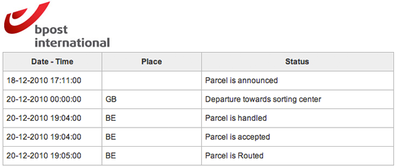
The execution of this separates the customer led from the IT led. The former will take the internal codes and language, ditch the codes that mean nothing to the customer and translate the status into words the customer understands. The latter just display the internal codes and status verbatim.  Both deliver the same functional requirements, one delights, one confuses.

Compare the following:

1. BPost: what does “parcel is routed” mean?

status from bPost

2. Royal Mail: “We received item xxxxxxx at [Placename] DO on the 2010-12-22. The item is now ready for delivery.”

3 For exactly the same package at the same time, Amazon track its status as “Latest event: Out for delivery – Dec 22, 2010 4:34:51 AM”

As you’d expect, the eCommerce website does eCommerce the best.

Usability and the $1 trillion mistake

Is this a case of fat fingers, a usability flaw or poor design that enabled a Citigroup trader to have placed an order to sell $16 billion, instead of $16 million? P&G shares plunged by 23% because of this individual erroneous trade. What followed was the algorithms kicked in and automated trading saw the Dow loose a tenth of its value in less than half an hour. (And Accenture dropped to 4 cents down from $42!)

Before we go blaming human error, questions should be asked why that error occurred. How can someone make such a simple mistake so easily? Was it a case of entering two many 0s? (Don’t stop to look or think, answer the question as soon as you’ve read it – how many zeros are there in this number? 160000000. Same thing again, how many zeros are in this number 12,000,000. That’s a bit easier isn’t it. Only an ‘N’ separates the B from the M on a qwerty keyboard, in a hurry, easily mistaken?)

I’d start by looking at human factors and experience design, and question why (assumption here) the IT team who implemented the system didn’t have before a UX designer on the team to think about the human factors. Could this be the most costly example of poor design?

Article: Big drop, was it all a mistake?

Hey usability dude, join the devs (Usability rant part 3)

The last couple of posts here and here have been critical of boutique usability companies that offer user testing services. In the final part of my rant, here’s an alternative approach.  Seed into the development teams someone with a usability background (probably with a psychology degree), someone who can create as well as critique.  Align them to Marketing (or ‘the business’) but physically locate them in IT.  To be successful they must be a passionate advocate for the business vision (hence business alignment), but unless they have a daily relationship with the developers (on hand to support immediate design decisions) they will fail.  (The only way to do this is for them to be part of the development team, same building, same floor, same location).

It is better than they Eschew the formal usability testing process for more informal guerilla usability testing.  In an agile project treat this as akin to the showcase.  Testing sketches and wireframes prior to the development iteration, and putting working software when it has sufficient UI coherence in front of users and well as business stakeholders, with the developers as observers in the process.  One person can cover multiple workstreams.  This is a far better use of a limited budget than commissioning ad-hoc reports too late in the day.

Usability reports (usability rant part 2)

Following on from yesterdays post about the usability process, today I’ll focus on the deliverables, the usability report and my contention that they are rarely grounded in any understanding of the project reality. Here are a couple of examples of usability findings from a (well respected) usability company’s report:

Finding: It was said that the ability to filter [the search results] would be important.
Recommendation: Add check boxes so the customer can choose between [result types]

“Add check boxes”.

That’s easy to say, three words “Add. Check. Boxes”. But what if the particular search engine the team are using does not allow such functionality?  Or such functionality will take significant effort to build.

Finding: When probed about the use of breadcrumbs on the site, 2 participants were confused by the structure that was displayed.
Recommendation: Consider using chevrons [for the breadcrumb] to better covey to the customer that these words show the journey they have been on [rather than ‘/’]

Let’s leave aside the basis of this recommendation; two participants commenting that they weren’t sure about the use of the ‘/’ (this sounds more like it is reinforcing the authors prejudice against the use of / in a breadcrumb and their preference for the ‘>’ symbol).  And let’s also leave aside the fact that it has taken three weeks to let the development team to know that.

It is presented on a powerpoint slide with a screen shot of the breadcrumb and a mockup of a preferred solution, e.g. “Home > UK > South East > News” (Rather than Home / UK / South East / News”).  I’d estimate this took twenty minutes elapsed time to produce this slide. It will take a further ten minutes to discuss when the page is presented to the product owner. And the product owner will spend ten minutes explaining it to the IT project manager who will take ten minutes to explain it to the developers to make the change…

Save your money

Usability testing is not a science. Investing in one or two formal usability tests is almost certainly money badly spent. The Cue reports give a good insight into this.  For example, they asked seventeen experienced professional teams to independently evaluate the usability of the website for the Hotel Pennsylvania in New York.

The teams reported 340 different usability issues. Only nine of these issues were reported by more than half of the teams, while 205 issues (60%) were uniquely reported, that is, no two teams reported the same issue. Sixty-one of the 205 uniquely reported issues were classified as serious or critical problems.

They go on to state…

The study also shows that there was no practical difference between the results obtained from usability testing and expert reviews for the issues identified.

This suggests getting a UI expert into the project team is probably money better spent than employing the usability company (and supports my assertion that usability testing is often just validating the work of a professional).  And when you do get a usability company to report back, as I’ve discussed above, don’t hold your breath for the quality or usefulness of the results:

They found that only 17% of comments in usability reports contained recommendations that were both useful and usable, and many recommendations were not usable at all [source]

So if the recommendations you get from one company are likely to be different to the recommendations from another; if the report is going to be full of recommendations that are impractical and not implementable; if an expert can pick up usability problems that usability testing can, why bother with the usability company testing at the back end of the project?  Indeed, why bother with the usability company at all?  Get an interaction designer on the project from the outset (call them an information architect, user centred designer ,UX person if you want), get them testing ideas and interfaces informally and regularly throughout, and truly embed usability into the project itself, not as an add-on process and report.

Usability rant part 3>

Critiquing the critics (usability rant part 1)

Michael Winner may be a good food critic, but if you were looking for someone to cook you the finest meal for your budget, I doubt he would be your first choice.Same with film critics, they may be able to write an insightful and critical review, but would you want them directing a film for your budget? Would you want Jakob Neilsen, who is essentially a usability critic, to design your website? I mean, take a look at his site!

When you are building a product, you get a usability company in because you know that usability is a good thing that you want to have. If usability companies are the critics, what are you expecting?

The first usability test I ran was in 1991. I’ve set up usability labs, I’ve observed hundreds of people interacting with technology and products. My passion has always to do things at speed, turn around results ASAP and engage all stakeholders in the process.  But I’ll talk about that in a later post.  For now I’ll draw on experience of working with organisations that have commissioned usability companies to review their products.  I’ll breakdown the process I have often observed from usability testing vendors, considering both the elapsed time and the actual ‘value added time’ taken.

Day one

The client (usually the business) engage the usability company to audit the usability of the product that is being developed. The consultants will come in and understand the user tasks, roles and goals; the target audience will be identified for recruitment. ‘Value added time’ = 1 hour.

Day two

The team go away and produce a test plan and a recruitment brief for a research agency to find participants. They promise to get it back to the client in a couple of days. They contact their preferred agency who set about recruiting people (let’s assume this is a simple brief for a retail website targeted at young mothers).  Produce test plan (value added time = 3 hours). Send to client for review.

Day three

Client return test plan with a few comments. Update test plan. Value added time = 30 minutes.

Days six-ten

Twelve usability sessions, each an hour long, they do three a day, that is four days of testing. Value added time = 12 hours

Days eleven – thirteen

The team spend three days analysising and synthesising the results, pull supporting video clips and produce a detailed report. Value added time – 15 hours

Day fourteen

The client sees the report for the first time. (Value added time = 2 hours). Interesting results. (IT representation were not invited, they did not commission the report, the product owner wants to see the output first before sharing it with IT).

Day sixteen

The product owner informs the dev team of the changes that need to be made in the light of the usability report. Project manager sucks air through his teeth and says “you’ll need to raise a change request for those items… ha! quick wins they say? hardly… Hmmm, OK, change the labels in the field, we should be able to do that…”

Value added Vs. Elapsed time

The usability company has delivered and their engagement is complete.  From the start of the process to the recommendations hitting the developers who must ultimately action these, for this not-too-fictitious scenario sixteen days have passed, of which only four were spent on value-added tasks, actually doing stuff.

Day n

The product goes live. The usability company are aghast that so many of the changes they reccomended have not been implemented. They place the blame fairly and sqaurely at the door of the developers and reinforce their belief that IT just doesn’t listen, or worse, care about usability. The critics have critcised from their armchair, like the pigs and chickens they are the chickens, participated not committed.

Usability rant part 2>

The journey doesn’t end with the buy button

Take a look at this and tell me what information it conveys to you.  Look at the order status…

Dispatched.

So five days later when I ring up Laskys to find out what has happened to my product I’m told “we’re sorry, the product is out of stock.  Would you like another similar product?”  I’m not exactly a happy chappy to find this out five days after the order has been placed. I’ve been to ‘my account’ to track my order and it tells me that the order has (click on the help icon) “been processed and either has a delivery date or has been delivered”.  Well no actually, it is out of stock and your eCommerce system hasn’t accommodated that scenario in the customer experience.  Sorry Laskys, you lied to me.

“We did actually send you an email on the 8th of March to let you know this”.  So I went back through my mailbox and indeed they had sent me a mail.  I use gmail.  The mail was unread, but I get so many mails I don’t always open them, especially as gmail gives you the title and the first line of the mail.  The mail in question from Customer Service was titled “Your Order” and the following first line; “Thank you for placing an order with Laskys. TheSEBO X4 EXTRA  on order 025”.  nothing there to suggest that it was out of stock.  Just a generic subject and first line of copy.  They had taken my phone number as part of the process; no-one thought to ring me.  Overall a poor experience.  I won’t be buying from Laskys again and I suggest you don’t either.

There’s a lesson here.  It is easy to focus upon the shiny stuff, to get customers converting, clicking on that buy button.  But if the post-buy button experience is lacking; if you haven’t factored in operational excellence into your process, in the long run it is likely to cost you.

1 of 4
1234