Is good design to be equated with functional?
Musings on my past, good design, functionality, ergonomics, customer experience, taps, light switches and a juicer.
Is good design to be equated with functional?
That was the question. For the next 40 minutes I scribbled the answer to the ‘A’ Level History of Art question. Twenty five years later two things strike me. Firstly, that my answer must have satisfied the examiner because I got a good grade. And that after all these years, that question still sticks in my mind. (My answer, not so much). It sticks in my mind because I’ve spent most of my working life addressing the inverse of that question. Is functional to be equated with good design? More often than not, the answer is a resounding no! Design is treated as an afterthought (if at all). The result is systems, products and processes that are hard and nasty to use.
What do you do?
“So what do you do?” I am often asked.
I pause. My job title doesn’t describe what I do. “Customer Experience” is not an activity; it’s not something you “do”. Customer experience is something I strive to make better. It is not something I am, as in I might be a designer or a developer or a marketer or a salesperson. I am not a customer experience. My passion is to help lead teams to create and curate great customer experiences.
So what am I?
I’m thinking that I should answer with what I am qualified in.
I am an ergonomist.
What does an ergonomist do? To quote from the Egonomics Society:
Ergonomics is about making life easier for people. This includes the products you use at home, at play and at work, the places in which you live and work… and the system that keep day-to-day life functioning properly.
“So what do you do?”
I am an ergonomist. I make life easier for people.
Why do I do this?
Twenty five years ago, with the question “is design to be equated with functional” rattling in my head, I stumbled across Ergonomics as a degree course at Loughborough University. As a degree I couldn’t decide whether I wanted to do; something scientific, something social or something arty. Ergonomics (or human factors as it is often known as) covered all three.
In the first year at Loughborough we had an Introduction to Ergonomics and Design course that was attended by design students as well as the ergonomists. Assessment was through a team project. The problem my team addressed was the design of bathroom taps (or faucets if you are reading this is the US).
The tap project
Is good design to be equated with functional?
At the time, the design vogue for taps was minimalist and that meant smooth. With wet or soapy hands it could be hard to grip and easily twist the tap, especially a problem for the elderly or less dexterous amongst us. We set up a rig to adjust resistance and measure the force involved in turning different tap designs. We had control data to work against. It was a great, multi-disciplinary team and we created an elegant new design that subjectively measured to be more pleasing to look at, and the data demonstrated that with wet or dry hands it enabled greater torque to be applied. It was easier to use.
It was obvious!
This is the way all products should be designed – get the user involved and use data to validate your assumptions. It is only in the last few years that this thinking is becoming more widespread.
Finally (with the poster child of Apple) we are beginning to see Functional equated with Good Design.
Hot or not?
Like that exam question, the design of taps has continued to haunt me.
But why am I rambling on about taps? Because there is still some quite shocking tap design still out there! Or rather, I suspect that if you know how to use this design you don’t see the problem with it.

Take a look at the above tap. Sorry for the quality of the picture. It’s a tap in a cheap hotel I stayed in a while ago.
Which way do you turn the tap to get hot water? Do you turn the tap to the right, fully exposing the hot circle (move tap right = lots of red circle = lots of hot water).
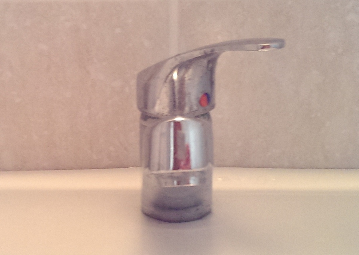
Or do you move the tap to select the hot circle (move tap left = red circle selected = lots of hot water). But all you can see now is blue which is cold!
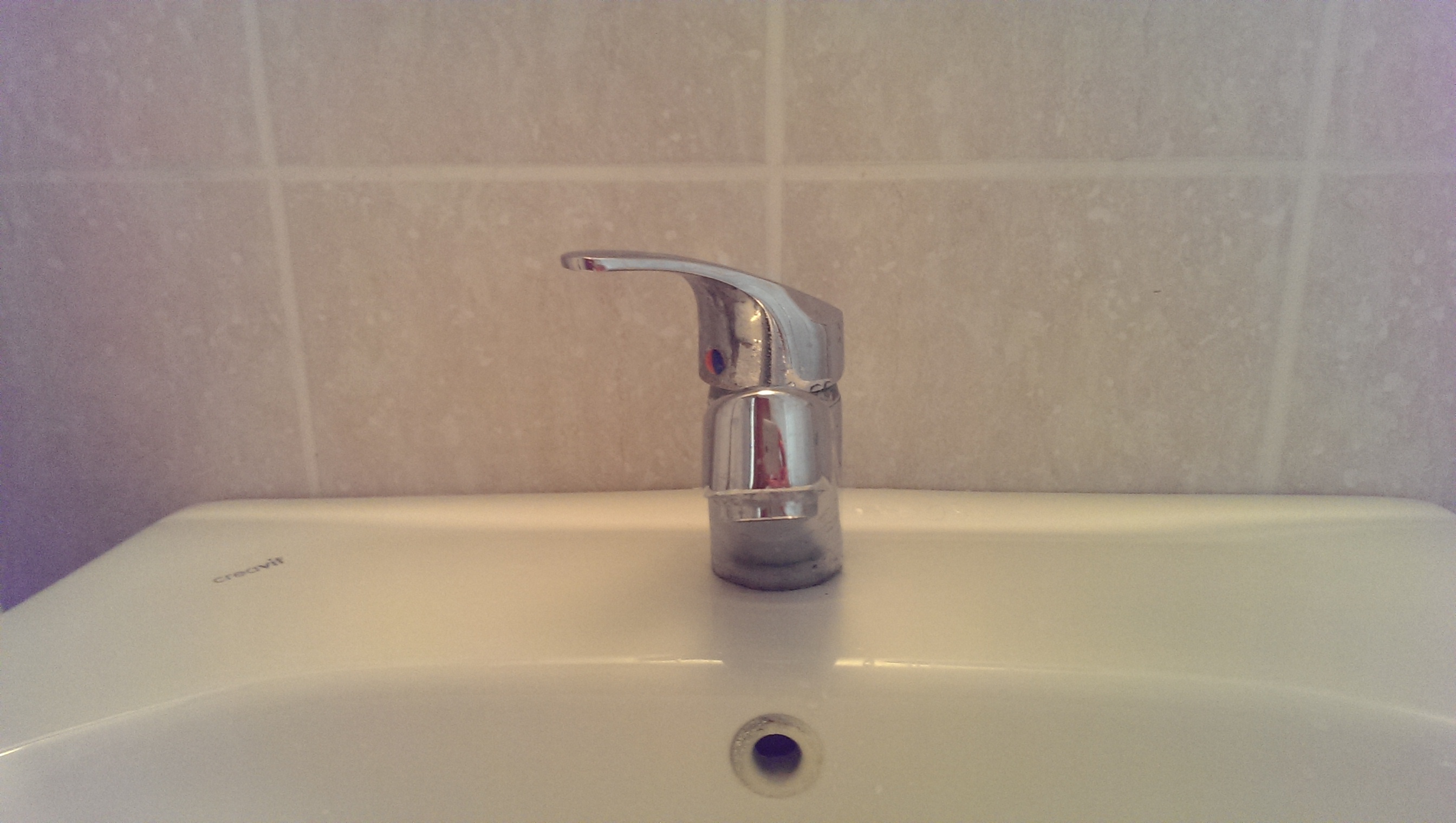
Now I assume that if you have one of these taps at home, you have learned the behaviour of this design, it is second nature to you. It is obvious to you! The ergonomist in me cringes every time I see one of these taps, and I still have no instinctive idea which way is hot and which was is cold.
When you are designing products, do you apply empathy and try and think like someone else? Listening to Dan Pink’s excellent book To sell is Human, he talks about role play; imagine selling an everyday product to an imaginary customer who has time travelled from the 17th century. (For example, try explaining buying a hamburger from a drive-in MacDonalds to someone from the past! You can’t even assume the time traveller will understand the concept of the hamburger, let alone a car…)
Take a look at the post I wrote about let’s pretend user testing, but this time role play as though you come from a different place and time.
Now do you think your product is still easy to use?
Here’s another example.

The humble light switch. Is it on or off? Trouble is, this is a cultural question. In the US it is on, in the UK it is off. (This picture is actually the light switch in my daughters bedroom. It was unintentionally wired the wrong way round. She’s recently grown tall enough to switch the light on and off. When I asked her the question, away from her room, “which way is it to switch a light on?” “Daddy,” she said, “that’s easy. On is up and off is down”. Your view of the world is how you learn it).
Juicer Vs iPhone
Is good design to be equated with functional.
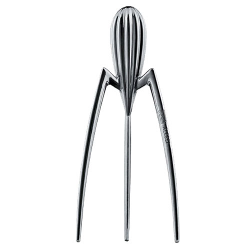
I started by stating that I couldn’t remember much of my answer to this question. I do remember drawing one object to back up my argument. The Alesi juicer. Undoubtedly a beautiful object. But form and function? I think not. As a desirable artifact to have in your kitchen? Definitely. As an orange juicer? Definitely not. Read the reviews; here’s a typical one:
A nice product to look at but rather difficult to use. I managed to get more juice down my front than in a glass!
It is good design, but on a functional level it fails. There are far better juicers out there that do not have the aesthetic, but are far more effective, cleaner in getting the job of squeezing out a citrus fruit.
The Alessi juicer has something in common with the iPhone. Both are the product of visionaries. Both were driven by uncompromising individuals with a single minded design vision. Both are products whose attraction ultimately lie in their design. The difference between the two is that the iPhone is user centred whilst the Alessi juicer is idea centred. It delivers on the idea, not on the needs of the user. One of the last times I met with Luke Barrett we talked about these products. If Apple and the Alessi juicer are driven by leaders for whom design is paramount, what about the other end of the scale. Products that are the result of design by committee. On a Wagamma placemat we sketched out the following matrix.
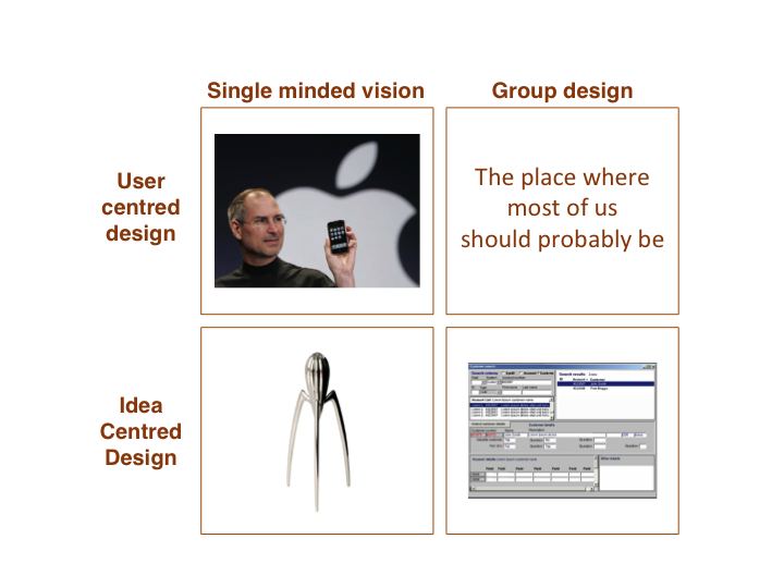
It was easy to fill the idea centred, group design box. You see this shocking design in almost all enterprise software. (“Enterprise software”. The term makes me shudder with unease. Because large organisations don’t call themselves enterprises. It’s a label that has been applied by software vendors touting their software to be applicable to companies they perceive to be large, often unwieldy and the potential source of large revenue streams for them).
Is functional to be equated with good design? No, most certainly not! Because enterprise software is usually focused upon the functionality, the idea of what the user need is, and the how is not rooted in user centred design.
It is rare for a large organization to have a design visionary who passionately cares about the quality of the design in the same way that Steve Jobs did. Go beyond the startup and design is almost inevitably going to be the responsibility of many people. Hitting that magic quadrant in the enterprise, the place where most of us should probably be, is going to be hard. It is, as this article suggests, the next UX revolution. I think we are getting close to this at Auto Trader. In the future I’ll write about it.