interaction design

Guess who? (Kill the Agile Buddha)

Guess who am I now.

I’m in a supermarket, I’m pushing a trolley. I’m putting items into it. I just need some bread and I’ll be going to the checkout. Who am I?
I’m in a bank, queueing up in front a machine for depositing cheques. I’ve got a couple of cheques I need to pay in. Who am I?
I’m in an electronics store. I want a new printer but I’m not sure what’s the best for me, I’m looking for someone to help me. Who am I?

Or maybe what am I?

I am a customer.

Aren’t I?

Business language backs up my assumption. The employee at the supermarket checkout is called a Customer Service Rep, my personal (customer) details are held in the banks Customer Relationship Management system, in the electronics store I’m looking for Customer Support. And after I’ve bought my printer I’ll be asked to complete a Customer Satisfaction Survey.

So everything indicates that I am a customer. Or that is what I thought I was.

Apparently not according to the Scrum zealots.

At Agile 2009 Tom Illmensee presented a paper “5 Users Every Friday: A Case Study in Applied Research”. It describes how an eCommerce division of an electronics retailers introduced agile and how the user experience team adapted to agile. It starts by describing how their initial forays into agile were deemed successful. It was collaborative with the disciplines well integrated; “whiteboard wireframes, minimal documentation, and product demos. Usability tests with paper and semi- functional prototypes were conducted with shoppers each sprint”. More than that, the whole team enjoyed the experience. A decision was made to “take agile to the next level”. The next level was the introduction of a consulting firm who brought in scrum training. The scrum dogma was painful to adopt, but they got there in the end. But there’s a line in the paper that made me angry:

“The peculiar semantics of Scrum were especially confusing at first. In retail customers were people who bought things like stereos and flat-screen TVs. Not anymore. Agile had changed the definition of perhaps the most important word in our business environment: customers were now internal product owners. Customers would now be referred to as shoppers—or users.”

I’ll write that again. Customers (the people who the business depended upon, and “the most important word in [their] business environment”) would now be called shoppers. Or users. Because in agile, customers are internal product owners.

Sorry, these consultants, these agile zealots, these software egos have got too big for their boots. Dan North, pulling to pieces the nonsense of ‘software craftsmanship’ put’s it eloquently:

Software Craftsmanship risks putting the software at the centre rather than the benefit the software is supposed to deliver, mostly because we are romantics with big egos. Programming is about automating work like crunching data, processing and presenting information, or controlling and automating machines.

Software at the centre rather than the benefit the software is supposed to deliver. Software is the means to an end, not the end itself. If a certified scrum master (certified master based on two days training and a multiple choice questionnaire, now there’s a farce) tries to rewrite your business language, tries to tell you that your domain language is wrong, show him or her the door.

There’s a budhist saying “If you see the Buddha on the road, kill him“.

If you see agile in your workplace, kill it.

Why kill the Buddha? because the Buddha becomes an object, your own illusion of what it is. And it this illusion is wrong.  To turn the Buddha into a religious fetish is to miss the essence of what he taught. Killing the Buddha means taking responsibility for yourself.  Same with Agile; to turn agile, to turn software development into a religious fetish is to miss the point of what it is all about.

===

I presented on the customer theme a while ago, here are the slides.

And here’s me narating the slides on google video.

Thinking inspired by the Agile UX retreat

In the quest to get agile and UX to get along better, and following successful retreats in the US, last weekend Johanna Kollmann brought together a bunch of agile and UX folk for an Agile UX retreat in London sponsored by.  Giving up a weekend was hard, but was worth it, meeting a great bunch of people and sharing thoughts and experiences from the agile and UX camps.  So what did I learn.

Rethink what we do

Coming out of the retreat it is clear that the way we do UX today needs a fundamental rethink.  As UX professionals we have fought long and hard to gain credibility and traction in organisations for what we do, but we need to be ready to evolve and embrace the changing world around us.  A world where IT no longer needs to have detailed specifications signed off before development start.  We no longer have the need (or the luxury) to do the up-front research that we are used to doing.  We no longer need to sign-off detailed wireframes before handing them over the fence to the developers to implement.  Software today really is soft.  It is more about creativity than engineering (see below).  The serialisation of activities is inefficient and wasteful.  It is time to ask how do we focus upon doing what is needed and when, working in parallel and infecting the whole system with user-centric thinking rather than siloing it into the upfront design.  This after all is what systems ergonomics is about; a forerunner to UCD that we know today, thinking about the macro (a broad system view of design, examining organizational environments, culture, history, and work goals) as well as the micro (fitting the task to the human).

But I am digressing from what I wanted to blog about, the Agile UX retreat.  Some key takeaways for me included Anders Ramsey‘s analogies to the restaurant and the theatre.

Thinking analogies

Think of a restaurant.  We have the kitchen, the back room world that is focussed upon delivering consistency of servings.  Everything in the kitchen is utilitarian, serving the purpose to meet this goal.  At the front of the restaurant we have the dining room where the dishes (of consistent(ly good) quality) made in the kitchen are served.  The dining room is all about the ambiance.  Quality here is far more subjective, but a successful restauranteur will be as passionate about the dining room as she is about the food that is cooked in the kitchen.  This is the way that software is all too often built, with the kitchen and dining room being separate entities, however the way they are organised, paid for and owned, there’s little communication between the two.  To quote another Ramsey, Gordon, it is a Kitchen Nightmare.

Anders’ second analogy to consider was the Theatre.  An overly simplistic representation is that the director starts with a script.  From the script he iterates the production.  The producer’s role is to provide the director with what he needs to make the production successful.  Just be ready for the premiere which is on a fixed date.  In the lead up to the premiere the director assembles the cast, the crew and they rehearse.  They’ve got a strawman plan to work from – MacBeth, but how they implement it will evolve according to the stage, actors and artistic direction the director wants to take.  The producer does not care how or when they rehearse, she is only concerned with the success of the end goal.  As they rehearse they increase the fidelity of their performance until they premiere (go live).  but even then they are not done.  They are happy to accommodate changes to the performance, and if something different happens that clearly delights the audience they will happliy incorporate that into future performances (releases).  Sure, the audience is seeing a performance of Shakespere’s MacBeth, but it is a unique performance that has taken the initial plan and evolved as it has been created.

And so should we approach software development.  Not as an exercise in engineering, where our raw materials are fixed and highly stable, but as a creative artform, where our iterations are rehearsals for the premier and ongoing performances.

Thinking tensions

I’m sure there are more, but some examples of tensions that emerge when we try to work together:

AUX promotes rapid open communication and sharing but designers fear sharing.  (They worry early designs will be seized upon before they are ready)
AUX promotes visualisation and use of walls but corporate policies prevent this
AUX promptes doing just enough, just in time but a legacy of deliverable expectations gets in the way (research is rarely bought by the developers who will ultimately consume it).

Thinking people

At the end of the day, success comes down to people.  Agile zealots have done Agile no favours when they bang on about business value and see anything other than code as waste.  Good product design needs vision, it needs research to ensure you are building the right thing for the right people.  No one has the right to tell a UXer that testing ideas or building a prototype or undertaking research is waste if it is right for their context.  But it doesn’t need to take the time it does today.  The UX community needs to get out and spend time with the development community and understand how software is built today.  UXers need to start seeing developers as partners rather than consumers of what they do.  What if we aligned our teams around the products we build rather than the functional silos that the roles describe?  Bringing agile and UX together is more fundamental than arguing about the process (one iteration in front, washing machine cycles etc), it is about fundamentally changing the way we build software; see it as a team activity that works collaboratively rather than a factory production line with process gates and separation of responsibility.

More on the #auxretreat twitter feed

Usability reports (usability rant part 2)

Following on from yesterdays post about the usability process, today I’ll focus on the deliverables, the usability report and my contention that they are rarely grounded in any understanding of the project reality. Here are a couple of examples of usability findings from a (well respected) usability company’s report:

Finding: It was said that the ability to filter [the search results] would be important.
Recommendation: Add check boxes so the customer can choose between [result types]

“Add check boxes”.

That’s easy to say, three words “Add. Check. Boxes”. But what if the particular search engine the team are using does not allow such functionality?  Or such functionality will take significant effort to build.

Finding: When probed about the use of breadcrumbs on the site, 2 participants were confused by the structure that was displayed.
Recommendation: Consider using chevrons [for the breadcrumb] to better covey to the customer that these words show the journey they have been on [rather than ‘/’]

Let’s leave aside the basis of this recommendation; two participants commenting that they weren’t sure about the use of the ‘/’ (this sounds more like it is reinforcing the authors prejudice against the use of / in a breadcrumb and their preference for the ‘>’ symbol).  And let’s also leave aside the fact that it has taken three weeks to let the development team to know that.

It is presented on a powerpoint slide with a screen shot of the breadcrumb and a mockup of a preferred solution, e.g. “Home > UK > South East > News” (Rather than Home / UK / South East / News”).  I’d estimate this took twenty minutes elapsed time to produce this slide. It will take a further ten minutes to discuss when the page is presented to the product owner. And the product owner will spend ten minutes explaining it to the IT project manager who will take ten minutes to explain it to the developers to make the change…

Save your money

Usability testing is not a science. Investing in one or two formal usability tests is almost certainly money badly spent. The Cue reports give a good insight into this.  For example, they asked seventeen experienced professional teams to independently evaluate the usability of the website for the Hotel Pennsylvania in New York.

The teams reported 340 different usability issues. Only nine of these issues were reported by more than half of the teams, while 205 issues (60%) were uniquely reported, that is, no two teams reported the same issue. Sixty-one of the 205 uniquely reported issues were classified as serious or critical problems.

They go on to state…

The study also shows that there was no practical difference between the results obtained from usability testing and expert reviews for the issues identified.

This suggests getting a UI expert into the project team is probably money better spent than employing the usability company (and supports my assertion that usability testing is often just validating the work of a professional).  And when you do get a usability company to report back, as I’ve discussed above, don’t hold your breath for the quality or usefulness of the results:

They found that only 17% of comments in usability reports contained recommendations that were both useful and usable, and many recommendations were not usable at all [source]

So if the recommendations you get from one company are likely to be different to the recommendations from another; if the report is going to be full of recommendations that are impractical and not implementable; if an expert can pick up usability problems that usability testing can, why bother with the usability company testing at the back end of the project?  Indeed, why bother with the usability company at all?  Get an interaction designer on the project from the outset (call them an information architect, user centred designer ,UX person if you want), get them testing ideas and interfaces informally and regularly throughout, and truly embed usability into the project itself, not as an add-on process and report.

Usability rant part 3>

Follow fast

I’ll pick on a random industry. Let’s say you are an airline. Part of your digital strategy includes a refresh to your website (maybe you were inspired by this presentation I did a while ago on digital for airlines!). You’ve built a business case and secured funding for the project.  First things first, you get a design agency in and set them to work.

Some sort of competitor analysis is performed that proabably includes features and functions that “we like”, (for example ‘the tactile sliders in kayak.com. We like!  And an iPhone-like coverflow, got to have one of those…)

The information architect takes these ideas away and starts building wireframes and the creative team produce designs that bring these wires to life.  The team come up with lots of new, innovative ideas.  This is after all a ‘refresh’, and ‘innovation’ was probably one of the words in the brief.  The creative is fresh and ‘of the moment’, the IA has developed some new interaction models that are unique and compelling.  The business is sold on a new, innovative way of interacting with their customers, something that no one else does and will blow all their competitors away.

I’ve been bouncing ideas around with Luke Barrett (and because he doesn’t blog, I’ll write them down for him) around this approach; specifically the value of innovation against ‘follow fast’.

Luke reminded me of a project we worked on together many years ago. Before we started designing webpages we did usability testing. We did usability testing of the competitors, and of sites that were getting a lot of press as ‘innovative’.  This was at a time that boo.com had just started and the client were talking about how cool an avatar would be on their site, just like boo. We put people in front of boo.com and watched them suffer. Clearly the avatar was an idea good on paper, terrible on execution.  So we killed it.  Not on our site.

We observed what worked and what didn’t on a multitude of sites with real users. Then, like magpies, we took what was good and worked. Nothing particularly innovative, (let other people do that), we took the best of what existed and delivered on that.

So back to our airline. How about a different approach where they start by usability testing their competitors. Ask participants to book tickets on competitor websites. Understand what interaction elements work, what don’t.

Those kayak sliders, cool for geeks (maybe), but how about the target audience that flies and buys online with you?  It may not be cutting edge design, but Does a drop down work better?

The coverflow may be cool on your iPhone, but how successful is it for people seeking a holiday?  A static list has worked for websites till now (and it wasn’t so long ago that horizontal scrolling was the Great Taboo), just because Apple do something that looks cool for a particular purpose on their products, doesn’t mean you have to follow by scrapping your navigation.

There are no prizies for (design) innovation (other than for some award that the design agency may covet). The only metric that counts is conversion rates and the ability of the website to deliver the business case. Leave others to do the crazy innovation stuff, let others go through the dip when they launch new features, make sure you have got the platform and expertise right and be ready to follow fast.

Why it pays to think about the whole system, not just your local function

Ability to do bulk price mark-downs? Nice to have.

Today we are looking at a large UK supermarket stock control system.  At the end of the day the staff mark down prices on the short-life items (sandwiches etc).  They have a hand held scanner with a belt printer.  Scan item – print label – stick label on item.  Well that’s what the process is supposed to be, only this takes time (20 seconds per item) and when you have a whole shelf to do is a chore (12 items takes four minutes).  Far easier to just write down the new price on a ‘discount label’ with a sharpie and stick it over the barcode (do the whole shelf in less than a minute).

Where’s the problem in that?  In fact three minutes of waste (waiting time) has been eliminated.  Only it is a problem

The customer takes the item to checkout and the mark-down label is covering the barcode.  The checkout colleague tries to peel it off to scan, but it doesn’t peel cleanly.  So she manually enters in the SKU. And the mark-down price.  And this has taken 2 minutes for one item and the queue has grown and because of the ‘one in front’ policy they have to open a new checkout and suddenly that small problem at one end of the value chain is replaced by a bigger costlier one at the front end.

But had we not observed this we would never know that bulk price mark-downs on the hand-held device is not a nice to have, it is million dollar requirement.

What would Sally do? Personas for retail financial services

Personas are ‘pen portraits’ that bring to life users or customers of a system, service or product.  Giving a personality and back story to your customers helps keep your thinking true to their real needs and goals.  Rather than using  ‘user’ or a segment descriptor such as ’empty nester’, or ‘this is what I would do’, what would Sally do?

Here’s a set of personas for financial service organisations, geared towards the retail / B2C market.  Sally is included (Shes skint).

View more presentations from marc mcneill.

Who would turn off the wrong engine?

In designing user interfaces there’s a lot we can learn from systems where failure to consider human factors has resulted in terrible consequences.

On 8th January 1989 British Midland Flight 92 crashed whilst attempting an emergency landing. There had been a fire on one of the engines which led to its malfunction. The captain reacted by shutting down the engine.  Only he shut down the wrong engine. With no power, approaching East Midlands airport the captain manged to glide the Boeing 737-400 to avoid Kegworth village but crashed short of the runway.  47 people died.

The investigation into the Kegworth air disaster identified engine malfunction (the engine used in the aircraft was an upgrade of an existing engine and had not been field-tested) as causal factor, however the report concentrated upon the failure of the flight crew to respond accurately to the malfunction.  Human error was the primary cause.

The truth is a little more complicated than that.  Why does a captain with over 13,000 hours flying experience and a first officer with over 3,000 hours experience shut down the wrong engine?

A number of human factors contributed to the disaster including organisational issues (refer to this paper for discussion of the role of managerial failures in disasters) and cognitive overload.  But of equal importance (and indeed buried in the appendices of the Investigation Report appendices) is the issue of design. Around 50% of accidents and incidents in the aircraft and nuclear industries have a root cause in design (source).

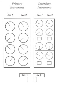
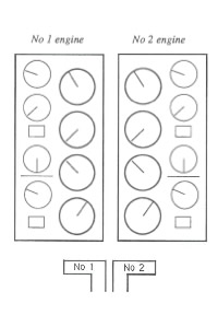
Take a look at the cockpit controls (taken from the investigation report). The left image is for the earlier 300 series and the right for the 400 series aircraft on which the captain had only 23 hours experience after a one day training course.

The actual cause of the engine malfunction was a broken turbine, itself the result of metal fatigue caused by excessive vibration (source).  Had the Captain noticed the Vibration Warning display he probably would not have made the wrong decision.

The Vibration Warning display on the new 400 series was in a different place to the 300 series, but more critically it was designed to be significantly smaller “the dial on the vibration meter was no bigger than a 20 pence piece and the LED needle went around the outside of the dial as opposed to the inside of the dial as in the previous 737 series aircraft” (Source: Wikipedia).  Take a look at the arrow on the left hand image, the display dials on the 300 series use mechanical pointers. On the 400 series they were redesigned with short LEDs rotating around the numbers. These, as the investigation report noted “are much less conspicuous than mechanical pointers, acting more as scale markers, and providing less immediate directional information).

The report criticised the layout of the instrumentation and helpfully suggested an improved layout.  The layout was (and as far as I can tell, remains in 737s) split into primary instruments and secondary instruments.  The issue with this layout is that the dials are not spatially aligned with their associated power levers.  If the pilot is focussing upon the primary instrumentation, the secondary instrumentation is in peripheral view.  This layout will lead to attention based around specific instruments rather than engines.

Compare this to an alternative design that the report provides where the dials are aligned to their associated power levers.  The report recognises the design trade-offs here but concludes that to break the left-right mental association with the engine position was probably not the most optimal solution.

This paper describes the issue well:

The 737 involved in the East Midlands crash had flight deck engine information that lead to confusion under mental pressure. Placing the secondary information sets for both engines to the right of the primary set broke the implied rule set by all the other engine information, that the left engine had left hand controls and indicators (and vice versa). If one assumes that the optimum positioning of indicators is the one that requires the least mental processing then a simple symmetry about the aircraft centre line seems appropriate. The actual positions required a mental spatial transposition of one set of dials to the other side… The readability of the indicators had been reduced by the substitution of electro-mechanical readouts with electronic readouts, but which simulated the old design. Possibly the redesign to electronic readouts should have taken the opportunity to use a rather different layout, possibly with linear indicators rather than rotary ones.

OK, so lots of words, but what is the point of this to what I usaully blog about?  The issue is one of design and layout and who’s responsibility is it.  In designing user interfaces UCD is often seen as a luxury, developers believe that they can design a GUI as well as anyone, and stakeholders (especially on internal projects) will question the value that a UCD person can bring to the project.  Does a developer or an engineer by training and instinct stop to ponder the human factor and the human consequences of the GUI layout? What are the consequences of this?  As can be seen from Kegworth, seemingly minor changes to the control layout can have a signficant impact on the safety of a complex system.

Do customers want to customise your site?

Have you ever added a custom tool bar on your office set up?  Have your non-techy friends and family changed the background image on their desktop or changed their screen saver.  Is there a demand for customisation?

So here’s the question.  Do people really want to make your homepage look the way they want it to?  Is there a demand for iGoogle and netvibes customisation?  They look cool and are attractive to the geeks in us, but do they have mass market appeal? Is there any research out there on the take up of user customisation?

“…back when Windows 95 was released, users could easily change My computer to something more personal. Apple users had been able to do this for many years, and many of them did name their computers. But few Windows users took the opportunity to do this, suggesting that they saw the computer as more of a tool than something with which they wanted to have a personalized relationship.” (David Malouf)

Just because we can doesn’t mean that we should.  When you log into your bank account it could look like netvibes, complete with BBC news feeds and YouTube videos (you decide what you want).  But should it?

Why should your customers see your website as something to have a personalized relationship with, especially if you don’t engage them with a personal relationship throguh your other channels?

How do you answer the phone?

IVR, (that’s the automated routing of phone calls) is an unpleasant reality of multi-channel service.  Let’s assume that you are committed to using it, how much time have you spent in creating the messaging.  Two examples of trying to put a more human touch to something that is inherently not human and machine driven.

Firstly the Halifax.  Listen carefully to what happens after you key in an option.  You here a key click.  You are then prompted to enter your account number.  “thanks” the voice says, “I’ll just enter that”.  And you hear a clackerty clack of data being entered into a keyboard.  BUT YOU ARE A MACHINE!!!  It is a nice touch, but it is trying to make an interaction that is clearly not human more personable.

Second example is the Financial Obudsman.  “Thank you for calling” says the voice.  Not a stock, model voice, but a real voice, “I hope we’ll be able to help you. My name is Walter Merricks and I am the Chief Ombudsman…”   The message is clearly a recording.  There is no attempt to be anything but a recording, but giving the voice a name and explaining the nature of IVR is a real human touch.  Even better, the narrative about recording the call- it is not scripted from the IVR manual.  It talks to the customer in language they understand.

If you must be mechanical in your communications with customers, be human, be transparent, but don’t try and pretend to be what you are not.

Links
Halifax | Financial Obudsman

Customer value proposition model

Customer value proposition model

There may be a niche in the market, but is there a market for the niche?

How do you create a successful proposition?  If the answer was obvious there wouldn’t be so many failures out there in the market place.

It is easy to commence on a journey of product development with a hunch and clearly there is no substitute for validating ideas in the flesh.  That something at ThoughtWorks we do; helping clients test and learn, rapidly building ideas into tangibles that can be piloted at low cost and low risk before investing in significant build and spend.  However, sometimes a little more rigour is required before you commit to commencing a project in earnest.

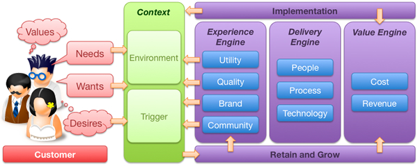
That rigour needs to be focused.  What often happens is this rigour turns into a research phase that turns into a project itself.  It need not be this way.  There are certain things you can do, certain questions to ask as you set out on the journey of creating a new, compelling customer proposition.  What follows then is a strawman customer value proposition model to help test potential propositions before moving forward with them.  There are three components to the value proposition model; the customer, the environmental context and the organisation or company.

All too often propositions are rooted in the organisation.  They make assumptions about the demand or usage. This model attempts to broaden the analysis and focus upon the customer and the why the proposition will be attractive to them.  The model supports questions that may be asked to help shape thinking, test hypotheses and validate thinking.

I do not propose that this should become a major research exercise  (for example market sizing is a huge effort in itself), rather a tool for asking the right questions, and if the answers are hard to come by, maybe that suggests more thought is required in refining the proposition.

So here goes, a model that provides a framework for considering new customer value propositions.  It’s just an initial idea and I’d welcome feedback and suggestions.

Customer

Before you get too carried away with the proposition, a good starting point would be the customer.  Who are they and what do they do.  Let’s remember that your customer is not everybody.  Your proposition in unlikely to be appealing 24/7.  The challenge is to segment your target market and identify the triggers for action.

The persona: Who do?

Personas are a useful tool for bringing the customer to life.  Much has been written about them, but they are a useful tool for extracting broad data into specific stories that describe individuals. Realise that it is unlikely you will design for everybody. Start with the market that you are targeting, how large is it and what is its propensity to spend? Then within that target market segment the target customer base into different profile customers (personas). You need to understand which persona, which customer profile is most important – prioritise them and focus on the highest value.  This may mean deciding between high volume, low margin mass market and low volume, high margin niche appeal.  This decision needs to be made as early as possible to ensure the proposition remains focused and doesn’t try to be all things to all people, satisfying none.

Values, needs, wants and desires

People are not empty vessels waiting to consume and be filled with your proposition.  Their behaviour is driven by their values, needs, wants and desire.  These may be fundamentally rational (to satisfy a basic human goal) or emotional (to demonstrate status). They are cultural and time based.  Thinking in these terms helps you understand how the proposition will appeal to the customer at different levels.  Let’s take an example of this; a new mobile phone.

Before we think about what the product must do, what are the values that the persona associates with the phone. Is our target market a technophile or a technophobe? Jan Chipchase who works for Nokia includes ethnography in his research to understand how people use their phones; women carry them in their handbags, men in their pockets or their belts.

The basic need that the phone must meet to satisfy the customer, she must be able to make and receive calls.  If the product is unable to meet these needs it is not fit for purpose and the phone proposition will inevitably fail.

Just making phone calls meets the need but there are additional wants that should be satisfied for the product to be more compelling.  It’s a hassle to remember the number of every person she rings, the customer wants to be able to store numbers and see the number of the person who is calling.

Having the ability to see a photograph of her daughter as a screen saver on her phone is neither a need not a want.  The phone is useful and usable without that.  But the customer desires to personalise her phone by having a picture of her daughter on it.  Desirability is the key differentiator of the iPhone.  It doesn’t need to compete on features, it is a cool device that people talk about.  And here is a key decision you need to make on your proposition journey.  Are you looking to compete on parity or whether you want to make a difference.

Questions

  • What is the basic need that the proposition is trying to fulfil?
  • What counts as hygiene?
  • What does the customer need to be satisfied?
  • What does the customer want in addition to being just satisfied
  • What do other competive products do to maintain feature parity (if you feel you really need to compete on features alone – bad move!)
  • Few people would argue they don’t want simplicity and clarity in their interactions with products.  How could your product to make life easier for the customer?
  • What will make the customer feel good in themselves about owning the product?
  • What other products are “cool” or desirable to your target market.  How can you leverage the essence of those products?

Context

So now we are beginning to understand who the customer is, it is time to nest the proposition in terms of their context.  The old maxim that a half drunk bottle of water in a desert is worth its weight in gold, but on the streets of a city is worthless trash, should be remembered.  Even the best of propositions will deliver little value if they not only consider the customer, but also the context in which they apply: time, demand and usage.

Trigger

So the next step in the model is to ask why, when and how will the customer be attracted to the proposition. What is the trigger that drives the customer to move from awareness (assuming you have that) to action?  There is no point in a financial services company trying to sell me a car loan if I am wealthy enough to own my own car, or I do not drive.  Understand what triggers the customer to be interested in the proposition, when and why this happens.  How can your proposition be at front of mind when the trigger is set.

Questions

  • What lifestyle / lifestage events will trigger?
  • Internal events personal to the customer; leaving school, getting a first job, getting married, moving house, retiring etc
  • External events that they have no control over (think about sports sponsorship and tying a proposition to that sport, or tying a proposition to a celebrity e.g. Michael Jackson..)

Environment

It is very unlikely that the proposition will be wholly unique.  What is the competitive landscape, what noise will it need to be heard above to capture the consumers attention.  Whilst you may review the immediate competitors to see where threats and opportunities lie, what can you learn from other, unrelated products or domains?  How can you fuse together concepts from outside your immediate focus to bring new innovation to your product?  Scenario planning may come in useful, playing out different outcomes for different timelines other than that which you plan for.

Questions

  • What is the competitive landscape?
  • What can you learn about similar but unrelated propositions?
  • Have you considered the political, environmental social and technical influences using the old PEST analysis?
  • Have you considered different scenarios and how your proposition would play out under them; what unplanned disruptors could get in the way, or how could your proposition done differently disrupt the market?

The experience engine

Enough of the customer and externalities, what will the proposition look like and why will the target customer go with it? There are three engines within the organisation that drive the proposition, the experience, delivery and value engines.  So…

Utility

To be any good, the product has got to offer basic utility.  It has to do what it says it is going to do.  Sadly, too many products and customer propositions end there.  A utility product will match the consumers needs.  This is where most enterprise software sits…

  • What are the key customer needs that the proposition must fulfil?
  • What is the basic core functionality that must be met, what are the features that must be offered to gain traction in the market place?
  • What features that are typical on competitor products that we could do without?

Quality

I could call this next box usability (as this follows the UXD model) but I think it goes beyond just usability.  What is the quality of not only the immediate interface, but also with the supporting functions?  For example, if you have a call centre to back up the proposition, how many layers of IVR are you forced through?

  • Have you considered usability?
  • Is the packaging aesthetically pleasing?
  • The “happy path” customer journey may be well framed, but what about the “sad path”?  What about when things go wrong, what about when customers don’t act in the way you expect of predict them to act?

Brand

It is easy to get carried away with a new idea before thinking about what it means to the brand.  Typically there will be a strategic roadmap and whilst the proposition may be attractive it may not fit into where the brand is going.

  • Is the proposition complementary to the overall brand direction or does it require a new brand and identity?
  • Does the proposition support / leverage the brand?
  • Does the brand already ‘do it’ under another guise (are you reinventing a wheel that has already been tried somewhere, sometime in the organisation’s history?)
  • How will it be marketed?

Community

Finally, what is the ‘buzz’ that the proposition will create, what will get people talking and sharing it and how will you create this buzz.

  • Is there a social network component built in that gets people talking and connected?  How will it get people talking in external networks?
  • What will cause people to recommend it to others?
  • How can customers become part of its evolution?
  • What of the proposition will get people passionate, what will drive them away?

Delivery engine

People

A successful proposition needs not only a talented, passionate and committed team to deliver it to market, it also needs a similar team to run it and support it when it is live.  It is a common failing for a rogue “skunkworks” team to emerge in an organisation and develop what appears a compelling proposition, only to have it knocked back and closed down by the “Business as Usual” processes inherent in the organisation

  • Who do you need to make the proposition successful?  What is the team?
  • Who will create the proposition and who will lead it?  Is it IT led or business led?
  • What are the cross-organisational boundaries that the proposition crosses and how will these be eliminated?
  • Who will take ownership of the proposition once it crosses over into the market?

Process

  • What are the processes that will be required to sustain the proposition?
  • If the proposition will require changes to the organisation, how will they be managed, communicated and rolled out?
  • How will the proposition be supported once it is let loose in the market?
  • How will it be communicated to customers?
  • How will you create new sales – sales force.

Technology

  • What is the technology that will underpin the proposition?
  • Is it possible to test the ideas using rapid languages such as Ruby on Rails before committing it to the enterprise Java stack?
  • What integration is really necessary and what can be worked around?
  • How can you deliver a beta version in the shortest period of time?
  • How will you avoid heavyweight frameworks and develop incrementally to deliver value early and often?
  • How performant and scalable must the innovation be?

Value Engine

At its most simplistic, how much will the proposition cost and how much revenue will it generate?  Does it offer cost saving opportunities?  Are there intangible benefits that will be accrued?  Ultimately is it a viable proposition that is worth pursuing, or will the cost to develop and run outweigh the value it will add?  Building out a financial model can take time, in the first instance this should be a napkin analysis, a wake-up call to make sure there is value in the proposition before too much time is invested in it.

Cost

Every day someone is working on the proposition it is costing you money.  The quicker you can get something to market the faster you will start seeing a return on your investment, similarly the sooner you can “get something out there”, “test and learn” the sooner you can kill a proposition that does not fulfill its promise.

  • How quickly can you get a beta to market?
  • How many people, how many days?
  • What will the cost be to develop the infrastructure?
  • Do you have the skills in house or will you need to go external?

Benefit / Revenue

At its most crude, how will the proposition make money, but there may be more to what we wish to achieve.  Is the proposition actually going to cut costs, a result of regulatory pressures or a CSR initiative?
What are the benefits that will be accrued – both tangible (e.g. financial) and intangible (e.g. social, environmental etc)

  • If you are selling units are you going for high volume low margin or low volume high margin?
  • If it an on-line proposition “advertising” is often seen as the source of revenue.

There are two additional components to the model…

Implementation

Having a compelling proposition is one thing, it is another to successfully communicate it and roll it out to target customers.

  • In a crowded market place, how will the proposition stand out?
  • What are the brand values it will communicate?
  • What is the story that customers will hear and how will they hear that story?
  • How will customers interact with the proposition, what channels will you use to take it to market?
  • What is the roll out strategy?

Retain and grow

Winning customers is only the first step.  A successful proposition will maintain a long-term relationship with its profitable customers, maintaining the warmth they have to the original proposition and cross-selling and up-selling new ones.

  • How will you retain them and turn them into repeat customers and passionate advocates of the proposition?
  • How will the proposition grow lifetime customer value?
  • What can be cross-sold or up-sold?
  • What can you bundle?
  • How will the proposition deal with churn?

OK, so it’s not a perfect model and by no means complete.  There’s some duplication in the thinking and many questions missing, but as any model it can be used to guide and prompt thinking and ensure there are no elephants left in the room when the first line of code gets cut.  I’d welcome any comments on its usefulness, utility and direction.

1 of 8
12345678