In designing user interfaces there’s a lot we can learn from systems where failure to consider human factors has resulted in terrible consequences.
On 8th January 1989 British Midland Flight 92 crashed whilst attempting an emergency landing. There had been a fire on one of the engines which led to its malfunction. The captain reacted by shutting down the engine. Only he shut down the wrong engine. With no power, approaching East Midlands airport the captain manged to glide the Boeing 737-400 to avoid Kegworth village but crashed short of the runway. 47 people died.
The investigation into the Kegworth air disaster identified engine malfunction (the engine used in the aircraft was an upgrade of an existing engine and had not been field-tested) as causal factor, however the report concentrated upon the failure of the flight crew to respond accurately to the malfunction. Human error was the primary cause.
The truth is a little more complicated than that. Why does a captain with over 13,000 hours flying experience and a first officer with over 3,000 hours experience shut down the wrong engine?
A number of human factors contributed to the disaster including organisational issues (refer to this paper for discussion of the role of managerial failures in disasters) and cognitive overload. But of equal importance (and indeed buried in the appendices of the Investigation Report appendices) is the issue of design. Around 50% of accidents and incidents in the aircraft and nuclear industries have a root cause in design (source).
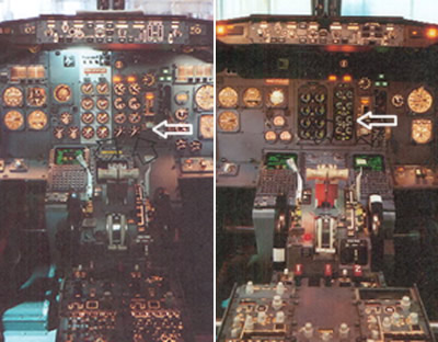
Take a look at the cockpit controls (taken from the investigation report). The left image is for the earlier 300 series and the right for the 400 series aircraft on which the captain had only 23 hours experience after a one day training course.

The actual cause of the engine malfunction was a broken turbine, itself the result of metal fatigue caused by excessive vibration (source). Had the Captain noticed the Vibration Warning display he probably would not have made the wrong decision.
The Vibration Warning display on the new 400 series was in a different place to the 300 series, but more critically it was designed to be significantly smaller “the dial on the vibration meter was no bigger than a 20 pence piece and the LED needle went around the outside of the dial as opposed to the inside of the dial as in the previous 737 series aircraft” (Source: Wikipedia). Take a look at the arrow on the left hand image, the display dials on the 300 series use mechanical pointers. On the 400 series they were redesigned with short LEDs rotating around the numbers. These, as the investigation report noted “are much less conspicuous than mechanical pointers, acting more as scale markers, and providing less immediate directional information).

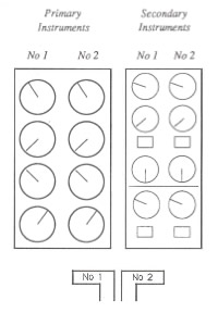
The report criticised the layout of the instrumentation and helpfully suggested an improved layout. The layout was (and as far as I can tell, remains in 737s) split into primary instruments and secondary instruments. The issue with this layout is that the dials are not spatially aligned with their associated power levers. If the pilot is focussing upon the primary instrumentation, the secondary instrumentation is in peripheral view. This layout will lead to attention based around specific instruments rather than engines.

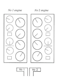
Compare this to an alternative design that the report provides where the dials are aligned to their associated power levers. The report recognises the design trade-offs here but concludes that to break the left-right mental association with the engine position was probably not the most optimal solution.

This paper describes the issue well:
The 737 involved in the East Midlands crash had flight deck engine information that lead to confusion under mental pressure. Placing the secondary information sets for both engines to the right of the primary set broke the implied rule set by all the other engine information, that the left engine had left hand controls and indicators (and vice versa). If one assumes that the optimum positioning of indicators is the one that requires the least mental processing then a simple symmetry about the aircraft centre line seems appropriate. The actual positions required a mental spatial transposition of one set of dials to the other side… The readability of the indicators had been reduced by the substitution of electro-mechanical readouts with electronic readouts, but which simulated the old design. Possibly the redesign to electronic readouts should have taken the opportunity to use a rather different layout, possibly with linear indicators rather than rotary ones.
OK, so lots of words, but what is the point of this to what I usaully blog about? The issue is one of design and layout and who’s responsibility is it. In designing user interfaces UCD is often seen as a luxury, developers believe that they can design a GUI as well as anyone, and stakeholders (especially on internal projects) will question the value that a UCD person can bring to the project. Does a developer or an engineer by training and instinct stop to ponder the human factor and the human consequences of the GUI layout? What are the consequences of this? As can be seen from Kegworth, seemingly minor changes to the control layout can have a signficant impact on the safety of a complex system.
