Cartoon wireframes
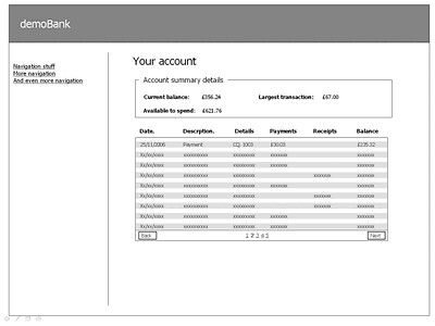
Creating a lo-fi prototype or wireframes in PowerPoint can be a time consuming pain. Lining things up, getting the widgets to look “just right” is not time well spent. Lo-fi is supposed to be just that, “low- fidelity”. Trouble is, once the client have seen something that looks rather polished they have high expectations, even expect the lo-fi to resemble what they might expect in production. This is clearly not a good state to be in, but sadly often happens. So here’s an example of a basic wireframe all nicely lined up…

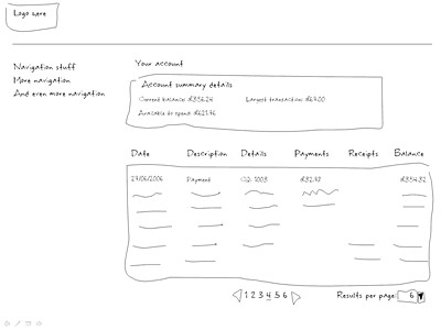
Anyway, inspired by http://napkinlaf.sourceforge.net/ and remembering the essence of lo-fi being “paper prototyping”, I downloaded a hand written font and used the line tool in powerpoint to knock out some lo-fi that is precisely that. It takes no time at all (needs a steady hand with the line tool I’ll admit), conveys everything that the more formal lo-fi gives but reminds the audience that it is a “sketch” of the screen, not design or anything like that. (And actually I think it looks a lot better than some of the screen mock-ups I’ve churned out in the past!)

Check out Sketchup – now from google. It has been used for creating 3D models of physical things. It is basically a CAD system, but very 3D and prototype oriented. One of it’s greatest features is that it can render things in a “sketch” mode. This sketch mode implies to the user that it is a prototype and not a polished thing. It might even be useful for doing GUI sketches a little easier than getting a “steady” hand in powerpoint.
Awesome! The lined up one is communicating an illusion. The “sketch” is communicating reality.
When you say “line tool”, are you saying that you’re drawing those boxes with your mouse?
What I’d really want to be able to do is to have good enough sketching and calligraphy skills to rapidly produce good sketches by hand on paper.
Why not just sketch it out by hand, rather than going to all the trouble of using PPT? In the past I’ve iterated 3-4 times in a few hours just by doing hand-drawn sketches, then using post-its to change values on the screen.
There’s a time and place for PPT in prototyping, but once you start using it, I think you’re always entering into the medium-high fidelity range, no matter what font you use.
I think the happy medium is probably producing lots of sketches with the client stood next to you, then scanning / ppting the one you end up settling on.
I do like the font and the lines though – makes the right point.
When I used to have graphic designers at my beck and call I always found sketches worked best. Not least because in the presence of someone who can ‘draw really well’ – even if it’s just sketches – clients tended to come over all awestruck…
Josh – I do start by sketching it out by hand, but when we want to leave something tangible or socialise it to a broader audience it has to be comitted to an electronic tool. Yes, we could photograph the sketches, but it is harder to iterate photographs…
Marc – Ahh, good call on iterating photographs. That is definitely a difficult thing to do.
Why haven’t they come up with an easy way to turn pictures of sketches into simple line drawings…or am I just out of the loop on how to do that?
Either way, I also wanted to add that I really enjoy reading your blog. 🙂