Most retail banking web presence is just not connected
Taking a look different UK banking web sites a consistent theme seems to appear. There is a fundamental mismatch between public brochureware site and the secure transactional site. Banking brochureware sites are generally (but by no means universally) reasonably good. Their look and feel has evolved over time. No bank (yet) offers a web 2.0 look and feel but some get close. Lloyds TSB has a very clean and polished feel.
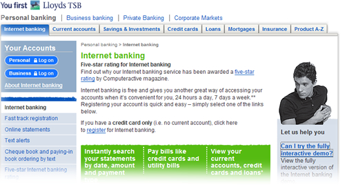
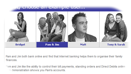
The LTSB site is customer focussed, indeed the “interactive demo” of their internet banking offering introduces different personas to explore different scenarios. Can we expect their internet bank to offer a compelling customer experience? To be driven around customer needs?
Well maybe. But there is more to a compelling experience than just usefulness and usability. There is something about the aesthetic execution of the proposition. What it looks like. Attention to detail, creativity… sadly missing with the transactional site. Is it the case that the agency who worked on the public site went nowhere near the transactional site? Probably. After all the skills and ownership needed to build a website are different from those to own and build what is effectively a business application. The primary stakeholders in the public site are marketing; the primary stakeholders in the transactional site are IT and operations.
Lloyds TSB are not alone. Smile are an internet bank. But take a look at their tables. In 2006 who still uses cell borders and padding?
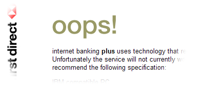
First Direct are another bank whose primary channel is the web. And yet they exclude more than 30% of customers who would wish to have a relationship with them but do not use the browser they choose to support.
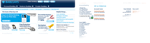
Barclays have got a great new brand that manifests itself on their public site, yet this has not worked its way down to their transactional iBank. Don’t get me wrong, iBank is pretty good (the interaction design was created by experts – ahem, I thank you – and was extensively usability tested. But this was in the dot-com boom times when we still had to get over fears over internet security). Yet six years later, apart from some changes to the stylesheet, little has changed.
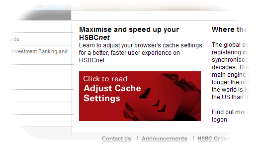
On the HSBC net home page they are almost saying our site is so slow you need to do something about it with your browser.
My hunch is that there are a couple of things going on here. Firstly, most banks implemented their internet banking applications during the dot-com boom. They were as much a reaction to the times as a strategic imperative. being rushed out bolt-ons to legacy banking applications. Almost a decade later and little has changed. And where legacy systems are being overhauled – SOA are three big letters in the banking IT world, I wonder to what extent changes to the customer experience are tabled on the agenda.
It makes sense for the brochureware site to be owned by marketing. With ownership marketing are free to choose a creative agency to implement a brand compliant look and feel. IT’s primary involvement in building anything was in commissioning the Content Management Solution (and updating the propriety software when the licences inevitably expire and the current version is no longer supported. The brochureware site can therefore evolve; it is probably built and maintained by people who understand the web. That is why these sites should by and large be cross browser and DDA compliant. So this brings me to my second hunch; the question of ownership. The public site is owned by marketing, the transactional site is owned by IT and operations. And their priorities are quite different. Whilst marketing people generally aim to have a polished look and feel, with a good attention to detail and an understanding of the customer intentions, the priority of IT is rather different. IT thinks in terms of requirements. And the look and feel is “gold plating” that is de-prioritised when deadlines slip.
It is time to bring all the parties together. Anywhere large IT projects are on the CIO agenda, “Infrastructure renewal”, “Service Orientated Architecture,” “Legacy refresh” etc. These should provide the marketing organisation the opportunity to address the customer experience and refresh the interactive experience of the transactional web site. Bring it up to date. And maybe soon we’ll start to see Bank 2.0 applications. Hopefully sometime before Web 3.0 becomes vogue.
I couldn’t agree with you more, Marc. I’m a happy smile customer but I can’t deny I was pretty disapointed by the experience of using their site when I first switched to them. Sure everything works (even though the default font size is slightly too small and I’m always increasing it). But as innovators in online banking I was expecting a much richer experience and there’s just no va-va-voom! There are other things about smile that I like (their ethical policy and the fact their call centres are genuinely helpful and friendly f’rinstance) but the site isn’t as enjoyable as my old account with the RBS and I did for a while think about switching back.
[…] Based on this it seems that the internet presence of Swedish banks perform fairly well compared to their UK counterparts. I’ve never had any browser problems and though I like the security solution of Swedbank better than that of SEB they’re just marginal differences. A big plus to SwedBank who actually provide you with a, almost, full working demo version of their internet banking application where you can log in and actualy transfer money between the accounts of the demo user etc. […]
Is it too critical to lambast transactional sites for their paucity of va-va-voom? Isn’t more important that they work or are the two mutually exclusive? I try to answer some of these questions myself on my ‘response’ post. Great blog Marc.
[…] I am with the dancing mango. The thing is: describing something as Web 2.0 doesn’t make it so. It lessens rather than adds credibility to point to a company as a 2.0 case study, if the evidence isn’t there? Does Barclays.com change based on user behaviours? Where is the community area? No architecture of participation I can see. Perhaps I am missing something. […]
[…] unique about Alliance and Leicester. I hate to pick on them. But this seems like a case of a lack of joined up thinking. When you are designing processes or procedures, don’t just think about them from the […]
Thanks for sharing good compartive analysis of retail banking websites.
I agree with your point of view thats most of these banking websites are similar to each other and there are also some fake sites which look 100% orignal but just a little change in title. the consumer may be open fake site and make transaction while fake site will hack it information. It is too wrong.
thanks
mathew