form design

Behaviour, intentions, interactions and corner cases

According to an article on eMarketer the method customers book travel depends upon their needs. Nothing revolutionary there; what is interesting is that fewer travelers are booking their trips online overall.

“This is not due to personal financial concerns—online travel bookers are an affluent demographic,” Mr. Grau [senior analyst at eMarketer] said. “Rather, it is caused by frustrations related to the planning and booking capabilities of OTAs (on-line travel agents). This, in turn, is spurring a renewed appreciation for the expertise and personalized services offered by traditional travel agents.”

Online travel bookers are an affluent demographic” and yet we continue to let them down with poor customer experiences and an inability to let them do what they want to do. As an e-marketeer, your sales numbers may be satisfactory, but how much more traction could you get if your customer interactions were more realistically modeled around their behaviours and their intentions. You may point to your personalization engine, but that is probably doing little more than offering up pages and offers based upon information the customer has told you, or prior pages they have visited. It is not going to be a challenge to “the expertise and personalized services offered by traditional [insert domain here] agents“.

Customer frustrations with the web are more often than not due to usability and restrictive Web 1.0 interaction paradigms. It need not be like this. Interactivity can be more human. Some sites such as Kayak.com are introducing web 2.0 interactivity to introduce more fuzzy searching to find what you want. Forms can be more like their real-world brethren. Rather than the “command and control” approach of imperative programming that drives a sequential, rule driven flow, the declarative approach to programming enables greater flexibility and puts the user in control.

So we can do something about the technology to provide a better customer experience, but that won’t be enough. The perfect customer experience will not fit in business rules your IT analysts have determined. In the real world, corner cases and ‘exceptions to the rule’ are abound. In the real world sales people, customer service reps (or their supervisors) have ‘management discretion’. They can listen to the customer, understand their story, recognise them as a loyal customer who made a mistake, and override the business rules to satisfy/ delight the customer in a way the cold logic of the business rules never considered. True personalization will focus upon the corner-case long-tail.

The next generation of eCommerce will be declarative, forgiving and understanding. Rather than being based upon a paradigm that is the result of the technical constraints of the channels early days, it will be something that more closely mirrors the real world. Getting there however will be difficult. As a first step Marketing departments need to address the shortcomings of their existing digital channel before their IT organisation embarks on new channels such as mobile and TV.
CAPTCHA: a barrier to entry

When a customer starts completing an application or registration form it demonstrates they are committed. It therefore makes sense to pay attention to the usability of that form. But how often is the content of the form considered? Are there content barriers in the form that prevent customers from completing it?

Marcelo Calbucci (Via Luke Wroblewski) describes a barrier that everyone assumes just has to be there so it is not tested: The CAPTCHA. When the team removed the CAPTCHA from the Sampa.com registration form they recorded a 10% increase in conversion rates. Marcelo writes “we created a set of tests and rules that will make us not display a CAPTCHA about 99% of the time” (interestingly when I looked at the page I got the CAPTCHA). A 10% increase in conversion is not insignificant, and probably more than outweighs the additional effort to implement an alternative solution.

Real world forms

In the real world, when I get an application form I’ll flick through the pages and have a look at what is required. I can choose which fields I complete in whatever order I like. If I want to take a break half way through I can. I can complete it when I like and how I like.

So why aren’t web forms like that?

The usual format for a web form starts with some copy that describes the form (which people skim through at best). The user clicks to the next page and the form commences. There may be a step indicator showing progress through the form, but almost certainly progress through it will be linear. You have to complete each page before progressing to the next. If you are lucky you’ll be able to click to previous completed steps. But the experience is nothing like a real-world form. And when was the last time a real-world paper form “timed out” half way through, demanding the user to start over again if they left it idle for ten minutes?

The web forms we see today are a relic of their tecnological past. There is no reason why they must be linear, (and if there is logic in the form, there is no reason why the user can’t explore the different routes – you do that with a paper based form). There is no reason why the user can’t click to whatever page in the process they like (just like with the paper form). There is no reason why a page must be completed before progressing to the next. There is no reason why the form should time out and forget everything the user has entered. Fields can be saved as they are completed against an anonymous user, until the user wants to provide personal credentials.

Bottom line – the web has moved on. Instead of reflecting technical constraints of yesterday, it can adopt more real-world metaphors. But do we have the courage to start introducing new paradigms? Are users, information architects and usability experts so ingrained with broken web metaphors that they will shun a new model, (a real world model) of completing a form?

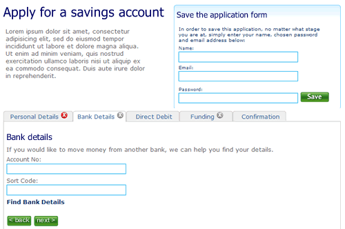
So here’s a rough example. It’s an application form for a savings account. Ignore the content, field labels etc, it is more the model that is illustrated.

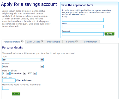
1. The user can move between the sections (tabs) to see the fields that are required. There is clear feedback on each tab that it has not been completed. The “Direct Debit” section is optional hence no indicator. The ability to save the application is seperate.

Application form, step 1, nothing filled out

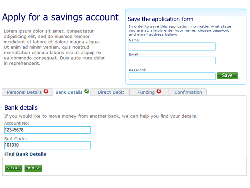
2. The user selects “Bank details”. They’ve not filled out all the fields on the first tab “Personal details”, but it doesn’t matter. There is clear feedback that this tab is yet to be completed.

Second tab on the application form, the first tab has not been completed

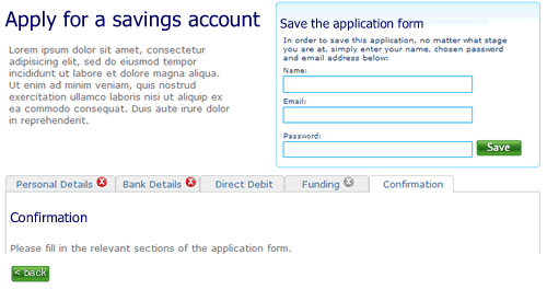
3. The user clicks right through to the confirmation tab. There is nothing to confirm so the page remains blank, with a prompt to fill out other sections.

Step 3 of the application form

4. When sections are completed the indicator on the tab changes to show completion. Here the user has completed step two ahead of step one.

almost there

5. Finally, when all sections are completed the user can review the entire form.

Confirmation screen

I’m not saying this is perfect, it’s a start. A start to re-thinking the way we design forms on the web and think about modelling them on real world behaviour instead of technical constraints of the past.

Just because you can, doesn’t mean that you should

Following a recent Economist article, JP Rangaswami blogged about “can versus should“. His theme was around DRM and identity; just because the government can monitor your digital behaviour does not mean that they should. I like this, but think it can be extended to much of the IT domain.

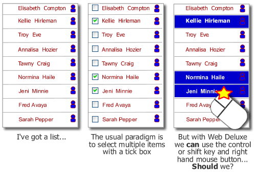
Web 2.0 introduces many new styles of interaction, drag and drop, take over the right-hand mouse button… just because we can do these things doesn’t necessarily mean that we should. What will the impact be? Hide calls to action behind the mouse button on your site and your site alone, how does the user know to find them there? When building a “deluxe web” site at the forefront of mind should be how will people actually interact with the proposition. Just because we can do some technically cool stuff that would give us a buzz and gain nods of appreciation from our technical colleagues, doesn’t mean that we should. A customer who has come to the proposition probably requires clarity and an ability to accomplish their goals. They care very little for the stuff we can do.

Multiple select on a list - check boxes or web deluxe take over the mouse?
And then there is mobile. Just because we can deliver the ability to enable customers to watch TV on their phones, doesn’t mean that we should. Too often new propositions are driven by IT ability rather than consumer demand. WAP was a great example of this; IT consultants getting excited about delivering content on mobile phones using WAP, completely overlooking what a shocking experience it was and simultaneously missing what consumers actually wanted to do – text message.