web

Are you prepared for the dip?

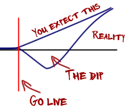
So you are refreshing or rebuilding your website.  You are introducing new functionality and features, and sweeping away the old. You’ve done usability testing of your new concepts and the results are positive.  Success awaits.   You go live.   And it doesn’t quite go as you expected.  You expect that the numbers and feedback will go on an upward trajectory from day one, but they don’t.  What you should have expected is the dip.

Illustration of the dip

In October 2009 Facebook redesigned the news feed.  Users were up in arms, groups were formed and noisy negative feedback was abound.  A couple of years back the BBC redesigned their newspage, “60% of commenters hated the BBC News redesign“.  Resistance to change is almost always inevitable,  especially if you have a vocal and loyal following, you can expect much dissent to be heard.  What is interesting is what happens next.  Hold your nerve and you will get over this initial dip.  We’ve seen a number of projects recently where this phenomenon occurred; numbers drop and negative feedback is loudly heard.  But this dip is ephemeral and to be expected.  The challenge is in planning for this and setting expectations accordingly.  Telling your CEO that the new design has resulted in a drop in conversion rate is going to be a painful conversation unless you have set her expectations that this is par for the course.

Going live in a beta can help avert the full impact of the dip.  You can iron out issues and prepare your most loyal people for the change, inviting them to feedback prior to the go-live.  Care must be taken with such an approach in the sample selection o participate in the beta.  If you invite people to ‘try out our new beta’, with the ability to switch back to the existing site, you are likely to get invalid results.  The ‘old’ version is always available and baling out is easy.  Maybe they take a look and drop out, returning to the old because they can.  Suddenly you find the conversion rates of your beta falling well below those of your main site.  Alternatively use A/B testing and filter a small sample to experience the new site.  That way you will get ‘real’ and representative data to make informed decisions against.  Finally, don’t assume that code-complete and go-live are the end of the project.  Once you are over the dip there will be changes that you can make to enhance the experience and drive greater numbers and better feedback.
Who do you beleive?

Only Five Percent Of Readers Would Pay For Online News. (Sep 20, 2009)

16 November two new reports come out simultaneously.

Research from Boston Consulting Group suggests that as many as 48% of British and American consumers would be willing to pay a few pounds a month for online news.

According to a new Forrester survey, almost 80% of Internet users in the US and Canada would not be willing to pay for access to newspaper and magazine websites (via readwriteweb).

So 5%, 20% or 52% of people will pay for online newspaper content.  Or maybe 12%. And Murdoch is going to “rewrite the economics of newspapers” based upon that kind of customer insight?  It is going to be interesting to watch.

If you say Log out, log me out

You’ve logged into your on-line banking checked your balance, paid your bills.  What do you do now?  Click on the logout button?

What do you expect will happen now?  Well given that you have actively chosen to log-out (it’s not something you are likely to click on my mistake), you’d expect to do exactly that.  Logout.  The next screen you get will probably be something that thanks you for on-line banking, with a cross sell for a product or two.

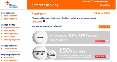
That’s what I assume most customers would expect.  So what are Alliance and Leicester thinking about with this screen?

The customer has clicked log-out but they are still logged in?

Why?

“You are still logged in to Internet Banking – before you go have a look at Your offers.”

Excuse me, I logged out, I don’t need to be logged in for you to show me offers.

Worse: “Are you sure you want to log out?”

OF COURSE I WANT TO LOG OUT!!! Why else would I have clicked the link.

Alliance and Leicester fail here in a fundamental usability rule, that of managing the customer’s expectation. In an application where security isn’t paramount this would be an error, in an application where customers expect their action of leaving their secure accounts will do exactly that… but doesn’t, is inexcusable.

Does enterprise IT know what Google is?

Imagine an investment bank, a trader has a requirement for a tool to screen stocks. The requirement is to select stocks based upon different parameters, so for example find companies with a market capitalisation between a selected range, and a P/E ratio, Dividend Yield and Net Profit Margin between other selected ranges. And maybe the ability to add additional parameters.

Typically the process will be for these requirements to be captured by the Business Analyst who acts as the conduit to the development team. Nowhere is the user interface explicitly referenced – it will almost certainly be articulated in the reality of the current systems; what the BA knows and understands. Despite the iterface being delivered through a browser, the developers are not web developers. Inevitably the finished product will be functionally correct, it meets the requirements, but it will be clunky: select parameters > search > results… because it reflects the requirements as the trader put them “I want to do this and this and this, press a button and get a list back“.

So what are the chances of an internally developed investment bank application looking like Google finance’s Stock Screener? And what would your trader rather have?