Customer Experience

Is this the most stupid question to ask?

Someone from the Barclaycard research centre rang me today doing some customer research. It is great to know they take the customer experience seriously – many of the questions were around my experience with the brand. But then they dropped this corker, not once, but twice.

To what extent do your other credit card providers offer innovative products

How important is it to you that your credit card provider offers innovative products

How on earth did those questions get through and on to the list? What is an “innovative product” when talking about credit cards or financial services? What is an “innovative product” to Joe Public? Maybe I can relate to an iPhone as such, but my credit card? Product innovation is hardly something that you or I consider when we pull a credit card out of the wallet.

“Innovative products” are something that marketeers talk about, they are not in the credit card users lexicon.

I am not a target in a campaign

Marketing may be a touchy-feely occupation, but the language that marketeers use is far from it. Campaigns, strategy, tactics, targets… all out of the military handbook. That might be OK within the organisation, but it shouldn’t be exposed to your customers. An email sent by BA inviting customers to register to a special deal results in a page informing the customer; “Thank You, [name] Your pre-registration for this campaign has been successful”. Now what is that all about? They’ve spent so much time creating the campaign, how it fits into their overall strategy that they’ve overlooked the details around what really matters – fullfillment, wording and how the customer feels about BA at the end of the process. I feel a little cooler than when I clicked on the promotion.

BA pre-registration page

Chinese immigration – how did I do today?

Today is one of those days. A meeting in Zhuhai at 11am. Take the 08:40 ferry from Hong Kong, no problem. I’d researched the ferry times, got to the ferry port with loads of time to spare and went up to the ticket counter. “Ticket to Zhuhai please”. Suddenly there was an earlier 8am ferry leaving in five minutes, if I run I could catch it. “You’re sure this goes to Zhu…” I started to ask, but the man behind the counter cut me off. “Yes it goes to zhunzen, now hurry!” but I didn’t hear him correctly, I was focussed on a boat leaving earlier than expected, and that would definitely get me to my meeting on time. Communication Breakdown. It was only as the ferry left Hong Kong and turned right rather than left I realised my mistake. I was on the boat to Shenzen.

But that is not the purpose of this post. Arriving in China, when going through passport control, under the glass window there is a little box with three buttons on it, inviting you to rate your experience – green for perfect, yellow for satisfactory and red for unsatisfactory. Capturing customer feedback at the time of the experience. Howe much more valuable is that than asking customers to complete a lengthy questionnaire some time later, after the event. I think that websites could learn from this. Rather than a pop-up inviting customers to complete a questionnaire of a number of pages (often this appears just as you start your experience at the site), why not get customers to “rate this page” or “rate your experience” as a simple thumbs up or down (as you might Digg comments). This will provide instant feedback, maybe not qualitative, but quick and simple quantative data.

And if I had the ability to rate today? Right now, as I sit in a dingy cafe waiting the two hours for the next ferry back to Hong Kong, with a rapidly flattening laptop battery, I’d have to press the thumbs down, unsatisfactory red light on my current experience.

Real world forms

In the real world, when I get an application form I’ll flick through the pages and have a look at what is required. I can choose which fields I complete in whatever order I like. If I want to take a break half way through I can. I can complete it when I like and how I like.

So why aren’t web forms like that?

The usual format for a web form starts with some copy that describes the form (which people skim through at best). The user clicks to the next page and the form commences. There may be a step indicator showing progress through the form, but almost certainly progress through it will be linear. You have to complete each page before progressing to the next. If you are lucky you’ll be able to click to previous completed steps. But the experience is nothing like a real-world form. And when was the last time a real-world paper form “timed out” half way through, demanding the user to start over again if they left it idle for ten minutes?

The web forms we see today are a relic of their tecnological past. There is no reason why they must be linear, (and if there is logic in the form, there is no reason why the user can’t explore the different routes – you do that with a paper based form). There is no reason why the user can’t click to whatever page in the process they like (just like with the paper form). There is no reason why a page must be completed before progressing to the next. There is no reason why the form should time out and forget everything the user has entered. Fields can be saved as they are completed against an anonymous user, until the user wants to provide personal credentials.

Bottom line – the web has moved on. Instead of reflecting technical constraints of yesterday, it can adopt more real-world metaphors. But do we have the courage to start introducing new paradigms? Are users, information architects and usability experts so ingrained with broken web metaphors that they will shun a new model, (a real world model) of completing a form?

So here’s a rough example. It’s an application form for a savings account. Ignore the content, field labels etc, it is more the model that is illustrated.

1. The user can move between the sections (tabs) to see the fields that are required. There is clear feedback on each tab that it has not been completed. The “Direct Debit” section is optional hence no indicator. The ability to save the application is seperate.

Application form, step 1, nothing filled out

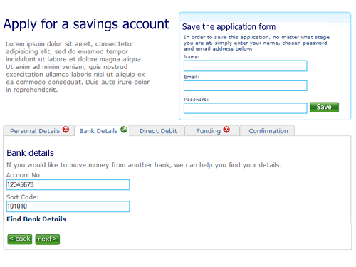
2. The user selects “Bank details”. They’ve not filled out all the fields on the first tab “Personal details”, but it doesn’t matter. There is clear feedback that this tab is yet to be completed.

Second tab on the application form, the first tab has not been completed

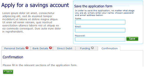
3. The user clicks right through to the confirmation tab. There is nothing to confirm so the page remains blank, with a prompt to fill out other sections.

Step 3 of the application form

4. When sections are completed the indicator on the tab changes to show completion. Here the user has completed step two ahead of step one.

almost there

5. Finally, when all sections are completed the user can review the entire form.

Confirmation screen

I’m not saying this is perfect, it’s a start. A start to re-thinking the way we design forms on the web and think about modelling them on real world behaviour instead of technical constraints of the past.

What about the non-functionals?

Non-functional requirements (NFRs) are the poor, ugly sisters to the functional requirements. They are often left out, or worse written in wooly and non SMART terms; “the website shall be available 24/7”. Is this what happened with HMRC? The website that allows UK citizens to complete their tax returns on-line has gone down, just as the deadline looms. I wonder if this is a case of the non-functional requirements around performance, scalability volumes etc being forgotten about or just not tested for. Inexcusable really.

Will corporate websites remain spotty teenagers or will they grow up to be beautiful?

In the corporate webspace most design is little more than mediocre. Interaction design has changed little since coporations first realised that this is a channel thery should exploit. Web 2.0 is slowly making in-roads with basic use of Ajax functionality, but there is nothing that is really breaking the mould. Despite its infancy (for most organisations ‘e’ is barely 10 years old, Amazon, the granddaddy of eBuisiness is only 13, born in 1995), conservatism rules; the corporate web is just not growing up. It would be easy to blame the technologists for being risk adverse- for having invested in architectures and frameworks that do not allow innovation. REST and all that declarative goodness may be great, but of little interst if you have invested in a propiertary framework that does not support it. But the business is also responsible for tardy innovation.

It doesn’t know what is possible. A miss-understanding of accesibility clobbers rich interactions; “no javascript” becomes the mantra, despite the guidance being “provide alternatives” and progressive enhancements making basic and rich interactions possible with the same code. And maybe as usability testing becomes the norm, and testing concepts with consumers throughout the product lifecycle is baked into the process, this is acutally the final nail in the creative coffin. Let me explain.

When you are developing new features or propositions it is only right that you should conduct market research, talk to your customers and get feedback to refine your ideas. But sometimes you need to ignore what you are being told and challenge the perceived wisdom. Imagine the scenario; you are developing a social networking site. You recruit a bunch of consumers to participate in user testing sessions. They match the socio-demographic profile of your target audience, they use the internet more than five hours a week. You let them loose on your concept boards and prototype. They like what they see, they like the blogs… but commenting? The feedback is that none of them would leave comments. So what do you do? Kill the commenting on the basis that the users who matched your “average” profile would not use this feature.

I’m not saying that if you are building a conventional, transactional experience; a retail shop, a financial services provider, you should not test the proposition with users that match the target profile. But beware that they will steer your thinking into the realm of the ordinary, the expected and the average. Try testing it with trend setters, gamers, teens, mybe even anti-personas to push the boundries and harvest real innovation insights.

And maybe testing the proposition is not needed at all. But don’t leave the design to the comittee or the accountants. Sometimes it is more important to have a real visionary driving the product development. Apple is a great example of this, no more so than with the iPhone bounce. When you scroll down a list, when you come to the end, the last item “bounces”. Where’s the “business value” in this? Isn’t this gold plating in the extreme? The development of this bounce will not have been for free, it will have come at a cost. This could have been a financial (more development effort) it could have been at the expense of another feature, or it could have been time. In most organisations this would not get get through the design by commitee. Apple can do such great things with their UI because they’ve got a visionary at the helm who understands the importance of good design and is passionate about it, and their customers become to expect it.

What not how

All too often the business thinks in terms of the “how” rather than the “what”. But why should they care how something is to be implemented? Why doesn’t the business state their requirements in terms of their desired outcomes? What is it that they want? Then, and only then should anybody think about the “how”.

Sadly, focusing upon the how rather than the what is a driving factor behind so much of the mediocrity in enterprise software. Rather than stating “what” (they want) in terms of their dreams and aspirations, the business express their requirements in terms of what they perceive IT can deliver. “What” could never be the design quality of Apple (visionary) because they believe the “how” (their IT team) is not Apple (mediocre). But wouldn’t your average developer rather be building something visionary than something mediocre?

Small shops do themselves no favours

Walk around London and it’s hard to miss the Maestro “Cash Is Dead” advertising campaign. You’d never believe this in many small bricks and mortar retailers; try to purchase something with a card for say £7.99, pull out the plastic and the shop keeper shakes his head and points to the sign – “no card payments for under £10”. What sort of madness is this that retailers refuse to accept money because it is the wrong sort of money?

OK, so there are interchange fees; a card payment is probably going to incur a charge of around 2% of the transaction. For the retailer there is therefore an incentive to prefer cash. But at what cost? (Perversely for the banks they penalise against not using cash, despite the handling for cash being so much more than an electronic transaction).

Let’s say I am buying something for £7.99. Let’s say the cost price for the item is £3.50. That’s £4.49 gross profit. Obviously this doesn’t all go into the retailers pocket; the tax man takes his share in VAT and there are the operating costs. I’m no retailer, but let’s assume that a whopping 90% of the gross pocket is swallowed up in costs, leaving the retailer 45 pence net profit. Now of this, the bank is going to take 15 pence from the retailer for me using my card. Which the retailer is not happy about.

And this is the mad part; for the sake of 15p the retailer is willing to loose the sale (OK, that is 36% of his net profit – and that is a lot, but isn’t cash flow king?). He has given me a shocking customer experience, not allowing me to buy from him this time (and I’ve got a memory – not going there again). I’ll go down the road to the supermarket where they will not only accept my card – but give me cashback as well!

There is of course, an alternative. Give the customer an option of using the card, passing on the card fee. For most customers, the opportunity cost of paying slightly more but getting instant gratification is probably more acceptable than either driving several miles out to the supermarket, or having to find a local ATM.

Consistency when things are poor

Call it a pattern, a heuristic or a rule of thumb. A fundamental one of those to ensuring usability is consistency. This may be external consistency – for something behaves in the software in a similar way elsewhere. A good example might be the ‘x’ button in the top right hand side of an open window. It is universally a call to action to close the window. If the designer created a button labelled “C”, and placed it on the left hand side this would result in confusion. It is not consistent with the users’ expectations from using other applications. The second type of consistency is internal – do things behave in a consistent manner throughout the application? This may be both in behaviours (e.g. buttons with the same titles perform the same action), and in look and feel – a website has a visual identity and coherence, assuring a continuity of experience.

There may be examples of where internal consistency is not possible. For example a brochureware site that uses a third party for fulfilment or payment. Paypal is a good example of this – the user is taken out of the shopping experience and into a paypal experience. This can be successful if there is clear signposting and use of the paypal imagery on the shopping site to assure the user.

So what happens when you have a large, legacy website that you acknowledge to be pretty poor in the usability front and want to introduce new functionality, or want to rebuild it. If you play the consistency card too strongly you may continue to be consistent with the old design and behaviours. This begs the question, is it better to introduce something that is internally inconsistent, but fundamentally better? This becomes even more an issue when you look to rebuilding your site in an incremental fashion.

As an information architect I can help you design your site architecture – the look and feel, navigation structure, user journeys etc., but this will probably be in its entirety. To build this new site will take time, and assumes a “big bang” whereby a completely new site will be (re)launched. Yet there are probably business imperatives to fix specific areas. If we build in an incremental fashion, and take the agile approach of focussing upon delivering business value, we are not going to have a fully redesigned site to go live with. We are probably going to have (for a short while at least), some parts of the site that are new and some that are old.

Going back to my original question, we can either build this to be consistent with the old site, or do something tangentially better. If we do the later it will probably be significantly inconsistent from other parts of the site, or the original parts of the site. It is in this scenario that I am inclined to throw away the consistency pattern. You may have internal inconsistency if you have a clear roadmap to throwing the old and the new functionality / design is proven to be usable, accessible and intuitive. With this the case, the interaction behaviour and visual identity of the new functionality must become the benchmark to which future functionality is consistent with. And you must clearly signpost to the user what is going on; customers will generally be forgiving if they understand that the changes are in their interests.

Unleashing innovation at speed

It sounds clichéd and old hat, but it is true. Truer now than ever before; the web is an enabler for new ideas. It provides you with the tools for disruptive innovation. Sadly for too many organisations it has become a hindrance.

A recurring theme with many organisations is the length of time it takes to take an idea to market. Especially in retail financial services, where you would expect lead times to be short it is not unusual for innovations to take a year to implement. This seems crazy, it’s not as if there is a physical product to manufactured.

So where are the hold ups? More often than not, they are rooted in the organisational structure. Innovative products often cross business boundaries; whilst customers only see the a single brand, different product teams only see what they are responsible for. They have own objectives that often conflict with other parts of the business; gaining agreement and consensus across all parties can often be a time consuming and painful experience that slows and often kills innovation.

Then there is the technology. Changes to systems have to be scheduled (along with every other request). Unproven ideas are put to the back of the queue. The business starts to perceive IT as a hindrance rather than an enabler and lines of conflict are drawn up.

Channel is the next hurdle to cross. Typically a face to face channel or telephony will be easiest, but getting something on the web? Now a new area of the business needs to be involved, the Internet Channel Team who interface between the business and IT. They’ve got to design web pages, get the creative done, produce requirements for technology to build (and schedule into deployment for which the dates are even further into the future), do usability testing… Long lead times are inevitable.

And then, before the innovation sees the light of day, someone new comes in to rationalise the product portfolio, the innovation doesn’t quite fit in with their new priorities and it is quietly ditched. This half hearted attempt at innovation has taken a year, cost in excess of a million and has come to nothing.

There has to be a better way.

There is. Do things at speed. You can start by sticking some amphetamines into ideation phase. Someone’s got an idea; identify who has a vested interest in it succeeding (or failing) and get them into a room to thrash it out. This doesn’t need to take long. Workshops are best limited to 90 minutes at a time (after that people get Blackberry withdrawal symptoms and loose interest). But if all the stakeholders are geographically dispersed, a structured day’s off-site might be the best solution. Avoid letting people dial in or video conference, this is one meeting where people have to be there in physical presence. Also avoid having too many people in the room, especially when forming ideas (there is a trade-off between having the right people and too many people to make the process unmanageable). Start with the users, the customers, the people whose lives will be changed by the idea. Scribble out personas -describe who they are, what their goals are, the perceptions of your company, of technology. Print out pictures of people that represent the personas, rip out photos from magazines, anything to bring them to life. As the idea takes shape, turn it into pictures. Draw out the customer experience. What would the persona do at each stage. Far better to do this than write it down in a document that can be open to interpretation. Illustrate the touch points. What does technology need to do. (Can we be pragmatic and use roller skate implementation rather than getting bogged down in an integration quagmire?)

Now is where it gets interesting. There once was a time when you would need to invest time and money into producing a heavyweight business model and business case for the innovation. You still need a business case, but at this stage it probably doesn’t need to be too robust; make some basic assumptions then test it. All too often business cases are built on flaky assumptions; build something quick, test it and get real data to build your models on. Again, this is about doing things at speed; a couple of weeks after the first workshop there is no reason why a small team of developers can’t be actually building something to bring the idea to life. So the team is using Ruby on Rails to build a proof of concept. There may be disquiet that this doesn’t fit into the current technology stack – doesn’t matter, it is a proof of concept. Six weeks later the proof of concept is done. It is not a static, prototype that demonstrates linear page flows, it is fully featured and fully functional. It can be usability tested (but more likely you were doing that on wire frames alongside the build). What then? In two months you’ve taken your idea and turned it into something tangible.

Why not put it into the market for real. Whilst IT might not want this Ruby “thing” on their stack, that doesn’t mean it isn’t possible and can’t be done. Large organisations have a testing ground of consumers inside a secure environment – their staff. Use them to beta pilot the idea? Friendly customers are delighted to be part of product development – put it out to a small and selected group of customers, and have some smoke and mirrors processes to handle fulfilment. The objective is to prove the viability of the idea, get data to make informed decisions and make your collective mind up quickly. To fail fast or succeed cheaply.

6 of 15
2345678910