Posts by: marc

Frustrations with a smaller “Enter” key

I  was recently in Hong Kong; my Chinese colleague had the same laptop as me, a Dell D610, yet using her machine caused no end of frustration.  whilst my laptop has a big “enter” key in the shape of an inverse L, her keyboard only has a small key the same size as the backspace key.  When I went to press Enter, more often than not I hit “\”.  There was probably a good reason for this design decision being made, but it breaks a fundamental usability concept – that of consistency.
chinese and english dell laptop keyboards

The Total Experience

The customer experience doesn’t start on the home page and finish on the payment confirmation page. A compelling customer experience comprises of a number of factors with the different factors residing in, and owned by different parts of the business. This can result in parts of the experience being excellent, others being shocking, such as at the Early Learning Centre. Projects that are driven forward by “IT” rarely see the bigger picture; the project manager’s primary concern is with delivery. And this means producing a product that covers all the use cases or stories that were specified in the plan. Agile development practices often reinforce this; an agile team is (rightly) focussed upon delivering technical excellence according to the “customer’s” requirements. The trouble with this is that project success in the on-line world goes beyond just delivering working software. Success is all about the total experience.

I’m sure there are a hundred and one different frameworks for “e” success. The following works pretty well for me.

The Total Experience Model.  Copyright Marc McNeill!

Compelling proposition
Any on-line offering starts with its proposition; what it is offering to the market place. Do we know who the consumers are (segment), how many of them are (market size) and their propensity to buy? What is going to attract them to the site, and what is the glue that will draw them back.

Findability

Well if no one can find your compelling proposition it’s never going to make you money. Do you have a strategy in place for ensuring consumers can find your proposition? This starts with search engine optimisation, but will extend to affiliate programs and making a noise about you (Product team blogging?). And then when they are at your site is navigation intuitive? Is relevant and wanted content findable?
Personality
What is the product aesthetic, what does it look like? Is it branded? Does it exhibit production values that reinforce the brand? How does the overall experience make me feel – how does it emotionally engage me?

Content
Content is king. But all too often it is a bit of an afterthought. It’s not just syndicated content, or articles that subject matter experts might write, it is all the copy, the words that appear on the site. Do they support the proposition, or are they just placeholders that the developers wrote and never got updated? Related to content, and maybe it should have a bubble unto itself is community. I think that increasingly, successful eCommerce offerings will include an element of community. Fulfilling the promise of the ClueTrain manifesto from several years back?

Technical Excellence
Working for a company that undoubtedly employs some of the finest developers in the market place, this is something I see a lot of. But it means nothing if the other elements are not realised. Technical excellence includes those “non functional requirements” that development projects talk about; reliability, performance, scalability etc etc.

Usability
Learnable, speaks the user language, memorable, all those old chestnuts. Probably the maxim is “don’t make me think”. Aligned to usability is accessibility; we don’t want to exclude potential consumers through sloppy implementation.

Operational excellence
So the on-line experience may be compelling, but what happens then. Is the fulfilment channel fulfilling? Is there a promise to deliver goods and is the promised delivered upon? What about support channels? Do they support or do they just pay lip service to the concept? Does the web experience go beyond the web and cross other channels? Can consumers start a journey on the website and seamlessly conclude the experience in store? My blogs on Early Learning Centre, Norwich Union and a seamless experience all touch on operational excellence.

Test – measure – refine

Underpinning these factors is the need to constantly test what we do. We can all learn from Test Driven Development (TDD); write the test first and only have the confidence to proceed when it passes. How do we know it has passed? Well we need to measure it; we can only know success if we can quantify it. Based upon the feedback we refine; test – measure – refine, a concept core to agile software development practices.

A lot of words and a picture that belie a simple concept. When working in the web world, always think about the total experience. Break out of your silo (be it technical development or marketing strategy) and think holistically. What will the end to end experience be for your consumers? A technically excellent website is not success. A polished, well branded look and feel is not success. Success is compelling total experience.

What does red mean to you?

I’ve recently been in Hong Kong and ran a really quick retrospective with the project team. I handed out red and green post-it notes and asked the team to write down things that went well and things that went not so well. They then stuck the post-its on the board, red “not so wells” on the left and green “goods” on the right. Only it didn’t quite work like that. In my western mind I’d assumed that green is good and red is bad. Not so in China where red is an auspicious and lucky colour…

Red and green post-its confused in a project retrospective.  cultural differences were forgotten

Off is on in Motorola world

I recently borrowed a motorola flip phone. The first non-Nokia I’ve ever used. I really liked it, once I’d worked out how to switch it on. How intuitive is it to switch the phone on using the red off button? How hard would it to have built the green button to have a call to action for on?

motorola red off / on button

Joined up experience

The “customer” agenda has moved beyond CRM. “Customer experience” is being taken ever more seriously; some more enlightened organisations have customer experience representation at the board level. It’s all about thinking in terms of the experience customers have with us- considering every touch point – understanding the journey the customer takes from first becoming aware of our brand, through researching and purchasing our products to developing them as a loyal and profitable advocate of ours.

Sadly the IT that underpins many organisations doesn’t get the customer journey. It is routed in organisational silos and delivery channels that mean everything to the organisation but nothing to the business.

We know how successful our web channel is: we’ve got webmetrics. We know how successful our telephony channel is: we’ve got a sales force motivated to sell, and a dashboard that tell us their success. We know how successful our stores are: we’ve got sales data, we even measure footfall in our stores.

But is it joined up?

I go into a store and a salesperson helpfully shows me the product, but I’m not yet ready to commit. She offers me a great deal, I’m tempted, but I want to check it out on the web. I search the competitors, the salesperson was right, she was offering me a really good deal. So I got to their online shop and there is nothing like the tailored deal I was offered in the store. There’s a number on the website and I get through to the call centre. I start all over again. I get the same sales patter I got in the store and saw on the web. I’m offered a deal that is similar to that in the store. I’m ready to commit… but they don’t have any in stock, I’ll have to wait seven day. So can’t I buy it now and pick it up in the store tomorrow? I don’t think so.

Where is the driver to improve things? Each channel has contributed to the sale but each is a silo that has its own reporting lines. They are in competition with each other, each wanting the sale none of them recognising the other in the journey that led to that sale. Yet ultimately their failure to work together is destroying the brand value.

Do you want to be famous?

I’m in Hong Kong and my wife and Children are out here with me. When we walk on the streets with my daughter sitting on my shoulders many people stare and point. Over the weekend we went to a beach and people were pointing their camera and taking photos of her. None more so than the mainland Chinese in their coach parties. It’s not every day they see a blond three year old with a riot of curly blond hair. And it bothers me. Who are they to take pictures of my children. Some peope ask and I generally refuse. I begin to get a feel for what I might me like to be a celebrity. There is however, a lack of consistency in my approach. Why will I not let the Chinese tourists take photos, yet I post my own on Flickr for all the world to see? My rationale for Flickr is to let family members to see our pictures, but they are in the public domain.

We live in (the UK) a world where 1 in 7 teenagers wants to “be famous” when they grow up. Not “be rich” as is used to be – there was an implication of effort and graft in that statement, no-one got rich by doing nothing at all. But now it is possible to get rich by being talentless and doing nothing but being on a reality TV show. A sad state of affairs I feel. And anyway, who would want to be famous, to have random people pointing at you and sticking their camera phones in your face? I certainly didn’t like my brief experience of that.
But then I must wonder. With social networking is there an element of all of us wanting to become famous? I’m broadcasting to the world who I am via flickr, through my blog (and I watch how many subscribers I have and strive for a higher ranking within technorati). I look at google analytics to see who is visiting my site (Hello Hanoi, Singapore, Kuopio and Buffalo). I increase my professional network on Linkedin. Maybe I put my videos of myself on Youtube or MySpace. It is all about creating a personal cult of fame. Maybe I don’t like the TV version of it, but I think that on the web I’m hooked. I do want to be famous. Grrrrrrr.

What if it began with UAT? (Agile and interaction design are compatible!)

There’s an argument brewing that pitches the agile community against the interaction design community. (You get a feel for this here via here ). Personally I don’t get it. The two approaches are a natural fit. You just need a bit of pragmatism and an ability to say “it depends”.

The interaction designers argue for ethnographic research, lots of user research, and only when we have a thorough understanding of the users, their goals and the context of their usage should we start thinking about writing code. The agile developers will say the only thing that is worthwhile is “working software”. Get something out there, quickly, and see what the users think. The agile approach mean that the direction of the software can be changed at the drop of a hat… If you are working in an investment bank, with a small user base who want this approach may be valid. But if you are building a large public facing web site, diving straight into code with little consideration of the users (e.g. their demographics, itentions, motivations etc.) would seem to be somewhat misguided. It need not be like this. At ThoughtWorks we start many engagements with a “QuickStart”. We’ll work with the client to produce a vision of where they want to get to. We’ll listen to end users, sit with them, watch them. Then use models; financial, process and visual to gain concensus and understanding of what the project is aiming to achieve. We do this quickly, focussing upon the outcomes the client are looking for the project deliver.

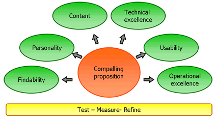
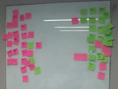
The visual models are straight out of the interaction designers tool kit: wireframes. Pen and ink sketches of screens, maybe on paper, maybe in PowerPoint or Visio. Alongside this we’ll watch the users, spend time with them and experience how the software will impact their lives. This doesn’t take much time. We don’t look to produce formal documentation – output is scribbled on cards or on flipchart paper stuck on the walls. In two to four weeks we’ve got a good understanding of the as-is situation, and produced a vision of where we want to get to. The benefits of this? The users get a feel for what might be in the application, we can write better stories (requirements) that are more explicit on what is needed and the developers have something more concrete to estimate against. Finally, when it comes to release planning we can visualise what a cut down version of the application might look like (and thus begin to manage expectations that they are not going to get everything in one big bang, and that things will probably change during the journey). This is not big up front design. It is quick and dirty. It is interaction design (e.g. personas, ethnography, low fidelity prototyping, user testing etc) and agile (e.g. rapid, iterative, incremental, tangible… hey! it’s test driven development without code).

Ah! Test driven development? So on my current project we showcased the wireframes and a comment came back from one of the users (someone who will actually use the application, not one of the “business representatives driving requirements).

“What you guys are doing is great,” he said. “UAT at the beginning”.

I rather like this, but with a caveat. All to often the first time the users see an application is when it comes to user acceptance testing- UAT. UAT has always struck me as a bit weird because it is rarely about “acceptance” (even weirder how it is so well embedded in the IT development lifecycle whilst usability testing rarely gets a look in). It is more about testing for bugs that the developers may have missed. It’s not whether I, as a user “accept” that the product is any good. It is probably the first time I’ve seen it. Maybe I’ve got a test script to run through, I can play with the application, but it is so late in the lifecycle that if I don’t “accept” that it is any good, nothing is going to change.

Agile proponents will argue that with small, regular drops, users are able to raise concerns earlier in the software lifecycle. Regular showcases at the end of each iteration will bring to light issues around “acceptability” and acceptance of the software. But these showcases are usually with the “super user”, the “customer” who is feeding the team requirements. Rarely is it the little person who will actually use their application. And then, even in agile, you’ll often have UAT. It will come at the end of a number of iterations, before the first “release”. But already the direction of the application is set. There is less to accept (and therefore it is easier for the direction of the development to change – one of the benefits of agile) but there is still scope for users to dislike and reject what is being released. And that is why doing UAT at the beginning, user acceptability testing, rapidly, user the interaction designers toolkit is such a good thing. You’re getting the users involved. Your testing and refining the vision. And probably getting usability in there by stealth.

Here’s a paper I wrote about this a while ago: Agile and Interaction design paper

When I was 16 I worked in a bank. Customers would ring up and ask for their account balance and I type on the green screen 809 for a simple balance. I can’t remember the code for a breakdown of transactions. I couldn’t use that system now. One of the benefits of command line prompts is that they are efficient. As a “power user” it would be difficult for a GUI to beat <809 account number>. Because the GUI can be cumbersome and requires mouse movement when only a few keystrokes would suffice. Power users love commands line prompts. But in the hands of a novice the command line is useless.

Cue Google.

google calendar

A pretty cool feature in Google calendar- the ability to “quick add” an event. Rather than the cumbersome use of date pickers and fields and boxes, the quick add function allows me to create a calendar entry using natural language. I type “meet Fred in the office at 9 tomorrow” (the language I use when describing my intention) and the meeting is set up. No need for fields and boxes and date pickers. So maybe it is time to rethink command line prompts using natural language with forgiving rules. Imagine being able to type “move £50 from my current account to my savings account” rather than the more usual current:

Page 1 – Step 1. Select from account. (Wait)
Page 2 – Step 2. Select to account. (Wait)
Page 3 – Step 3. Enter amount. (Wait)
Page 4 – Step 4. Confirm transaction. (Wait)

(Done).

Would you humanise a hammer?

User. Male. 57. Bank customer. Usability test of bank website. “I hate computers. Why are they so damned difficult. They’re supposed to be so clever, and yet half the time I’m left clueless what to do next”.

Interaction designer: Humanise the interface. Speak the users language; be intentional not instructional. “I want to move money to another account” not “Transfer funds”.

Developer: “Bah humbug”. (Well he didn’t really say that. What he did say was…) “Would you humanise a hammer?” “I want to tell the computer what to do”. (I suppose you’d like a command line prompt then). “I don’t what the computer to tell me what I already know what to do”.

Moral of the story: you are not the user. What you want, how you do it and the way you (and also the person who is commisioning you to write your code) do it is almost certainly not the way the end user wants to do it. And unless you speak to them and watch them you will never know.