Banking

About a successful project that was a failiure

On time, on budget, to the scope that was agreed from the outset of development.  A successful project?  Well no actually.  It was a complete failure.

Here is a story about an insurance company with a number of differnet products sold through intermediaries.  Whilst the intermediaries were good at selling single insurance products, they weren’t so good at cross-selling or up-selling other products.  Focus groups with the intermediaries revealed that they didn’t know about all the other types of insurance available through the company.

What if the intermediaries could have a portal where they could access all our insurance products in the same place with customer alerts and sales support prompts identifying further selling opportunities?

From this initial idea a benefits case was pulled together consisting of a product definition and financial projections.  In pulling together the benefits case, the potential revenue uplift numbers surprised everyone.  Signing off the benefits case on the new Intermediary Portal was duly signed off, and the product definition was handed over to IT to build.

Being an agile IT shop, the business and developers sat down together and got their heads around the product definition.  It soon became clear that the challenge was one of “single sign-on”.  Each of the insurance products offered were on a different legacy application that required the intermediaries to sign-on with different credentials.  To bring them all together in a single portal was far harder than the simple problem that the initial product definition suggested.

In pulling together the benefits case, a rough estimate had been supplied by IT. Now it was an in-flight project with an initial list of stories, it became clear that they had significantly under-estimated.   Of the twenty different products that the business wanted on the portal, for the budget the business had set aside would deliver barely four products.

With new estimates a release plan was drawn up.  Release one would deliver single sign-on across four products identified by the business as being most profitable.  All the  sales support tools were de-scoped and scheduled for a third release with the second release delivering single sign-on for the remaining products.

Development started, the business stakeholders worked closely with the developers and the First Release of the Intermediary Portal went live with congratulations all round.  Funding for the next release was lined up depending upon the success of the first release.  But that success never came, take-up was less than expected and the cross and up-selling never materialised.

The proposition to the intermediaries as delivered was flawed; the portal had to be all or nothing, single sign-on across four unrelated products was not compelling to them.  There was no sales support.  The intermediaries thought “so what?”  IT had delivered on the business requirements yet the project was deemed a failure.

This story tells a striking lesson. The project failure was due to a lack of joined-up thinking.  The business and IT both had followed their processes and done the right thing.  The business had identified an opportunity, built a benefits case and had this signed off.  IT had run a model agile project with close engagement with the business.  However whilst both stages of the process were locally optimised, they were done in isolation of each other.  Once the (development) train had left the station both sides were committed to delivering the product portal.  No-one returned to the business case, no-one went back to the end users, the intermediaries and asked whether the cut down scope for the first release would actually be of value to them.  More importantly, IT were engaged too late in the process.  The business had settled on an IT solution to the problem without engaging IT.  Had IT been party to the ideation and visioning process they would have been able to raise the risk of the project complexity earlier on.  Indeed they could have killed the project before it started.

Returning to the initial problem; “intermediaries weren’t so good at cross-selling or up-selling other products… Focus groups with the intermediaries revealed that they didn’t know about all the other types of insurance available through the company.”  The problem didn’t need a portal solution. The issue was one of awareness; almost certainly an off-line marketing campaign would have delivered a greater ROI without the need for IT to build the wrong product.

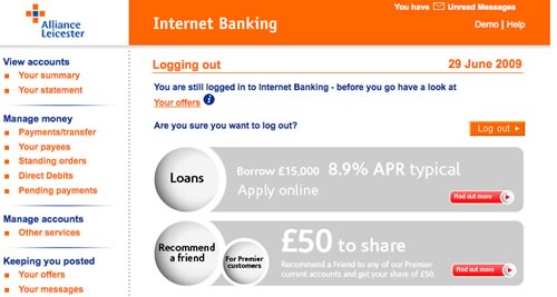
If you say Log out, log me out

You’ve logged into your on-line banking checked your balance, paid your bills.  What do you do now?  Click on the logout button?

What do you expect will happen now?  Well given that you have actively chosen to log-out (it’s not something you are likely to click on my mistake), you’d expect to do exactly that.  Logout.  The next screen you get will probably be something that thanks you for on-line banking, with a cross sell for a product or two.

That’s what I assume most customers would expect.  So what are Alliance and Leicester thinking about with this screen?

The customer has clicked log-out but they are still logged in?

Why?

“You are still logged in to Internet Banking – before you go have a look at Your offers.”

Excuse me, I logged out, I don’t need to be logged in for you to show me offers.

Worse: “Are you sure you want to log out?”

OF COURSE I WANT TO LOG OUT!!! Why else would I have clicked the link.

Alliance and Leicester fail here in a fundamental usability rule, that of managing the customer’s expectation. In an application where security isn’t paramount this would be an error, in an application where customers expect their action of leaving their secure accounts will do exactly that… but doesn’t, is inexcusable.

Resign or fix what you broke?

There once was a time where the honorable thing to do if you screwed up was to resign. No more it seems.  Times change and to resign is to walk away and admit defeat.  Defeat is something our culture doesn’t honor; no-one likes a loser.  So you ignore the critics and stay on; you know what went wrong, so you are the best person to fix what you broke.  The honorable thing is no longer honorable.  Failure is rewarded, and we just carry on as if nothing happened.

Front of wallet

Credit card companies talk about “front of wallet”. With customers having a number of cards at their disposal, how does a credit card issuer ensure that their card is the customer’s card of choice; the card they will pull out first because it is at the front of the customer’s wallet?

How do you make sure that your website is “front of wallet”? One solution is to become the wallet. In Web 1.0 many organisations tried this, branding themselves as “portals” trying to be a one stop shop to do everything. The reality was that people liked to “jam jar” their experiences. They didn’t trust one one provider who did one thing well to sell them unrelated products; that just didn’t fit in their mental jam jar. They buy insurance from an insurance site, cars from a car site. So if they wanted to buy a car they would go to Autotrader. It was not a banks place to offer car sales in their portal offering. (The value proposition to the bank of course looked good on PowerPoint, sell people cars on the banks portal web and there was a ripe market for cross selling finance and insurance at the same time).

Web 2.0 brings a new “portal” to the playground. A concept rather than a product. Thus we have iGoogle and netvibes and mash-ups. No company can become the wallet, they must resign themselves to being the cards inside. They can do this by offering rss feeds and widgets. Making their content and functionality promiscuous, divorcing it from their site and allowing the customer to consume it how and when they want it. Sadly the banks have yet to grasp this concept. Their technically savvy customers would love to have their balances and recent transactions displayed on a widget or as a feed. Sadly they listen to the masses and their inherent conservatism prevents them from such offerings, killing it with what-ifs and unfounded security concerns (“what if a husband and wife shared the home computer and the wife saw suspicious transactions…” yawn).

Anyway, so there’s Twitter. I’ve signed up to it and for a long time it just sat there I had a subscription, but out of sight and out of mind. It wasn’t at the front of my wallet. It wasn’t even in my wallet. Until I got round to putting it on iGoogle. Suddenly it is visible to me. I see it every time I log in. I get bothered by the inane, uninteresting tweets that most of the people I follow burble, but I also update my status on it (and it updates my facebook status as well). Twitter is now part of my on-line experience. It is now front of my wallet.

Unlike the banks who I visit periodically to check my balance and pay bills (in-out, no lingering). Now if my bank balance was a feed on iGoogle I’d have more of an interest to drill down into more detail. I could manage my money better. I could establish a better on-line relationship with my bank. If they gave a little away, I’d give them so much more. But for now, they are back of my wallet.

Do you know what you are doing?

Recently I was told of a Blue Chip company whose IT organisation, in the guise of cost cutting, has recently disbanded its QA function. From now on, testing will be conducted by the developers themselves. Since when have developers relished the role of testing? It is inevitable that this cost cutting solution will end up costing the organisation more than it saves.

At the end of last summer I was working with a bank on their on-line retail banking strategy. During a workshop with representatives from their mortgage business they made it clear that they saw the biggest sector for growth in 2008 was the buy-to-let market. I left the workshop shaking my head, were they not reading the same newspapers I was? Even then I didn’t need a crystal ball to tell them that they were putting their eggs into the wrong basket.

Clearing out old paperwork, I came across a document describing the technology strategy for a blue chip organisation that I’d worked with in the past.

There is a guiding principle that is being applied to product technology selection that says we do not follow a ‘best-of-breed’ approach, but rather select a major technology leader (IBM) and ride their product development cycle. This means we explicitly seek and accept the “80% solution” rather than trying to optimise for each and every possible requirement. [We are] emphatic on this point. What this means in practice is that, following the selection of IBM WebSphere Application Server… add-on functionality should be sought from the IBM WebSphere family of products first. Shortcomings will be made explicit in order that we can escalate with IBM, and influence their product strategy.

No rationale was given for their preference for going with a single vendor rather than a best of breed solution, but talk to developers who have used best of breed products and the above mentioned vendor product and they will almost certainly come down on the side of the “best of breed” (that is why they are best).

During the dot-com boom I worked with bank who were developing a WAP mobile banking platform. Trouble was it could only be accessed via a Nokia 7110 (the first mobile phone with a WAP browser), the experience sucked – “Worthless Application Protocol” and the market penetration was never going to reach beyond the most hard-core (and GUI-patient) of early adopters.

At the time the same bank was intent on closing as many branches as possible – branch banking was considered unprofitable; on-line was the way forward… yet several years later I was back in the same bank helping them with their in-branch customer experience.

We all must have examples of times when we have shaken our heads and asked of others do they really know what do are doing? Whose interests are their decisions in aid of? You may not be able to do anything proactive about it at the time, but the question is, what can you learn from these encounters and how can you use them to teach others in the future.

Banks don’t want you emailing their staff

You went to the local branch of your bank and spoke to a really helpful person there. In the few minutes you were with her you established a relationship with her. You felt comfortable and confident that she would take ownership of your request. But before she could deal with your query, disaster! You left some critical information at home.

Can I email it to you later you asked her?

Silly question.

Have you ever tried emailing someone in the branch network? Chances are the frontline staff don’t have external email. What sort of business is it that doesn’t give its staff email and the ability to communicate on a personal level with its customers? the same sort of business that has centralised all its customer contact and put it behind IVR.

So you give up on email.

Can I give you a ring with the details later you asked her?

She shakes her head. She doesn’t have a number. you see the branch doesn’t give out its number to the public. Go through the 0845 central switchboard, and let someone in the call centre pass a message to the person in the branch. (With no formal process to get this to happen, good luck if your messages ever gets passed on).

In fact the only way you will probably get a message to the person you talked to this morning is if you send a fax. One step removed from the telex, two away from the telegram.

What is it with the banks that they don’t want their staff to have external email access?

Web 2.0, retail banks and a Slide Share presentation

This is nothing new, but there are still people out there to whom Web 2.0 is a bit of a mystery. What exactly is it, and more to the point, should our business care about this stuff? Or, as I have heard senior executives argue, is it just another bubble, a distraction to let others waste their time, effort and money on. In an attempt to challenge this assumption, I’ve used a model with a few sceptical clients to hang some structure on. This is central to the below presentation that I’ve given to a few financial services organisations. It discusses what Web 2.0 is, and towards the end describes what it could mean for their on-line retail bank website. (Thanks to Duncan Cragg and Prashant Gandhi for some insights).

[slideshare id=377944&doc=web20public-1209431680446543-9&w=425]

Does enterprise IT know what Google is?

Imagine an investment bank, a trader has a requirement for a tool to screen stocks. The requirement is to select stocks based upon different parameters, so for example find companies with a market capitalisation between a selected range, and a P/E ratio, Dividend Yield and Net Profit Margin between other selected ranges. And maybe the ability to add additional parameters.

Typically the process will be for these requirements to be captured by the Business Analyst who acts as the conduit to the development team. Nowhere is the user interface explicitly referenced – it will almost certainly be articulated in the reality of the current systems; what the BA knows and understands. Despite the iterface being delivered through a browser, the developers are not web developers. Inevitably the finished product will be functionally correct, it meets the requirements, but it will be clunky: select parameters > search > results… because it reflects the requirements as the trader put them “I want to do this and this and this, press a button and get a list back“.

So what are the chances of an internally developed investment bank application looking like Google finance’s Stock Screener? And what would your trader rather have?

Is this the most stupid question to ask?

Someone from the Barclaycard research centre rang me today doing some customer research. It is great to know they take the customer experience seriously – many of the questions were around my experience with the brand. But then they dropped this corker, not once, but twice.

To what extent do your other credit card providers offer innovative products

How important is it to you that your credit card provider offers innovative products

How on earth did those questions get through and on to the list? What is an “innovative product” when talking about credit cards or financial services? What is an “innovative product” to Joe Public? Maybe I can relate to an iPhone as such, but my credit card? Product innovation is hardly something that you or I consider when we pull a credit card out of the wallet.

“Innovative products” are something that marketeers talk about, they are not in the credit card users lexicon.

Real world forms

In the real world, when I get an application form I’ll flick through the pages and have a look at what is required. I can choose which fields I complete in whatever order I like. If I want to take a break half way through I can. I can complete it when I like and how I like.

So why aren’t web forms like that?

The usual format for a web form starts with some copy that describes the form (which people skim through at best). The user clicks to the next page and the form commences. There may be a step indicator showing progress through the form, but almost certainly progress through it will be linear. You have to complete each page before progressing to the next. If you are lucky you’ll be able to click to previous completed steps. But the experience is nothing like a real-world form. And when was the last time a real-world paper form “timed out” half way through, demanding the user to start over again if they left it idle for ten minutes?

The web forms we see today are a relic of their tecnological past. There is no reason why they must be linear, (and if there is logic in the form, there is no reason why the user can’t explore the different routes – you do that with a paper based form). There is no reason why the user can’t click to whatever page in the process they like (just like with the paper form). There is no reason why a page must be completed before progressing to the next. There is no reason why the form should time out and forget everything the user has entered. Fields can be saved as they are completed against an anonymous user, until the user wants to provide personal credentials.

Bottom line – the web has moved on. Instead of reflecting technical constraints of yesterday, it can adopt more real-world metaphors. But do we have the courage to start introducing new paradigms? Are users, information architects and usability experts so ingrained with broken web metaphors that they will shun a new model, (a real world model) of completing a form?

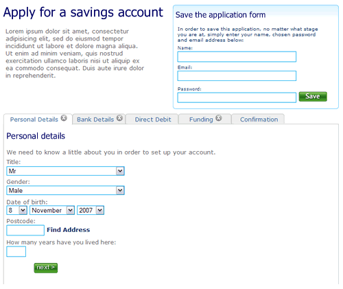
So here’s a rough example. It’s an application form for a savings account. Ignore the content, field labels etc, it is more the model that is illustrated.

1. The user can move between the sections (tabs) to see the fields that are required. There is clear feedback on each tab that it has not been completed. The “Direct Debit” section is optional hence no indicator. The ability to save the application is seperate.

Application form, step 1, nothing filled out

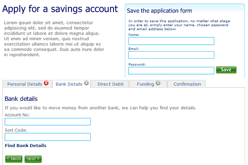
2. The user selects “Bank details”. They’ve not filled out all the fields on the first tab “Personal details”, but it doesn’t matter. There is clear feedback that this tab is yet to be completed.

Second tab on the application form, the first tab has not been completed

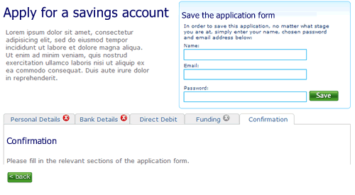
3. The user clicks right through to the confirmation tab. There is nothing to confirm so the page remains blank, with a prompt to fill out other sections.

Step 3 of the application form

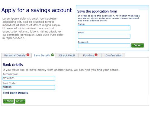
4. When sections are completed the indicator on the tab changes to show completion. Here the user has completed step two ahead of step one.

almost there

5. Finally, when all sections are completed the user can review the entire form.

Confirmation screen

I’m not saying this is perfect, it’s a start. A start to re-thinking the way we design forms on the web and think about modelling them on real world behaviour instead of technical constraints of the past.

2 of 4
1234