Banking

Match the context, not the pattern

Example of website requesting credit card details in a textual format

To my knowledge, all credit cards present their “valid from” and “expiry dates” as numerical dates, e.g. 02/06 – 02/09. So why do many transactional websites request the credit card validity in text date format, e.g. Feb 06? Most people will not know their credit card details – they arrive at the credit card details form, reach into their wallet, select the relevent card and work through the form referring to the card that they have placed near the keyboard. When they reach the date fields, additional cognitive processing is required, translating the number on the card to a month on the form. This interupts the process (do not assume that everybody can make the immediate leap from 02 to February. Spend time observing consumers on the task and it will not be long before you see fingers coming out to help with the counting).

So whilst using textual dates may be considered to be more “user friendly” and understandable, in the context of completing the credit card form, it adds complexity. UI guidelines, patterns, heuristics are all well and good, but ultimately you must consider the context of usage and design accordingly, even if it does at first glance result in something that is not immediately user friendly.

When I was 16 I worked in a bank. Customers would ring up and ask for their account balance and I type on the green screen 809 for a simple balance. I can’t remember the code for a breakdown of transactions. I couldn’t use that system now. One of the benefits of command line prompts is that they are efficient. As a “power user” it would be difficult for a GUI to beat <809 account number>. Because the GUI can be cumbersome and requires mouse movement when only a few keystrokes would suffice. Power users love commands line prompts. But in the hands of a novice the command line is useless.

Cue Google.

google calendar

A pretty cool feature in Google calendar- the ability to “quick add” an event. Rather than the cumbersome use of date pickers and fields and boxes, the quick add function allows me to create a calendar entry using natural language. I type “meet Fred in the office at 9 tomorrow” (the language I use when describing my intention) and the meeting is set up. No need for fields and boxes and date pickers. So maybe it is time to rethink command line prompts using natural language with forgiving rules. Imagine being able to type “move £50 from my current account to my savings account” rather than the more usual current:

Page 1 – Step 1. Select from account. (Wait)
Page 2 – Step 2. Select to account. (Wait)
Page 3 – Step 3. Enter amount. (Wait)
Page 4 – Step 4. Confirm transaction. (Wait)

(Done).

Would you humanise a hammer?

User. Male. 57. Bank customer. Usability test of bank website. “I hate computers. Why are they so damned difficult. They’re supposed to be so clever, and yet half the time I’m left clueless what to do next”.

Interaction designer: Humanise the interface. Speak the users language; be intentional not instructional. “I want to move money to another account” not “Transfer funds”.

Developer: “Bah humbug”. (Well he didn’t really say that. What he did say was…) “Would you humanise a hammer?” “I want to tell the computer what to do”. (I suppose you’d like a command line prompt then). “I don’t what the computer to tell me what I already know what to do”.

Moral of the story: you are not the user. What you want, how you do it and the way you (and also the person who is commisioning you to write your code) do it is almost certainly not the way the end user wants to do it. And unless you speak to them and watch them you will never know.

Consumer driven development

One of the things that makes me passionate about agile is the way that it places the customer at the heart of everything we do. The trouble is “the customer” is often wrong. For me, the customer is the person whose life is transformed by the software they use. This is not the person who is writing the cheque, nor is it the person who is defining the requirement. In consultancy speak, they are the client. The “users” are the customer. I don’t like the use of the word “user” because it implies a choice to use the software has already been made. I’m probably going to have to accept that “customer” is never going to change, so why don’t we call our users (my customers) “consumers”.

So enough about semantics. The team are building an on-line banking product. The team ask the customer (client) what she wants. She bases her requirement around what she knows. Often this will be swayed by the development team talking about implementation detail. (Few things make me as uncomfortable as a customer (client) from the business (product owner) talking about APIs).

So the requirement is to log-in. The customer is comfortable with customers (consumers) having system IDs; a unique n digit number that identifies the customer on the legacy database. It has, after all, always been this way. She asks whether the customer’s credit card number could be used, but the developers tell her (via the BA) that these often change (customers loose their cards) and it would be hard to do. She nods her head in agreement (she’s put on the spot by the BA – the iteration is due to start next week…) And the requirement is manifest on the login screen (“please enter your 16 digit customer number”).

In reality, the “customer” bases the requirement on her experience with the organisation and what she knows about it. The consumer (if they were to be invited into the conversation) wouldn’t come to the problem with any of that baggage. She needs a simple login. She needs a user name that is accessible or memorable. She does not want a 16 digit number.

It may take a little longer to listen to the consumers’ need (we need to find consumers to talk to them). It may mean a little up front analysis (I’d suggest pre-project analysis, doing due-diligence if you like). But it will pay dividends downstream. In the login example above, the developers have swayed a simple and cost-effective solution in the short term, but have failed to consider the down-stream costs. How will the customer find their 16 digit number? Do we have to post it out (cost) on a card (cost) and have a support team (cost) and process (cost) for letting customers know their number if they’ve forgotten it?

As agile grows up, I’d ask for us to spend more time thinking about the real customer, the consumer, the person whose life will be changed by what we build. The inconvenience we may incur during development may be nothing compared to the pain we will experience after we have “delivered”.

Why the number not the user name?

User name and password. Ever since setting up my first hotmail account, since buying my first book on amazon these are the two unique peices of information that securely identify me. It’s a pattern I’m used to. Sometimes the username I want will be taken, but I’ll find another one. I remember my user names. Passwords are a little harder, I seem to be forever changing them, but at least with a user name I can usually click on a link to get a password reset emailed to me.

So why do the banks do the whole identifcation thing differently? The majority of banks don’t allow you to have a user name that you define. They allocate you a “customer number” or a “membership ID” or some other randomly generated number that you are almost certainly not going to remember. You are going to write it down. So this number can’t be more secure than a user name. And it is not as if you don’t already have a plethora of numbers with the banks; card number, account number, sort code. Couldn’t they use these numbers as identifiers? With HSBC you can generate your “IB” number from these information, but it is a more lengthy procedure. First Direct have an on-line support ID and an on-line access ID (whatever they are!?)

Security is paramount with on-line banking; as banks renew their security infrastructure they should review the customer experience; how security manifests itself to the end user and how easy it is to use, as well as ensuring it offers the highest level of protection to themselves and their customers.

bank sign on

If you were a bank, which bank would you be?

In the last year, Barclays have rebranded themselves. This is not just a change in the logo (as apparent with NatWest) but a focus on the customer experience. Go into a branch and there’s a calculator on the desk to add up those cheques you are paying in. And a pen to fill out your paying-in book. A free pen. A nice touch – they don’t assume their customers to be thieves and chain the pen to the desk – how much does a pen cost? And put a logo on the pen and you have free advertising.

Free pen at Barclays

On the counter there’s some technology to enable customers to rate the experience they’ve just had. Capturing customer feedback at the time of engagement, better than a focus group at a later date in a stale market research suite.

feedback at barclays

Outside the branch they don’t call the hole in the wall an ATM. They call it what their customers call it. A Hole in the Wall. All these things make me feel warm towards the brand. Brand Warmth is something that marketeers measure. Customers who feel warm towards a brand a more likely to consume that brand. In marketing research, perceptions of the brand can be tested further using word association. “If AcmeBrand was a car, what car would it be?” “If AcmeBrand was a tablet and you took it, what would happen to you?”

I think that we can borrow some of this thinking when we build software. I’ve written previously about emotional requirements – how do we want users to feel when using what we design and build. Before we start on something new, ask the question “how warm do we want our users to feel when using this product?” It’s a useful level to pull; warmth is probably going to cost more.” “If this product was a car, what car would it be?” If the customer says “Ferrari” and we are thinking Ford Mondeo we need to focus on managing expectations. A Ferrari is going to cost a lot more than the Ford. I’d like to know what I’m going to get before I start bragging about the new sports car I expect to soon be parked in my drive.

Parsimony and the golden plate

A general principle in science is that if there are two feasible explanations for a phenomenon then you will take the most parsimonious, the simplest and most elegant solution. Agile software development takes a similar principle, do just enough focussing upon what is truly needed. Practitioners of the methodology will recount with pride how they have worked on projects were the “customer” required A,B and C. They’d planned for eight iterations, but by the sixth iteration they’d delivered A,B and half of C and the customer was happy; the software met the customers requirements and was delivering business value. There’d be diminishing returns by carrying on any further; any more work would be “gold plating”

“Gold plating” in software development is a concept that is frowned upon. Doing more than is strictly necessary breaks the theory of parsimony; if it is not going to demonstrably deliver value then it is gold plating and is to be given a low priority. More often than not gold plating is seen to be “scope creep”. This is often manifest in agile projects when requirements are deliberately vague at the outset of the project. Why invest time in specifying requirements that will undoubtedly change as the project progresses? The problem is that the developers’ idea of how a solution will be implemented will be the most parsimonious solution whilst the customer has a more complex idea of how a feature will be manifest. The requirement is the same, yet what the customer actually wants is gold plating and scope creep. Let’s explore this with an example outside the software industry.

Imagine a product in development. It’s hi-fi comprising of separate amplifier, CD player and speakers. It is to be sold as a package (yeah, development is iterative and each component could be a release, but that is not the point here…) We are going to need to connect the CD player to the amp. We can express that as a story:

As a customer
I want to connect the CD player to the amplifier
So that I can amplify my music and listen to it through speakers

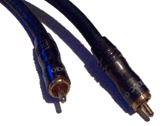
OK, so we need some interconnect cables. Using our experience of connecting amps to CD players we picture this:

phono1.gif

We know what it takes to make one of those cables because we’ve made them before so we can accordingly put an estimate to this requirement. Trouble is, for this scenario it will be wrong.

Return to the opening statement, “imagine a product in development”. There is a whole wealth of information missing in this statement. There is more to the product than it’s physical construct. We need to consider the context in which the product is to exist. In the world of interaction design this is contextual analysis.

Numerous factors may have an influence on the development of features. Start with the competitive landscape it will play in. When placed against competitor products, what is it aiming to do, is it going to meet a need (the CD player just plays CDs); are we looking to achieve competitive parity (we will match other features that are standard on our competitors products) or is the product goal to exceed expectations and become the market leader (it will offer superior sound quality and the ability to play MP3 files).

Who is the target market? In our story we stated “as a customer”, but who is the customer? Is it mass market or niche audiophile?

In addition to the business objectives which are critical to drive forward the project, (i.e. launch the new product to increase market share) the product objectives should also be considered. For our hi-fi this is “great sound for the budget audiophile”. Once we have this we can attribute emotional requirements to the product. How will our target customers expect to feel when they use the product. What emotions should it elicit? For this product let’s assume “high quality” and “simplicity,” rank highest.

With this background, when we return to the interconnect requirement, it is clear that the original assumptions are invalid. Our assumptions were based upon a mass market solution achieving competitor parity. In fact we need to aim a little higher, our customers are more discerning, the product is to be marketed as high quality audio and we are looking for the product to be an award winning design. So those interconnects? We need to gold plate them. The story will actually manifest itself as this:

phono2.gif

Mmmm. Gold plated interconnects. Gonna sound good!

Now the real world

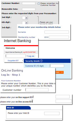
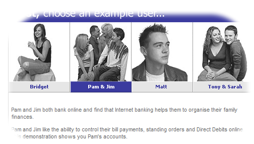
Let’s take a requirement from the banking world. It’s a system that allows users to trade equities; to buy and sell shares.

As a user
I want to select a UK equity
So that I can see its current bid / ask price.

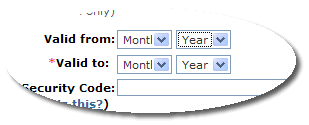
At its most parsimonious our acceptance criteria (i.e. how we will know this requirement is complete) are as follows:

Given the user enters the stock RIC code
When the chosen stock is valid and tradable
Then display the bid/ask price of the stock

Given the user enters a stock RIC code
When the RIC code is not recognised, the chosen stock is invalid or untradable
Then display an error message saying “RIC not valid”

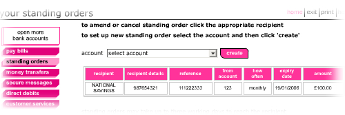
But is the most parsimonious solution the right one? We can only answer that once we have carried out some contextual analysis. For professional equity traders, who know RIC codes and speed is of the esscence then the implementation implied in the acceptance criteria is correct. But if the stock look-up is a new feature on a retail banking “portal”, extending the banking offering beyond balance and transaction reporting and making payments, to include share trading for a “mass market” audience then the implementation falls short of what is truly required. In this scenario the feature requires gold plating. This may include

  • Searching on company name in addition to RIC code
  • Meaningful error messages
  • Help text, content managed.

If the requirement is to have a “world class” share trading system we may need even more gold plating:

  • Narrow search results as the user types in letters
  • And so on.

If we turn to business value, it is hard to ascribe business value to the gold plating of individual features. Instead we should explicitly state up-front the emotional requirements that will “bloat” features beyond the most parsimonious implementation and inflate our initial estimates accordingly.

Port my functionality

Once upon-a-time there was no such thing as “legacy” in IT. It was a time when systems were shiny and new and development was Greenfield (and green-screen). We’ve moved on, IT has grown up and legacy systems are abound. Version numbers increase, licenses expire, software is no longer supported. “Upgrade” and “migrate” become priorities on the CIOs agenda.Because upgrades and migration projects have an IT focus, they generally remain in the ownership of, and funded by IT with the business only playing a peripheral role. After all, the requirements are already known; just move (aka “port”) everything that is “as-is” to the new “to-be”.

The reality is all too often slightly different.

It is a common misconception that “porting functionality” is a simple re-write. Here’s an example of a bank who was engaged in migrating its legacy applications onto a new, single stack environment. There were 39 legacy applications that supported 280 processes.

The original business case conducted by the IT organisation was built upon the assumption that 100% of the functionality could be ported. When these figures were shared with the business they baulked. They were incredulous that IT could be building something new, and building all that was wrong in the existing processes on the new platform. What they didn’t have was a business case that articulated what the cost “wrong” was. So the project was put on hold, no longer could it be soley in the ownership of IT, the business needed to ratify the requirements.

The business took an enlightened approach to requirement ratification (they got me involved!) We ran a series of focus groups with key stakeholders, then went into the field undertaking what I could pompously call ethnographic research. We spent time shadowing staff on the ground, observing staff-customer interactions, watching how they interacted with the technology, what applications they used, how long they spent on them and what bank processes they touched. It rapidly became clear that much of what IT was proposing to “straight port” was not fit for purpose. Simple, core bank processes took up significant customer time. For new staff to get up to speed with the basket of applications, it took weeks, if not months.

What soon became apparent, (as expected by the business), only a fraction of the overall functionality offered to the bank users was actually used. Indeed of the thirty nine applications that users had access to, five were redundant; their functionality was never used or was replicated elsewhere. When looking at banking processes that the applications covered, almost a quarter were ripe for redesign. Initially there was resistance to this figure; after all, the processes existed “as-is” and the bank was working with them. The original business case did not justify the significant additional cost that redesign over port would offer. But the ethnographic research gave grounds to challenge this. We could point to the time that users spent interacting with the technology rather than interacting with the customer. The underlining processes were not necessarily broken, but their technical implementation hindered staff work effectively. For example, on opening an account for a new customer the bank employee more time keying data into the application than talking to the customer. This prevented a conversation; the first personal touch point the bank had with a customer was a poor experience. And focussing upon form filling rather than the needs of the customer left both parties potentially unfulfilled.

Worse for the bank, when an existing customer informed the employee of a change of name and address (i.e. just got married), the employee would visibly sink in their chair. Again. rather than engaging in a conversation, congratulating the customer, talking about their new financial needs following their change of life, they had to update the same information in six different places. The technology was an impedance. And thus a cost.

What if we could reduce the time spent entering data into the system? What if there was time for conversation? Time to probe the customers financial needs…? We could model different scenarios whereby this initial customer meeting could drive revenue with cross sell opportunities. Furthermore, if we could reduce the time spent with each customer and thus increase footfall there would be an opportunity to reduce costs. For example, assume the request for a change of address generates a new home insurance lead, model different conversion rate scenarios and we have a business case for improving the change of address process.

To demonstrate the art of the possible, we created a functional prototype. This started with lo-fi sketches, testing these with users before moving to an HTML prototype that supported different journeys through key processes. This was tested with users in a usability lab. We got bank staff to come in, gave them tasks to complete in a role playing scenario (e.g. Here’s Jon, he is a new customer. He wants to open a current account…) With no training, everyone who played with the prototype was able to accomplish their goals, something that was impossible on the current applications (that remember, IT just wanted port). For the most data-entry intensive process, that of completing a new customer account opening, we were able to reduce the time taken by more than 30%. And this was for novice users who had never used the system before. We now had metrics that we could input into the business case, to further strengthen the case for redesign.

And that’s when I left the project. Some functionality was still ported, but the focus shifted from an IT owned project to a business owned programme of work.

This case study demonstrated the fallacy that porting functionality should ever be a simple task that can be driven by IT. It provides an excellent opportunity to audit what you have got and make things better. Almost undoubtedly there will be a compelling business case for doing something more drastic than an IT owned project to make changes to the underlying technology. And the best way to demonstrate this? Ask the people whose lives are impacted by the technology. Use prototypes to test ideas of change. And take measurements.

(I’ve been on holiday, hence the ability to write long blog entries. In case you were wondering!)

Most retail banking web presence is just not connected

Taking a look different UK banking web sites a consistent theme seems to appear. There is a fundamental mismatch between public brochureware site and the secure transactional site. Banking brochureware sites are generally (but by no means universally) reasonably good. Their look and feel has evolved over time. No bank (yet) offers a web 2.0 look and feel but some get close. Lloyds TSB has a very clean and polished feel.
ltsb.jpg

The LTSB site is customer focussed, indeed the “interactive demo” of their internet banking offering introduces different personas to explore different scenarios. Can we expect their internet bank to offer a compelling customer experience? To be driven around customer needs?

ltsb page

Well maybe. But there is more to a compelling experience than just usefulness and usability. There is something about the aesthetic execution of the proposition. What it looks like. Attention to detail, creativity… sadly missing with the transactional site. Is it the case that the agency who worked on the public site went nowhere near the transactional site? Probably. After all the skills and ownership needed to build a website are different from those to own and build what is effectively a business application. The primary stakeholders in the public site are marketing; the primary stakeholders in the transactional site are IT and operations.

ltsb page

Lloyds TSB are not alone. Smile are an internet bank. But take a look at their tables. In 2006 who still uses cell borders and padding?

Smile page

First Direct are another bank whose primary channel is the web. And yet they exclude more than 30% of customers who would wish to have a relationship with them but do not use the browser they choose to support.

First Direct page

Barclays have got a great new brand that manifests itself on their public site, yet this has not worked its way down to their transactional iBank. Don’t get me wrong, iBank is pretty good (the interaction design was created by experts – ahem, I thank you – and was extensively usability tested. But this was in the dot-com boom times when we still had to get over fears over internet security). Yet six years later, apart from some changes to the stylesheet, little has changed.

barclays pages

On the HSBC net home page they are almost saying our site is so slow you need to do something about it with your browser.

hsbc net page
My hunch is that there are a couple of things going on here. Firstly, most banks implemented their internet banking applications during the dot-com boom. They were as much a reaction to the times as a strategic imperative. being rushed out bolt-ons to legacy banking applications. Almost a decade later and little has changed. And where legacy systems are being overhauled – SOA are three big letters in the banking IT world, I wonder to what extent changes to the customer experience are tabled on the agenda.

It makes sense for the brochureware site to be owned by marketing. With ownership marketing are free to choose a creative agency to implement a brand compliant look and feel. IT’s primary involvement in building anything was in commissioning the Content Management Solution (and updating the propriety software when the licences inevitably expire and the current version is no longer supported. The brochureware site can therefore evolve; it is probably built and maintained by people who understand the web. That is why these sites should by and large be cross browser and DDA compliant. So this brings me to my second hunch; the question of ownership. The public site is owned by marketing, the transactional site is owned by IT and operations. And their priorities are quite different. Whilst marketing people generally aim to have a polished look and feel, with a good attention to detail and an understanding of the customer intentions, the priority of IT is rather different. IT thinks in terms of requirements. And the look and feel is “gold plating” that is de-prioritised when deadlines slip.

It is time to bring all the parties together. Anywhere large IT projects are on the CIO agenda, “Infrastructure renewal”, “Service Orientated Architecture,” “Legacy refresh” etc. These should provide the marketing organisation the opportunity to address the customer experience and refresh the interactive experience of the transactional web site. Bring it up to date. And maybe soon we’ll start to see Bank 2.0 applications. Hopefully sometime before Web 3.0 becomes vogue.

4 of 4
1234