Customer Experience

Gold VIP experience at Hilton Hotel? Not really…

Before Christmas I received a letter from either Hilton Hotels or British Airways that as a BA frequent flyer I was entitled to a Hilton Honors VIP Gold Card. Indeed the Gold Card was enclosed. I scanned through the letter, and stuffed the Gold Card into my wallet – on the off chance that I would stay in a Hilton Hotel in the next few months – within the period for the card to be activated.

A couple of months later I found myself in Glasgow and was booked into the Hilton. On arrival on the first night I handed over the card. I mentioned that I thought it needed activating. The receptionist took the card and swiped it, and offered me a room upgrade as a VIP customer. Great! I presumed that this meant the card was activated (an inactivated card would not be accepted by their system right?) Over the next few weeks I banked the points on the Goldcard, the number was logged at the top of my receipts and I was a generally happy chappy. Until I logged on to their website to find out how many points my card had earned. The card number was not recognised. So I sent an email to Hilton explaining the above and this is the response they sent me.

thank you for your email. The card which you received was sent to you as part of a promotion by British Airways. For the membership/Gold VIP status to be valid, you would have needed to call us before May 31st 2006 to have your card activated. As this was not done, this would explain why your account number was not recognised by our website.

I have taken the liberty of activating your card for you so that you may begin using it. Your account, however, has Blue membership status, as the promotion which entitled you to Gold status has now expired. We can credit you with points for any eligible stays you made with us within the 3 months prior to today. If you have copies of the bills for any such stays, kindly forward them either to this email address or to the fax number listed below, indicating your HHonors account number, so that we may update your account accordingly.

Now I am puzzled. Why was a card that was not activated, accepted by their system? (Where did this record go to?)  Why were they unable to retrieve details of stays against a card number that was entered into their system? And how could they give me Gold membership with a card and account (which can be activated now) but withdraw the offer, despite my having stayed at your hotel and enjoyed the Gold VIP status during my stays. When I challenged them with this I received the following response:

The letter which you received with your promotional Gold VIP card would have clearly stated that you must call to have the card activated before May 31st 2006. As you did not do this, the account was not activated in our system and your stays were therefore not registered against it. We regret if you have been misinformed regarding this, i.e. that our hotels were accepting your card even though it was not active. We are, however, unable to honour you with the Gold status you were offered, as you did not fulfill the criteria of the promotion, which has since expired.

Do I have a warm feeling towards Hilton now? Not really. The promise of a loyalty card that would have driven my return business (and reccomendation to colleagues) has been dangled before me and cruelly snatched away. Worse, my conversation about Hilton is now this story of a poor experience. And what is a hotel if it is not an experience?

Orange website search

Take a look at the Orange website. Who are you? What is your motivation for visiting it?

I’m an Orange customer and I’m looking for information on thier phone insurance. I’m a Googler, I don’t browse, I search. I enter my query in the search box…

google search box

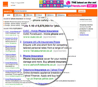
And I get these results:

orange search results

Eh?

Compare UK Life Insurance prices??

Why would I want to search the web via the Orange website?

I thought we’d moved beyond the Portal concept. Customers generally “jam jar” their experiences. If they want news, they will go to a news provider – bbc.co.uk. If they want search they go to Google..

Clearly their strategy is to move Orange beyond being a provider of phones and tariffs, to become an integral part of their customers life. Regardless of channel you get the same consistent and compelling experience. And if that experience is sufficiently sticky, they’ll drive revenue off the back of it. That’s the motivation. Yet sadly they have forgetten about the simple things. They’ve forgotten about the most of us who want simplicity from our phone provider.

The Orange search box is a good example of a brand that has great aspirations that look great on Customer Strategy PowerPoints (“We’ll be our customers information gate, regardless of channel”) but overstretches itself by forgetting what customers actually want (“how much will phone insurance cost me”).

Organisational convergence

Success is rarely delivered by one part of the organisation; it requires the collaboration of different departments working together. Yet there is all too often a separation of responsibilities that can hinder the efficient development of ideas. Worse, there is no single owner of the business case resulting in business value being lost.

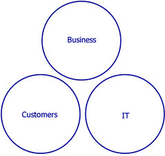
A crude model illustrates this. The “business” holds the business case. They are focussed upon the benefits case. IT are treated a factory to build the mechanisms that will support proposition and are thus focussed upon the costs. The customers (who ultimately use the proposition) are held at arms length and not involved in the development of the proposition.

business, IT and customers seperated

There can often be a tension between the business benefits case and the IT cost to deliver. The cynical view of the waterfall approach is that Business want it all, IT promise it all and their relationship deteriorates as the project nears its scheduled completion; IT cannot deliver on time or budget, the business has to make unplanned compromises and ultimately the customer suffers. The Agile approach goes some way to mitigating the risk of relationship breakdown. Painful messages about what can or cannot be delivered are communicated early on, enabling informed decisions to be made. However if the organisation is structured with clearly defined boundaries it is far harder to make truly informed decisions. As soon as scope changes, the business case will change. What often happens is that IT adjusts the numbers on the cost side, but the benefits case remains unchanged. If the business has spent many months working on the benefits case it is difficult to make changes on the back of an afternoon’s reprioritisation exercise. There is a solution to this. Taking an inclusive approach to proposition development and delivery; having all parties involved from the outset.

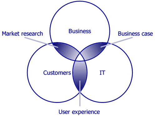
Here’s another crude model. Rather than being separated, the different stakeholders converge. There is a cross-pollination of ideas and understanding. The business case is shared, iteratively and incrementally developed. Customers are engaged in the process; providing market insight and testing the user experience. There is nothing new in this model, although I rarely see it working from the project outset. Often two of the three circles converge; the challenge is to get all three overlapping. I’m pleased to say at ThoughtWorks, increasingly when we initiate projects we are doing this.

Convergence of IT, customers and business

I declare! Rich internet applications

One of the problems of many internet applications is that they are constrained by the “command and control” approach of imperative programming. This results in a sequential, step driven behaviour that allows little freedom for the user to work efficiently. Contrast this with the declarative approach to programming which is very much user-behaviour driven.

Think of your on-line banking application. You want to pay a bill. Your natural behaviour may be “I want to make a payment from account to beneficary on or around date for the value of amount.” Yet typically this will be handled imperatively; a payment wizard forcing you down the route of account-beneficary-date-amount, with each step being a new page. I do not have the flexibility with such an approach to change my mind or to do things in a different order: “I want to make a payment for the value of amount on or around date from account to beneficary“.

Think of a spreadsheet; you would enter all the fields on the same sheet. Make changes to one field and other fields can be simultaneously updated. This would be impossible to achieve if your web application is linear and step driven.

The declarative approach to programming allows such flexibility being data or behaviour driven rather than process driven. With the constraints of implementation process removed we can build user interfaces that better address user goals and intentions. Rich Internet Applications (RIA) are an excellent example of the declarative approach. Ajax enables RIA to a degree, but Macromedia Flex and the opensource cousin Laszlo take it one step further. Take a look at this demo – a truly awesome (IMHO) flight checker application (click on the Search Now button to see the functionality).

The main issue with RIAs that are built in Laszlo or Flex (or indeed extensive Ajax) is those of compatibility and accesibility. By forcing users to have Flash downloaded are you likely to exclude users who don’t want, or can’t have Flash? And accesibility – I’m not sure to what extent this is addressed by them. However if resonable alternatives are provided (i.e. a “text only” version with little rich client side functionality) this ceases to be a problem.

Google analytics

Last year I worked with a client who had an antiquated web analytics package. They had no idea what was going on on their site until they spent £££££s on an updated package.

…I’ve recently downloaded google analytics that seems to do pretty much everything that the commercial package did. I can track user journeys through my site, and see conversion rates (if I had anything to convert…) Setting it up was simplicity itself (as you’d expect from google). Some of the stats it provides are useful for tweaking the usability of the site – I can see bounce rates for each page. Other stats are just plain interesting. Hello to the 3 people in Singapore who visited dancingmango yesterday. And hello to you in Streatham. Shame you left after 5 seconds, you don’t know what you missed!

Password paradox

That dreadful peice of software Lotus Notes prompts for a password change at regular intervals. It does not permit you to use the same password used before. A similar situation occurs with opening Microsoft XP. Whilst this may be considered to be more secure from a technology point of view, it betrays human behaviour. Generally we humans adopt the most parsimonious strategy for getting on with life. We go for simplicity. I’ve tried to be clever with my password strategy, but I’ve just run out of unique passwords that I can remember. This morning I was struck down with password amnesia. Ten minutes spent trying to remember my passwords. So I can do one of two things. Write the passwords down. Hardly secure. Or adopt a common strategy of selecting a word and adding a digit to it. and incrementally increasing the digit at every password change. This will undoubtedly compromise the goals of complex passwords regularly changed, but how much easier is it to have “Password1” this week and “Password2” the next. (That’s not my passwords BTW. Obviously.)

Office 2007 beta – pleasure & pain

Downloaded the beta version of Office 2007 – I’d been assured you can run it alongside Office 2003. First impressions are good – PowerPoint gets infinitely better, you can make presentations that don’t look a thing like PowerPoint. They gone back to basics with Word; the whole styles and formatting thing was just getting stupid. Now it is intention driven and pretty simple to use. If you are going to replace the whole UI of probably the worlds most used software application you need to make sure you do it right. I think they have succeeded. Excel looks pretty good as well, but didn’t spend much time with it because…

IT KNACKERED OUTLOOK!!

So I no can no longer access outlook. Something to do with .dll files. A visit to some of the forums (or is it fora?) does not reveal a solution. So I am left with no other option but to uninstall both the beta and my existing version of Office. A return to Lotus Notes for my mail (grrrrrr) and a sour taste in my mouth. ho hum.

What’s the point of usability testing?

I’ve seen a couple of projects recently where the team have invested in usability testing of wireframe mock-ups of application processes. I’m beginning to wonder whether this is effort well spent.

Don’t get me wrong. I am a firm advocate of usability testing and incorporating it as early as possible into the design process. I’ve set up a few usability labs in my time, facilitated hundreds of usability sessions… I even once had the pleasure (is that the right word) of watching users struggling with boo.com. There is always much to learn from seeing users actually using what you are building. But I now ask the question at what point can you learn the most. If you’ve designed with usability in mind, where is the value in testing the basics of something that instinctively you know as a usability professional to be “right?”

Let me qualify this. The development of an on-line application processes / tools / wizards is now a well trodden path. Any interaction designer worth his or her salt will have experience of building one and will instinctively know what works and what doesn’t work.

In the first instance the interaction designer will create wireframes that illustrate the process; a visualisation of the pages representing the flow that has initially been created.

In creating the wireframes the Interaction Designer should be making reference to personas, will have been collaborating with other team members, validating their assumptions, and will probably be doing informal guerrilla testing around the office to confirm ideas that are puzzling them.

If the interaction designer is any good there will be few, if any issues with the wireframe flow that the users walk through. In a usability test the user is more likely to pick up on labels (and if it is not lorem-ipsumed up any copy that the interaction designer will have written – It is unlikely at this stage that the copywriter will have been involved).

That is a lot of cost and effort to validate the work of a professional.

The wireframes in usability test will generally be based upon a set scenario through a “happy path”. What the wireframes are unlikely to uncover are issues where the user wanders from the “happy path”. Producing reams of wireframes in Visio or PowerPoint and then linking them all up to simulate the finished product is painful and not particularly productive or useful, especially if there is a lot of interactive “web 2.0” stuff going on. To really simulate that you are going to have to build a prototype for real.

Here is something that the devs at ThoughtWorks are pretty good at. Using high productivity platforms such as Django or Ruby on Rails they can pull together a fully featured product that can be usability tested in earnest. It is not a dumb “smoke and mirrors” html prototype; it can have database and “intelligence” behind it. The benefits of this are clear. The business can try and break the process; we can get the business rules right. The developers are able to see how the vision actually functions. Again, they less likely to uncover corner cases that have been missed if a first pass of build has been done already.

Once we have this new avenues of testing are opened to us we can move away from the need to test in a clinical lab environment. Providing a user with a URL to the application form, and using collaborative software such as Skype and Net Meeting we can perform usability testing with greater ecological validity – the user can use the application form on their own PC at home.

Agile doesn’t do good UI does it?

There is an argument that goes like this. Give two development teams the same problem. Get one team to use a waterfall model, the other an Agile model and see what you get. Chances are that the agile team’s code will be more elegant and cleaner than the waterfall team but their UI design will fall short of the Waterfall team’s.

Truly incremental development of code, adding features as they are required (according to business value) is just not suited to developing a consistent and intuitive interface. Without a model to specify what the interface consistencies will be the developers will build the interface according to the requirements of the current feature, not necessarily how it contributes to the overall experience of the application. This is often compounded by listening to the wrong “customer”. All too often the people who buy software are confused with the people who use it. Buying decisions aren’t using decisions. (Anyone who has used Lotus Notes primarily as a mail client will testify to this: you are a captive users. If you as an end user could choose you would probably use something different, but you didn’t buy Notes and were probably never invited into the discussion about it’s purchase).

Big up-front design?
If “change” is a dirty word in Waterfall approaches then “Big-up-front-design” is a dirty phrase in the agile vocabulary. Anything that smacks of design and specification documentation before a line of code has been written is guaranteed to get the backs up of agile zealots. Yet it is clear that in an absence of any roadmap for a UI, the interface could go anywhere, and for a component as critical as the interface between the user and the functionality this can have disastrous consequences. Any feature is only as good as the users’ ability to use the feature. The underlying code the developer has written may gain the admiration of her colleagues, but if it takes the user twice as long to use the new feature because of a poor UI then any business value promised in the application has been destroyed. On a project iteration level, the lack of any detailed UI design can cause a number of issues ranging from inability to get customer sign off on stories through to rework (not refactor) as the UI metaphor starts to evolve.

In practice it doesn’t have to be like this. You don’t have to do “big up-front design” to get the UI right, rather just do enough to produce a model that drives the project forward (what original XP called “metaphor”); an understanding of what we’re all striving for, so we can make emergent design decisions that match that metaphor. The question therefore is what is “enough”? As always it depends.

The user interface is rarely specified as a requirement. It is just assumed it will have one. A starting point to getting the UI right is by capturing it as an emotional requirement. How are users to engage with the application, how do we want them to feel about it. By doing this we can quickly ascertain whether we are looking at a “world class, best in breed, competitor beating application;” an “application that will help transform the productivity of our employees [happy workers = productive workers]”; or “just a maintenance application that the tech guys use”. Business value can be placed upon each of these requirements and should be prioritised against feature requirements, both in terms of benefit (builds the brand, faster transaction times, fewer mistakes etc) and in terms of cost (interaction designer and graphic artist input on project team).

The GUI model
Once we are agreed that the UI is important to the success of the project, we can produce models for the look and feel of the UI.

Feel
The model isn’t the UI design for the application per se, but rather the vision and the basic structure of the UI for the application to fit into. It provides some guidance for developers and BAs as they begin to analyse and implement stories – some basic structure the application can fit into so we don’t have to struggle to invent so much UI stuff for each story. And, so the finished application feels a bit coherent. The model may have two halves, firstly the vision that illustrates the feel of the application; how the user will flow through processes, an information architecture illustrating where pages will fit. Secondly the model may be prescriptive; how the will the user know what to do, how will widgets work. The primary artefact of this model might be ‘wireframe’ sketches of pages – a low fidelity prototype that walks through key user journeys. Alongside this may be basic interaction patterns, for example how a search mechanism will work, how forms are to be laid out. Just enough to ensure consistency in the feel of the application and prevent avoidable re-work at a later date.

Look
Alongside the feel model is the look model. The developers need not care too much about this, provided their html is cleanly marked up. The feel will be created by the graphic artist and interaction designer, and implemented in the style sheet. Obviously if the goal of the application is to be a customer facing “world class” website, more attention will be required on the look than if the application is a development support tool.

The important thing with these two models is that they are sociable, communicable and flexible. The whole project must be aware of them; when new people are brought onto the project, the starting point of the communication should be the wireframe sketches. “This is the vision of the project… currently we are working on these parts… you see that tab – that is release two…” They may also change. We originally thought we’d have a ‘wizard’ to complete the process, but after showing the wireframes to users they wanted it all to go on the same page. But it is better to have something to hold the UI together than assuming that it will evolve through incremental development.

(These thoughts are not entirely my own – much of it is distilled from a ThoughtWorks email thread on UI design, agile methods, and BUFD… or BUFUID as someone commented).

Designing the bleedin’ obvious

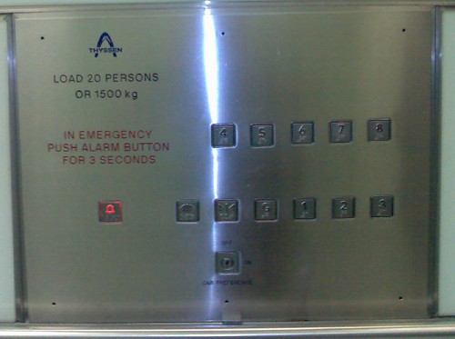
How hard can it be to design something as simple as lift control panel.

The specifications are as follows: buttons for eight floors, hold door open, door close, alarm and key slot for manual override.

I’m sure that most people would logically take advantage of the users mental model of the way lifts work – i.e. up and down and posiiton the button for the eighth floor on the top and the button for the ground floor at the bottom. That is bleedin’ obvious isn’t it? (I believe that 90% of user centred design is the bleedin’ obvious). Sadly, some people don’t get the bleedin’ obvious and all too often they design things that we use every day. Like whoever designed this lift control panel. Vertically positioned buttons with the most frequently used button [ground floor] hidden in the middle of the bottom row of buttons. I have to think to find it.

lift control panel

(I also have to think “how sad am I” to notice such a thing, take a photo and blog about it. S’pose that is why the world needs interaction designers, to state the bleedin’ obvious.)

13 of 15
9101112131415