Information Architecture

Does content need a home?

We like to classify things, put them in homes. Information Architects design controlled vocabularies and taxonomies; ultimately labeling where things should go. Things may live in more than one place; we may use a faceted classification, but essentially that is a roadmap to the same unique, indivisible place. On the web this typically means an unintelligible URL with lots of random characters rather than something that is human readable. And that is just not nice. So you want a Robbie Williams CD (not that I’m sure why you’d want such a thing) – your journey may take you down any route:

Adult contemporary > Male Vocalists
Popular artists > Q-T
Pop > Dance Pop
British acts > Male Vocalists
Award winners > Brits > 2005

Whatever the route, chances are they’ll take you to the same page; “robbiewilliams.htm” with a unique URL (more likely than not it will be a dogs dinner of characters and symbols thrown up by the content management system).

The drawback of each journey terminating at the same place is that it lacks context. For example, a music store might have a campaign around specific artists. They may choose a different flavour to the branding in the campaign, a different look and feel. The “Brits” pages are different to the “Dance pop” pages. But as soon as the user is directed to a specific record they will served up the standard artist page. Any context of the journey in a breadcrumb will be lost (or in Amazon repeated to show where the product “lives” according to the different classification hierarchies).

Yet what if the product’s classification was truly faceted, was not indivisible, but lived wherever it was sought? Should the URL of “Robbie Williams” not be how the user has found it, the URL becoming the breadcrumb?

store.com/popular artists/Q-T/robbie.htm
store.com/britishacts/solo/male/robbie.htm
store.com/awardwinners/brits/robbie.htm
Store.com/search/robbie.htm
store.com/tags/robbie/robbie.htm

The page may be (almost) the same, served up (mashed /meshed up) with the context in which it was sought. Related links would be specific to the URL rather than generic (other Brits awards winner in the Brits context, other male vocalists in that context). Yes, there maybe multiple versions of the same page on the site, but from a findability perspective this is little different to a conventional faceted classification system.

OK, this is all well and good, but doesn’t it hinder search engine optimisation? Well no, Google handles duplicate content quite nicely thank you very much. So bring on the tidy URLs and content living nowhere and everywhere.
Accesibility is a distraction

A while ago Jeff Veen wrote that he “[didn’t] care about accessibility”.

It is exhilarating working with ThoughtWorkers who have a similar approach. It is not unusual for them to state blankly when the client starts talking about DDA. “Arrrrr” they will say when the acronym is explained. Disability discrimination Act- make it accessible? It is what we do. If what we build is not accessible we have not written good code – we have failed. Accesibility is a distraction – it should be a by-product of good development practices. They’ll wax lyrical about progressive enhancement and well structured mark-up and not only will it be inherently accessible but will work on mobile devices or any devices and off they go on a roll….

Is there anything wrong with my attachment to Saffron?

A funny thing happened today. We’ve had up on the wall our personas – boards showing the key users of the site we are developing; their photos and mood imagary visually describing them. These were stuck on top of earlier, crude descriptions of the personas with their names the same but different photographs and less detail.  A seperate workshop was held in another room and the boards were taken down for it, leaving the earlier versions behind.

Suddenly our key user who we are calling Saffron had gone. Her photograph had changed. Her “type” was the same, but her personification was different…

I was kinda attatched to the old Saffron. Who is this imposter?

In a while the boards will be put back up again and my Saffron will return…

Now whilst I am a keen advocate of personas to bring a user type to life, clearly there is a danger of getting overly attached to that persona, and that feels like a smell.

“Let’s pretend” user testing

How do you test the usability of the software you’ve built?  At one end of the scale you could run full usability tests with a sample of users, given them a scenario and let them loose, trying to realise pre-set goals.  On the other you could do guerrilla usability testing, just grabbing people and informally doing a usability test at your desk.  You could get the experts in to do a usability review.  They’ll typically use a bunch of usability heuristics and provide you with a report critiquing the application against the heuristics.  But what if you don’t have the budget for usability testing, can’t get hold of any representative users, don’t want to wait for some experts report?  How about playing “let’s pretend”?  Remember playing doctors and nurses as a child?  Well do it again, only this time be Users and Computers.  And you’ve got the role of the user.

Create a persona, a pen portrait of your customer.  Think in your mind how they act, behave.  Maybe you know someone like them, seen someone like them in the supermarket.  Now ask yourself some quetions:

How do they behave in their daily interactions with others?
What does their life look like?
What experience do they have with using computers, with using products like yours? How much time have they got? How are they feeling?
Why are they using your product?

Spend a few minutes internalising the persona.

Now turn to your application and imagine you are the persona, using it for the first time.  Give yourself a task to complete (make sure the task is something real that your persona would look to achieve, not a goal you think the application will help him achieve – there is a subtle difference).  Try and forget all you know about the application (easier said then done) and be the novice user.  Walk through the process, speaking aloud (in your head will do).   Focus upon I not “the user”.

I’m looking for this, I’m looking for that.  I do this, I do that”.  I can’t find this; I don’t think that makes sense”

I want to check my balance.  Hmmmm, there are three “balances” here; I’m not a banker, what’s the difference between Running balance and Cleared balance?

I owe my mate some money for the golf holiday, he’s given me his bank account details, I want to transfer some money into his account… huh?  I can’t do that.  What do I do?  Pay a bill?  He’s not really a Bill is he… Etc etc.

You don’t need heuristics for this – many of issues the heuristics would help uncover should come out using this method anyway (speed, ease of navigation, speak users language etc).  If your persona is having difficulty you can probably multiple the usability issues for a real user.

This approach works for a quick and dirty review of an application’s usability.  And if you document your experience make sure you preface it with a description of your approach.  Someone who is close to the development of the application, reading your first person critique, is rightly likely to think you are an arrogant so and so.  I speak from experience.

Let the UI drive the requirements

Conventional approaches to building software applications start with a Big Idea. Someone needs (to define an application) “a program that gives a computer instructions that provide the user with tools to accomplish a task“.

Someone picks up the big idea and breaks it down into a smaller list of “requirements”, things that the application must do to fulfil the Big Idea. In conventional waterfall development Business Analysts will spend a while documenting the list of requirements in some detail – in agile approaches they will do it as they go in a far more “lightweight” manner. Maybe a technical architect will draw up a blueprint design of the solution. Regardless, soon the developers will start writing code. With either agile or waterfall the user interface usually only starts to emerge at this stage. Until then, everything is coded in words (and maybe some boxes and arrows showing flow).  Only late in the process does the UI emerge.

Returning to that definition of an application, IT development seems to spend most of its time in the “a program that gives a computer instructions” world, and often looses sight of “provid[ing] the user with tools to accomplish a task”.

How about a different focus. Start with the user interface. Take the Big Idea and illustrate it. Draw pictures of what the tools will look like, how the user will interact with them. Sketch storyboards, wireframes, lo-fi prototypes, paper mock-ups, call them what you will. Use this as the primary requirements document, supported by explanatory text and detail where we required. These may be stories or use cases, but let the visual representation of the big idea drive the requirements rather than it being almost an afterthought.  Start with the UI and specify the functionality from that rather than the other way round.  After all, it will be the UI that the user uses to accomplish their task, not the computer instructions.

The customer is not always right

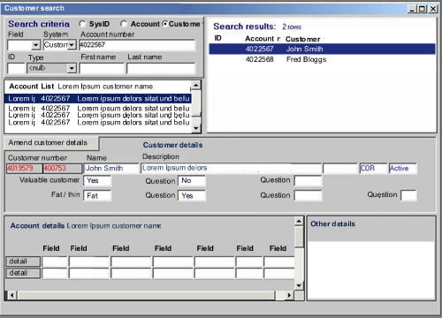
I was recently working with a financial services client, rationalising their systems to have a “single view of the customer”. This demanded a single user interface rather than the 13 or so current UIs that they use in their daily business. As we were coming up with ideas one of the consumers of the new system showed us an old system – “make it look like this” she said, “that’s what we want”.

Example of ugly user interface

My initial reaction to a screen like that is a nervous twitch. Eugchhhhhhhh!! Hold my breath. Count to ten. Repeat the mantra “RANA”. Relax, be Aware, be Non-judgemental, and Allow… RANA, RANA, RANA.

OK.

So when a customer asks you for something that in your gut feels wrong; if it feels wrong, it might just be wrong. The challenge is to get the customer to feel your feeling. Do not to just do as the customer says but probe and question and ask why.

This UI was built by developers to manifest data from the database. Not something we wanted to repeat. So we started by asking what is it about that UI that she likes? Some gentle probing uncovers that she likes the ability to have everything in one place. She can rapidly perform searches and see the results in the same place. Taking this as our cue, we probed what information on the screen was important to her and what was not – in the context of her usage. If we took each individual field one by one and asked “is this important”, she would answer “yes”. By asking about frequency of use, criticality and importance we were able to discount most of the fields. At the same time we were able to identify a number of fields that were critical and frequently used, but not displayed on this screen. We soon had a framework for a new search / results screen. Then we broached implementation.

Talk of a browser based solution filled her with fear and loathing. She perceived this to mean having to enter a search criterion, and then wait for the page to refresh / results to return. She’d experienced this with other applications and did not want to go there again. She was pointing at the Fugly screen again. “Build me that” she says, pointing at the screen shot. Yes but….

In an enterprise solution, performance, speed and accuracy are the most important criteria. Yet the Web 1.0 paradigm of query – response via a refreshed page is just not fit for purpose. AJAX overcomes this. She could have her cake an eat it.

The result was nothing like what the customer had asked for. We’d listened to her (and others like her) and probed her on her goals. We used scenarios to talk through the context of usage and came up with something that was fit for purpose and IMHO delighted her. The take away is this. Don’t always believe what the customer says, often they are constrained by their narrow view of the world and their current reality. If we are doing our jobs properly we are opening them up to the art of the possible. To a new reality a world apart.

Why technical architects will never make a solution secure

In one form or another, human error is the overwhelming cause of sensitive data loss, responsible for 75 percent of all occurrences. User error is directly responsible for one in every two cases (50 percent) while violations of policy – intended, accidental and inadvertent – is responsible for one in every four cases (25 percent). Malicious activity in the form of Internet-based threats, attacks and hacks is responsible for one in every five occurrences.

Source via Techweb

This statistic is worth paying attention to. I’ve worked with numerous clients, and particularly banks, who invest sigificant effort and investment designing complex, expensive (and often over-engineered) solutions to ensure their systems are immune from external threats.

The usability story is generally being won at the customer facing website level, so they invest in usability there. But when it comes to employee facing applications? “They’ll get what they get given” seems to be an all too common story.

The thing is, IT spend is dictated by people whose professional lives are rooted in technical architectures and physical boxes; the message that the real threat to their systems is “information architecture” and boxes on screens is one that will challenge them more than any hacker will.

Oh for a declarative experience

Want to go on holiday to France. Want to take the car on a ferry. Want to sail to Cherborg, or St. Malo, or Le Harve, or Caen. Flexible about time. Looking for best price. Want to book on-line. These are my goals. Not unreasonable goals, although as soon as I add “I want to have a ticket booked within five minutes” I enter the real of dreams. Currently, it is not possible to realise my goals.

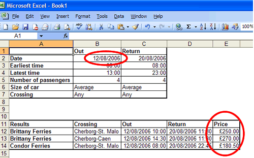
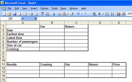
What I want to be able to do is enter my broad travel criteria into a aggregation website and then filter my search. Imagine an excel spreadsheet where I enter my criteria:

Excel sheet, cells empty

The results appear immediately:

Excel sheet, cells filled
And as I change the quantity in my search fields, the results fields immediately update:

Excel sheet, cells changed

That is the declarative paradigm that is conspicuous by its absence on so much of the web. Rather than flexibility, the ferry booking sites send me down an imperative, step driven journey. I cannot adjust my criteria without starting the process again- and that means re-entering all the data I have already provided.

The story doesn’t end there. After fighting with a number of different websites I finally find a ferry crossing that matches my requirements. Condor Ferries. The price is alright – £160.00. I Don’t want to book it there and then, I need to confirm it with my wife. She says “OK” so I return to the site to find that the booking form has timed out. There had been no option to save the quote. I have to start again. I go through the process again to find the price has suddenly jumped from £160.00 to £280.00. Unhappy, I ring the company to be told their system has a real-time flexible pricing engine that changes according to demand. The price lower price is no longer available to me. (At least they didn’t have the cheek to put a premium for the booking over the phone rather than the internet). Indecisiveness gets the better of me so I put off booking till the following day. Once again I go through the pain of step-driven booking wizards. And lo-behold, the price has dropped again to £160.00.

I started with some “wants” and I’ll reiterate them. I want a declarative web experience that meets my expectations and helps me painlessly realise my goals. I want travel booking forms to enable me to push and pull different levers to refine my choices, just like I can change fields on a spreadsheet. Finally, I want to be able to save quotes to return to them later. I don’t want the web to be like a high pressure salesperson who tells me this price is only available if I make a decision now.

Give me results according to my refine

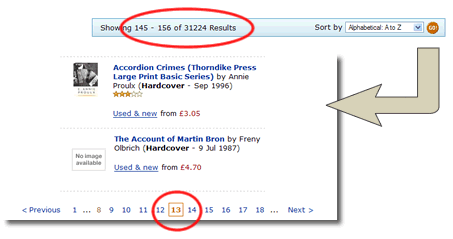
I know there’s a book out there. I know the author’s name begins with M. I know it’s a historical book. So I go to Amazon and for once I don’t search, I browse. I follow the site hierarchy: books> history > general and am presented with 32,5882 results. By default they are ordered by “bestselling” (best selling on Amazon – not always a helpful guide. Today’s number 27 on the list is “IEE on Site Guide (BS 7671: 2001 16th Edition Wiring Regulations Including Amendment 2: 2002)”. Mmmmm. Gripping).

Anyway, so I’ve got 32,5882 results to trawl through. Kindly Amazon provide an ascending / descending alphabetic filter. The intuitive way to return alphabetic results would be by letter. Unfortunatly the technically easy thing is done. Pages are returned by number, with up to ten pages accesibile at a time. That’s not very useful if you’ve got more than thirty thousand results.

Amazon search results

I’m on page 13 and I’m only up to AC… The letter M is an infinite number of clicks away. I’m off to Waterstones where I can physically browse the shelves, and hopefully find the book that way.

2 of 3
123