usability

Pillars of a compelling experience

Pillars of a compelling experience

This is a model I often see in organisations when it comes to their web presence.  A product owner comes up with a commercial proposition, marketing work up the content, IT build the functionality and it is goes live.  With this model, no-one actually owns the customer experience.

Worse, this little temple model is repeated across different commercial propositions so you end up with something that is not very joined up.  I’ve blogged about this lack of joined up thinking before.

Now let’s construct a model where the roof of the temple is a compelling customer experience.

What are the ingredients of this new temple model?  It is still going to be founded upon commercial propositions, but they are going to be overlaid by a culture of test and learn.  That is a willingness and ability to experiment; to realise that what you have developed is never final and is always evolving.  It is about taking the learnings of experiments to inform and improve the experience, or to rapidly refine or kill propositions that just do not work.

Then we have the five pillars.  I describe these in a paper I wrote ages back (pdf here, google books here).

Unfortunately these pillars tend to sit within organisational silos; content and personality are ‘owned’ by  marketing, functionality by IT, and operational excellence (that’s all about fulfilling on the customer promise and beyond) is a mixture of IT and operations.  Usability is a ‘funny one’ in that might sit alone, sit in marketing or sit in IT.  But ultimately it is best placed to direct the horizonal filter of Quality Control.  Quality control is not an additional layer of bureaucracy, rather a cultural component that all the pillars feed into.  It is about ensuring consistency and meaningfulness of the experience.  It is about balancing the commercial needs of the product, with the marketing needs of the message and the delivery capability of IT.

Photo credit: K. Dafalias

What would Sally do? Personas for retail financial services

Personas are ‘pen portraits’ that bring to life users or customers of a system, service or product.  Giving a personality and back story to your customers helps keep your thinking true to their real needs and goals.  Rather than using  ‘user’ or a segment descriptor such as ’empty nester’, or ‘this is what I would do’, what would Sally do?

Here’s a set of personas for financial service organisations, geared towards the retail / B2C market.  Sally is included (Shes skint).

View more presentations from marc mcneill.

Who would turn off the wrong engine?

In designing user interfaces there’s a lot we can learn from systems where failure to consider human factors has resulted in terrible consequences.

On 8th January 1989 British Midland Flight 92 crashed whilst attempting an emergency landing. There had been a fire on one of the engines which led to its malfunction. The captain reacted by shutting down the engine.  Only he shut down the wrong engine. With no power, approaching East Midlands airport the captain manged to glide the Boeing 737-400 to avoid Kegworth village but crashed short of the runway.  47 people died.

The investigation into the Kegworth air disaster identified engine malfunction (the engine used in the aircraft was an upgrade of an existing engine and had not been field-tested) as causal factor, however the report concentrated upon the failure of the flight crew to respond accurately to the malfunction.  Human error was the primary cause.

The truth is a little more complicated than that.  Why does a captain with over 13,000 hours flying experience and a first officer with over 3,000 hours experience shut down the wrong engine?

A number of human factors contributed to the disaster including organisational issues (refer to this paper for discussion of the role of managerial failures in disasters) and cognitive overload.  But of equal importance (and indeed buried in the appendices of the Investigation Report appendices) is the issue of design. Around 50% of accidents and incidents in the aircraft and nuclear industries have a root cause in design (source).

Take a look at the cockpit controls (taken from the investigation report). The left image is for the earlier 300 series and the right for the 400 series aircraft on which the captain had only 23 hours experience after a one day training course.

The actual cause of the engine malfunction was a broken turbine, itself the result of metal fatigue caused by excessive vibration (source).  Had the Captain noticed the Vibration Warning display he probably would not have made the wrong decision.

The Vibration Warning display on the new 400 series was in a different place to the 300 series, but more critically it was designed to be significantly smaller “the dial on the vibration meter was no bigger than a 20 pence piece and the LED needle went around the outside of the dial as opposed to the inside of the dial as in the previous 737 series aircraft” (Source: Wikipedia).  Take a look at the arrow on the left hand image, the display dials on the 300 series use mechanical pointers. On the 400 series they were redesigned with short LEDs rotating around the numbers. These, as the investigation report noted “are much less conspicuous than mechanical pointers, acting more as scale markers, and providing less immediate directional information).

The report criticised the layout of the instrumentation and helpfully suggested an improved layout.  The layout was (and as far as I can tell, remains in 737s) split into primary instruments and secondary instruments.  The issue with this layout is that the dials are not spatially aligned with their associated power levers.  If the pilot is focussing upon the primary instrumentation, the secondary instrumentation is in peripheral view.  This layout will lead to attention based around specific instruments rather than engines.

Compare this to an alternative design that the report provides where the dials are aligned to their associated power levers.  The report recognises the design trade-offs here but concludes that to break the left-right mental association with the engine position was probably not the most optimal solution.

This paper describes the issue well:

The 737 involved in the East Midlands crash had flight deck engine information that lead to confusion under mental pressure. Placing the secondary information sets for both engines to the right of the primary set broke the implied rule set by all the other engine information, that the left engine had left hand controls and indicators (and vice versa). If one assumes that the optimum positioning of indicators is the one that requires the least mental processing then a simple symmetry about the aircraft centre line seems appropriate. The actual positions required a mental spatial transposition of one set of dials to the other side… The readability of the indicators had been reduced by the substitution of electro-mechanical readouts with electronic readouts, but which simulated the old design. Possibly the redesign to electronic readouts should have taken the opportunity to use a rather different layout, possibly with linear indicators rather than rotary ones.

OK, so lots of words, but what is the point of this to what I usaully blog about?  The issue is one of design and layout and who’s responsibility is it.  In designing user interfaces UCD is often seen as a luxury, developers believe that they can design a GUI as well as anyone, and stakeholders (especially on internal projects) will question the value that a UCD person can bring to the project.  Does a developer or an engineer by training and instinct stop to ponder the human factor and the human consequences of the GUI layout? What are the consequences of this?  As can be seen from Kegworth, seemingly minor changes to the control layout can have a signficant impact on the safety of a complex system.

NFR 001: Make it easy to use

Designing an enterprise application.   Recently someone was grumbling to me about the statement “easy to use”. They felt it was a worthless statement; what does it actually mean? For them it had no meaning and thus should not be used at all.  This is nonsense.  “Easy to use” is a worthy statement that should either be treated as a non functional requirement with clearly defined acceptance criteria, or as a measurable KPI.  So to start the thinking on defining what easy to use must mean to your project, try using the BDD format of given, when, then:

As an Expert User
Given I have had no training
When I have to complete <insert goal>
Then I will be able to accomplish it in under five minutes

As a Novice User
Given I have had no training
When I have to complete <insert goal>
Then I will be able to accomplish it in under seven minutes

Links

Dan North introduces BDD

Customer value proposition model

Customer value proposition model

There may be a niche in the market, but is there a market for the niche?

How do you create a successful proposition?  If the answer was obvious there wouldn’t be so many failures out there in the market place.

It is easy to commence on a journey of product development with a hunch and clearly there is no substitute for validating ideas in the flesh.  That something at ThoughtWorks we do; helping clients test and learn, rapidly building ideas into tangibles that can be piloted at low cost and low risk before investing in significant build and spend.  However, sometimes a little more rigour is required before you commit to commencing a project in earnest.

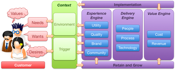
That rigour needs to be focused.  What often happens is this rigour turns into a research phase that turns into a project itself.  It need not be this way.  There are certain things you can do, certain questions to ask as you set out on the journey of creating a new, compelling customer proposition.  What follows then is a strawman customer value proposition model to help test potential propositions before moving forward with them.  There are three components to the value proposition model; the customer, the environmental context and the organisation or company.

All too often propositions are rooted in the organisation.  They make assumptions about the demand or usage. This model attempts to broaden the analysis and focus upon the customer and the why the proposition will be attractive to them.  The model supports questions that may be asked to help shape thinking, test hypotheses and validate thinking.

I do not propose that this should become a major research exercise  (for example market sizing is a huge effort in itself), rather a tool for asking the right questions, and if the answers are hard to come by, maybe that suggests more thought is required in refining the proposition.

So here goes, a model that provides a framework for considering new customer value propositions.  It’s just an initial idea and I’d welcome feedback and suggestions.

Customer

Before you get too carried away with the proposition, a good starting point would be the customer.  Who are they and what do they do.  Let’s remember that your customer is not everybody.  Your proposition in unlikely to be appealing 24/7.  The challenge is to segment your target market and identify the triggers for action.

The persona: Who do?

Personas are a useful tool for bringing the customer to life.  Much has been written about them, but they are a useful tool for extracting broad data into specific stories that describe individuals. Realise that it is unlikely you will design for everybody. Start with the market that you are targeting, how large is it and what is its propensity to spend? Then within that target market segment the target customer base into different profile customers (personas). You need to understand which persona, which customer profile is most important – prioritise them and focus on the highest value.  This may mean deciding between high volume, low margin mass market and low volume, high margin niche appeal.  This decision needs to be made as early as possible to ensure the proposition remains focused and doesn’t try to be all things to all people, satisfying none.

Values, needs, wants and desires

People are not empty vessels waiting to consume and be filled with your proposition.  Their behaviour is driven by their values, needs, wants and desire.  These may be fundamentally rational (to satisfy a basic human goal) or emotional (to demonstrate status). They are cultural and time based.  Thinking in these terms helps you understand how the proposition will appeal to the customer at different levels.  Let’s take an example of this; a new mobile phone.

Before we think about what the product must do, what are the values that the persona associates with the phone. Is our target market a technophile or a technophobe? Jan Chipchase who works for Nokia includes ethnography in his research to understand how people use their phones; women carry them in their handbags, men in their pockets or their belts.

The basic need that the phone must meet to satisfy the customer, she must be able to make and receive calls.  If the product is unable to meet these needs it is not fit for purpose and the phone proposition will inevitably fail.

Just making phone calls meets the need but there are additional wants that should be satisfied for the product to be more compelling.  It’s a hassle to remember the number of every person she rings, the customer wants to be able to store numbers and see the number of the person who is calling.

Having the ability to see a photograph of her daughter as a screen saver on her phone is neither a need not a want.  The phone is useful and usable without that.  But the customer desires to personalise her phone by having a picture of her daughter on it.  Desirability is the key differentiator of the iPhone.  It doesn’t need to compete on features, it is a cool device that people talk about.  And here is a key decision you need to make on your proposition journey.  Are you looking to compete on parity or whether you want to make a difference.

Questions

  • What is the basic need that the proposition is trying to fulfil?
  • What counts as hygiene?
  • What does the customer need to be satisfied?
  • What does the customer want in addition to being just satisfied
  • What do other competive products do to maintain feature parity (if you feel you really need to compete on features alone – bad move!)
  • Few people would argue they don’t want simplicity and clarity in their interactions with products.  How could your product to make life easier for the customer?
  • What will make the customer feel good in themselves about owning the product?
  • What other products are “cool” or desirable to your target market.  How can you leverage the essence of those products?

Context

So now we are beginning to understand who the customer is, it is time to nest the proposition in terms of their context.  The old maxim that a half drunk bottle of water in a desert is worth its weight in gold, but on the streets of a city is worthless trash, should be remembered.  Even the best of propositions will deliver little value if they not only consider the customer, but also the context in which they apply: time, demand and usage.

Trigger

So the next step in the model is to ask why, when and how will the customer be attracted to the proposition. What is the trigger that drives the customer to move from awareness (assuming you have that) to action?  There is no point in a financial services company trying to sell me a car loan if I am wealthy enough to own my own car, or I do not drive.  Understand what triggers the customer to be interested in the proposition, when and why this happens.  How can your proposition be at front of mind when the trigger is set.

Questions

  • What lifestyle / lifestage events will trigger?
  • Internal events personal to the customer; leaving school, getting a first job, getting married, moving house, retiring etc
  • External events that they have no control over (think about sports sponsorship and tying a proposition to that sport, or tying a proposition to a celebrity e.g. Michael Jackson..)

Environment

It is very unlikely that the proposition will be wholly unique.  What is the competitive landscape, what noise will it need to be heard above to capture the consumers attention.  Whilst you may review the immediate competitors to see where threats and opportunities lie, what can you learn from other, unrelated products or domains?  How can you fuse together concepts from outside your immediate focus to bring new innovation to your product?  Scenario planning may come in useful, playing out different outcomes for different timelines other than that which you plan for.

Questions

  • What is the competitive landscape?
  • What can you learn about similar but unrelated propositions?
  • Have you considered the political, environmental social and technical influences using the old PEST analysis?
  • Have you considered different scenarios and how your proposition would play out under them; what unplanned disruptors could get in the way, or how could your proposition done differently disrupt the market?

The experience engine

Enough of the customer and externalities, what will the proposition look like and why will the target customer go with it? There are three engines within the organisation that drive the proposition, the experience, delivery and value engines.  So…

Utility

To be any good, the product has got to offer basic utility.  It has to do what it says it is going to do.  Sadly, too many products and customer propositions end there.  A utility product will match the consumers needs.  This is where most enterprise software sits…

  • What are the key customer needs that the proposition must fulfil?
  • What is the basic core functionality that must be met, what are the features that must be offered to gain traction in the market place?
  • What features that are typical on competitor products that we could do without?

Quality

I could call this next box usability (as this follows the UXD model) but I think it goes beyond just usability.  What is the quality of not only the immediate interface, but also with the supporting functions?  For example, if you have a call centre to back up the proposition, how many layers of IVR are you forced through?

  • Have you considered usability?
  • Is the packaging aesthetically pleasing?
  • The “happy path” customer journey may be well framed, but what about the “sad path”?  What about when things go wrong, what about when customers don’t act in the way you expect of predict them to act?

Brand

It is easy to get carried away with a new idea before thinking about what it means to the brand.  Typically there will be a strategic roadmap and whilst the proposition may be attractive it may not fit into where the brand is going.

  • Is the proposition complementary to the overall brand direction or does it require a new brand and identity?
  • Does the proposition support / leverage the brand?
  • Does the brand already ‘do it’ under another guise (are you reinventing a wheel that has already been tried somewhere, sometime in the organisation’s history?)
  • How will it be marketed?

Community

Finally, what is the ‘buzz’ that the proposition will create, what will get people talking and sharing it and how will you create this buzz.

  • Is there a social network component built in that gets people talking and connected?  How will it get people talking in external networks?
  • What will cause people to recommend it to others?
  • How can customers become part of its evolution?
  • What of the proposition will get people passionate, what will drive them away?

Delivery engine

People

A successful proposition needs not only a talented, passionate and committed team to deliver it to market, it also needs a similar team to run it and support it when it is live.  It is a common failing for a rogue “skunkworks” team to emerge in an organisation and develop what appears a compelling proposition, only to have it knocked back and closed down by the “Business as Usual” processes inherent in the organisation

  • Who do you need to make the proposition successful?  What is the team?
  • Who will create the proposition and who will lead it?  Is it IT led or business led?
  • What are the cross-organisational boundaries that the proposition crosses and how will these be eliminated?
  • Who will take ownership of the proposition once it crosses over into the market?

Process

  • What are the processes that will be required to sustain the proposition?
  • If the proposition will require changes to the organisation, how will they be managed, communicated and rolled out?
  • How will the proposition be supported once it is let loose in the market?
  • How will it be communicated to customers?
  • How will you create new sales – sales force.

Technology

  • What is the technology that will underpin the proposition?
  • Is it possible to test the ideas using rapid languages such as Ruby on Rails before committing it to the enterprise Java stack?
  • What integration is really necessary and what can be worked around?
  • How can you deliver a beta version in the shortest period of time?
  • How will you avoid heavyweight frameworks and develop incrementally to deliver value early and often?
  • How performant and scalable must the innovation be?

Value Engine

At its most simplistic, how much will the proposition cost and how much revenue will it generate?  Does it offer cost saving opportunities?  Are there intangible benefits that will be accrued?  Ultimately is it a viable proposition that is worth pursuing, or will the cost to develop and run outweigh the value it will add?  Building out a financial model can take time, in the first instance this should be a napkin analysis, a wake-up call to make sure there is value in the proposition before too much time is invested in it.

Cost

Every day someone is working on the proposition it is costing you money.  The quicker you can get something to market the faster you will start seeing a return on your investment, similarly the sooner you can “get something out there”, “test and learn” the sooner you can kill a proposition that does not fulfill its promise.

  • How quickly can you get a beta to market?
  • How many people, how many days?
  • What will the cost be to develop the infrastructure?
  • Do you have the skills in house or will you need to go external?

Benefit / Revenue

At its most crude, how will the proposition make money, but there may be more to what we wish to achieve.  Is the proposition actually going to cut costs, a result of regulatory pressures or a CSR initiative?
What are the benefits that will be accrued – both tangible (e.g. financial) and intangible (e.g. social, environmental etc)

  • If you are selling units are you going for high volume low margin or low volume high margin?
  • If it an on-line proposition “advertising” is often seen as the source of revenue.

There are two additional components to the model…

Implementation

Having a compelling proposition is one thing, it is another to successfully communicate it and roll it out to target customers.

  • In a crowded market place, how will the proposition stand out?
  • What are the brand values it will communicate?
  • What is the story that customers will hear and how will they hear that story?
  • How will customers interact with the proposition, what channels will you use to take it to market?
  • What is the roll out strategy?

Retain and grow

Winning customers is only the first step.  A successful proposition will maintain a long-term relationship with its profitable customers, maintaining the warmth they have to the original proposition and cross-selling and up-selling new ones.

  • How will you retain them and turn them into repeat customers and passionate advocates of the proposition?
  • How will the proposition grow lifetime customer value?
  • What can be cross-sold or up-sold?
  • What can you bundle?
  • How will the proposition deal with churn?

OK, so it’s not a perfect model and by no means complete.  There’s some duplication in the thinking and many questions missing, but as any model it can be used to guide and prompt thinking and ensure there are no elephants left in the room when the first line of code gets cut.  I’d welcome any comments on its usefulness, utility and direction.

If you say Log out, log me out

You’ve logged into your on-line banking checked your balance, paid your bills.  What do you do now?  Click on the logout button?

What do you expect will happen now?  Well given that you have actively chosen to log-out (it’s not something you are likely to click on my mistake), you’d expect to do exactly that.  Logout.  The next screen you get will probably be something that thanks you for on-line banking, with a cross sell for a product or two.

That’s what I assume most customers would expect.  So what are Alliance and Leicester thinking about with this screen?

The customer has clicked log-out but they are still logged in?

Why?

“You are still logged in to Internet Banking – before you go have a look at Your offers.”

Excuse me, I logged out, I don’t need to be logged in for you to show me offers.

Worse: “Are you sure you want to log out?”

OF COURSE I WANT TO LOG OUT!!! Why else would I have clicked the link.

Alliance and Leicester fail here in a fundamental usability rule, that of managing the customer’s expectation. In an application where security isn’t paramount this would be an error, in an application where customers expect their action of leaving their secure accounts will do exactly that… but doesn’t, is inexcusable.

What time does the meeting start

Lotus Notes is a gem of a product for usability howlers. Barely a day goes by without me cursing or swearing at it.  Here’s an example of its dumbness…  Without thinking, what time does the meeting start?  I mean, what time do I, in the UK, need to dial in to the conference call?

Test Driven Design

I recently worked with a client where one of our deliverables were wireframes that illustrated how pages would be laid out and how the UI would work.  We were quite pleased with the results, there was some quite complex AJAX based functionality that provided a really immersive, goal orientated experience that looked like it would make finding products easy and enjoyable.  Testing the initial wireframes with users was an enlightening exercise, and demonstrated that the wireframes we had developed were not yet ready – users were not able to fulfill the goals they were set.  More worrying, some of the complex functionality we were introducing just did not work (some of the navigation, filters and sorts were confusing, just presenting information on a single page would suffice).

Usability testing often gets discussed and is a good intention but all too often budgetary or time constraints mean it never happens.  The user testing I refer to here impacted neither.  We did our testing in a meeting room, the customer sitting at one end with a facilitator, and the team watching on the projection screen in the same room.  We used a talk-aloud protocol walking through the static powerpoint wireframes that were linear in their presentation according to the ‘happy path’ to realise the customer goal.  Someone took notes as we went through the wireframes (in the notes section at the bottom of the PowerPoint deck).   It was quick and dirty but produced results.  After a couple of sessions things that we, too close to the design, had missed.  Changes to the wireframes took a few hours and allowed retesting the following day.  Indeed we made some quite significant changes to the user interaction model.  When we re-tested the wireframes the improvements were evident.  The feedback was more positive; there were fewer blank faces, less confusion and “I’ve no idea what to do next” was never uttered.  This was true iterative design in cycles that took a few hours.  Compare this to the days if code was involved.

Where does this fit into the agile way of delivering software?  In the agile/ lean zealot’s passion (and impatience) delivery, and their (dogmatic?) assertion that anything but code (working software) is waste, they loose focus upon what is really important, that of overall product quality.  Product quality is not only zero/ minimal defects and meeting the business requirement, but also delivering something that is usable and delightful to use.  Developers may do Test Driven Development, but this is based on assumptions that what they will code is right.  TDD should start earlier in the process, Test Driven Design.  It takes time to write your tests up-front, but we know it to be a good thing.  So why not design the user interface (wireframes) and test that up front?

User interface is a disruptive technology

Last year, according to Gartner, with belts tightening, technology executives need to focus upon disruptive technologies (that cut costs).  The top ten list of disruptive technologies makes strange reading.  How will social computing and mash-ups cut costs (enterprise 2.0?)  Most interestingly, coming in at number six on the list is “user interface”.  Now let’s leave aside the fact that a “user interface’ is hardly a technology (it is how technology manifests itself to the user) I’m interested by the fact that it can be considered to be disruptive. What is disruptive about user interface design?

But think a little further.  What is really disruptive is the realisation that good design is more than just adherence to functional requirements; good creative design is more than ‘bells and whistles’ or ‘gold plating’.  A good user interface will cut costs by enabling the internal user base be more efficient and productive.  A good user interface will enable customers to succesfully complete their transactions / goals.  In a world where poor UI on enterprise applications remains, maybe user interface is indeed a disruptive technology after all.

What’s a URL?

Do you know what a URL is and what to do with it?  It sounds like a stupid question, of course you know what a URL is, everybody does! But you’d be wrong.  Having observed countless users interacting with websites, it is striking how many people enter the URL into their search engine.  My hypothesis is that the URL bar in the browser is something technical and best left alone.  But don’t just take my anecdotal evidence for it, look at the top 500 search engine keywords– in the top 20, four are URLs that could have been typed into the browser address.  Look at the keywords in your web analytics, almost certainly (if yours is a B2C proposition), your URL will come in the top ten keywords for your homepage.

Lesson number one: people are not as tech savy that you think they are.  If they don’t know how to use URLs, what other assumptions are you making about your customers in the product you are developing?

Lesson number two: your URL is not as important as your ability to be found in the search engines.  It is refreshing to see an increasing number of companies not giving any URL in their print or TV advertising, rather “search for us on google using <insert term>”.  But before you go off engaging SEO snakeoil merchants, the basics of optimising your website for search engines (SEO) are hardly rocket science (especially if you are an already trusted brand), and Google let’s you in on a lot of their secrets which is 80% of what any SEO company will tell you.  Only google give it to you for free.

2 of 7
1234567