usability

Why technical architects will never make a solution secure

In one form or another, human error is the overwhelming cause of sensitive data loss, responsible for 75 percent of all occurrences. User error is directly responsible for one in every two cases (50 percent) while violations of policy – intended, accidental and inadvertent – is responsible for one in every four cases (25 percent). Malicious activity in the form of Internet-based threats, attacks and hacks is responsible for one in every five occurrences.

Source via Techweb

This statistic is worth paying attention to. I’ve worked with numerous clients, and particularly banks, who invest sigificant effort and investment designing complex, expensive (and often over-engineered) solutions to ensure their systems are immune from external threats.

The usability story is generally being won at the customer facing website level, so they invest in usability there. But when it comes to employee facing applications? “They’ll get what they get given” seems to be an all too common story.

The thing is, IT spend is dictated by people whose professional lives are rooted in technical architectures and physical boxes; the message that the real threat to their systems is “information architecture” and boxes on screens is one that will challenge them more than any hacker will.
Reflections on QCon

Qcon is a “Conference for the Enterprise Software Development Community;” a pretty hardcore techie bunch then. So it was really refreshing to see a whole days track given over to usability and a keynote by Larry Constantine on “Meeting the Usability Challenge”. Last night Martin Fowler and Dan North gave an excellent keynote titled “The Yawning Crevasse of Doom”. Their central theme was around communication between the customer / end user / consumer / business and the developers / IT. Martin drew a great analogy; do you want your communication between the two “sides” to be like a ferry boat or a bridge. Part of the bridge that Martin and Dan talked about was the use of ethnographic research – observing users in their natural environments and storyboards / wireframes / lo-fi prototypes to visually articulate requirements in a way that written requirements can never do. i.e. championing the stuff that I am passionate about, and what we at ThoughtWorks do deliver successful projects.

A couple of other nuggets that are worth sharing; Jeff Sutherland talked about how at Google they don’t have performance appraisals. Instead everyone has personal “three month objectives” that are posted on their blogs (the first thing that a new recruit at Google does apparently is creates a personal web page). In this way people can share with the broader organisation what they are doing. With google search experts and their knowledge can easily be found. Advertising to the organisation what your goals drives performance far more effectively than a sterile quarterly form distributed by HR…

Jim Webber gave an excellent and entertaining presentation on Geurilla SOA. If you get a chance to see him in full opinionated flow, you should seize it. (And I don’t just say that because of his kind words about my presentation, that I’ll upload soon).

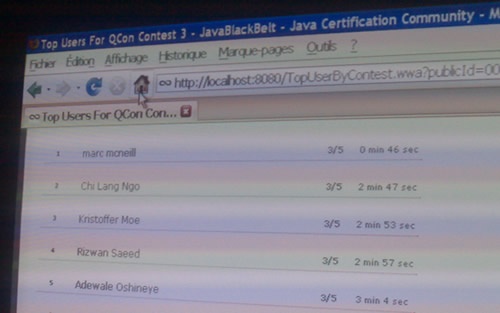
At the conference one of the vendors was JavaBlackBelt. They had a multiple choice test on your knowledge of Java. Some of my esteemed colleagues did not fair so well on it; my programming knowledge goes little beyond

10 print “hello world”
20 goto 10

So I am very proud to announce that I came top of the JavaBlackBelt class and won a t-shirt, scoring 3/5 in a little over 40 seconds, a cool 2 minutes faster than the second placed geek. Don’t you just love multiple choice.

Top of class java black belt programmer

How not to create an itinerary

ctrip UI makes no sense

Do you feel “quite the cheese?”

This doesn’t need much comment, other than the the page title “Leading online travel service in China…” If you want to be “leading” across markets, it is not sufficient to translate pages from the local language (“Fly total consume the hour”?!), nor assume your local processes are globally applicable – “Delivery city” when booking airline tickets?

Do you know who you are building for?

Senior management in both Tescos and Sainsburys have to spend some mandated time every year at the checkout in the stores. This keeps them in tune with what it is like to be at the front line. Taking them out of the realm of reports and documents and experiencing the reality of their strategy and decisions.

Becky Carroll recently posted a blog about looking through the eyes of others.

We need to get to know our customers, their wants and needs, their frustrations with us, and their raves about us. You need to see your company through the eyes of your customers.”

It shouldn’t just be the senior managers of supermarkets that do this. There should be no reason why the whole project team should not gain some sort of exposure to the people whose lives will be touched by the product they are building.

Creating personas and scenarios that everybody is familiar with is a start, but it is no substitute to seeing what really happens. It may not be feasible to let everyone on the team get out onto the shop floor, but how about videoing the users at work; a five minute video of traders on the trading floor, customers at the checkout, call centre reps on the phone. When new team members join a project don’t just give them a verbal briefing or a bunch of documentation to read, let them see what’s going on.

Why is this important? Because we carry the baggage of our experience, and that is not necessarily the best or most appropriate way to approach things. We may think we are doing something cool with the technology, but is it appropriate to our users? As an ergonomist my first impression when seeing traders with four screens in front of them is one of shock. Its information overload and a poor way to work. But in the context of use, watching traders in their environment, you understand why so many screens are important. Through observation I was able to change my perceptions to reflect reality rather than my preconceived opinions.
If marketers need to “see your company through the eyes of your customers”, IT professionals need to “see your product through the eyes of your users”.

Macro-tastic

It’s a remote control unit for a conference room phone. Slide the cover down and you’ve got 34 “macro” buttons. Why, why why? There maybe a functional requirement for user defined programmes (most likely one-touch dial), but did no one consider the context of usage? How people use conference phones?

A little insight would most probably have revealed that 34 macro buttons is overkill. Unless I am missing something “macro”, In the space allowed, far better to have a vertical column of 7 buttons with label space by each for users to write down the numbers they will call.

The worlds worst remote control

When do you need to design a UI?

Via Ian Cartwright  an interview with “Lean software gurus” Mary and Tom Poppendieck.  All is going well until  Mary says this:

When do you really need to design a user interface? Oftentimes it drives the whole design, but in fact you don’t really need it until you’re about to do your first alpha test. Before that you can be designing the business layer and you can actually put testing in below the user interface and you can be designing all of the other business logic; you can get that done with any kind of interface and in fact you ca drive testing with a automated interface, and then just before you go to alpha testing you decide what you want for your user interface. Then you take it off and at that point in time you figure it out. But up until that point in time you don’t need that.

This jars with my experience of building compelling customer experiences. There is a good reason why the user interface should drive the whole design because that is how the software is manifest.  To the people whose lives are to be touched by the software, the users, the consumers, the interface is the software.  To leave the UI till last presents a  huge risk of building software that is functionally rich but has a UI modelled around the features; the underlying data and logic rather than how the user wants to work.

Starting with the UI is an excellent way of capturing and communicating requirements.  And bakes in usability into the design.  You want this feature and that feature?  Great.  But will they be coherent and usable to the user?  Drawing out a UI  on paper – paper prototyping- is far more efficient that making assumptions about requirements on a list.  Afterall, isn’t this what the manufacturing industry that the Poppendiecks take thier inspiration from?  Don’t the car manufacturers start with CAD and move onto clay models?  Ergonomists have a hand in the design of car interiors, using anthropometrics to build in comfort and work out lines of sight.  The engineers don’t build the engine and the bodywork and then make decisions about how the car will look.  These things are designed from the start.  And so should it be with software.

When do you really need to design a user interface? It should be the first thing that you do.

Have you considered the consumer mind?

Some things that the development community take for granted as “bleedin’ obvious” are often far from it for the end consumer.

Cue a story.

I’ll protect his identity and call him Jack. Jack is 60 and has been using the internet for a while; He’s got broadband; he banks on line, buys books on Amazon, books cheap flights with easyjet and sold his car on eBay. He considers himself internet savvy.

Not so long ago a friend castigated Jack for using Internet Explorer as his browser, and downloaded Firefox for him. Jack loved the tabbed browsing. Jack was a happy chappy.

When I was in Hong Kong, Jack thought it would be good opportunity to try out the web camera he had never used. He had Instant Messenger, and pinged me asking me if we could have a video chat. We tried to connect but couldn’t. Messenger told me he had an old version of IM and should upgrade. Jack said he thought he’d already done this – I sent him the URL and left him to it. Five minutes later he pinged me that he’d installed the new version of IM. Great I thought. I tried to connect and got the same error message – Jack was still using an old version of IM. Maybe he needed to shut down his machine… Jack disappeared for a couple of minutes and came back on line. Still the old version. Hmmm. I asked Jack to try installing it again. He came back proud of definitely having definitely installed it. We tried to start a video call:

The Video Call failed because jack is using a version of Messenger that does not support this feature.

Hmmmmm.

So we went through all the steps that Jack was going through. It transpired that Jack was saving the file, but there was no call to action to actually launch it.

Firefox save dialog box

And there on Jacks desktop were eight saved versions of msgr8.exe.

Jack often wondered what these files on his desktop were, but assumed they were important (he hadn’t put them there, the system had) and didn’t want to open them, let alone delete them.

Was Jack’s mistake such a big one; to assume that “saving” a downloaded application was the same as installing it? In developer mind, probably. But in consumer mind? Clearly not.

We talk a lot about beginner mind / expert mind, shu ha ri… But thinking about Jack, there is another mind that needs to be considered. Consumer mind. Expert in the things I do everyday, clueless in anything beyond my immediate sphere of need or want.

This impatient monkey

I’m impatient.  I also expect technology to work.  When it doesn’t appear to be working, when I’m getting no feedback as to what is happening, I get frustrated.  I click-click-click the mouse button.  I hammer the enter key.  I repeatedly thump the keyboard.  “Work damn you!” I curse.

The technology was probably just creaking along, it may have got there in the end, but my hammering is the last straw, it breaks the application. Frozen out, frustration turns to user anger.

The developer tuts, “it’s your own fault” he says, “you broke it with your impatience”.  And that is why Dan North’s recent blog about Monkey Testing fills me with happiness.  Testing software for my monkey behaviour, so that it doesn’t break when I do things that I’m not supposed to do – because I am human.

Just because you can, doesn’t mean that you should

Following a recent Economist article, JP Rangaswami blogged about “can versus should“. His theme was around DRM and identity; just because the government can monitor your digital behaviour does not mean that they should. I like this, but think it can be extended to much of the IT domain.

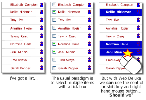
Web 2.0 introduces many new styles of interaction, drag and drop, take over the right-hand mouse button… just because we can do these things doesn’t necessarily mean that we should. What will the impact be? Hide calls to action behind the mouse button on your site and your site alone, how does the user know to find them there? When building a “deluxe web” site at the forefront of mind should be how will people actually interact with the proposition. Just because we can do some technically cool stuff that would give us a buzz and gain nods of appreciation from our technical colleagues, doesn’t mean that we should. A customer who has come to the proposition probably requires clarity and an ability to accomplish their goals. They care very little for the stuff we can do.

Multiple select on a list - check boxes or web deluxe take over the mouse?
And then there is mobile. Just because we can deliver the ability to enable customers to watch TV on their phones, doesn’t mean that we should. Too often new propositions are driven by IT ability rather than consumer demand. WAP was a great example of this; IT consultants getting excited about delivering content on mobile phones using WAP, completely overlooking what a shocking experience it was and simultaneously missing what consumers actually wanted to do – text message.

6 of 7
1234567