usability

The user journey

“Faster, slicker, easier to use.  That’s how we sold it to the business.”  It is a common theme, IT have a system that is costly to maintain, hard to extend, is on a dated platform and no longer fit for purpose.  The business are persuaded of the need for a replacement.

This is what happened at an organisation I recently visited.  But it didn’t quite go to plan.  A number of years later and they’ve got an application that is slower, uglier and harder to use.  What happened was the business intent was distilled into requirements (based upon the existing functionality).  Each requirement was captured as a control on a screen.  These were bundled up and sent to India for coding, and the developers went and built a bunch of screens.  They considered interface design but not interaction design.  They focussed upon technical processes rather than user journeys and the resultant deliverable was something that functionally ticked all the boxes (it did what the specifications said it should do) but was ultimately rejected by the people it was intended to help. The code may have been great but that meant little to the business who found the application a pig to use.  Another failed multi-million dollar IT project.

User interface design is more than just screen design, it is about the journey the user takes to accomplish their goals.  Remembering that could have saved this particular organisation a lot of money.

What’s your social strategy?

Last year Twitter grew by an incredible 752%. That is something too large to ignore. It’s not just individuals who are twittering, corporates are getting in on the act. But do they think before taking the plunge?

The tools for getting a social presence on the web are easy. Twitter is free, there’s little effort to setting up a blog, it is simple to plug in reviews and ratings with BazaarVoice. But with the tools comes commitment; you need to start listening and have a strategy for responding.

Listening

You can start listening by setting up Google News Alerts. You will be alerted whenever someone is talking about you (or your competitors, or anyone or anything you like). It can deliver alerts as a digest or as they happen. This gives you a fundamental tool to find out who is talking about you and where they are doing it.

Responding

Knowing people are talking about you is one thing, knowing what to do about it is another. Making a decision to start engaging in social media is the right thing to do, but with that decision comes responsibilities. This is where having a clearly thought-out strategy is essential.

The strategy starts with a role, someone responsible for the conversation. Jeremiah Owyang lists a number of oganisations who have a dedicated role for social computing and community management – Dell has a VP Communities & Conversations. This is not a PR role, it is not something that will have messages crafted by committee with formal sign-off before speaking. It is about having an authentic voice, speaking with honesty and personality. Using Twitter to broadcast your traditional press releases is more likely to alienate than win you friends and lovers (you want people to love your brand right?).

Your customers want to help

“But why?” is a question I’ve often heard asked when talking about social media. “Why would anyone want to comment, or write advice, or be bothered to ‘get social’ with us?” Good experiences and (especially) bad experiences bring out the passion in people. And then there are the people who just like to have their voice heard. There’s an often used ratio, 1:9:90 – for every one regular contributer there are 9 occasional contributers (commenter’s) and 90 ‘lurkers’ – see Jakob Neilsen’s post on this.

Even if they don’t engage in the conversation themselves, most people listen to the contributer – it is (usually) an authentic voice, and that authenticity is priceless. Word of mouth is more valuable than any advertising, it is by far the most trusted source for purchase ideas and information (funny how so many organisations when they ask that question, “how did you hear about us, they list their channels- TV, Radio, Press, but often leave out recommendation from a friend, or heard about you from an acquaintances, or even “I just know you”). The challenge is to harness the conversation that others are having and where appropriate engage in it in a natural and honest way.

Rather than questioning why someone wants to talk about your brand, or offer support to the community on your products for free, build a relationship with that person. They will feel all the better for being listened to. Invite them to customer panels, tell them about your ideas, and let them generate buzz about your product.

Some listening anecdotes

Here are three brief anecdotes of organisations who have started by listening and then engaged in conversation. To be contrasted with doing it the other way round.

A client we’ve been working with had been ignoring the conversation in technical forums. There was a wealth of discussion about issues with their hardware, fixes and work-arounds. Much of the comment, whilst positive about the brand overall, was negative about certain aspects of the product and customer service. They took the plunge and engaged in the conversation. A regular poster who was being particularly vocal (and getting a lot of response) was directly connected. His issue was simply addressed. He then posted to the forum how he had been listened to, and the negative experience was transformed into a positive experience. Inviting him to customer panels makes him feel even more valued.

A while back I posted about a negative experience with Norwich Union. I blogged about the experience – a few days later I had a comment from their Head of Customer Experience. I was listened to. NU had a face, we spoke and I will now sing the praises of Norwich Union (I’m still a customer). I’ve forgotten what the problem I has was all about.

Another blog was about a poor experience with the Fedex website. Their Application Development Team left a comment thanking me for the feedback, again I was listened to. This has erased the memory of the bad experience I had.

Speaking, not listening

I don’t know anything about confused.com internal operations, but my experience suggests the following. Someone suggested they get a Twitter account and they started tweeting. Only their tweets were for PR messages. They were not ready for inbound Tweets from customers about them.

I heard about confused.com from a friend as a good site to get a home insurance quote from. I tried it and had a far from satisfactory experience. I persevered (because of the personal recommendations) but after a bunch of techinical problems with the site I gave up.

I then actively sought out confused.com on Twitter, my thinking if they have an account I can give them my feedback direct (I am one of the 1 of the 1:9:90 who so many business people don’t understand. I also have almost 17 years of usability experience behind me which I would be happy to share with them – as a customer, not professionally). So I did a search for confused.com on Twitter and found them. I was pleased to see they had an account and wrote a tweet to @confused_com. But it seems twitter was just a mouth piece for their PR and all I was greeted with was silence. I heard nothing back.

I returned back to their website a few days later and tried again to get a quote, this time I had an even worse experience, the site failed to return any results to me. Again, I Twittered about it. I was creating some negative feedback, and feeling doubly annoyed. Not only was I having a crappy experience but they weren’t listening to me on a channel I expect to be heard. Now I am a small fish in the big ocean and easily ignored, but look at Motrin and you can see the consequences of not engaging in the Twitter conversation.

To their credit, Confused.com have recently sent me a private message on Twitter informing me they are going to start “more interactive twittering soon”. I look forward to that. If there is a lesson in this it is when getting onto Twitter you have to be ready to engage in the conversation that is likely to ensue.  Have a strategy before playing with the tools.

Do not click Stop or Reload

On the Fedex Shipment web application, in fine-print at the bottom of the page:

Please note: Click the Ship button only once. Expect some delay due to transmission time. Do not click Stop or Reload; it may cause a duplicate shipment transaction to occur.

This is frankly inexcusable.  If the form doesn’t appear to work, the user will inevitably click on the button more than once.  The code should accommodate this behaviour, not weasel out of it with small print. In developing the form there was an important acceptance or test case left out, that for monkey behaviour.

Where’s the call to action?

On logging in to your HSBC Hong Kong personal bank account the customer gets a brochureware spashpage promoting HSBC products (why no account summary?).  To access their accounts (the reason the customer has gone to the trouble of logging in) the primary call to action is in a box on the right hand side of the screen.  It’s the <Show> button next to gray-on-gray text “My Accounts”.   The strongest call to action is to the ‘new trading site’ Stock Xpress.  It’s a small point, but a call to action as important as account access should more prominent and be the focal point, not an easily missed button.

A new page

This blog was getting tired in its design so I’ve given it an overhaul, including introducing some widgets.  (What an awesome piece of software WordPress is).  I’ve also added a new page with a bunch of published papers.  some classics in there (if I do say so myself) such as “Heat stress in night clubs” and “Occupational disorders in Ghanaian Subsistence farmers” !!.  The rest of the dancingmango site was not built using wordpress, so to update it all in one go would be time consuming and of little value.  OK, so there is inconsistency across the site and as a UI guy that hurts, but it is one of the trade-offs that needs to be made.

Where are the missing floors?

Lift panel with numbers missing

It is fairly standard practice in Hong Kong for buildings to have no thirteenth or fourteenth floors. They are considered unlucky numbers. Not sure what happened to the first, second and fifth floor here. And back-to-front button numbering that is neither in the telephone format nor the phone format. There’s a couple of lessons to learn here; when designing human-technology interactions consider cultural norms and existing design stereotypes. (Sorry, its the Human Factors conditioning in me that notices such things).

CAPTCHA: a barrier to entry

When a customer starts completing an application or registration form it demonstrates they are committed. It therefore makes sense to pay attention to the usability of that form. But how often is the content of the form considered? Are there content barriers in the form that prevent customers from completing it?

Marcelo Calbucci (Via Luke Wroblewski) describes a barrier that everyone assumes just has to be there so it is not tested: The CAPTCHA. When the team removed the CAPTCHA from the Sampa.com registration form they recorded a 10% increase in conversion rates. Marcelo writes “we created a set of tests and rules that will make us not display a CAPTCHA about 99% of the time” (interestingly when I looked at the page I got the CAPTCHA). A 10% increase in conversion is not insignificant, and probably more than outweighs the additional effort to implement an alternative solution.

What the customer wants

I’m a strong proponent of engaging the customer in all stages of the design process. But sometimes you need to be careful with what they say and not always believe their first answer.

Ask the customer “what do you want” and the chances are you will get an answer that is rooted in their experiences and expectations. Not what they really want.

I want an intranet portal“.

No, you don’t. You want a place where your employees can share files and documents.

I want a google search appliance“.

No you don’t. You want to be able to find documents quickly and efficiently.

Worse is when vendors try and force products onto the customer…

You want an integrated BI toolset“.

No they don’t. What they really want is to be able to pull some specific data from a legacy application into an excel spreadsheet and insert a graph into a word document.

OK, so it is easy to say that, but how to follow though? How do you actually get the customer to create a vision of what they really want? Well I’d start by not asking them that question. Get them to articulate what their goals are. Then try to understand in what context they will try to accomplish those goals? Think in terms of customer journeys and value outcomes over features. Think about the what, not the how. Start with the “to-be” vision rather than dwelling in the “as-is” quagmire, indeed use a system obituary to kill the as-is thinking. Use visual tools to model your ideas. And don’t get bogged down in detail.

I’ll write more about this in the future…

Real world forms

In the real world, when I get an application form I’ll flick through the pages and have a look at what is required. I can choose which fields I complete in whatever order I like. If I want to take a break half way through I can. I can complete it when I like and how I like.

So why aren’t web forms like that?

The usual format for a web form starts with some copy that describes the form (which people skim through at best). The user clicks to the next page and the form commences. There may be a step indicator showing progress through the form, but almost certainly progress through it will be linear. You have to complete each page before progressing to the next. If you are lucky you’ll be able to click to previous completed steps. But the experience is nothing like a real-world form. And when was the last time a real-world paper form “timed out” half way through, demanding the user to start over again if they left it idle for ten minutes?

The web forms we see today are a relic of their tecnological past. There is no reason why they must be linear, (and if there is logic in the form, there is no reason why the user can’t explore the different routes – you do that with a paper based form). There is no reason why the user can’t click to whatever page in the process they like (just like with the paper form). There is no reason why a page must be completed before progressing to the next. There is no reason why the form should time out and forget everything the user has entered. Fields can be saved as they are completed against an anonymous user, until the user wants to provide personal credentials.

Bottom line – the web has moved on. Instead of reflecting technical constraints of yesterday, it can adopt more real-world metaphors. But do we have the courage to start introducing new paradigms? Are users, information architects and usability experts so ingrained with broken web metaphors that they will shun a new model, (a real world model) of completing a form?

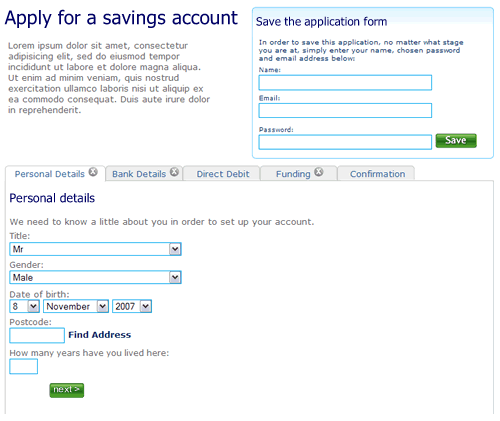
So here’s a rough example. It’s an application form for a savings account. Ignore the content, field labels etc, it is more the model that is illustrated.

1. The user can move between the sections (tabs) to see the fields that are required. There is clear feedback on each tab that it has not been completed. The “Direct Debit” section is optional hence no indicator. The ability to save the application is seperate.

Application form, step 1, nothing filled out

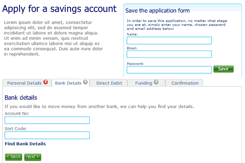
2. The user selects “Bank details”. They’ve not filled out all the fields on the first tab “Personal details”, but it doesn’t matter. There is clear feedback that this tab is yet to be completed.

Second tab on the application form, the first tab has not been completed

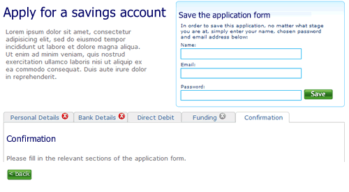
3. The user clicks right through to the confirmation tab. There is nothing to confirm so the page remains blank, with a prompt to fill out other sections.

Step 3 of the application form

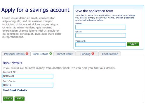
4. When sections are completed the indicator on the tab changes to show completion. Here the user has completed step two ahead of step one.

almost there

5. Finally, when all sections are completed the user can review the entire form.

Confirmation screen

I’m not saying this is perfect, it’s a start. A start to re-thinking the way we design forms on the web and think about modelling them on real world behaviour instead of technical constraints of the past.

Will corporate websites remain spotty teenagers or will they grow up to be beautiful?

In the corporate webspace most design is little more than mediocre. Interaction design has changed little since coporations first realised that this is a channel thery should exploit. Web 2.0 is slowly making in-roads with basic use of Ajax functionality, but there is nothing that is really breaking the mould. Despite its infancy (for most organisations ‘e’ is barely 10 years old, Amazon, the granddaddy of eBuisiness is only 13, born in 1995), conservatism rules; the corporate web is just not growing up. It would be easy to blame the technologists for being risk adverse- for having invested in architectures and frameworks that do not allow innovation. REST and all that declarative goodness may be great, but of little interst if you have invested in a propiertary framework that does not support it. But the business is also responsible for tardy innovation.

It doesn’t know what is possible. A miss-understanding of accesibility clobbers rich interactions; “no javascript” becomes the mantra, despite the guidance being “provide alternatives” and progressive enhancements making basic and rich interactions possible with the same code. And maybe as usability testing becomes the norm, and testing concepts with consumers throughout the product lifecycle is baked into the process, this is acutally the final nail in the creative coffin. Let me explain.

When you are developing new features or propositions it is only right that you should conduct market research, talk to your customers and get feedback to refine your ideas. But sometimes you need to ignore what you are being told and challenge the perceived wisdom. Imagine the scenario; you are developing a social networking site. You recruit a bunch of consumers to participate in user testing sessions. They match the socio-demographic profile of your target audience, they use the internet more than five hours a week. You let them loose on your concept boards and prototype. They like what they see, they like the blogs… but commenting? The feedback is that none of them would leave comments. So what do you do? Kill the commenting on the basis that the users who matched your “average” profile would not use this feature.

I’m not saying that if you are building a conventional, transactional experience; a retail shop, a financial services provider, you should not test the proposition with users that match the target profile. But beware that they will steer your thinking into the realm of the ordinary, the expected and the average. Try testing it with trend setters, gamers, teens, mybe even anti-personas to push the boundries and harvest real innovation insights.

And maybe testing the proposition is not needed at all. But don’t leave the design to the comittee or the accountants. Sometimes it is more important to have a real visionary driving the product development. Apple is a great example of this, no more so than with the iPhone bounce. When you scroll down a list, when you come to the end, the last item “bounces”. Where’s the “business value” in this? Isn’t this gold plating in the extreme? The development of this bounce will not have been for free, it will have come at a cost. This could have been a financial (more development effort) it could have been at the expense of another feature, or it could have been time. In most organisations this would not get get through the design by commitee. Apple can do such great things with their UI because they’ve got a visionary at the helm who understands the importance of good design and is passionate about it, and their customers become to expect it.

3 of 7
1234567