So you are designing a form…
You don’t need a book full of patterns to tell you how to do it, just take a look at this excellent presentation by Luke Wroblewski.
You don’t need a book full of patterns to tell you how to do it, just take a look at this excellent presentation by Luke Wroblewski.
How do you test the usability of the software you’ve built? At one end of the scale you could run full usability tests with a sample of users, given them a scenario and let them loose, trying to realise pre-set goals. On the other you could do guerrilla usability testing, just grabbing people and informally doing a usability test at your desk. You could get the experts in to do a usability review. They’ll typically use a bunch of usability heuristics and provide you with a report critiquing the application against the heuristics. But what if you don’t have the budget for usability testing, can’t get hold of any representative users, don’t want to wait for some experts report? How about playing “let’s pretend”? Remember playing doctors and nurses as a child? Well do it again, only this time be Users and Computers. And you’ve got the role of the user.
Create a persona, a pen portrait of your customer. Think in your mind how they act, behave. Maybe you know someone like them, seen someone like them in the supermarket. Now ask yourself some quetions:
How do they behave in their daily interactions with others?
What does their life look like?
What experience do they have with using computers, with using products like yours? How much time have they got? How are they feeling?
Why are they using your product?
Spend a few minutes internalising the persona.
Now turn to your application and imagine you are the persona, using it for the first time. Give yourself a task to complete (make sure the task is something real that your persona would look to achieve, not a goal you think the application will help him achieve – there is a subtle difference). Try and forget all you know about the application (easier said then done) and be the novice user. Walk through the process, speaking aloud (in your head will do). Focus upon I not “the user”.
“I’m looking for this, I’m looking for that. I do this, I do that”. I can’t find this; I don’t think that makes sense”
I want to check my balance. Hmmmm, there are three “balances” here; I’m not a banker, what’s the difference between Running balance and Cleared balance?
I owe my mate some money for the golf holiday, he’s given me his bank account details, I want to transfer some money into his account… huh? I can’t do that. What do I do? Pay a bill? He’s not really a Bill is he… Etc etc.
You don’t need heuristics for this – many of issues the heuristics would help uncover should come out using this method anyway (speed, ease of navigation, speak users language etc). If your persona is having difficulty you can probably multiple the usability issues for a real user.
This approach works for a quick and dirty review of an application’s usability. And if you document your experience make sure you preface it with a description of your approach. Someone who is close to the development of the application, reading your first person critique, is rightly likely to think you are an arrogant so and so. I speak from experience.
Conventional approaches to building software applications start with a Big Idea. Someone needs (to define an application) “a program that gives a computer instructions that provide the user with tools to accomplish a task“.
Someone picks up the big idea and breaks it down into a smaller list of “requirements”, things that the application must do to fulfil the Big Idea. In conventional waterfall development Business Analysts will spend a while documenting the list of requirements in some detail – in agile approaches they will do it as they go in a far more “lightweight” manner. Maybe a technical architect will draw up a blueprint design of the solution. Regardless, soon the developers will start writing code. With either agile or waterfall the user interface usually only starts to emerge at this stage. Until then, everything is coded in words (and maybe some boxes and arrows showing flow). Only late in the process does the UI emerge.
Returning to that definition of an application, IT development seems to spend most of its time in the “a program that gives a computer instructions” world, and often looses sight of “provid[ing] the user with tools to accomplish a task”.
How about a different focus. Start with the user interface. Take the Big Idea and illustrate it. Draw pictures of what the tools will look like, how the user will interact with them. Sketch storyboards, wireframes, lo-fi prototypes, paper mock-ups, call them what you will. Use this as the primary requirements document, supported by explanatory text and detail where we required. These may be stories or use cases, but let the visual representation of the big idea drive the requirements rather than it being almost an afterthought. Start with the UI and specify the functionality from that rather than the other way round. After all, it will be the UI that the user uses to accomplish their task, not the computer instructions.
What a cool tool Firebug is. It lets you get under the covers of web pages, to see what is going on. One feature is the ability to measure the page size and that of individual components on the page. This blog post comes in at 294kb. If I think back to the early days, that number would make me shiver. In the days of 56k dial up a page that size could take more than a minute to download. Things are different now. In the UK Broadband penetration is now greater than 72% (source [xls]) and the page appears almost instantaneously.
So do we still need to optimise our pages for size and speed of download? Having run hundreds of usability sessions, the key gripe of the web used to be speed – slow download times could effectively kill a proposition. But that’s not such an issue with a fat connection. Not unless it’s a hollywood movie you are downloading…
But what about the remaining 30% who still use dial-up – that is not an insignificant minority to exclude. I assume that people who read this blog are more likely to be using a fast connection, so I don’t feel I am excluding anyone there. But as large pages become acceptable, with rich content and streaming media, should we spare a thought for the dwindling dial-uppers?
I was recently working with a financial services client, rationalising their systems to have a “single view of the customer”. This demanded a single user interface rather than the 13 or so current UIs that they use in their daily business. As we were coming up with ideas one of the consumers of the new system showed us an old system – “make it look like this” she said, “that’s what we want”.
My initial reaction to a screen like that is a nervous twitch. Eugchhhhhhhh!! Hold my breath. Count to ten. Repeat the mantra “RANA”. Relax, be Aware, be Non-judgemental, and Allow… RANA, RANA, RANA.
OK.
So when a customer asks you for something that in your gut feels wrong; if it feels wrong, it might just be wrong. The challenge is to get the customer to feel your feeling. Do not to just do as the customer says but probe and question and ask why.
This UI was built by developers to manifest data from the database. Not something we wanted to repeat. So we started by asking what is it about that UI that she likes? Some gentle probing uncovers that she likes the ability to have everything in one place. She can rapidly perform searches and see the results in the same place. Taking this as our cue, we probed what information on the screen was important to her and what was not – in the context of her usage. If we took each individual field one by one and asked “is this important”, she would answer “yes”. By asking about frequency of use, criticality and importance we were able to discount most of the fields. At the same time we were able to identify a number of fields that were critical and frequently used, but not displayed on this screen. We soon had a framework for a new search / results screen. Then we broached implementation.
Talk of a browser based solution filled her with fear and loathing. She perceived this to mean having to enter a search criterion, and then wait for the page to refresh / results to return. She’d experienced this with other applications and did not want to go there again. She was pointing at the Fugly screen again. “Build me that” she says, pointing at the screen shot. Yes but….
In an enterprise solution, performance, speed and accuracy are the most important criteria. Yet the Web 1.0 paradigm of query – response via a refreshed page is just not fit for purpose. AJAX overcomes this. She could have her cake an eat it.
The result was nothing like what the customer had asked for. We’d listened to her (and others like her) and probed her on her goals. We used scenarios to talk through the context of usage and came up with something that was fit for purpose and IMHO delighted her. The take away is this. Don’t always believe what the customer says, often they are constrained by their narrow view of the world and their current reality. If we are doing our jobs properly we are opening them up to the art of the possible. To a new reality a world apart.
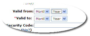
To my knowledge, all credit cards present their “valid from” and “expiry dates” as numerical dates, e.g. 02/06 – 02/09. So why do many transactional websites request the credit card validity in text date format, e.g. Feb 06? Most people will not know their credit card details – they arrive at the credit card details form, reach into their wallet, select the relevent card and work through the form referring to the card that they have placed near the keyboard. When they reach the date fields, additional cognitive processing is required, translating the number on the card to a month on the form. This interupts the process (do not assume that everybody can make the immediate leap from 02 to February. Spend time observing consumers on the task and it will not be long before you see fingers coming out to help with the counting).
So whilst using textual dates may be considered to be more “user friendly” and understandable, in the context of completing the credit card form, it adds complexity. UI guidelines, patterns, heuristics are all well and good, but ultimately you must consider the context of usage and design accordingly, even if it does at first glance result in something that is not immediately user friendly.
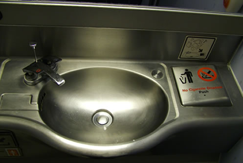
Washing your hands is a two handed affair involving a pair of hands, soap and water. There are instructions on how to do it properly. I’ve not done any research on it, but my gut feel is that most people wet and rinse their hands under a running tap (faucet). With this presumption, the Boeing airline toilet wash area is not fit for purpose. I adapt my behaviour to suit the technology. I press the hot and cold buttons down with my thumbs and attempt to rinse the rest of my hands under the running water. I could fill the bowl up, but (a) that is not my habitual behaviour; (b) wouldn’t that mean rinsing in dirty water and (c) those bowls are not always the cleanest of things anyway.
Seems like the design on the airline faucet was an engineering solution to an engineering problem. You don’t want to have the tap left running. So let’s make it really difficult to use. Let’s demand our users have to learn a new technique to use it. If the designers had considered the human factor, the design would probably be quite different. If they’d prototyped and user-tested the design they would have seen that it was sub-optimal.
Yet it is easy to criticise. (There is one good thing about it, it is clear which is hot and cold – assuming you know that red = hot and blue = cold). How could it be better? Maybe a foot control or infra-red sensor. But inevitably such solutions are costly to implement and costly to maintain. Why not a spring-loaded press button that gives a timed flow of water (not fail safe?) In designing solutions there are always trade-offs and compromises and maybe other more user friendly options were considered but discounted on the grounds of cost to implement or maintain. And as a customer in coach, a little hassle in washing my hands is an acceptable price to pay. But that is not going to stop me grumbling every time I struggle with the tap on the plane. (Oh dear, am I sounding rather obsessed?)

OK, so not the finest photo in the world, but it is the innovation that is important. Problem: crown-caps on bottles require bottle openers. No bottle opener = improvisation = damaged furniture / cutlery / hand / teeth. And here’s an elegent solution, a ring-pull crown-cap. Same bottle experience only easier to access. Nice.
A ward clerk who organised admissions and discharges went sick for a few weeks. In her absence, the nursing staff who took over selected the first options that popped up on the computer screen. The result was that most patients were entered on the system as both deceased and discharged. [source]
This is inexcusable. How hard can it be to design an interface for frequently used tasks such as discharging patients or recording them as dead? Some informal usability testing with novice users would have demonstrated that the UI could not be used by novices. The mistake is dressed up as a lack of training- “Patients sent home from a hospital were wrongly recorded as dead when a group of nurses was asked to use a new IT system without receiving appropriate training”. Training?! Rubbish. You shouldn’t need training on a UI designed to check patients in and out. How difficult can that be? If they’d invested a little time in usability testing, and designing a usable UI, training, and costly mistakes would be all but eliminated. But the rush was probably just to get the software out of the door – to meet the functional requirements rather than the contextual and operational needs of the end users and the realities in which software will be used in.
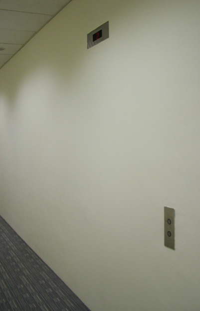
The story goes that when the building was built, the organisation taking the top floor demanded their own lift that would not stop at any other floor. They got their wish. Entrances to the lift shaft were blocked off on every floor except the ground and top floor. End of story? Not quite. The floor indicator and call buttons were installed on every floor.
Do you build invisible lift openings when you build software? Install buttons and indicators in the anticipation that they might one day be needed. (Ignoring the fact these are mere details hiding the bigger picture… doors for example). This is a good example of YAGNI, you ain’t gonna need it. You don’t need a lift floor indicator and call button until you’ve got an opening to the shaft and doors. And when you need those lift technology will probably have moved on and the buttons and indicators will be all but obsolete.