Are you missing a trick?
…by giving out blank USB memory sticks with your logo down the side but not filling them with any brochureware or marketing materials inside?
…by giving out blank USB memory sticks with your logo down the side but not filling them with any brochureware or marketing materials inside?
In the recent copy of the Hong Kong British Chamber of Commerce magazine there is an interview with Fergal Murray, the Master Brewer for Guinness. He is asked “what do you think it is that makes Guinness so distinctive?” He replies,
I think there are a number of elements. From the brewers point of view, we want you to have a great all round experience. We don’t just want you to have a beer that’s refreshing, we want you to have an experience, to go through the ritual and theatre of emptying that glass. We want there to be a visual impact as well, it has to look fantastic. Finally, there’s a lot of flavour…
And you thought you were buying a pint of the Black Stuff because it was refreshing and tastes good. Yet for the Master Brewer these are bottom of the pile. Most important is the experience.
This is something that is missing in much software development. There are very few master brewers who go beyond just satisfying their customers with features and functionality, to focus upon delivering “a great all round experience”. To turn the mediocre and mundane into theatre. Like Apple have done with the iPhone. Like Guinness do with their stout. Yet something gets lost as you move away from the strategic owners of the Brand, to those responsible for tactical implementations. And this loss can obviously be costly. If the Guinness Master Brewer was only responsible for a drink that is an acquired taste, would it still be the sixth top ranked global Beer brand?
I’m a strong proponent of engaging the customer in all stages of the design process. But sometimes you need to be careful with what they say and not always believe their first answer.
Ask the customer “what do you want” and the chances are you will get an answer that is rooted in their experiences and expectations. Not what they really want.
“I want an intranet portal“.
No, you don’t. You want a place where your employees can share files and documents.
“I want a google search appliance“.
No you don’t. You want to be able to find documents quickly and efficiently.
Worse is when vendors try and force products onto the customer…
“You want an integrated BI toolset“.
No they don’t. What they really want is to be able to pull some specific data from a legacy application into an excel spreadsheet and insert a graph into a word document.
OK, so it is easy to say that, but how to follow though? How do you actually get the customer to create a vision of what they really want? Well I’d start by not asking them that question. Get them to articulate what their goals are. Then try to understand in what context they will try to accomplish those goals? Think in terms of customer journeys and value outcomes over features. Think about the what, not the how. Start with the “to-be” vision rather than dwelling in the “as-is” quagmire, indeed use a system obituary to kill the as-is thinking. Use visual tools to model your ideas. And don’t get bogged down in detail.
I’ll write more about this in the future…
I’ve only thought of blogging about Lois Vuitton once before and that was on how they positively encourage queueing outside their stores during busy periods. It’s a pretty strong brand that can tell its customer to hang about before being allowed to come in and shop.
This time I’m not blogging about them in a positive light, and nor are many others. Jeremiah Owyang describes the situation they are in well. Their brand has been hijacked by Nadia Plesner, an artist trying to raise awareness about Darfur and how the media considers Paris Hilton with her “designer bags and ugly dogs” to be more worthy of attention than genocide in Darfur. She uses an image of a LV bag in her T-shirts. LV take offence and sue, she refuses to budge and suddenly the image, the issue and LV all hit the spot-light. And in this David and Goliath contest, who is going to come out worst? There can only be one looser.
So why didn’t LV just ignore it, or even as Jeremiah suggests, harness the issue, turn it into a conversation that would paint them in a good light? I’ll argue that it is because they don’t understand risk.
There was always a risk to the brand be de-valued by being associated by asociation with Dafur. And this is what the marketing and legal team jumped on with such zeal. Did no-one think about the risk to the brand of turning this into the issue it has become on the web? Laying out the options and doing a risk analysis would have been a worthy exercise.
Option 1. Assess the global impact of nadia plesner, assume it is minimal and do nothing. Risk to brand: minimal.
Option 2. Follow standard route of brand defamation and sue. Ignore association with ‘good cause’, ignore blogosphere. Risk to brand: potentially significant.
Sadly, it seems that LV ignored the whole concept of risk and went with the default option – sue. They are not alone in failing to assess the risks properly before pursuing a course of action. In IT this approach is endemic. Where is the greater risk? Placing all your eggs in one basket, investing heavily in a desired outcome that will be many months before it sees the light of day. Or take a more gradual approach, investing ‘just enough’ to get ‘just enough’, ‘just in time’. The latter approach is lean and agile. A good agile project is a lesson in risk management, building resillience into the process and testing options as you go. It is organic and evolutionary, (rather like nature), as opposed to the plan and control approach of waterfall which is brittle and will struggle to react to or accommodate risk appropriately. I should write more but there is a day’s work ahead.
This is nothing new, but there are still people out there to whom Web 2.0 is a bit of a mystery. What exactly is it, and more to the point, should our business care about this stuff? Or, as I have heard senior executives argue, is it just another bubble, a distraction to let others waste their time, effort and money on. In an attempt to challenge this assumption, I’ve used a model with a few sceptical clients to hang some structure on. This is central to the below presentation that I’ve given to a few financial services organisations. It discusses what Web 2.0 is, and towards the end describes what it could mean for their on-line retail bank website. (Thanks to Duncan Cragg and Prashant Gandhi for some insights).
[slideshare id=377944&doc=web20public-1209431680446543-9&w=425]
Imagine an investment bank, a trader has a requirement for a tool to screen stocks. The requirement is to select stocks based upon different parameters, so for example find companies with a market capitalisation between a selected range, and a P/E ratio, Dividend Yield and Net Profit Margin between other selected ranges. And maybe the ability to add additional parameters.
Typically the process will be for these requirements to be captured by the Business Analyst who acts as the conduit to the development team. Nowhere is the user interface explicitly referenced – it will almost certainly be articulated in the reality of the current systems; what the BA knows and understands. Despite the iterface being delivered through a browser, the developers are not web developers. Inevitably the finished product will be functionally correct, it meets the requirements, but it will be clunky: select parameters > search > results… because it reflects the requirements as the trader put them “I want to do this and this and this, press a button and get a list back“.
So what are the chances of an internally developed investment bank application looking like Google finance’s Stock Screener? And what would your trader rather have?
Someone from the Barclaycard research centre rang me today doing some customer research. It is great to know they take the customer experience seriously – many of the questions were around my experience with the brand. But then they dropped this corker, not once, but twice.
To what extent do your other credit card providers offer innovative products
How important is it to you that your credit card provider offers innovative products
How on earth did those questions get through and on to the list? What is an “innovative product” when talking about credit cards or financial services? What is an “innovative product” to Joe Public? Maybe I can relate to an iPhone as such, but my credit card? Product innovation is hardly something that you or I consider when we pull a credit card out of the wallet.
“Innovative products” are something that marketeers talk about, they are not in the credit card users lexicon.
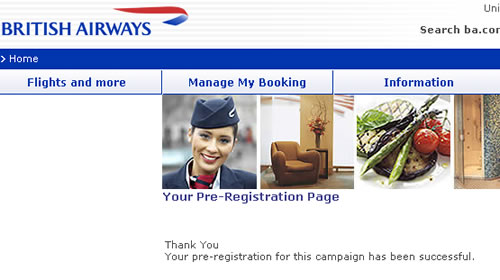
Marketing may be a touchy-feely occupation, but the language that marketeers use is far from it. Campaigns, strategy, tactics, targets… all out of the military handbook. That might be OK within the organisation, but it shouldn’t be exposed to your customers. An email sent by BA inviting customers to register to a special deal results in a page informing the customer; “Thank You, [name] Your pre-registration for this campaign has been successful”. Now what is that all about? They’ve spent so much time creating the campaign, how it fits into their overall strategy that they’ve overlooked the details around what really matters – fullfillment, wording and how the customer feels about BA at the end of the process. I feel a little cooler than when I clicked on the promotion.
Today is one of those days. A meeting in Zhuhai at 11am. Take the 08:40 ferry from Hong Kong, no problem. I’d researched the ferry times, got to the ferry port with loads of time to spare and went up to the ticket counter. “Ticket to Zhuhai please”. Suddenly there was an earlier 8am ferry leaving in five minutes, if I run I could catch it. “You’re sure this goes to Zhu…” I started to ask, but the man behind the counter cut me off. “Yes it goes to zhunzen, now hurry!” but I didn’t hear him correctly, I was focussed on a boat leaving earlier than expected, and that would definitely get me to my meeting on time. Communication Breakdown. It was only as the ferry left Hong Kong and turned right rather than left I realised my mistake. I was on the boat to Shenzen.
But that is not the purpose of this post. Arriving in China, when going through passport control, under the glass window there is a little box with three buttons on it, inviting you to rate your experience – green for perfect, yellow for satisfactory and red for unsatisfactory. Capturing customer feedback at the time of the experience. Howe much more valuable is that than asking customers to complete a lengthy questionnaire some time later, after the event. I think that websites could learn from this. Rather than a pop-up inviting customers to complete a questionnaire of a number of pages (often this appears just as you start your experience at the site), why not get customers to “rate this page” or “rate your experience” as a simple thumbs up or down (as you might Digg comments). This will provide instant feedback, maybe not qualitative, but quick and simple quantative data.
And if I had the ability to rate today? Right now, as I sit in a dingy cafe waiting the two hours for the next ferry back to Hong Kong, with a rapidly flattening laptop battery, I’d have to press the thumbs down, unsatisfactory red light on my current experience.
In the real world, when I get an application form I’ll flick through the pages and have a look at what is required. I can choose which fields I complete in whatever order I like. If I want to take a break half way through I can. I can complete it when I like and how I like.
So why aren’t web forms like that?
The usual format for a web form starts with some copy that describes the form (which people skim through at best). The user clicks to the next page and the form commences. There may be a step indicator showing progress through the form, but almost certainly progress through it will be linear. You have to complete each page before progressing to the next. If you are lucky you’ll be able to click to previous completed steps. But the experience is nothing like a real-world form. And when was the last time a real-world paper form “timed out” half way through, demanding the user to start over again if they left it idle for ten minutes?
The web forms we see today are a relic of their tecnological past. There is no reason why they must be linear, (and if there is logic in the form, there is no reason why the user can’t explore the different routes – you do that with a paper based form). There is no reason why the user can’t click to whatever page in the process they like (just like with the paper form). There is no reason why a page must be completed before progressing to the next. There is no reason why the form should time out and forget everything the user has entered. Fields can be saved as they are completed against an anonymous user, until the user wants to provide personal credentials.
Bottom line – the web has moved on. Instead of reflecting technical constraints of yesterday, it can adopt more real-world metaphors. But do we have the courage to start introducing new paradigms? Are users, information architects and usability experts so ingrained with broken web metaphors that they will shun a new model, (a real world model) of completing a form?
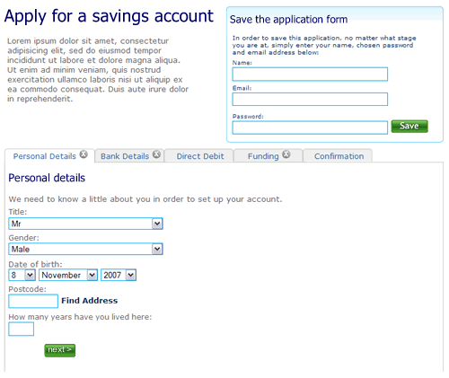
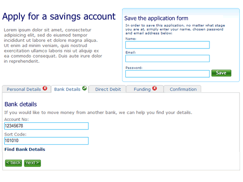
So here’s a rough example. It’s an application form for a savings account. Ignore the content, field labels etc, it is more the model that is illustrated.
1. The user can move between the sections (tabs) to see the fields that are required. There is clear feedback on each tab that it has not been completed. The “Direct Debit” section is optional hence no indicator. The ability to save the application is seperate.
—
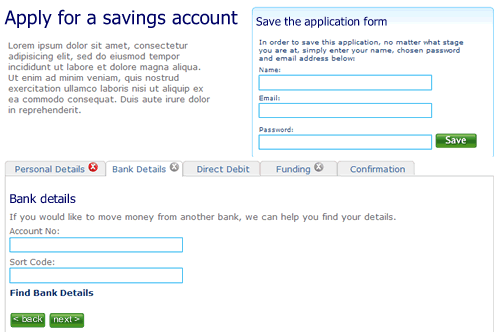
2. The user selects “Bank details”. They’ve not filled out all the fields on the first tab “Personal details”, but it doesn’t matter. There is clear feedback that this tab is yet to be completed.
—
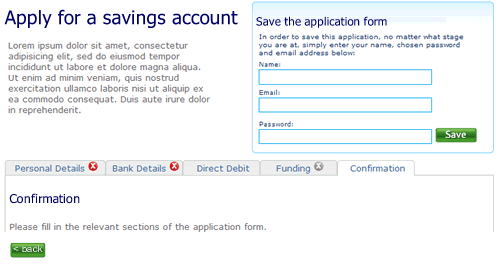
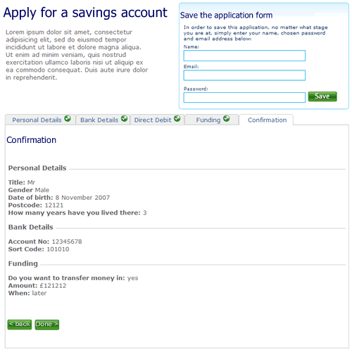
3. The user clicks right through to the confirmation tab. There is nothing to confirm so the page remains blank, with a prompt to fill out other sections.
—
4. When sections are completed the indicator on the tab changes to show completion. Here the user has completed step two ahead of step one.
—
5. Finally, when all sections are completed the user can review the entire form.
I’m not saying this is perfect, it’s a start. A start to re-thinking the way we design forms on the web and think about modelling them on real world behaviour instead of technical constraints of the past.