Web design

Blue is the colour. The website isn’t the game.

So I may support Chelsea on the pitch, but on their website? Oh dear me. It’s as though they got someone who has just learnt flash to build it – to use as many flash animations as possible. And any website designer that incorporates a link on their splash page (why oh why a splash page) that says “check out the site demo” and a first message “learn how to navigate through ChelseaFC.com” needs to be questioned. Learn how to navigate a web site? Oh please!

The nature of football fans is their brand loyalty, but to give them something that visibly takes time to load (page loading status bar), requires instructions to learn how to use, and doesn’t make things easy – support me achieve my goals – is frankly insulting.

Oh, and they’ve got a text only version (the CFC Flash website isn’t going to win awards for accesibility so one can only presume this is the only reason it is provided) but the splashpage requires JavaScript to load up, so no JS and no website, regardless of any text-only goodness that may be there. So not an accesible website then.
Meanwhile the community stuff that supporters care about (beyond the news and match reports, it’s probably going to be the most sticky content) is a seperate site that looks like it was built in the early days of the web. I mean, who uses frames anymore.

Sorry Chels, poor show. Your league status doesn’t extend to your on-line prescence.

Going pre-technical

Developers who no longer code refer to themselves as going “post-technical”.  I’m never sure if this is a badge of honour or not.  For someone who is pretty non-technical, I am delighted to announce that I’ve gone “pre-technical”.  I’ve got an apache web server running on my local machine with a mySQL server all courtesy of the delightfully simple Apache Friends XAMPP.  In only a few minutes I had it up and running (and after an internet basics 101 with Dan North) and a couple of clicks I’d installed WordPress on my laptop.   I can now play around with different designs and start making this website exhibit the sort of production values that I strive for with clients. 

What’s the value in changing colour?

As a registered user, I want to change the colour scheme on the web site so that…

Where’s the value in this story? Agile focuses upon business value, and in doing so it commoditise features. The sponsors of the development are invited to prioritise features based on their “business value”. This means that seemingly pointless gimmicks will slip out. And this may impact the overall experience that the sponsors strive for. Yet by commoditising features the sponsor sees how the costs break down. To have functionality that changes the colour of the site will require effort. It’s not going to come for free. And that means that either scope will increase resulting in either increased cost or increased time. The challenge is when you have a sponsor who knows just a little: “changing colour? Pah! That’s a bit of JavaScript and changes to the stylesheet. I could get the code on hotscripts and knock it up in front of the telly tonight…

And of the requirement to change colour on a site, in fact that whole customisation thing? Until recently I’ve never seen the value of it. After all, how many people have you seen with a personalised theme on their windows desktop, or even just changing the desktop background? One reason people don’t do this is because they are lazy. The call to action to change it is hidden behind a right click, and it’s not exactly straight forward to do. But there’s a bunch of new sites that challenge the user’s laziness. These seemingly pointless customisation features are part of the overall experience. And they work. And by doing that, they add value to the site.

Imagine a customer journey…

Imagine.

I go into a store and a salesperson helpfully shows me the product, but I’m not yet ready to commit. She offers me a great deal, I’m tempted, but I want to check it out on the web. She says “great!” scans the products and prints me of a personal card with a short unique identifier and a unique website URL. I search the competitors, the salesperson was right, she was offering me a really good deal. So I got to their online shop and enter the URL and there is the tailored deal that the salesperson told me about. It has even got her name on it (so I know he’s going to get some credit for the sale). I get through to the checkout screen. I enter my personal details and I’m just about to buy, but I’ve got a question about the terms and conditions so I take a pause in filling out the form. There’s a number on the website and I get through to the call centre. I don’t have broadband so I loose my connection. The voice at the end of the phone knows who I am and where I am up to. I’m ready to commit… but she apologises, she doesn’t have any in stock. I’ll have to wait seven days. But I could pick it up from the store tomorrow if I want (or even a store close to where I work) or I can get the store to deliver if that would be more convenient. I’m delighted. The next day I go to the store and it is waiting to me. The sales person smiles. She didn’t take my money, but she ultimately made the sale and she’ll be rewarded for it.

Fantasy? It shouldn’t be. Thinking in terms of the customer experience and the customer journey is only the first baby step. The giant leap is to get IT bought into it and implement a solution that is not going to cost the earth and take years to (not) deliver.

And that’s where ThoughtWorks comes in. We thrive on getting everybody together and using creative, collaborative and highly visual techniques we quickly get everybody to consensus on the vision we want to move forward on. Because we are an IT company, we understand the opportunities and constraints with technology. But most importantly because we use lean and agile techniques to delivering technical solutions we are responsive to change, flexible with emerging requirements and can focus on getting things done – the baby steps – whilst working towards the giant leap that will win lifetime value for customers. Hmmmm. That’s beginning to sound like marketing blurb.

Ditch the feature shopping list. Think customer journeys.

Let’s imagine a mobile phone provider that that has an on-line presence as well as a high street retail network. Their current website was built several years back on legacy technology; it is slow and has a conversion rate lower than industry norms. Along with having poor usability, the current shopping cart functionality does not support the concurrent usage figures that are hitting the site. The business takes the output from their web metrics and throw these at IT and demand improvements. And a new IT project is born. Rebuild the existing site on a new platform. They get a design agency to handle the look and feel. The functional requirements are built upon the existing functionality and chunked into functional silos:

  • Content managed brochureware site
  • Phone selection
  • Tariff selection
  • Shopping cart
  • Order management

A typical project process. That is flawed. It is starting with a functional premise. An alternative is to think in terms of the customer and customer journeys.

We can start by asking who the customers are. Almost certainly the marketing department has a customer segmentation model – this is a good place to start. That may give us basic attitudinal and behavioural details on customers, but we need richer data. How do customers shop for phones? So we go and spend time in the stores and observe how people buy them. It soon becomes clear that the choose phone – choose tariff buy model is a journey that is only taken by a certain number of customers. Other customers come into the store with intentions – they don’t know what phone or tariff they want, but they know what they want a mobile phone for. Other customers come into the store asking lots of questions, they are doing research; they leave the store with the sales guy’s number, and costs for a couple of phones and tariffs. We look at the competition and see how they sell phones. We look at Amazon and eBay and expedia and see how other retailers sell products and experiences on the web. We synthesise our research and suddenly we have a whole bunch of new requirements. Gasp! Scope creep. Indeed if we list them out into functional silos again:

  • Content managed brochureware site
  • Lifestyler phone selection wizard
  • Save a quote
  • In-store quote save for on-line fulfilment
  • On-line purchase for store fulfilment
  • Phone selection
  • Tariff selection
  • Shopping cart
  • Order management
  • Etc

The business is excited and IT is despondent. When the business announce the date all this must go live by, the letters of resignation land on the IT directors desk and they start looking for contractors. It does have to be this way. You can have your cake and eat it.
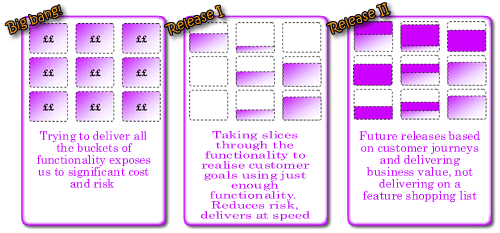
Rather than thinking about vertical functional silos, we should think about horizontal slices through the functionality. Slices that support customer journeys. We can start with simple journeys to start and build complexity as we prove our process and new platform, mitigating technical risk as we progress.

don't functionally silo, slice by customer journey

The first release probably needs to demonstrate the new platform works: we can deliver on time; that a new shopping cart interfaces with our legacy warehouse order management system; etc. What’s the bare minimum we can do that does this and delivers business value. How about a microsite that sells a single product. Customers are directed to the microsite via a URL published on a flyer handed out in the stores.

As a customer who has picked up a special offer N80 deal flyer, I want to buy a Nokia N80 on a pay as you go contract

Our acceptance criteria:

Given I enter my personal details and credit card details When my credit card details are validated Then send order to warehouse to dispatch phone and activate contract.

We can decompose this requirement into discrete requirements, “stories” of sufficiently small size and estimate them. We’ll soon get a project velocity and because it is only a small release expectations, risks and dependencies will be easy to manage. We’ve not had to wait for months to get something out, everybody is happy.

We identify that a profitable segment of the market are the aspirationally clueless. People who want a mobile phone, realise they are a minority who don’t have one but are too afraid to admit they have no idea what they want. So we build a new customer journey.

As an aspirationally clueless I want say what I do and how I live my life and have a suitable phone selected for me.

OK, not the finest story, but you get the point. This story might take elements of the phone selection and tariff selection functional silos, but just enough to realise the required functionality. Because we are building around customer journeys, just enough to realise customer intentions that support those journeys we build only what is required. We are not building by feature list. We don’t over promise and under-deliver. We are building trust with all stakeholders. Surely this is the better way to build software, thinking about customer intentions and incrementally delivering to support more complex customer goals. Sadly, people all too often get fixated by feature lists. Because that is what they are used to. Because that is how products are sold. But isn’t there a marketing 2.0 where we sell experiences and go beyond the product. Isn’t that what Virgin does? But I’m probably off on a tangent.

Most retail banking web presence is just not connected

Taking a look different UK banking web sites a consistent theme seems to appear. There is a fundamental mismatch between public brochureware site and the secure transactional site. Banking brochureware sites are generally (but by no means universally) reasonably good. Their look and feel has evolved over time. No bank (yet) offers a web 2.0 look and feel but some get close. Lloyds TSB has a very clean and polished feel.
ltsb.jpg

The LTSB site is customer focussed, indeed the “interactive demo” of their internet banking offering introduces different personas to explore different scenarios. Can we expect their internet bank to offer a compelling customer experience? To be driven around customer needs?

ltsb page

Well maybe. But there is more to a compelling experience than just usefulness and usability. There is something about the aesthetic execution of the proposition. What it looks like. Attention to detail, creativity… sadly missing with the transactional site. Is it the case that the agency who worked on the public site went nowhere near the transactional site? Probably. After all the skills and ownership needed to build a website are different from those to own and build what is effectively a business application. The primary stakeholders in the public site are marketing; the primary stakeholders in the transactional site are IT and operations.

ltsb page

Lloyds TSB are not alone. Smile are an internet bank. But take a look at their tables. In 2006 who still uses cell borders and padding?

Smile page

First Direct are another bank whose primary channel is the web. And yet they exclude more than 30% of customers who would wish to have a relationship with them but do not use the browser they choose to support.

First Direct page

Barclays have got a great new brand that manifests itself on their public site, yet this has not worked its way down to their transactional iBank. Don’t get me wrong, iBank is pretty good (the interaction design was created by experts – ahem, I thank you – and was extensively usability tested. But this was in the dot-com boom times when we still had to get over fears over internet security). Yet six years later, apart from some changes to the stylesheet, little has changed.

barclays pages

On the HSBC net home page they are almost saying our site is so slow you need to do something about it with your browser.

hsbc net page
My hunch is that there are a couple of things going on here. Firstly, most banks implemented their internet banking applications during the dot-com boom. They were as much a reaction to the times as a strategic imperative. being rushed out bolt-ons to legacy banking applications. Almost a decade later and little has changed. And where legacy systems are being overhauled – SOA are three big letters in the banking IT world, I wonder to what extent changes to the customer experience are tabled on the agenda.

It makes sense for the brochureware site to be owned by marketing. With ownership marketing are free to choose a creative agency to implement a brand compliant look and feel. IT’s primary involvement in building anything was in commissioning the Content Management Solution (and updating the propriety software when the licences inevitably expire and the current version is no longer supported. The brochureware site can therefore evolve; it is probably built and maintained by people who understand the web. That is why these sites should by and large be cross browser and DDA compliant. So this brings me to my second hunch; the question of ownership. The public site is owned by marketing, the transactional site is owned by IT and operations. And their priorities are quite different. Whilst marketing people generally aim to have a polished look and feel, with a good attention to detail and an understanding of the customer intentions, the priority of IT is rather different. IT thinks in terms of requirements. And the look and feel is “gold plating” that is de-prioritised when deadlines slip.

It is time to bring all the parties together. Anywhere large IT projects are on the CIO agenda, “Infrastructure renewal”, “Service Orientated Architecture,” “Legacy refresh” etc. These should provide the marketing organisation the opportunity to address the customer experience and refresh the interactive experience of the transactional web site. Bring it up to date. And maybe soon we’ll start to see Bank 2.0 applications. Hopefully sometime before Web 3.0 becomes vogue.

Oh for a declarative experience

Want to go on holiday to France. Want to take the car on a ferry. Want to sail to Cherborg, or St. Malo, or Le Harve, or Caen. Flexible about time. Looking for best price. Want to book on-line. These are my goals. Not unreasonable goals, although as soon as I add “I want to have a ticket booked within five minutes” I enter the real of dreams. Currently, it is not possible to realise my goals.

What I want to be able to do is enter my broad travel criteria into a aggregation website and then filter my search. Imagine an excel spreadsheet where I enter my criteria:

Excel sheet, cells empty

The results appear immediately:

Excel sheet, cells filled
And as I change the quantity in my search fields, the results fields immediately update:

Excel sheet, cells changed

That is the declarative paradigm that is conspicuous by its absence on so much of the web. Rather than flexibility, the ferry booking sites send me down an imperative, step driven journey. I cannot adjust my criteria without starting the process again- and that means re-entering all the data I have already provided.

The story doesn’t end there. After fighting with a number of different websites I finally find a ferry crossing that matches my requirements. Condor Ferries. The price is alright – £160.00. I Don’t want to book it there and then, I need to confirm it with my wife. She says “OK” so I return to the site to find that the booking form has timed out. There had been no option to save the quote. I have to start again. I go through the process again to find the price has suddenly jumped from £160.00 to £280.00. Unhappy, I ring the company to be told their system has a real-time flexible pricing engine that changes according to demand. The price lower price is no longer available to me. (At least they didn’t have the cheek to put a premium for the booking over the phone rather than the internet). Indecisiveness gets the better of me so I put off booking till the following day. Once again I go through the pain of step-driven booking wizards. And lo-behold, the price has dropped again to £160.00.

I started with some “wants” and I’ll reiterate them. I want a declarative web experience that meets my expectations and helps me painlessly realise my goals. I want travel booking forms to enable me to push and pull different levers to refine my choices, just like I can change fields on a spreadsheet. Finally, I want to be able to save quotes to return to them later. I don’t want the web to be like a high pressure salesperson who tells me this price is only available if I make a decision now.

Give me results according to my refine

I know there’s a book out there. I know the author’s name begins with M. I know it’s a historical book. So I go to Amazon and for once I don’t search, I browse. I follow the site hierarchy: books> history > general and am presented with 32,5882 results. By default they are ordered by “bestselling” (best selling on Amazon – not always a helpful guide. Today’s number 27 on the list is “IEE on Site Guide (BS 7671: 2001 16th Edition Wiring Regulations Including Amendment 2: 2002)”. Mmmmm. Gripping).

Anyway, so I’ve got 32,5882 results to trawl through. Kindly Amazon provide an ascending / descending alphabetic filter. The intuitive way to return alphabetic results would be by letter. Unfortunatly the technically easy thing is done. Pages are returned by number, with up to ten pages accesibile at a time. That’s not very useful if you’ve got more than thirty thousand results.

Amazon search results

I’m on page 13 and I’m only up to AC… The letter M is an infinite number of clicks away. I’m off to Waterstones where I can physically browse the shelves, and hopefully find the book that way.

5 of 5
12345