Web design

How quick can you jump on the trend?

Here’s a bunch of marketing trends for 2007, predicted in In December 2006.  A year is a short time period, we are already more than a quarter of the way through the year – how many of these trends are making inroads beyond the pure play eCommerce offerings.  How many are filtering through into FTSE 100?

Not many is my hunch.  How familiar is it for the marketing department to come up with an idea, only to have it disapear into the IT quagmire of architecturual incompatibility, budget constraints, change requests and innovation inertia?   And of the list of 7 trends, the one that will probably get most traction in the corporatesphere is contentcasting.  Trouble with that is, it is one thing to syndicate your content as RSS feeds, but who will consume it?

Swivel chair integration?

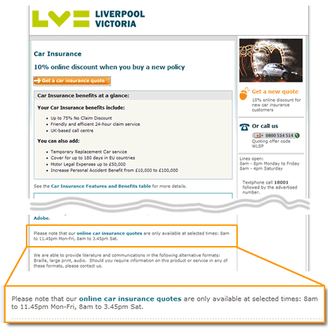
Liverpool Victoria website - quotes only available at selected times

One of the great promises of the eCommerce was that goods and services are always available, 24/7.  Not apparently at Liverpool Victoria whose online quotations are only available at selected times:

Please note that our online car insurance quotes are only available at selected times: 8am to 11.45pm Mon-Fri, 8am to 3.45pm Sat.

One can only assume that this is an issue with their integration of their website with their backend quotation engine.  Was the quotation engine built in the days of 9-5 business and is unavailable outside business hours?  Maybe it depends upon overnight batch processes that render it inoperational between 11.45 to 08:00 and from 3.45 on Saturdays to Monday morning?  Or is this swivel chair integration, some poor soul manually taking requests from the web site and entering them into the legacy system?  Someone who doesn’t work nights, Sundays and whose weekend starts at 3.45 on Saturday?

Match the context, not the pattern

Example of website requesting credit card details in a textual format

To my knowledge, all credit cards present their “valid from” and “expiry dates” as numerical dates, e.g. 02/06 – 02/09. So why do many transactional websites request the credit card validity in text date format, e.g. Feb 06? Most people will not know their credit card details – they arrive at the credit card details form, reach into their wallet, select the relevent card and work through the form referring to the card that they have placed near the keyboard. When they reach the date fields, additional cognitive processing is required, translating the number on the card to a month on the form. This interupts the process (do not assume that everybody can make the immediate leap from 02 to February. Spend time observing consumers on the task and it will not be long before you see fingers coming out to help with the counting).

So whilst using textual dates may be considered to be more “user friendly” and understandable, in the context of completing the credit card form, it adds complexity. UI guidelines, patterns, heuristics are all well and good, but ultimately you must consider the context of usage and design accordingly, even if it does at first glance result in something that is not immediately user friendly.

The Total Experience

The customer experience doesn’t start on the home page and finish on the payment confirmation page. A compelling customer experience comprises of a number of factors with the different factors residing in, and owned by different parts of the business. This can result in parts of the experience being excellent, others being shocking, such as at the Early Learning Centre. Projects that are driven forward by “IT” rarely see the bigger picture; the project manager’s primary concern is with delivery. And this means producing a product that covers all the use cases or stories that were specified in the plan. Agile development practices often reinforce this; an agile team is (rightly) focussed upon delivering technical excellence according to the “customer’s” requirements. The trouble with this is that project success in the on-line world goes beyond just delivering working software. Success is all about the total experience.

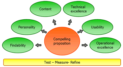
I’m sure there are a hundred and one different frameworks for “e” success. The following works pretty well for me.

The Total Experience Model.  Copyright Marc McNeill!

Compelling proposition
Any on-line offering starts with its proposition; what it is offering to the market place. Do we know who the consumers are (segment), how many of them are (market size) and their propensity to buy? What is going to attract them to the site, and what is the glue that will draw them back.

Findability

Well if no one can find your compelling proposition it’s never going to make you money. Do you have a strategy in place for ensuring consumers can find your proposition? This starts with search engine optimisation, but will extend to affiliate programs and making a noise about you (Product team blogging?). And then when they are at your site is navigation intuitive? Is relevant and wanted content findable?
Personality
What is the product aesthetic, what does it look like? Is it branded? Does it exhibit production values that reinforce the brand? How does the overall experience make me feel – how does it emotionally engage me?

Content
Content is king. But all too often it is a bit of an afterthought. It’s not just syndicated content, or articles that subject matter experts might write, it is all the copy, the words that appear on the site. Do they support the proposition, or are they just placeholders that the developers wrote and never got updated? Related to content, and maybe it should have a bubble unto itself is community. I think that increasingly, successful eCommerce offerings will include an element of community. Fulfilling the promise of the ClueTrain manifesto from several years back?

Technical Excellence
Working for a company that undoubtedly employs some of the finest developers in the market place, this is something I see a lot of. But it means nothing if the other elements are not realised. Technical excellence includes those “non functional requirements” that development projects talk about; reliability, performance, scalability etc etc.

Usability
Learnable, speaks the user language, memorable, all those old chestnuts. Probably the maxim is “don’t make me think”. Aligned to usability is accessibility; we don’t want to exclude potential consumers through sloppy implementation.

Operational excellence
So the on-line experience may be compelling, but what happens then. Is the fulfilment channel fulfilling? Is there a promise to deliver goods and is the promised delivered upon? What about support channels? Do they support or do they just pay lip service to the concept? Does the web experience go beyond the web and cross other channels? Can consumers start a journey on the website and seamlessly conclude the experience in store? My blogs on Early Learning Centre, Norwich Union and a seamless experience all touch on operational excellence.

Test – measure – refine

Underpinning these factors is the need to constantly test what we do. We can all learn from Test Driven Development (TDD); write the test first and only have the confidence to proceed when it passes. How do we know it has passed? Well we need to measure it; we can only know success if we can quantify it. Based upon the feedback we refine; test – measure – refine, a concept core to agile software development practices.

A lot of words and a picture that belie a simple concept. When working in the web world, always think about the total experience. Break out of your silo (be it technical development or marketing strategy) and think holistically. What will the end to end experience be for your consumers? A technically excellent website is not success. A polished, well branded look and feel is not success. Success is compelling total experience.

When I was 16 I worked in a bank. Customers would ring up and ask for their account balance and I type on the green screen 809 for a simple balance. I can’t remember the code for a breakdown of transactions. I couldn’t use that system now. One of the benefits of command line prompts is that they are efficient. As a “power user” it would be difficult for a GUI to beat <809 account number>. Because the GUI can be cumbersome and requires mouse movement when only a few keystrokes would suffice. Power users love commands line prompts. But in the hands of a novice the command line is useless.

Cue Google.

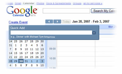
google calendar

A pretty cool feature in Google calendar- the ability to “quick add” an event. Rather than the cumbersome use of date pickers and fields and boxes, the quick add function allows me to create a calendar entry using natural language. I type “meet Fred in the office at 9 tomorrow” (the language I use when describing my intention) and the meeting is set up. No need for fields and boxes and date pickers. So maybe it is time to rethink command line prompts using natural language with forgiving rules. Imagine being able to type “move £50 from my current account to my savings account” rather than the more usual current:

Page 1 – Step 1. Select from account. (Wait)
Page 2 – Step 2. Select to account. (Wait)
Page 3 – Step 3. Enter amount. (Wait)
Page 4 – Step 4. Confirm transaction. (Wait)

(Done).

Consumer driven development

One of the things that makes me passionate about agile is the way that it places the customer at the heart of everything we do. The trouble is “the customer” is often wrong. For me, the customer is the person whose life is transformed by the software they use. This is not the person who is writing the cheque, nor is it the person who is defining the requirement. In consultancy speak, they are the client. The “users” are the customer. I don’t like the use of the word “user” because it implies a choice to use the software has already been made. I’m probably going to have to accept that “customer” is never going to change, so why don’t we call our users (my customers) “consumers”.

So enough about semantics. The team are building an on-line banking product. The team ask the customer (client) what she wants. She bases her requirement around what she knows. Often this will be swayed by the development team talking about implementation detail. (Few things make me as uncomfortable as a customer (client) from the business (product owner) talking about APIs).

So the requirement is to log-in. The customer is comfortable with customers (consumers) having system IDs; a unique n digit number that identifies the customer on the legacy database. It has, after all, always been this way. She asks whether the customer’s credit card number could be used, but the developers tell her (via the BA) that these often change (customers loose their cards) and it would be hard to do. She nods her head in agreement (she’s put on the spot by the BA – the iteration is due to start next week…) And the requirement is manifest on the login screen (“please enter your 16 digit customer number”).

In reality, the “customer” bases the requirement on her experience with the organisation and what she knows about it. The consumer (if they were to be invited into the conversation) wouldn’t come to the problem with any of that baggage. She needs a simple login. She needs a user name that is accessible or memorable. She does not want a 16 digit number.

It may take a little longer to listen to the consumers’ need (we need to find consumers to talk to them). It may mean a little up front analysis (I’d suggest pre-project analysis, doing due-diligence if you like). But it will pay dividends downstream. In the login example above, the developers have swayed a simple and cost-effective solution in the short term, but have failed to consider the down-stream costs. How will the customer find their 16 digit number? Do we have to post it out (cost) on a card (cost) and have a support team (cost) and process (cost) for letting customers know their number if they’ve forgotten it?

As agile grows up, I’d ask for us to spend more time thinking about the real customer, the consumer, the person whose life will be changed by what we build. The inconvenience we may incur during development may be nothing compared to the pain we will experience after we have “delivered”.

Storyboarding with comics

Storyboarding is a really powerful way of communicating how a tool will work. The Sun design team have put together some cartoons that can be used for presenting storyboards; for example taking a bunch of wireframes and using the cartoons to tell the story through them. The cartoons are in powerpoint here. I’m looking forward to using these, to ditching the dry persona description and annotations and replacing them with a more compelling cartoon journey…

Early Learning Centre fail to deliver

Last year I wrote about Early Learning Centre and how impressed I was with their revamped web site. It was recently picked up by About Customer Relations: The New Competitive Edge. Whilst I stand by my comments about the site itself being well designed, the rest of the experience leaves a lot to be desired.

In the summer I bought a product on their website – the product that was delivered was not the same that was ordered. They succeeded in repeating the mistake twice, delivering two toy pushchairs before the pram finally arrived. With no present arriving on time we had to postpone our daughter’s birthday for a day whilst we waited for her birthday present to arrive.

I probably should have learnt from this experience. I didn’t and on 11th December I ordered toys on their website for my daughters and their cousins. The on-line shopping experience was faultless, I received a confirmatory email and the following day, on the 12th I received the following note:

We’re pleased to let you know that the following items from your order of 11 December 2006 have been despatched from the Early Learning Centre warehouse… You can expect your toys by Wednesday 20th December.

That was great, managing my expectations, keeping me informed. Only on Thursday 21st December no delivery arrived at my address. We rang their number and were informed that the delivery would be made, the order would be with us by Christmas. That was a promise.

Friday 22nd and still nothing. I was getting worried, I could postpone my daughter’s birthday, but postponing Christmas because of ELC’s incompetence was not on the cards. I got through to the call centre and was told that sorry, the delivery had not left the couriers warehouse, and would not go out before Christmas. The call centre representative said he’d phone local stores and see if the toys I’d ordered would be available for pick-up. I was put on hold as he rang a local store. All sold out. I suggested another store and was put on hold again. After fifteen minutes on hold I gave up and rang back. This time I was told that the courier firm would be making deliveries on the Saturday morning and I could expect my order to arrive first thing in time for Christmas.

Saturday morning and no delivery. I rang the call centre again. The representative I spoke to said that she couldn’t tell me whether the delivery would be made. I put the phone down. I rang back again and asked to speak to a manager. “Sorry, all our managers are in a meeting” came the response. This was not good enough. I asked for a manager to ring me back when they came out of the meeting. I’m still waiting for a call.

A little later on, the parcel arrived, in time for Christmas, but not in time for me to have anything good to say about ELC’s ability to execute on their web promise.

Central to my experience was a breakdown in communication. The call centre had access to the courier firm’s tracking website (that they wouldn’t share with me), but seemed to have no way to talk to someone on the ground to find out why my gifts were not put on a van before the date they’d promised in the email. I don’t care that the courier company let them down. For me, the courier is ELC. In the call centre it was clear that they’d brought in extra people to handle the Christmas rush. These people probably had a bare minimum of training and were not able to handle queries from disgruntled customers in a consistent way.

The lesson learned here is that having a good website is just part of the total customer experience. You may have the right products at the right price, easily found and simply paid for. My web experience may end with me parting with my credit card details and receiving a confirmation e-mail. But I’m not satisfied until the right goods arrive at my home and they meet my expectations based upon promises made on the website. At any stage of the whole process I expect a consistent and excellent experience. Anything less and I won’t return. Worse, I’ll tell others how bad my experience was.
WWW. Why. Why. Why.

The www prefix is redundant. Technically, and now, given the ubiquitous nature of the web, in marketing as well. So why do companies insist on retaining it. Worse, why do some companies have URLs that only work with the www.? This is sloppy, a couple of lines of code would direct either company.com or www.company.com to the correct IP address. There are some big names who suffer from this sloppiness. Will ’07 be the year that WWW, an acronym that takes longer to say than to write, drifts into history?

4 of 5
12345