Do you modify your approach according to context?

I look in the rearview mirror.  Blue lights flashing. Maybe he’s been called out to respond to a call and will overtake me.  No, he’s flashing me.  Instinctly I’ve slowed down, I look at the speedo, it is in KM/H and I’ve not been paying attention to the roadsigns, but it is clear that I’ve been going too fast.  So I pull over.

The question in my mind is what to do next.  I’m in Australia, driving an awesome road, the Great Ocean Road that just asks for a car to be driven (OK, it’s hardly an Grand Tourer, it is a compact Hyundai Getz).  The brain is racing, pumped by adrenaline and fear.   In the UK I would get out of the car, go to the back of it and talk to the officer.  You’ll be asked to do this anyway “Would you kindly step out of the car sir”…  The last time I hired a car overseas was in the US in Atlanta.  Driving through the deep south I got pulled over and I jumped out of the car. Bad move.  “You’re makin’ me kinda nervous’ the cop drawled with his thick southern accent.  He spread me over the ‘hood’ to search me and ended up taking me down to the station, something that was straight out of the Dukes of Hazard, and handed me a huge fine to pay.

So I’m slowing down and thinking do I do the UK thing and jump out, or do the US thing and stay in the car?

I decide to stay in the car.  The right move.

So that’s an interesting story, but what does it have to do with the themes that I usually blog about?  Adapting your approach based upon context.

A while ago I met with the CIO of a company whose core business is in complex instrumentation hardware.  They were looking to diversify their offering, take some of their products out of the hands of specialist practitioners and into the broader marketplace.  Core to the success of these new offerings was usability; their devices required complex set-up and calibration.  Their question; how do you redesign an expert system for novices?

Seeking an answer they hired a customer experience consultancy to gather insights, understand the new segment needs and create wireframes for the new application interface.  But the consultancy couldn’t fit with the way the company worked.  They would run a workshop with the client for a couple of hours then go ‘back to base’ to do the thinking and designing and return to present their designs, well thought out and well polished.  Yet every time they would come back they had got something wrong.  That approach may have worked for a website, but for this complex product they were getting it wrong.

We were asked for our advice.  I started by saying that I thought they should stick with the incumbant,  whilst we would love the business, both parties had invested a lot and learned a lot in the past few months and it would be a folly for us to come in and have to start from scratch.  The answer was to get both sides into the same room, a war room, and thrash out the designs.  Forget about their formal methodology and way of doing things.  If you they were both in the same building they didn’t need that formal staccato present  – review – sign-off process.  They could continually innovate.  That is certainly the way we would do it, yet the CIO thought the incumbent would be resistant to changing their ways.
The theme that joins these two stories?  It’s about reading the situation, knowing the culture and context you are in and adapting your approach and behaviour accordingly.   And that applies as much to agile practitioners as Big Methodology people.  know your audience, understand the context then pick your battles; think big, start small scale fast, remember that change won’t occur overnight.

Innovation games

Innovation games are a great way of engaging stakeholders, getting them to collaborate and think creatively around solutions to problems. Here are a few I’ve recently used. Introducing a persona helps focus the attention.

What happens if?
Ask participants to construct a back story for the persona. What have they done in the last year. Describe each touch point they have had with your brand or product. Now introduce a crisis moment. Lost a job, got a terminal illness, won the lottery. What happens? How does the experience with each touch point change?

Build a widget
Again, give the group a persona to help focus their attention. Now give them half an hour to build a widget that would solve a problem the persona has. Give them paper, post-its sharpies, coloured pencils. This is agile right. Now present back – They get two minutes to provide the context, pitch the product. Then one minute to demonstrate how the widget works. Open the widget to questions. How will it work….

You’re all crooks
<Insert your industry> are crooks. What new laws would you introduce to clean up their act? (OK, this feels uncomfortable but it may help get people thinking about how consumers perceive the industry and how the customer experience could be improved. For example you are crooks because you hide details in small print, introduce a new law on transparency. What would that mean you would change?)

Kill the sacred cows
Every business has sacred cows or elephants in the room; things that are done because they’ve always been done, not to be challenged, considered immune from criticism or are too risky or dangerous to change. Ask participants to identify these, putting them on post-it notes. Now imagine that they no-longer exist. What could you do now that you couldn’t do when the sacred cows were in place?

Pillars of a compelling experience

Pillars of a compelling experience

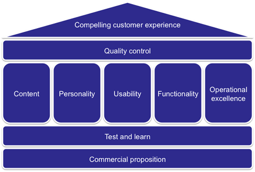
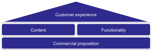
This is a model I often see in organisations when it comes to their web presence.  A product owner comes up with a commercial proposition, marketing work up the content, IT build the functionality and it is goes live.  With this model, no-one actually owns the customer experience.

Worse, this little temple model is repeated across different commercial propositions so you end up with something that is not very joined up.  I’ve blogged about this lack of joined up thinking before.

Now let’s construct a model where the roof of the temple is a compelling customer experience.

What are the ingredients of this new temple model?  It is still going to be founded upon commercial propositions, but they are going to be overlaid by a culture of test and learn.  That is a willingness and ability to experiment; to realise that what you have developed is never final and is always evolving.  It is about taking the learnings of experiments to inform and improve the experience, or to rapidly refine or kill propositions that just do not work.

Then we have the five pillars.  I describe these in a paper I wrote ages back (pdf here, google books here).

Unfortunately these pillars tend to sit within organisational silos; content and personality are ‘owned’ by  marketing, functionality by IT, and operational excellence (that’s all about fulfilling on the customer promise and beyond) is a mixture of IT and operations.  Usability is a ‘funny one’ in that might sit alone, sit in marketing or sit in IT.  But ultimately it is best placed to direct the horizonal filter of Quality Control.  Quality control is not an additional layer of bureaucracy, rather a cultural component that all the pillars feed into.  It is about ensuring consistency and meaningfulness of the experience.  It is about balancing the commercial needs of the product, with the marketing needs of the message and the delivery capability of IT.

Photo credit: K. Dafalias

Just ignore what they say

What customers say they like and how they behave are not the same thing. Don’t always trust what you are told, use data and real insights to drive decisions that have major commercial implications.

So there was a skyscraper, banner and numerous MPUs across the website.  A survey panel was set up and the results came back.  The agency briefed the team, “Your customers really don’t like all the ads you have on the page”.  The message was reiterated in focus groups.  Ditch the ads.  This would be a painful decision, despite customer’s not liking them they were still delivering reasonable revenue.

The organisation was striving to be more customer-centric; if the advertisements were degrading the customer experience then removing them would be a price worth paying.  And so they were switched off.

The result?  Nothing.  Except lost revenue.  Analysing the data, customer volumes remained the same.  There was no difference in the successful completion of customer goals.  Switching the ads off had no impact on customer behaviour on the site; when asked customers said they didn’t like them, but what they said and what they did were different things.

The moral: if you are going to use emotion and what customers say to make commercial decisions, consider A/B testing with real data before making wholesale changes.

Why it pays to think about the whole system, not just your local function

Ability to do bulk price mark-downs? Nice to have.

Today we are looking at a large UK supermarket stock control system.  At the end of the day the staff mark down prices on the short-life items (sandwiches etc).  They have a hand held scanner with a belt printer.  Scan item – print label – stick label on item.  Well that’s what the process is supposed to be, only this takes time (20 seconds per item) and when you have a whole shelf to do is a chore (12 items takes four minutes).  Far easier to just write down the new price on a ‘discount label’ with a sharpie and stick it over the barcode (do the whole shelf in less than a minute).

Where’s the problem in that?  In fact three minutes of waste (waiting time) has been eliminated.  Only it is a problem

The customer takes the item to checkout and the mark-down label is covering the barcode.  The checkout colleague tries to peel it off to scan, but it doesn’t peel cleanly.  So she manually enters in the SKU. And the mark-down price.  And this has taken 2 minutes for one item and the queue has grown and because of the ‘one in front’ policy they have to open a new checkout and suddenly that small problem at one end of the value chain is replaced by a bigger costlier one at the front end.

But had we not observed this we would never know that bulk price mark-downs on the hand-held device is not a nice to have, it is million dollar requirement.

What do you see?

A cleaner and a doctor both watch a surgeon perform a complex operation on a patient.  Both watch the same operation, yet each sees a completely different thing.

Are you aware of how different people will see the product you are building?

I just want to talk to someone

I’ve got a query about an Account I opened with Alliance and Leicester.  I’ve got a letter that provides me with an account number and a phone number, it reads  “…if you have any further question [sp] please contact a member of the team on 0844 5619737“. So I ring the number.

“Please enter your eight digit ID number.  This is on your welcome letter, monthly statements, or internet banking ID.  It is NOT your account number.”

Hmmm. I don’t have any of those things to hand, they are not on the letter.  I’ve got my debit card, but that’s obviously on a different system.  I put the phone down and return to the letter, near the bottom, in bold it gives another number “if you would like us to send you information in the future in larger print…” I ring this number.  It doesn’t work.

So I go to the website and look for a telephone number.  I’m an existing customer.  I select my product and ring the number on the page.

“Please enter your eight digit ID number.  This is on your welcome letter, monthly statements, or internet banking ID.  It is NOT your account number.”

I don’t have that information to hand.  I choose another product.  Same message.  I’m getting frustrated.  There’s a page titled “Other enquiries“.  Lots of words, but no number.  I navigate to the complaints page, it has a number.  Hey! Kill two birds with the same stone, speak to someone in their complaints department, make a complaint about how my time is being wasted trying to find a number and get transferred to the relevant department.

I dial the complaints number, more IVR and the prerecorded message.

“Please enter your eight digit ID number.  This is on your welcome letter, monthly statements, or internet banking ID.  It is NOT your account number.”

Frustration turns to anger.  I find a number for new customers.  I get through the IVR and finally talk to someone.  “I need to transfer you to the relevent department” she says.  OK.  The line goes silent.  And then goes dead.  Lovely.  Stress.  I give up and start the motions of closing the account.

There’s nothing unique about Alliance and Leicester.  I hate to pick on them.  But this seems like a case of a lack of joined up thinking.  When you are designing processes or procedures, don’t just think about them from the business perspective, take a persona and test them with real people in roll plays.  What if someone doesn’t have what you expect them to have?  Customers do not always behave according to the expected happy path.  What are you doing about that?

What would Sally do? Personas for retail financial services

Personas are ‘pen portraits’ that bring to life users or customers of a system, service or product.  Giving a personality and back story to your customers helps keep your thinking true to their real needs and goals.  Rather than using  ‘user’ or a segment descriptor such as ’empty nester’, or ‘this is what I would do’, what would Sally do?

Here’s a set of personas for financial service organisations, geared towards the retail / B2C market.  Sally is included (Shes skint).

View more presentations from marc mcneill.

Who would turn off the wrong engine?

In designing user interfaces there’s a lot we can learn from systems where failure to consider human factors has resulted in terrible consequences.

On 8th January 1989 British Midland Flight 92 crashed whilst attempting an emergency landing. There had been a fire on one of the engines which led to its malfunction. The captain reacted by shutting down the engine.  Only he shut down the wrong engine. With no power, approaching East Midlands airport the captain manged to glide the Boeing 737-400 to avoid Kegworth village but crashed short of the runway.  47 people died.

The investigation into the Kegworth air disaster identified engine malfunction (the engine used in the aircraft was an upgrade of an existing engine and had not been field-tested) as causal factor, however the report concentrated upon the failure of the flight crew to respond accurately to the malfunction.  Human error was the primary cause.

The truth is a little more complicated than that.  Why does a captain with over 13,000 hours flying experience and a first officer with over 3,000 hours experience shut down the wrong engine?

A number of human factors contributed to the disaster including organisational issues (refer to this paper for discussion of the role of managerial failures in disasters) and cognitive overload.  But of equal importance (and indeed buried in the appendices of the Investigation Report appendices) is the issue of design. Around 50% of accidents and incidents in the aircraft and nuclear industries have a root cause in design (source).

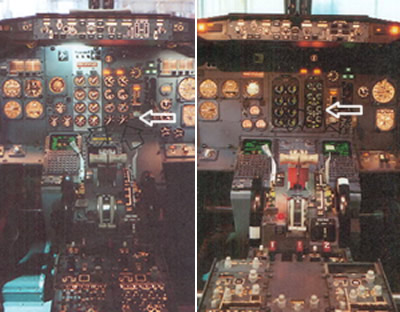
Take a look at the cockpit controls (taken from the investigation report). The left image is for the earlier 300 series and the right for the 400 series aircraft on which the captain had only 23 hours experience after a one day training course.

The actual cause of the engine malfunction was a broken turbine, itself the result of metal fatigue caused by excessive vibration (source).  Had the Captain noticed the Vibration Warning display he probably would not have made the wrong decision.

The Vibration Warning display on the new 400 series was in a different place to the 300 series, but more critically it was designed to be significantly smaller “the dial on the vibration meter was no bigger than a 20 pence piece and the LED needle went around the outside of the dial as opposed to the inside of the dial as in the previous 737 series aircraft” (Source: Wikipedia).  Take a look at the arrow on the left hand image, the display dials on the 300 series use mechanical pointers. On the 400 series they were redesigned with short LEDs rotating around the numbers. These, as the investigation report noted “are much less conspicuous than mechanical pointers, acting more as scale markers, and providing less immediate directional information).

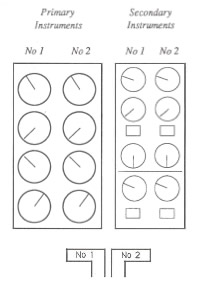
The report criticised the layout of the instrumentation and helpfully suggested an improved layout.  The layout was (and as far as I can tell, remains in 737s) split into primary instruments and secondary instruments.  The issue with this layout is that the dials are not spatially aligned with their associated power levers.  If the pilot is focussing upon the primary instrumentation, the secondary instrumentation is in peripheral view.  This layout will lead to attention based around specific instruments rather than engines.

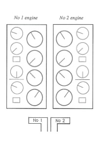
Compare this to an alternative design that the report provides where the dials are aligned to their associated power levers.  The report recognises the design trade-offs here but concludes that to break the left-right mental association with the engine position was probably not the most optimal solution.

This paper describes the issue well:

The 737 involved in the East Midlands crash had flight deck engine information that lead to confusion under mental pressure. Placing the secondary information sets for both engines to the right of the primary set broke the implied rule set by all the other engine information, that the left engine had left hand controls and indicators (and vice versa). If one assumes that the optimum positioning of indicators is the one that requires the least mental processing then a simple symmetry about the aircraft centre line seems appropriate. The actual positions required a mental spatial transposition of one set of dials to the other side… The readability of the indicators had been reduced by the substitution of electro-mechanical readouts with electronic readouts, but which simulated the old design. Possibly the redesign to electronic readouts should have taken the opportunity to use a rather different layout, possibly with linear indicators rather than rotary ones.

OK, so lots of words, but what is the point of this to what I usaully blog about?  The issue is one of design and layout and who’s responsibility is it.  In designing user interfaces UCD is often seen as a luxury, developers believe that they can design a GUI as well as anyone, and stakeholders (especially on internal projects) will question the value that a UCD person can bring to the project.  Does a developer or an engineer by training and instinct stop to ponder the human factor and the human consequences of the GUI layout? What are the consequences of this?  As can be seen from Kegworth, seemingly minor changes to the control layout can have a signficant impact on the safety of a complex system.

Who do you beleive?

Only Five Percent Of Readers Would Pay For Online News. (Sep 20, 2009)

16 November two new reports come out simultaneously.

Research from Boston Consulting Group suggests that as many as 48% of British and American consumers would be willing to pay a few pounds a month for online news.

According to a new Forrester survey, almost 80% of Internet users in the US and Canada would not be willing to pay for access to newspaper and magazine websites (via readwriteweb).

So 5%, 20% or 52% of people will pay for online newspaper content.  Or maybe 12%. And Murdoch is going to “rewrite the economics of newspapers” based upon that kind of customer insight?  It is going to be interesting to watch.

8 of 38
456789101112