Customer Experience

What the customer wants

I’m a strong proponent of engaging the customer in all stages of the design process. But sometimes you need to be careful with what they say and not always believe their first answer.

Ask the customer “what do you want” and the chances are you will get an answer that is rooted in their experiences and expectations. Not what they really want.

I want an intranet portal“.

No, you don’t. You want a place where your employees can share files and documents.

I want a google search appliance“.

No you don’t. You want to be able to find documents quickly and efficiently.

Worse is when vendors try and force products onto the customer…

You want an integrated BI toolset“.

No they don’t. What they really want is to be able to pull some specific data from a legacy application into an excel spreadsheet and insert a graph into a word document.

OK, so it is easy to say that, but how to follow though? How do you actually get the customer to create a vision of what they really want? Well I’d start by not asking them that question. Get them to articulate what their goals are. Then try to understand in what context they will try to accomplish those goals? Think in terms of customer journeys and value outcomes over features. Think about the what, not the how. Start with the “to-be” vision rather than dwelling in the “as-is” quagmire, indeed use a system obituary to kill the as-is thinking. Use visual tools to model your ideas. And don’t get bogged down in detail.

I’ll write more about this in the future…

Web 2.0, retail banks and a Slide Share presentation

This is nothing new, but there are still people out there to whom Web 2.0 is a bit of a mystery. What exactly is it, and more to the point, should our business care about this stuff? Or, as I have heard senior executives argue, is it just another bubble, a distraction to let others waste their time, effort and money on. In an attempt to challenge this assumption, I’ve used a model with a few sceptical clients to hang some structure on. This is central to the below presentation that I’ve given to a few financial services organisations. It discusses what Web 2.0 is, and towards the end describes what it could mean for their on-line retail bank website. (Thanks to Duncan Cragg and Prashant Gandhi for some insights).

[slideshare id=377944&doc=web20public-1209431680446543-9&w=425]

Is this the most stupid question to ask?

Someone from the Barclaycard research centre rang me today doing some customer research. It is great to know they take the customer experience seriously – many of the questions were around my experience with the brand. But then they dropped this corker, not once, but twice.

To what extent do your other credit card providers offer innovative products

How important is it to you that your credit card provider offers innovative products

How on earth did those questions get through and on to the list? What is an “innovative product” when talking about credit cards or financial services? What is an “innovative product” to Joe Public? Maybe I can relate to an iPhone as such, but my credit card? Product innovation is hardly something that you or I consider when we pull a credit card out of the wallet.

“Innovative products” are something that marketeers talk about, they are not in the credit card users lexicon.

Chinese immigration – how did I do today?

Today is one of those days. A meeting in Zhuhai at 11am. Take the 08:40 ferry from Hong Kong, no problem. I’d researched the ferry times, got to the ferry port with loads of time to spare and went up to the ticket counter. “Ticket to Zhuhai please”. Suddenly there was an earlier 8am ferry leaving in five minutes, if I run I could catch it. “You’re sure this goes to Zhu…” I started to ask, but the man behind the counter cut me off. “Yes it goes to zhunzen, now hurry!” but I didn’t hear him correctly, I was focussed on a boat leaving earlier than expected, and that would definitely get me to my meeting on time. Communication Breakdown. It was only as the ferry left Hong Kong and turned right rather than left I realised my mistake. I was on the boat to Shenzen.

But that is not the purpose of this post. Arriving in China, when going through passport control, under the glass window there is a little box with three buttons on it, inviting you to rate your experience – green for perfect, yellow for satisfactory and red for unsatisfactory. Capturing customer feedback at the time of the experience. Howe much more valuable is that than asking customers to complete a lengthy questionnaire some time later, after the event. I think that websites could learn from this. Rather than a pop-up inviting customers to complete a questionnaire of a number of pages (often this appears just as you start your experience at the site), why not get customers to “rate this page” or “rate your experience” as a simple thumbs up or down (as you might Digg comments). This will provide instant feedback, maybe not qualitative, but quick and simple quantative data.

And if I had the ability to rate today? Right now, as I sit in a dingy cafe waiting the two hours for the next ferry back to Hong Kong, with a rapidly flattening laptop battery, I’d have to press the thumbs down, unsatisfactory red light on my current experience.

Small shops do themselves no favours

Walk around London and it’s hard to miss the Maestro “Cash Is Dead” advertising campaign. You’d never believe this in many small bricks and mortar retailers; try to purchase something with a card for say £7.99, pull out the plastic and the shop keeper shakes his head and points to the sign – “no card payments for under £10”. What sort of madness is this that retailers refuse to accept money because it is the wrong sort of money?

OK, so there are interchange fees; a card payment is probably going to incur a charge of around 2% of the transaction. For the retailer there is therefore an incentive to prefer cash. But at what cost? (Perversely for the banks they penalise against not using cash, despite the handling for cash being so much more than an electronic transaction).

Let’s say I am buying something for £7.99. Let’s say the cost price for the item is £3.50. That’s £4.49 gross profit. Obviously this doesn’t all go into the retailers pocket; the tax man takes his share in VAT and there are the operating costs. I’m no retailer, but let’s assume that a whopping 90% of the gross pocket is swallowed up in costs, leaving the retailer 45 pence net profit. Now of this, the bank is going to take 15 pence from the retailer for me using my card. Which the retailer is not happy about.

And this is the mad part; for the sake of 15p the retailer is willing to loose the sale (OK, that is 36% of his net profit – and that is a lot, but isn’t cash flow king?). He has given me a shocking customer experience, not allowing me to buy from him this time (and I’ve got a memory – not going there again). I’ll go down the road to the supermarket where they will not only accept my card – but give me cashback as well!

There is of course, an alternative. Give the customer an option of using the card, passing on the card fee. For most customers, the opportunity cost of paying slightly more but getting instant gratification is probably more acceptable than either driving several miles out to the supermarket, or having to find a local ATM.

Consistency when things are poor

Call it a pattern, a heuristic or a rule of thumb. A fundamental one of those to ensuring usability is consistency. This may be external consistency – for something behaves in the software in a similar way elsewhere. A good example might be the ‘x’ button in the top right hand side of an open window. It is universally a call to action to close the window. If the designer created a button labelled “C”, and placed it on the left hand side this would result in confusion. It is not consistent with the users’ expectations from using other applications. The second type of consistency is internal – do things behave in a consistent manner throughout the application? This may be both in behaviours (e.g. buttons with the same titles perform the same action), and in look and feel – a website has a visual identity and coherence, assuring a continuity of experience.

There may be examples of where internal consistency is not possible. For example a brochureware site that uses a third party for fulfilment or payment. Paypal is a good example of this – the user is taken out of the shopping experience and into a paypal experience. This can be successful if there is clear signposting and use of the paypal imagery on the shopping site to assure the user.

So what happens when you have a large, legacy website that you acknowledge to be pretty poor in the usability front and want to introduce new functionality, or want to rebuild it. If you play the consistency card too strongly you may continue to be consistent with the old design and behaviours. This begs the question, is it better to introduce something that is internally inconsistent, but fundamentally better? This becomes even more an issue when you look to rebuilding your site in an incremental fashion.

As an information architect I can help you design your site architecture – the look and feel, navigation structure, user journeys etc., but this will probably be in its entirety. To build this new site will take time, and assumes a “big bang” whereby a completely new site will be (re)launched. Yet there are probably business imperatives to fix specific areas. If we build in an incremental fashion, and take the agile approach of focussing upon delivering business value, we are not going to have a fully redesigned site to go live with. We are probably going to have (for a short while at least), some parts of the site that are new and some that are old.

Going back to my original question, we can either build this to be consistent with the old site, or do something tangentially better. If we do the later it will probably be significantly inconsistent from other parts of the site, or the original parts of the site. It is in this scenario that I am inclined to throw away the consistency pattern. You may have internal inconsistency if you have a clear roadmap to throwing the old and the new functionality / design is proven to be usable, accessible and intuitive. With this the case, the interaction behaviour and visual identity of the new functionality must become the benchmark to which future functionality is consistent with. And you must clearly signpost to the user what is going on; customers will generally be forgiving if they understand that the changes are in their interests.

What’s in it for me?

Social networking is all the rage at the moment. I’m attending meetings where clients are buzzing about creating a community… and I find myself challenging their enthusiasm. I return to a simple question: “So what”. Put yourself in the shoes of your customers and ask “What’s in it for me?” Leisa says this succinctly:

If you’re thinking of joining the bun rush (or your client has insisted that they must), I think the first and most important question to ask is from your potential users perspective – what’s in it for them? What’s their motivation to sign up, to find and make friends, to participate, and to come back, ever?

What is it about a community that you are looking to build? Indeed is it really a community that you want per se, or is it more about building affiliation around your products? Where is the justification for the investment? Is the business case geared more towards product development; about letting your customers comment on your products, providing feedback that you can use to improve, enhance and develop new products and features – a forum for listening to your customers conversations?

Maybe you think there is something in your proposition and it demands a social network. How are you going to make it a destination of choice, to cut through the noise of every other social networking site (how long before we see friendship fatigue setting in?) Facebook has opened up its APIs to the outside world – Could you leverage Facebook, developing applications that will sit on their platform rather than trying to build a network from scratch?

But most importantly keep asking So what? What is in it for me?

What does Web 2.0 look like?

Here’s a presentation I recently put together on digital strategy and what Web 2.0 could mean to a fictional jewelery company. It rapidly introduces some of the key concepts then presents a customer journey through a “what if” scenario. Apologies for the poor audio!

[slideshare id=1140985&doc=cdocumentsandsettingsmmcneilldesktopmarc02-projects45-dtcjewellery-090313063919-phpapp02]

Make something consumers love

Bubblegum generation presents a compelling model for Apple’s iPhone strategy:

1) Pick an industry which sucks (ie, imposes significant nuisance costs/menu costs/externalities on consumers)
2) Redress the imbalance by making something consumers love
3) …Which disrupts the long-standing industry equilibrium, and shifts market power
4) Use said market power to redesign (a hyperefficient) value chain

Don’t think that organisations in industries that suck don’t aspire to “do an iPod”. Go to any proposition development or product strategy workshop and it won’t be long before someone is mentioning Apple products. Yet all too often they fail to do anything truly revolutionary; they end up doing something different rather than “Redress(ing) the imbalance by making something consumers love”.

Do customers want something that is different or something that is just better?

Interestingly, little functionally in the iPhone is new. Like every other phone on the market it makes phone calls, sends messages, receives emails, takes photos and allows users to listen to music. Nothing different or new there… other than being better than every other phone on the market.

What Steve Jobs espouses is the experience of the phone. He says “So, we’re going to reinvent the phone. Now, we’re going to start with a revolutionary user interface… Now, what’s the killer app? The killer app is making calls! It’s amazing, it’s amazing how hard it is to make calls on most phones.”

He’s not looked to do anything radically different, rather do it radically better.

So how do you bring revolution to your product set? Rather than trying to be different, why not try to better. Make something that consumers love?

Take a leaf from the Apple book and focus upon the experience. Design and attention to detail are critical. Moving beyond purely functional and satisfying products to crafting experiences that engage the emotions. In agile product development it is often easy to focus upon delivering functionality that is perceived to deliver business benefit, yet end up with a mediocre product that has little resemblance to the original idea it was meant to become. Incremental delivery is a key feature of agile; it means you get stuff out there early and often. The challenge is to identify what that stuff is. To make something that consumers love using the agile approach, in addition to great developers and focussed project management, you need three people;

1. A passionate sponsor who has a dream and a vision and can articulate that to the team, banishing mediocrity from the outset
2. A business analyst who will help the team slice the functionality according to consumer needs and desires; that take the consumer of the journey they want to travel, not a predefined route that constrained to picking those features that eventually will deliver greatest value.
3. A customer experience architect, interaction designer or graphically minded usability dude who can champion the product aesthetic and usability.

Get them on your side and maybe you might be taking the first step on developing a better gizmo that your consumers will love, and sleep outside your retail outlet for hours to buy one.
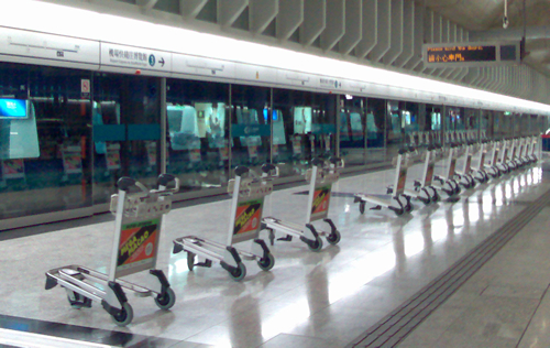
Forty five grand to line your trolleys up?

Trolleys lined up at Hong Kong MTR station

They’ve thought about the customer at Hong Kong airport. At every MTR station on the express route to the aiport, the trolleys have been lined up so that they are in front of the passengers getting off the train. No hunting for a free trolley – they are waiting for you! Nice!

But stop to think about that. Someone is employed to line up the trolleys. Given the hours the station is open (18 hours) it is going to be more than one person every day, more likely two; three to cover shifts across the whole week. Trains arrive every 15 minutes, so there will be other tasks for this role to do, but if they are offering a consistent customer experience then the focus will be this role.

So let’s work a UK equivalent, we need to employ three additional employees at, say, £8 per hour. Once Employers National Insurance is factored in (and not including sick pay or any benefits) that’s about £15k for each individual, or an optimistic £45,000 pa for the customer experience of having the trolleys lined up.

Justify that to the beancounters…

5 of 6
123456