Design

Are you doing the simple things well?

Anthony Bourdin in Kitchen Confidential writes “Good food is very often, even most often, simple food.  Some of the best cuisine in the world… is a matter of three or four ingredients.  Just make sure they’re good ingredients, and then garnish them.  How hard is that?”

How hard is that indeed.  There’s a lesson there for building out your product set.  Are you doing the simple stuff well?

Another meeting, another executive talks about the need for innovation and creative thinking and pushing the boat out and beating competitors with something new.  Meanwhile, doing the the simple “hygiene” things that will delight existing customers (reducing customer attition and churn) get lost with the innovation hyperbole foccused on “capturing market share”.

The customer is not always right

I was recently working with a financial services client, rationalising their systems to have a “single view of the customer”. This demanded a single user interface rather than the 13 or so current UIs that they use in their daily business. As we were coming up with ideas one of the consumers of the new system showed us an old system – “make it look like this” she said, “that’s what we want”.

Example of ugly user interface

My initial reaction to a screen like that is a nervous twitch. Eugchhhhhhhh!! Hold my breath. Count to ten. Repeat the mantra “RANA”. Relax, be Aware, be Non-judgemental, and Allow… RANA, RANA, RANA.

OK.

So when a customer asks you for something that in your gut feels wrong; if it feels wrong, it might just be wrong. The challenge is to get the customer to feel your feeling. Do not to just do as the customer says but probe and question and ask why.

This UI was built by developers to manifest data from the database. Not something we wanted to repeat. So we started by asking what is it about that UI that she likes? Some gentle probing uncovers that she likes the ability to have everything in one place. She can rapidly perform searches and see the results in the same place. Taking this as our cue, we probed what information on the screen was important to her and what was not – in the context of her usage. If we took each individual field one by one and asked “is this important”, she would answer “yes”. By asking about frequency of use, criticality and importance we were able to discount most of the fields. At the same time we were able to identify a number of fields that were critical and frequently used, but not displayed on this screen. We soon had a framework for a new search / results screen. Then we broached implementation.

Talk of a browser based solution filled her with fear and loathing. She perceived this to mean having to enter a search criterion, and then wait for the page to refresh / results to return. She’d experienced this with other applications and did not want to go there again. She was pointing at the Fugly screen again. “Build me that” she says, pointing at the screen shot. Yes but….

In an enterprise solution, performance, speed and accuracy are the most important criteria. Yet the Web 1.0 paradigm of query – response via a refreshed page is just not fit for purpose. AJAX overcomes this. She could have her cake an eat it.

The result was nothing like what the customer had asked for. We’d listened to her (and others like her) and probed her on her goals. We used scenarios to talk through the context of usage and came up with something that was fit for purpose and IMHO delighted her. The take away is this. Don’t always believe what the customer says, often they are constrained by their narrow view of the world and their current reality. If we are doing our jobs properly we are opening them up to the art of the possible. To a new reality a world apart.

Ring pull on a bottle

ringpull on a bottle

OK, so not the finest photo in the world, but it is the innovation that is important. Problem: crown-caps on bottles require bottle openers. No bottle opener = improvisation = damaged furniture / cutlery / hand / teeth. And here’s an elegent solution, a ring-pull crown-cap. Same bottle experience only easier to access. Nice.

The invisible lift

Lift button and fllor indicator with no door

The story goes that when the building was built, the organisation taking the top floor demanded their own lift that would not stop at any other floor. They got their wish. Entrances to the lift shaft were blocked off on every floor except the ground and top floor. End of story? Not quite. The floor indicator and call buttons were installed on every floor.

Do you build invisible lift openings when you build software? Install buttons and indicators in the anticipation that they might one day be needed. (Ignoring the fact these are mere details hiding the bigger picture… doors for example). This is a good example of YAGNI, you ain’t gonna need it. You don’t need a lift floor indicator and call button until you’ve got an opening to the shaft and doors. And when you need those lift technology will probably have moved on and the buttons and indicators will be all but obsolete.

Why technical architects will never make a solution secure

In one form or another, human error is the overwhelming cause of sensitive data loss, responsible for 75 percent of all occurrences. User error is directly responsible for one in every two cases (50 percent) while violations of policy – intended, accidental and inadvertent – is responsible for one in every four cases (25 percent). Malicious activity in the form of Internet-based threats, attacks and hacks is responsible for one in every five occurrences.

Source via Techweb

This statistic is worth paying attention to. I’ve worked with numerous clients, and particularly banks, who invest sigificant effort and investment designing complex, expensive (and often over-engineered) solutions to ensure their systems are immune from external threats.

The usability story is generally being won at the customer facing website level, so they invest in usability there. But when it comes to employee facing applications? “They’ll get what they get given” seems to be an all too common story.

The thing is, IT spend is dictated by people whose professional lives are rooted in technical architectures and physical boxes; the message that the real threat to their systems is “information architecture” and boxes on screens is one that will challenge them more than any hacker will.

Macro-tastic

It’s a remote control unit for a conference room phone. Slide the cover down and you’ve got 34 “macro” buttons. Why, why why? There maybe a functional requirement for user defined programmes (most likely one-touch dial), but did no one consider the context of usage? How people use conference phones?

A little insight would most probably have revealed that 34 macro buttons is overkill. Unless I am missing something “macro”, In the space allowed, far better to have a vertical column of 7 buttons with label space by each for users to write down the numbers they will call.

The worlds worst remote control

The Total Experience

The customer experience doesn’t start on the home page and finish on the payment confirmation page. A compelling customer experience comprises of a number of factors with the different factors residing in, and owned by different parts of the business. This can result in parts of the experience being excellent, others being shocking, such as at the Early Learning Centre. Projects that are driven forward by “IT” rarely see the bigger picture; the project manager’s primary concern is with delivery. And this means producing a product that covers all the use cases or stories that were specified in the plan. Agile development practices often reinforce this; an agile team is (rightly) focussed upon delivering technical excellence according to the “customer’s” requirements. The trouble with this is that project success in the on-line world goes beyond just delivering working software. Success is all about the total experience.

I’m sure there are a hundred and one different frameworks for “e” success. The following works pretty well for me.

The Total Experience Model.  Copyright Marc McNeill!

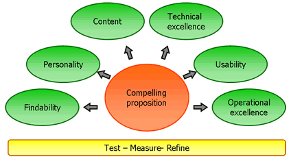
Compelling proposition
Any on-line offering starts with its proposition; what it is offering to the market place. Do we know who the consumers are (segment), how many of them are (market size) and their propensity to buy? What is going to attract them to the site, and what is the glue that will draw them back.

Findability

Well if no one can find your compelling proposition it’s never going to make you money. Do you have a strategy in place for ensuring consumers can find your proposition? This starts with search engine optimisation, but will extend to affiliate programs and making a noise about you (Product team blogging?). And then when they are at your site is navigation intuitive? Is relevant and wanted content findable?
Personality
What is the product aesthetic, what does it look like? Is it branded? Does it exhibit production values that reinforce the brand? How does the overall experience make me feel – how does it emotionally engage me?

Content
Content is king. But all too often it is a bit of an afterthought. It’s not just syndicated content, or articles that subject matter experts might write, it is all the copy, the words that appear on the site. Do they support the proposition, or are they just placeholders that the developers wrote and never got updated? Related to content, and maybe it should have a bubble unto itself is community. I think that increasingly, successful eCommerce offerings will include an element of community. Fulfilling the promise of the ClueTrain manifesto from several years back?

Technical Excellence
Working for a company that undoubtedly employs some of the finest developers in the market place, this is something I see a lot of. But it means nothing if the other elements are not realised. Technical excellence includes those “non functional requirements” that development projects talk about; reliability, performance, scalability etc etc.

Usability
Learnable, speaks the user language, memorable, all those old chestnuts. Probably the maxim is “don’t make me think”. Aligned to usability is accessibility; we don’t want to exclude potential consumers through sloppy implementation.

Operational excellence
So the on-line experience may be compelling, but what happens then. Is the fulfilment channel fulfilling? Is there a promise to deliver goods and is the promised delivered upon? What about support channels? Do they support or do they just pay lip service to the concept? Does the web experience go beyond the web and cross other channels? Can consumers start a journey on the website and seamlessly conclude the experience in store? My blogs on Early Learning Centre, Norwich Union and a seamless experience all touch on operational excellence.

Test – measure – refine

Underpinning these factors is the need to constantly test what we do. We can all learn from Test Driven Development (TDD); write the test first and only have the confidence to proceed when it passes. How do we know it has passed? Well we need to measure it; we can only know success if we can quantify it. Based upon the feedback we refine; test – measure – refine, a concept core to agile software development practices.

A lot of words and a picture that belie a simple concept. When working in the web world, always think about the total experience. Break out of your silo (be it technical development or marketing strategy) and think holistically. What will the end to end experience be for your consumers? A technically excellent website is not success. A polished, well branded look and feel is not success. Success is compelling total experience.

What does red mean to you?

I’ve recently been in Hong Kong and ran a really quick retrospective with the project team. I handed out red and green post-it notes and asked the team to write down things that went well and things that went not so well. They then stuck the post-its on the board, red “not so wells” on the left and green “goods” on the right. Only it didn’t quite work like that. In my western mind I’d assumed that green is good and red is bad. Not so in China where red is an auspicious and lucky colour…

Red and green post-its confused in a project retrospective.  cultural differences were forgotten

Off is on in Motorola world

I recently borrowed a motorola flip phone. The first non-Nokia I’ve ever used. I really liked it, once I’d worked out how to switch it on. How intuitive is it to switch the phone on using the red off button? How hard would it to have built the green button to have a call to action for on?

motorola red off / on button
4 of 7
1234567