Design

Is your IT department like the NHS?

Can Gerry Robinson Fix The NHS? has been compelling TV viewing the last few nights. The thing that really comes across is the lethargy and the inablility to take responsibility to get things done. The two messages that resonate with me are listen to people on the ground and “just do it”. CEOs may chuckle at such incompetence in the public sector but how often are these issues manifest in the corporate world, and in IT organisations in particular. IT is full of reasons why not:

“You may be able to do xyz in Ruby on Rails, and it may only take you two weeks to complete (compared to the six month project we’d take to do it) but we just don’t (and won’t) support anything that’s not on our architecture roadmap…”

“You can’t do abc until we’ve completed our infrastructure refresh project.”

And how often is interviewing / listening to end users on an IT project plan?

Consumer driven development

One of the things that makes me passionate about agile is the way that it places the customer at the heart of everything we do. The trouble is “the customer” is often wrong. For me, the customer is the person whose life is transformed by the software they use. This is not the person who is writing the cheque, nor is it the person who is defining the requirement. In consultancy speak, they are the client. The “users” are the customer. I don’t like the use of the word “user” because it implies a choice to use the software has already been made. I’m probably going to have to accept that “customer” is never going to change, so why don’t we call our users (my customers) “consumers”.

So enough about semantics. The team are building an on-line banking product. The team ask the customer (client) what she wants. She bases her requirement around what she knows. Often this will be swayed by the development team talking about implementation detail. (Few things make me as uncomfortable as a customer (client) from the business (product owner) talking about APIs).

So the requirement is to log-in. The customer is comfortable with customers (consumers) having system IDs; a unique n digit number that identifies the customer on the legacy database. It has, after all, always been this way. She asks whether the customer’s credit card number could be used, but the developers tell her (via the BA) that these often change (customers loose their cards) and it would be hard to do. She nods her head in agreement (she’s put on the spot by the BA – the iteration is due to start next week…) And the requirement is manifest on the login screen (“please enter your 16 digit customer number”).

In reality, the “customer” bases the requirement on her experience with the organisation and what she knows about it. The consumer (if they were to be invited into the conversation) wouldn’t come to the problem with any of that baggage. She needs a simple login. She needs a user name that is accessible or memorable. She does not want a 16 digit number.

It may take a little longer to listen to the consumers’ need (we need to find consumers to talk to them). It may mean a little up front analysis (I’d suggest pre-project analysis, doing due-diligence if you like). But it will pay dividends downstream. In the login example above, the developers have swayed a simple and cost-effective solution in the short term, but have failed to consider the down-stream costs. How will the customer find their 16 digit number? Do we have to post it out (cost) on a card (cost) and have a support team (cost) and process (cost) for letting customers know their number if they’ve forgotten it?

As agile grows up, I’d ask for us to spend more time thinking about the real customer, the consumer, the person whose life will be changed by what we build. The inconvenience we may incur during development may be nothing compared to the pain we will experience after we have “delivered”.

Storyboarding with comics

Storyboarding is a really powerful way of communicating how a tool will work. The Sun design team have put together some cartoons that can be used for presenting storyboards; for example taking a bunch of wireframes and using the cartoons to tell the story through them. The cartoons are in powerpoint here. I’m looking forward to using these, to ditching the dry persona description and annotations and replacing them with a more compelling cartoon journey…

Blue is the colour. The website isn’t the game.

So I may support Chelsea on the pitch, but on their website? Oh dear me. It’s as though they got someone who has just learnt flash to build it – to use as many flash animations as possible. And any website designer that incorporates a link on their splash page (why oh why a splash page) that says “check out the site demo” and a first message “learn how to navigate through ChelseaFC.com” needs to be questioned. Learn how to navigate a web site? Oh please!

The nature of football fans is their brand loyalty, but to give them something that visibly takes time to load (page loading status bar), requires instructions to learn how to use, and doesn’t make things easy – support me achieve my goals – is frankly insulting.

Oh, and they’ve got a text only version (the CFC Flash website isn’t going to win awards for accesibility so one can only presume this is the only reason it is provided) but the splashpage requires JavaScript to load up, so no JS and no website, regardless of any text-only goodness that may be there. So not an accesible website then.
Meanwhile the community stuff that supporters care about (beyond the news and match reports, it’s probably going to be the most sticky content) is a seperate site that looks like it was built in the early days of the web. I mean, who uses frames anymore.

Sorry Chels, poor show. Your league status doesn’t extend to your on-line prescence.

Success is more than just features

All too often there is an assumption that we can deliver a bunch of features and they will provide a benefit to the customer. A simple model and it underlies much of what agile is perceived to be about. Deliver those features that provide greatest (business) benefit at the earliest opportunity.

Features leads to benefits

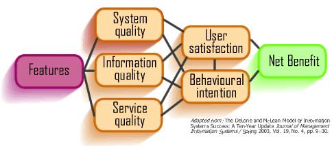
It is worth looking at the updated DeLone and McLean model for Information Systems (IS) success [pdf]. This is a causal model; if you want to accrue benefits with a system it is not sufficient just to deliver “features”. There are qualities that must be realised; these will drive an intention to use and actually use the application. This is tightly correlated with satisfaction, use will precede satisfaction, but if the outcome is satisfaction then use will increase and this is the ultimate test of how beneficial a system is.

DeLone and McLean model for IS success.  Slightly modified.

So taking the “qualities” one by one:

System quality: e.g. reliability, usability, performance, availability, accessibility
Information quality: e.g. usefulness, personalisation, speaking the user’s language, keywords, search terms
Service quality: the overall experience, interface design, emotional impact, trust, security, support

Typically development teams may consider some system quality attributes as “non-functional requirements” but these are generally from a technical perspective (e.g. availability) rather than a human perspective (e.g. usability). Probably this is because this is the language that development teams understand.

Information quality is usually left to someone else, someone from the business, from marketing, to write the copy for example. On the web, where most customer experiences start with search so getting copy right is essential to ensure search engine optimisation. On pages that are not content managed, pages that the developers are coding have meta-tags been identified? Has copy been written with targeted keywords in mind, keywords at the beginning of the page, with repeated use of the keywords etc?

Service quality is something that everybody assumes will be manifest but is rarely explicitly stated as a measurable component. I recently worked with a client that wanted to offer “world class” services. What did this mean? Asking them resulted in different things to different parties. The DeLone and McLean is a little light on “service quality”. Depending upon the application, it is something that looks and feels good, and makes me feel good using it. It is something that delivers a complete and holistic experience from the first point of contact (e.g. hitting the home page) through to realising my goal (e.g. correct products ordered arrive at promised time).

These qualities have a causal impact on use and user satisfaction. These can be measured (e.g. usage patterns/ repeat usage/ surveys) and should be incorporated into the non-functional requirements at the outset of the development.

Get all this right and you will realise net benefits from the project.

What’s the value in changing colour?

As a registered user, I want to change the colour scheme on the web site so that…

Where’s the value in this story? Agile focuses upon business value, and in doing so it commoditise features. The sponsors of the development are invited to prioritise features based on their “business value”. This means that seemingly pointless gimmicks will slip out. And this may impact the overall experience that the sponsors strive for. Yet by commoditising features the sponsor sees how the costs break down. To have functionality that changes the colour of the site will require effort. It’s not going to come for free. And that means that either scope will increase resulting in either increased cost or increased time. The challenge is when you have a sponsor who knows just a little: “changing colour? Pah! That’s a bit of JavaScript and changes to the stylesheet. I could get the code on hotscripts and knock it up in front of the telly tonight…

And of the requirement to change colour on a site, in fact that whole customisation thing? Until recently I’ve never seen the value of it. After all, how many people have you seen with a personalised theme on their windows desktop, or even just changing the desktop background? One reason people don’t do this is because they are lazy. The call to action to change it is hidden behind a right click, and it’s not exactly straight forward to do. But there’s a bunch of new sites that challenge the user’s laziness. These seemingly pointless customisation features are part of the overall experience. And they work. And by doing that, they add value to the site.

Don’t say UCD is incompatible with agile

Consultancy is great, you get to see lots of different problems that different organisations and people have. You get to apply the learning’s built up through experience to help solve problems, and sometimes help organisations realise opportunities that they may not have realised possible.

I was recently working with a new client and sat through a presentation by an agile coach from a different consultancy on what agile is. It was great to hear a different slant on the agile proposition and how it delivers business benefit early and regularly. The presenter really honed in on human behaviour. She was suggesting that despite our best efforts and beliefs otherwise, human behaviour is fundamentally unpredictable. The best plans in the world are held hostage by human behaviour…

At the end of her presentation there were a number of great questions from folk more happy in the waterfall space. People who have seen agile and it’s like before – RAD, DSDM etc etc, “yeah, yeah, heard it all before. Agile’s just another passing fad. Then one of the HCI guys asked the question: “in what you have said, it sounds like you would have little time for doing low-fidelity or paper prototypes; a fundamental tool in the interaction designers arsenal of techniques to ensure usability (and acceptability) in design”.

To give her credit, the presenter explained that agile practices are by nature pragmatic and there may be instances where such prototypes may be valid, but in principle she suggested that they should be eschewed.

Something bothers me here. We are quite happy to “spike” technical problems, but possibly the most important part of any software implementation, the user interface, we are happy to let emerge according to the developers’ preference? For it to be refined following feedback from each showcase? What if we call the lo-fi prototype, the wireframes a “spike”. Does that make it acceptable to the agile zealots? What if rather than writing code, testing and refining it, we draw storyboards, test and refine them? Get the UI right quickly and cheaply before a line of (costly) code needs to be developed. It helps you to have a shared vision of how the application will be manifest to the customer. It helps you to show what they will be getting in an iteration, what the goal is for a release.

To say that user-centred design is incompatible with agile (which was certainly the impression the presenter left the UI team I was working with) is nonsense. Which reminds me. I’m supposed to be writing a paper to this effect.

Cack-handed speed boat

A colleague did Luke Hohnann’ s speedboat exercise last night.  The way she drew it looked a little different to the way I draw it.

Picture a speed boat.  Now attach some anchors that are holding it back.  Which direction is the boat heading?

The boat is on the left, (travelling from right to left) and the anchor is on the right?

You are right handed.  For us special people, the left handed amoungst us, we draw the boat on the right and the anchort on the left.  That’s because we think quicker and better at performing complicated jobs.

Pictures and narative

Every night I try to get home in time to read my daughter a bed time story. Currently her favourite is Cinderella. The story is short, it could easily be fit onto one sheet of A4 paper (the plot in Wikipedia is just under 800 words). I could even decompose it down to a number of bullet points to fit into a couple pf PowerPoint slides. Somehow I doubt this would engage my daughter. I read Cinderella from a picture book. There are only a few words on each page, I read those whilst she looks at the illustrations. It is from these pictures that her imagination is fired. They bring my words of princesses and castles and fairy godmothers and balls to life.

Similarly when building new propositions, I’m much more interested in drawing pictures that articulate the user journey story. But this blog entry is not so much about pictures to articulate the process of building products. It’s about PowerPoint.

I have a bit of reputation as a PowerPoint monkey. Whilst our developers build code, I spend a lot of time building presentations on how they will do it. All to often I see slides that have been crammed full of words. There is often an unwritten rule that considers 20 slides to be a maximum number in a presentation. The rationale? An hour long presentation, say three minutes per slide and pow! Time up!

First slide title “Background”. A dozen bullet points on the history of the project.

This is like telling Cinderella from an A4 sheet.

I’ve been inspired by the Lessing method; tearing up the 20 slide convention. A PowerPoint presentation should be like telling a story. Just like the picture book of Cinderella engages my daughter and her imagination with pictures, the words being a cue for the narrative, so a successful presentation should have a narrative, supported by images and carefully chosen points. And if that means a slide deck with 100 slides so be it. Take a look at Dick Hardt doing this for real. Awesome!

Oh for a declarative experience

Want to go on holiday to France. Want to take the car on a ferry. Want to sail to Cherborg, or St. Malo, or Le Harve, or Caen. Flexible about time. Looking for best price. Want to book on-line. These are my goals. Not unreasonable goals, although as soon as I add “I want to have a ticket booked within five minutes” I enter the real of dreams. Currently, it is not possible to realise my goals.

What I want to be able to do is enter my broad travel criteria into a aggregation website and then filter my search. Imagine an excel spreadsheet where I enter my criteria:

Excel sheet, cells empty

The results appear immediately:

Excel sheet, cells filled
And as I change the quantity in my search fields, the results fields immediately update:

Excel sheet, cells changed

That is the declarative paradigm that is conspicuous by its absence on so much of the web. Rather than flexibility, the ferry booking sites send me down an imperative, step driven journey. I cannot adjust my criteria without starting the process again- and that means re-entering all the data I have already provided.

The story doesn’t end there. After fighting with a number of different websites I finally find a ferry crossing that matches my requirements. Condor Ferries. The price is alright – £160.00. I Don’t want to book it there and then, I need to confirm it with my wife. She says “OK” so I return to the site to find that the booking form has timed out. There had been no option to save the quote. I have to start again. I go through the process again to find the price has suddenly jumped from £160.00 to £280.00. Unhappy, I ring the company to be told their system has a real-time flexible pricing engine that changes according to demand. The price lower price is no longer available to me. (At least they didn’t have the cheek to put a premium for the booking over the phone rather than the internet). Indecisiveness gets the better of me so I put off booking till the following day. Once again I go through the pain of step-driven booking wizards. And lo-behold, the price has dropped again to £160.00.

I started with some “wants” and I’ll reiterate them. I want a declarative web experience that meets my expectations and helps me painlessly realise my goals. I want travel booking forms to enable me to push and pull different levers to refine my choices, just like I can change fields on a spreadsheet. Finally, I want to be able to save quotes to return to them later. I don’t want the web to be like a high pressure salesperson who tells me this price is only available if I make a decision now.

5 of 7
1234567