Design

Give me results according to my refine

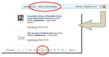
I know there’s a book out there. I know the author’s name begins with M. I know it’s a historical book. So I go to Amazon and for once I don’t search, I browse. I follow the site hierarchy: books> history > general and am presented with 32,5882 results. By default they are ordered by “bestselling” (best selling on Amazon – not always a helpful guide. Today’s number 27 on the list is “IEE on Site Guide (BS 7671: 2001 16th Edition Wiring Regulations Including Amendment 2: 2002)”. Mmmmm. Gripping).

Anyway, so I’ve got 32,5882 results to trawl through. Kindly Amazon provide an ascending / descending alphabetic filter. The intuitive way to return alphabetic results would be by letter. Unfortunatly the technically easy thing is done. Pages are returned by number, with up to ten pages accesibile at a time. That’s not very useful if you’ve got more than thirty thousand results.

Amazon search results

I’m on page 13 and I’m only up to AC… The letter M is an infinite number of clicks away. I’m off to Waterstones where I can physically browse the shelves, and hopefully find the book that way.

Shoot the wizard! Designing a real world form

The web has created some clunky metaphors that suit the limitations of the code rather than supporting the intentions of the user. Forms are a great example of something that has a direct “real world” analogy, yet rarely mirror what happens in the real world.

I sit at my desk and I complete my tax return. Half way through I hear my two month old daughter screaming. I take a break from the form and feed her. When I return it is still on my desk in the same state I left it. Yet my online experience? I get timed out and anything I have done on the form has been lost. Unless I saved the form at that point.

And then there is the wizard. A linear step processes that dictates I complete one page before continuing to the next. Usually the wizard has a step indicator or progress monitor through the form; yet this is rarely a true monitor of progress through the work completed, rather page x of y. Probably this step indicator will not be clickable – if I am on page 3 I’ll be lucky if I can hyperlink back to page 1 and almost certainly I will not be able to hyperlink to page 5.

Forcing me to follow the wizard, down a clearly defined route to complete the form has a number of inherent issues.

  • Clearly it is inconsistent with my real world experience of form filling. When I get my tax return through the post I flick through it. I get a feel for it. Maybe I fill out the boxes that I am comfortable to answer now, leaving others till later. I jump around the form in a way that is rarely possible on on-line forms. I don’t have to “register”. I don’t have to “save”. The form is there. I’m in control to do what I want to do with it, not what the form designer wants.
  • The wizard is not only inconsistent with my real world experience, it is also inconsistent with my expectations of the web. I browse the web. Yet I cannot browse the form before I complete it. The one, consistent point of reference I have with my experience of the internet is the back button. Yet in many web applications this is removed. Or it behaves inconsistently; i.e. you’ve got two back buttons that behave differently (browser back button moves you to the previous page, back buttons on the page direct you to the previous page in the process).
  • With a wizard pushing me down a pre-determined route, I am more likely to feel lost, trapped or unable to complete the form – when I reach a barrier my experience necessarily ends. You need my national insurance number? I don’t have it to hand. I click “next” and an error message appears. “Please enter your national insurance number”. I can hear an exasperated sigh.

There is an alternative to this “command and control”, imperative programming approach. It is a behaviour driven, declarative approach. Ditch the prescriptive wizard and adopt a “hub and spokes” structure to the form. The user navigates around the form, completing it according to their own preferences. With AJAX we no-longer have to post the form on each page transition, this can be done at the field completion level. Dependencies on the form can be dynamically driven rather than being prescribed up-front. There is no need to register first, the user name and password can be anonymous (and stored via a cookie) until the user decides to reveal their identity to us. The user takes control away from the designer. The metaphor for the form becomes the off-line form with the web technology providing enhancements to the experience rather than the limitations seen in so many forms you see today.

I declare! Rich internet applications

One of the problems of many internet applications is that they are constrained by the “command and control” approach of imperative programming. This results in a sequential, step driven behaviour that allows little freedom for the user to work efficiently. Contrast this with the declarative approach to programming which is very much user-behaviour driven.

Think of your on-line banking application. You want to pay a bill. Your natural behaviour may be “I want to make a payment from account to beneficary on or around date for the value of amount.” Yet typically this will be handled imperatively; a payment wizard forcing you down the route of account-beneficary-date-amount, with each step being a new page. I do not have the flexibility with such an approach to change my mind or to do things in a different order: “I want to make a payment for the value of amount on or around date from account to beneficary“.

Think of a spreadsheet; you would enter all the fields on the same sheet. Make changes to one field and other fields can be simultaneously updated. This would be impossible to achieve if your web application is linear and step driven.

The declarative approach to programming allows such flexibility being data or behaviour driven rather than process driven. With the constraints of implementation process removed we can build user interfaces that better address user goals and intentions. Rich Internet Applications (RIA) are an excellent example of the declarative approach. Ajax enables RIA to a degree, but Macromedia Flex and the opensource cousin Laszlo take it one step further. Take a look at this demo – a truly awesome (IMHO) flight checker application (click on the Search Now button to see the functionality).

The main issue with RIAs that are built in Laszlo or Flex (or indeed extensive Ajax) is those of compatibility and accesibility. By forcing users to have Flash downloaded are you likely to exclude users who don’t want, or can’t have Flash? And accesibility – I’m not sure to what extent this is addressed by them. However if resonable alternatives are provided (i.e. a “text only” version with little rich client side functionality) this ceases to be a problem.

Collaborative drawing

I am a true beleiver of the power of drawing. I get itchy feet in meetings when people are just talking about concepts. I get an urge to jump up to the whiteboard and try and illustrate what we are talking about. When we are distributed this can be a little harder. There is no whiteboard on a conference call… This doesn’t have to be the case. Here is an awesome collaborative drawing tool that has great potential to develop and share ideas in illustration. Next step is to get a pen to replace drawing by mouse and make my sketches actually look like what my hand is drawing.

Consistency or usability feature?

The National Lottery have added a new Results Checker to their website. They use JavaScript to support the user enter their numbers into the boxes: you type a number and the focus of the mouse jumpts to the next box. First impressions are that this is a useful feature. However, it is conflict with the user behaviour of manually tabbing between fields. Given the audience profile I would make a call that this is acceptable; what percentage of the general population are familiar with the concept of using the tab key to move between field? My hunch would be a small number.

The feature fails in one small but crucial respect. It lacks internal consistency. They have an “orignal results checker” that does not use the JavaScript onFocus script. This leads to a conflicting mental model of the site. Some boxes automatically tab, other’s manually tab. Is this a lesson for interface designers to learn, when updating some parts of a site, don’t forget to refactor other parts of the GUI?

What’s the point of usability testing?

I’ve seen a couple of projects recently where the team have invested in usability testing of wireframe mock-ups of application processes. I’m beginning to wonder whether this is effort well spent.

Don’t get me wrong. I am a firm advocate of usability testing and incorporating it as early as possible into the design process. I’ve set up a few usability labs in my time, facilitated hundreds of usability sessions… I even once had the pleasure (is that the right word) of watching users struggling with boo.com. There is always much to learn from seeing users actually using what you are building. But I now ask the question at what point can you learn the most. If you’ve designed with usability in mind, where is the value in testing the basics of something that instinctively you know as a usability professional to be “right?”

Let me qualify this. The development of an on-line application processes / tools / wizards is now a well trodden path. Any interaction designer worth his or her salt will have experience of building one and will instinctively know what works and what doesn’t work.

In the first instance the interaction designer will create wireframes that illustrate the process; a visualisation of the pages representing the flow that has initially been created.

In creating the wireframes the Interaction Designer should be making reference to personas, will have been collaborating with other team members, validating their assumptions, and will probably be doing informal guerrilla testing around the office to confirm ideas that are puzzling them.

If the interaction designer is any good there will be few, if any issues with the wireframe flow that the users walk through. In a usability test the user is more likely to pick up on labels (and if it is not lorem-ipsumed up any copy that the interaction designer will have written – It is unlikely at this stage that the copywriter will have been involved).

That is a lot of cost and effort to validate the work of a professional.

The wireframes in usability test will generally be based upon a set scenario through a “happy path”. What the wireframes are unlikely to uncover are issues where the user wanders from the “happy path”. Producing reams of wireframes in Visio or PowerPoint and then linking them all up to simulate the finished product is painful and not particularly productive or useful, especially if there is a lot of interactive “web 2.0” stuff going on. To really simulate that you are going to have to build a prototype for real.

Here is something that the devs at ThoughtWorks are pretty good at. Using high productivity platforms such as Django or Ruby on Rails they can pull together a fully featured product that can be usability tested in earnest. It is not a dumb “smoke and mirrors” html prototype; it can have database and “intelligence” behind it. The benefits of this are clear. The business can try and break the process; we can get the business rules right. The developers are able to see how the vision actually functions. Again, they less likely to uncover corner cases that have been missed if a first pass of build has been done already.

Once we have this new avenues of testing are opened to us we can move away from the need to test in a clinical lab environment. Providing a user with a URL to the application form, and using collaborative software such as Skype and Net Meeting we can perform usability testing with greater ecological validity – the user can use the application form on their own PC at home.

Agile doesn’t do good UI does it?

There is an argument that goes like this. Give two development teams the same problem. Get one team to use a waterfall model, the other an Agile model and see what you get. Chances are that the agile team’s code will be more elegant and cleaner than the waterfall team but their UI design will fall short of the Waterfall team’s.

Truly incremental development of code, adding features as they are required (according to business value) is just not suited to developing a consistent and intuitive interface. Without a model to specify what the interface consistencies will be the developers will build the interface according to the requirements of the current feature, not necessarily how it contributes to the overall experience of the application. This is often compounded by listening to the wrong “customer”. All too often the people who buy software are confused with the people who use it. Buying decisions aren’t using decisions. (Anyone who has used Lotus Notes primarily as a mail client will testify to this: you are a captive users. If you as an end user could choose you would probably use something different, but you didn’t buy Notes and were probably never invited into the discussion about it’s purchase).

Big up-front design?
If “change” is a dirty word in Waterfall approaches then “Big-up-front-design” is a dirty phrase in the agile vocabulary. Anything that smacks of design and specification documentation before a line of code has been written is guaranteed to get the backs up of agile zealots. Yet it is clear that in an absence of any roadmap for a UI, the interface could go anywhere, and for a component as critical as the interface between the user and the functionality this can have disastrous consequences. Any feature is only as good as the users’ ability to use the feature. The underlying code the developer has written may gain the admiration of her colleagues, but if it takes the user twice as long to use the new feature because of a poor UI then any business value promised in the application has been destroyed. On a project iteration level, the lack of any detailed UI design can cause a number of issues ranging from inability to get customer sign off on stories through to rework (not refactor) as the UI metaphor starts to evolve.

In practice it doesn’t have to be like this. You don’t have to do “big up-front design” to get the UI right, rather just do enough to produce a model that drives the project forward (what original XP called “metaphor”); an understanding of what we’re all striving for, so we can make emergent design decisions that match that metaphor. The question therefore is what is “enough”? As always it depends.

The user interface is rarely specified as a requirement. It is just assumed it will have one. A starting point to getting the UI right is by capturing it as an emotional requirement. How are users to engage with the application, how do we want them to feel about it. By doing this we can quickly ascertain whether we are looking at a “world class, best in breed, competitor beating application;” an “application that will help transform the productivity of our employees [happy workers = productive workers]”; or “just a maintenance application that the tech guys use”. Business value can be placed upon each of these requirements and should be prioritised against feature requirements, both in terms of benefit (builds the brand, faster transaction times, fewer mistakes etc) and in terms of cost (interaction designer and graphic artist input on project team).

The GUI model
Once we are agreed that the UI is important to the success of the project, we can produce models for the look and feel of the UI.

Feel
The model isn’t the UI design for the application per se, but rather the vision and the basic structure of the UI for the application to fit into. It provides some guidance for developers and BAs as they begin to analyse and implement stories – some basic structure the application can fit into so we don’t have to struggle to invent so much UI stuff for each story. And, so the finished application feels a bit coherent. The model may have two halves, firstly the vision that illustrates the feel of the application; how the user will flow through processes, an information architecture illustrating where pages will fit. Secondly the model may be prescriptive; how the will the user know what to do, how will widgets work. The primary artefact of this model might be ‘wireframe’ sketches of pages – a low fidelity prototype that walks through key user journeys. Alongside this may be basic interaction patterns, for example how a search mechanism will work, how forms are to be laid out. Just enough to ensure consistency in the feel of the application and prevent avoidable re-work at a later date.

Look
Alongside the feel model is the look model. The developers need not care too much about this, provided their html is cleanly marked up. The feel will be created by the graphic artist and interaction designer, and implemented in the style sheet. Obviously if the goal of the application is to be a customer facing “world class” website, more attention will be required on the look than if the application is a development support tool.

The important thing with these two models is that they are sociable, communicable and flexible. The whole project must be aware of them; when new people are brought onto the project, the starting point of the communication should be the wireframe sketches. “This is the vision of the project… currently we are working on these parts… you see that tab – that is release two…” They may also change. We originally thought we’d have a ‘wizard’ to complete the process, but after showing the wireframes to users they wanted it all to go on the same page. But it is better to have something to hold the UI together than assuming that it will evolve through incremental development.

(These thoughts are not entirely my own – much of it is distilled from a ThoughtWorks email thread on UI design, agile methods, and BUFD… or BUFUID as someone commented).
Designing the bleedin’ obvious

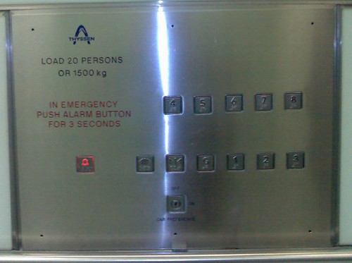
How hard can it be to design something as simple as lift control panel.

The specifications are as follows: buttons for eight floors, hold door open, door close, alarm and key slot for manual override.

I’m sure that most people would logically take advantage of the users mental model of the way lifts work – i.e. up and down and posiiton the button for the eighth floor on the top and the button for the ground floor at the bottom. That is bleedin’ obvious isn’t it? (I believe that 90% of user centred design is the bleedin’ obvious). Sadly, some people don’t get the bleedin’ obvious and all too often they design things that we use every day. Like whoever designed this lift control panel. Vertically positioned buttons with the most frequently used button [ground floor] hidden in the middle of the bottom row of buttons. I have to think to find it.

lift control panel

(I also have to think “how sad am I” to notice such a thing, take a photo and blog about it. S’pose that is why the world needs interaction designers, to state the bleedin’ obvious.)

The business value of emotional requirements

Whilst amazon.co.uk languishes in yesteryear, it’s transatlantic cousin amazon.com has gone all web 2.0. They’ve also introduced some new features, the ability for customers to associate and share their photos with products they have bought. For example for an ipod nano people have uploaded images that graphically illustrate how small the nano really is. Cool stuff. But I have a question. Where is the business value in this feature?

Agile is all about delivering business value. Business value can be crudely decomposed into four reasons why we do things:

  • To reduce cost
  • To increase revenue
  • Because of reguatory or compliance pressures
  • For altruistic reasons (such as giving something back to the community / imrpove emloyee morale etc)

Features that do not address these business objectives (and more often than not just the first two objectives) will be deemed low priority (if ever considered in the first place) and typically fall by the wayside. Which makes me wonder how Amazon get away with it. What is this business case for “Customer Images”? What business metric will they look to that will demonstrate the features success in driving revenue? I’m sure some obscure derrived metric could be arrived at – but I would guess that the key driver for this functionality is an extension of the brand. There is no monetry reason for the feature, it is just a right cultural fit with the overall product. It is about developing an emotional engagement with the customer that is beyond the purely functional (browse – buy).

As agile practitioners we capture stories. During the process we will also capture “non-functional” stories. (some would add “technical” stories to these). I’d argue we need to add a new category of story – the emotional requirement – how do we want our users to feel about our product? Such stories will enable us to build software that goes beyond the strictly functional and begin to engage. They will help us temper the cold business objectives that focus upon getting things done, with the softer intangible / aesthetic quality of the applicaiton that will keep the user coming back again and again. Come to think about it, there’s the business case for “Customer Images”. Building a better relationship with our customers to increase customer purchasing and reduce customer attrition. Now why don’t other businesses think like that.

Is the ThoughtWorks mind the creative mind?

The guys over the fence in the media and advertising world are seeing a paradigm shift away from focussing upon the narrow “message” of a campaign to the broader “user experience” that encompasses the whole brand, not just a flashy graphic. This requires the “creative minds” to broaden their horizons. One such creative mind has created a picture that illustrates this.

The creative mind

This is a good way of thinking when attacking an IT problem. Not just focussing upon implementation detail, but the whole user experience. It means broadening the mind beyond the analytical. In addressing IT problems, developing greater “curiousity” and “expressiveness” is not a giant leap. But sesuality? Can developers ever have a sensual mind?

Recent experiences suggest so. Once a Dev has been hypnotised with a bit of web 2.0, emotional design seems to flow through their arteries. They “seek to satisfy all the senses. Aesthetics, beauty and form are driving forces…” That is they get all gradient-fills and curves and funky Ajax gizmos…

6 of 7
1234567