Design

Real world forms

In the real world, when I get an application form I’ll flick through the pages and have a look at what is required. I can choose which fields I complete in whatever order I like. If I want to take a break half way through I can. I can complete it when I like and how I like.

So why aren’t web forms like that?

The usual format for a web form starts with some copy that describes the form (which people skim through at best). The user clicks to the next page and the form commences. There may be a step indicator showing progress through the form, but almost certainly progress through it will be linear. You have to complete each page before progressing to the next. If you are lucky you’ll be able to click to previous completed steps. But the experience is nothing like a real-world form. And when was the last time a real-world paper form “timed out” half way through, demanding the user to start over again if they left it idle for ten minutes?

The web forms we see today are a relic of their tecnological past. There is no reason why they must be linear, (and if there is logic in the form, there is no reason why the user can’t explore the different routes – you do that with a paper based form). There is no reason why the user can’t click to whatever page in the process they like (just like with the paper form). There is no reason why a page must be completed before progressing to the next. There is no reason why the form should time out and forget everything the user has entered. Fields can be saved as they are completed against an anonymous user, until the user wants to provide personal credentials.

Bottom line – the web has moved on. Instead of reflecting technical constraints of yesterday, it can adopt more real-world metaphors. But do we have the courage to start introducing new paradigms? Are users, information architects and usability experts so ingrained with broken web metaphors that they will shun a new model, (a real world model) of completing a form?

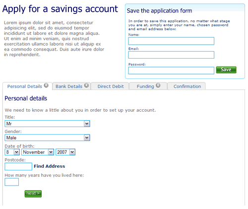
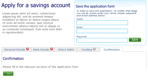
So here’s a rough example. It’s an application form for a savings account. Ignore the content, field labels etc, it is more the model that is illustrated.

1. The user can move between the sections (tabs) to see the fields that are required. There is clear feedback on each tab that it has not been completed. The “Direct Debit” section is optional hence no indicator. The ability to save the application is seperate.

Application form, step 1, nothing filled out

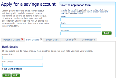
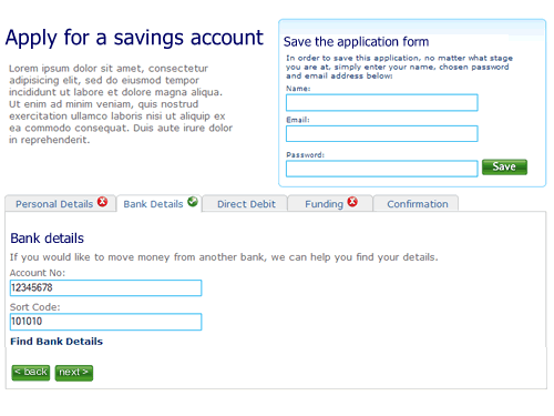
2. The user selects “Bank details”. They’ve not filled out all the fields on the first tab “Personal details”, but it doesn’t matter. There is clear feedback that this tab is yet to be completed.

Second tab on the application form, the first tab has not been completed

3. The user clicks right through to the confirmation tab. There is nothing to confirm so the page remains blank, with a prompt to fill out other sections.

Step 3 of the application form

4. When sections are completed the indicator on the tab changes to show completion. Here the user has completed step two ahead of step one.

almost there

5. Finally, when all sections are completed the user can review the entire form.

Confirmation screen

I’m not saying this is perfect, it’s a start. A start to re-thinking the way we design forms on the web and think about modelling them on real world behaviour instead of technical constraints of the past.

What not how

All too often the business thinks in terms of the “how” rather than the “what”. But why should they care how something is to be implemented? Why doesn’t the business state their requirements in terms of their desired outcomes? What is it that they want? Then, and only then should anybody think about the “how”.

Sadly, focusing upon the how rather than the what is a driving factor behind so much of the mediocrity in enterprise software. Rather than stating “what” (they want) in terms of their dreams and aspirations, the business express their requirements in terms of what they perceive IT can deliver. “What” could never be the design quality of Apple (visionary) because they believe the “how” (their IT team) is not Apple (mediocre). But wouldn’t your average developer rather be building something visionary than something mediocre?

Confirmation – undo

The traditional pattern for the on-line banking “make a payment” GUI is:

  • What you are about to do (text)
  • Select “From account”
  • Select / enter “To account” (Beneficary)
  • Enter Amount
  • (Optional) enter “when” (you want payment to be made
  • Confirmation (“you are about to pay this amount from this account to that account. Are you sure?”)
  • Post process confirmation (“You have paid this amount to that account from this account”)

So here is a question. Are those confirmation screens really necessary. What if you made your payment, hit the “OK, make the payment” button and it is done. An alert appears (like when you do something with google) that says what you have just done with an “undo” call to action (“I’ve made a mistake, I don’t actually want to make that payment afterall”). The assumption there is that the user knows what they are doing – we assume a happy path with the opportunity to go back rather than placing “confirmation” barriers to completion which are probably unread anyway. There will be considerations of when the payment is actually made; does it hit the clearing systems when the user hits the pay button (not that it ever does anyway). Does the undo option disapear after a period of time (i.e. five minutes), or when the user navigates away from the page the alert appears? But let’s leave the implementation to one side.

I like the idea of undo instead of confirmation. However, I have a hunch that it will not fly when we show it to customers, because people are so ingrained with the “confirmation” dialog. I’m waiting for the response “I’m not sure I like that” from customers who use the current website, because it different, unexpected and is wholly inconsistent with what they have today. But what they have to day is based upon legacy technology and the immaturity of the platform.

So a suggestion. Let people undo. Tell them what they’ve done after they’ve done it (positive feedback), with the opportunity (in the banking environment in a time boxed period) to rectify their errors or change their minds. Do away with confirmation dialogs. Everywhere. (Do you want to save this document? – instinctively I say “no”. It is only later that I realise my mistake…) Here’s to a web that places minimal barriers to task completion.

Is there anything wrong with my attachment to Saffron?

A funny thing happened today. We’ve had up on the wall our personas – boards showing the key users of the site we are developing; their photos and mood imagary visually describing them. These were stuck on top of earlier, crude descriptions of the personas with their names the same but different photographs and less detail.  A seperate workshop was held in another room and the boards were taken down for it, leaving the earlier versions behind.

Suddenly our key user who we are calling Saffron had gone. Her photograph had changed. Her “type” was the same, but her personification was different…

I was kinda attatched to the old Saffron. Who is this imposter?

In a while the boards will be put back up again and my Saffron will return…

Now whilst I am a keen advocate of personas to bring a user type to life, clearly there is a danger of getting overly attached to that persona, and that feels like a smell.

Make something consumers love

Bubblegum generation presents a compelling model for Apple’s iPhone strategy:

1) Pick an industry which sucks (ie, imposes significant nuisance costs/menu costs/externalities on consumers)
2) Redress the imbalance by making something consumers love
3) …Which disrupts the long-standing industry equilibrium, and shifts market power
4) Use said market power to redesign (a hyperefficient) value chain

Don’t think that organisations in industries that suck don’t aspire to “do an iPod”. Go to any proposition development or product strategy workshop and it won’t be long before someone is mentioning Apple products. Yet all too often they fail to do anything truly revolutionary; they end up doing something different rather than “Redress(ing) the imbalance by making something consumers love”.

Do customers want something that is different or something that is just better?

Interestingly, little functionally in the iPhone is new. Like every other phone on the market it makes phone calls, sends messages, receives emails, takes photos and allows users to listen to music. Nothing different or new there… other than being better than every other phone on the market.

What Steve Jobs espouses is the experience of the phone. He says “So, we’re going to reinvent the phone. Now, we’re going to start with a revolutionary user interface… Now, what’s the killer app? The killer app is making calls! It’s amazing, it’s amazing how hard it is to make calls on most phones.”

He’s not looked to do anything radically different, rather do it radically better.

So how do you bring revolution to your product set? Rather than trying to be different, why not try to better. Make something that consumers love?

Take a leaf from the Apple book and focus upon the experience. Design and attention to detail are critical. Moving beyond purely functional and satisfying products to crafting experiences that engage the emotions. In agile product development it is often easy to focus upon delivering functionality that is perceived to deliver business benefit, yet end up with a mediocre product that has little resemblance to the original idea it was meant to become. Incremental delivery is a key feature of agile; it means you get stuff out there early and often. The challenge is to identify what that stuff is. To make something that consumers love using the agile approach, in addition to great developers and focussed project management, you need three people;

1. A passionate sponsor who has a dream and a vision and can articulate that to the team, banishing mediocrity from the outset
2. A business analyst who will help the team slice the functionality according to consumer needs and desires; that take the consumer of the journey they want to travel, not a predefined route that constrained to picking those features that eventually will deliver greatest value.
3. A customer experience architect, interaction designer or graphically minded usability dude who can champion the product aesthetic and usability.

Get them on your side and maybe you might be taking the first step on developing a better gizmo that your consumers will love, and sleep outside your retail outlet for hours to buy one.

Compel me to continue

Web site registration is usually more stick than carrot. The worst sites are those that require you to register before providing any indication of the benefits that will be accrued from entering yet another username and another password. (Bring on OpenID and single sign-on).

Geni.com breaks that rule of not placing a registration barrier before customers can interact with your site, but they get away with it. How? Registration is hardly a barrier – it is only a request for an email. The first page you view visually articulates the proposition, compelling you to continue. To add an email is hardly an onerous task. There’s no request for password, no T’s and C’s. The password is covered by the email they send you, and do we really need the small print that no-one reads anyway… Besides, logging in is only relevant the next time you visit the site, by which time you will probably already be committed. Not only is proposition itself is really compelling, the execution is excellent. The guys behind this have obviously spent some time thinking about the design and the usability. They could easily have jumped on the community site bandwagon and built something to obtain VC investment. But they’ve gone one step further and built something that engages not only on content, but also on interaction.

It’s how you ask it…

Prioritising requirements

You’re running a workshop and the group have come up with a bunch of new propositions. You want them to vote on which ones to take forward to the next stage. Or maybe you’ve identified a bunch of functionality and features and you want the group to prioritise what they’d like to see built first. What question you ask the group next is critical to the answer you will get.

You need to frame the question appropriately and make it clear to the group the criteria by which they are making their vote…

Do they need to be thinking about “do-ability”, the ease to implement, or do they need to be focussed upon the innovation and the idea itself. Should they be considering the cost to implement, time to market, return on investment, or should they be thinking about the art of the possible; the “blue sky”; the destination, regardless of the journey to get there.

Which line of thinking they should use will depend upon where you are in the process. Get them thinking about practicalities of implementation too early and you are likely to dilute the vision. Too late in the process and you will have candidate propositions or features that by their complexity or uncertainty will never the light of day.

So two tips. Before you ask the group to vote, or to prioritise, clarify the objectives and the critiera by which they are to decide. Maybe ask them to assume a ‘persona’ and vote in the way they’d expect the persona to vote, for example a customer will have different priorities to a developer.  Whose vote is it anyway?
And after they have made their vote make sure you manage the group’s expectations. Don’t let them leave the room thinking what they’ve decided upon is final and binding. It rarely is.

Cultural differences in toilet walls

US executive toilet gap legs and all

What do you see? Depends on who you are. In the US it’s just a row of toilet cubicles. Elsewhere in the world it is “what’s with the huge gap between the floor and cubicle wall? A gap large enough to see the legs of the person in the cubicle next to me!”

Apologies for dragging this blog to the level of the toilet, but there is a point to this observation. Things that are normal in one culture may not be quite so normal in other, even the most mundane. On distributed projects with off-shore teams it is not enough to ensure you have robust processes and open channels of communication. You need to ensure that cultural differences are understood and respected. Don’t assume everyone shares your design of toilet.

Won’t you please… be concise

Won't you please give this seat to the eldery or disabled

Seen on the New York subway.  Is the “won’t you” really necessary?  The tone of the notice is trying to be friendly, but surely when you are writing signs or labels it is better to be concise and to the point. Afterall, it’s a sign, not conversation.

Heard on a suburban comuter train going into London, a pre-recorded generated message.  “London Underground inform me that there are currently no delays on the system”.

“Inform me?”

The “me” is a recording.  Again, the tone is trying to be friendly, but it is not real.

When communicating to customers use a style that is appropriate to the media.  If it is impersonal information you are providing, be concise and unless it is coming from the mouth of a human in real time, don’t try to fool me that it is otherwise.

Let the UI drive the requirements

Conventional approaches to building software applications start with a Big Idea. Someone needs (to define an application) “a program that gives a computer instructions that provide the user with tools to accomplish a task“.

Someone picks up the big idea and breaks it down into a smaller list of “requirements”, things that the application must do to fulfil the Big Idea. In conventional waterfall development Business Analysts will spend a while documenting the list of requirements in some detail – in agile approaches they will do it as they go in a far more “lightweight” manner. Maybe a technical architect will draw up a blueprint design of the solution. Regardless, soon the developers will start writing code. With either agile or waterfall the user interface usually only starts to emerge at this stage. Until then, everything is coded in words (and maybe some boxes and arrows showing flow).  Only late in the process does the UI emerge.

Returning to that definition of an application, IT development seems to spend most of its time in the “a program that gives a computer instructions” world, and often looses sight of “provid[ing] the user with tools to accomplish a task”.

How about a different focus. Start with the user interface. Take the Big Idea and illustrate it. Draw pictures of what the tools will look like, how the user will interact with them. Sketch storyboards, wireframes, lo-fi prototypes, paper mock-ups, call them what you will. Use this as the primary requirements document, supported by explanatory text and detail where we required. These may be stories or use cases, but let the visual representation of the big idea drive the requirements rather than it being almost an afterthought.  Start with the UI and specify the functionality from that rather than the other way round.  After all, it will be the UI that the user uses to accomplish their task, not the computer instructions.

3 of 7
1234567