interaction design

If you say Log out, log me out

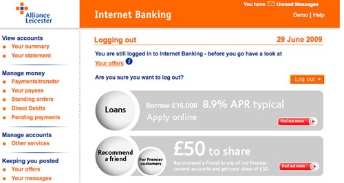
You’ve logged into your on-line banking checked your balance, paid your bills.  What do you do now?  Click on the logout button?

What do you expect will happen now?  Well given that you have actively chosen to log-out (it’s not something you are likely to click on my mistake), you’d expect to do exactly that.  Logout.  The next screen you get will probably be something that thanks you for on-line banking, with a cross sell for a product or two.

That’s what I assume most customers would expect.  So what are Alliance and Leicester thinking about with this screen?

The customer has clicked log-out but they are still logged in?

Why?

“You are still logged in to Internet Banking – before you go have a look at Your offers.”

Excuse me, I logged out, I don’t need to be logged in for you to show me offers.

Worse: “Are you sure you want to log out?”

OF COURSE I WANT TO LOG OUT!!! Why else would I have clicked the link.

Alliance and Leicester fail here in a fundamental usability rule, that of managing the customer’s expectation. In an application where security isn’t paramount this would be an error, in an application where customers expect their action of leaving their secure accounts will do exactly that… but doesn’t, is inexcusable.

Does this train go to Bangor?

Over the loudspeaker comes a garbled message “…this train divides at Chester.  Customers for Bangor must travel in the front four coaches of the train”.
There was a group of women behind me talking loudly, one of them picked out part of the message and was worried.  The train guard (sorry, Customer Revenue Protection Officer) walked by.
One of the women got his attention, “Excuse me, we’re going to Bangor?” she said.
“Oh” said the guard.  “You need to get out at Milton Keynes and walk to the front of the train”.
“What? We need to change trains?” the woman replied.
“No, it is the same train, just the front part of it.”
“Is it on the same platform?” Asked the woman.
“Yes, just walk up a little” replied the guard.
“We don’t need to cross over to another platform then?”
“No, it is the same platform, the same train”
“So why can’t we stay on this train then”
“Because this part of the train divides at Chester?”
“But we’re not going to Chester, we’re going to Bangor”
The guard was getting frustrated, “when the train stops at the next station, you just need to get out and walk up the platform, in fact to the next carraige and get on the train there”
“So why can’t we walk through the train to the next carraige?”
“Because it is a different train”
“but this train is going to Bangor isn’t it?  We are on the right train aren’t we?”

And so on until a fellow passenger jumped in “when we get to Milton Keynes, I’ll show you where to go” and at Milton Keynes he led them all off the train to walk past the train divide on the platform and I’ll assume they made it to Bangor in one peice.

The point of this narative is that not everybody “gets it”.  Just because you think something is straight forward or obvious doesn’t mean that your customers will.  You are not your customer, be wary of making assumptions on how people will use your Great New Product.

Test Driven Design

I recently worked with a client where one of our deliverables were wireframes that illustrated how pages would be laid out and how the UI would work.  We were quite pleased with the results, there was some quite complex AJAX based functionality that provided a really immersive, goal orientated experience that looked like it would make finding products easy and enjoyable.  Testing the initial wireframes with users was an enlightening exercise, and demonstrated that the wireframes we had developed were not yet ready – users were not able to fulfill the goals they were set.  More worrying, some of the complex functionality we were introducing just did not work (some of the navigation, filters and sorts were confusing, just presenting information on a single page would suffice).

Usability testing often gets discussed and is a good intention but all too often budgetary or time constraints mean it never happens.  The user testing I refer to here impacted neither.  We did our testing in a meeting room, the customer sitting at one end with a facilitator, and the team watching on the projection screen in the same room.  We used a talk-aloud protocol walking through the static powerpoint wireframes that were linear in their presentation according to the ‘happy path’ to realise the customer goal.  Someone took notes as we went through the wireframes (in the notes section at the bottom of the PowerPoint deck).   It was quick and dirty but produced results.  After a couple of sessions things that we, too close to the design, had missed.  Changes to the wireframes took a few hours and allowed retesting the following day.  Indeed we made some quite significant changes to the user interaction model.  When we re-tested the wireframes the improvements were evident.  The feedback was more positive; there were fewer blank faces, less confusion and “I’ve no idea what to do next” was never uttered.  This was true iterative design in cycles that took a few hours.  Compare this to the days if code was involved.

Where does this fit into the agile way of delivering software?  In the agile/ lean zealot’s passion (and impatience) delivery, and their (dogmatic?) assertion that anything but code (working software) is waste, they loose focus upon what is really important, that of overall product quality.  Product quality is not only zero/ minimal defects and meeting the business requirement, but also delivering something that is usable and delightful to use.  Developers may do Test Driven Development, but this is based on assumptions that what they will code is right.  TDD should start earlier in the process, Test Driven Design.  It takes time to write your tests up-front, but we know it to be a good thing.  So why not design the user interface (wireframes) and test that up front?

User interface is a disruptive technology

Last year, according to Gartner, with belts tightening, technology executives need to focus upon disruptive technologies (that cut costs).  The top ten list of disruptive technologies makes strange reading.  How will social computing and mash-ups cut costs (enterprise 2.0?)  Most interestingly, coming in at number six on the list is “user interface”.  Now let’s leave aside the fact that a “user interface’ is hardly a technology (it is how technology manifests itself to the user) I’m interested by the fact that it can be considered to be disruptive. What is disruptive about user interface design?

But think a little further.  What is really disruptive is the realisation that good design is more than just adherence to functional requirements; good creative design is more than ‘bells and whistles’ or ‘gold plating’.  A good user interface will cut costs by enabling the internal user base be more efficient and productive.  A good user interface will enable customers to succesfully complete their transactions / goals.  In a world where poor UI on enterprise applications remains, maybe user interface is indeed a disruptive technology after all.

What’s a URL?

Do you know what a URL is and what to do with it?  It sounds like a stupid question, of course you know what a URL is, everybody does! But you’d be wrong.  Having observed countless users interacting with websites, it is striking how many people enter the URL into their search engine.  My hypothesis is that the URL bar in the browser is something technical and best left alone.  But don’t just take my anecdotal evidence for it, look at the top 500 search engine keywords– in the top 20, four are URLs that could have been typed into the browser address.  Look at the keywords in your web analytics, almost certainly (if yours is a B2C proposition), your URL will come in the top ten keywords for your homepage.

Lesson number one: people are not as tech savy that you think they are.  If they don’t know how to use URLs, what other assumptions are you making about your customers in the product you are developing?

Lesson number two: your URL is not as important as your ability to be found in the search engines.  It is refreshing to see an increasing number of companies not giving any URL in their print or TV advertising, rather “search for us on google using <insert term>”.  But before you go off engaging SEO snakeoil merchants, the basics of optimising your website for search engines (SEO) are hardly rocket science (especially if you are an already trusted brand), and Google let’s you in on a lot of their secrets which is 80% of what any SEO company will tell you.  Only google give it to you for free.

Web 2.0 is far from dead

Web 2.0 is anything but dead. The term is no longer necessary as its concepts become ubiquitous.

So Web 2.0 is in terminal decline according to this TechCrunch article. The basis of this statement is anecdotal and from Google Trends which show a declining use of the term ‘Web 2.0’ in google searches. This tells us nothing, indeed I’d almost suggest that it is an indication of the health of Web 2.0. As it becomes ubiquitous people no-longer need to use the term. Do a similar trend search for ‘eCommerce’ and you will see a similar decline in that term and no-one is suggesting that business on the internet is in decline.

Web 2.0 was always a catch-all term for a number of concepts. If you look at ‘social media‘ in Google Insights you will see that term on an upward trajectory (interestingly the area that is driving the greatest worldwide search traffic for that term is Singapore – anything to do with the Power of Influence?) Web2.0 as a term may be in decline, but everything it stands for – community, rich interactivity, new business models – I don’t see these things dying.

The user journey

“Faster, slicker, easier to use.  That’s how we sold it to the business.”  It is a common theme, IT have a system that is costly to maintain, hard to extend, is on a dated platform and no longer fit for purpose.  The business are persuaded of the need for a replacement.

This is what happened at an organisation I recently visited.  But it didn’t quite go to plan.  A number of years later and they’ve got an application that is slower, uglier and harder to use.  What happened was the business intent was distilled into requirements (based upon the existing functionality).  Each requirement was captured as a control on a screen.  These were bundled up and sent to India for coding, and the developers went and built a bunch of screens.  They considered interface design but not interaction design.  They focussed upon technical processes rather than user journeys and the resultant deliverable was something that functionally ticked all the boxes (it did what the specifications said it should do) but was ultimately rejected by the people it was intended to help. The code may have been great but that meant little to the business who found the application a pig to use.  Another failed multi-million dollar IT project.

User interface design is more than just screen design, it is about the journey the user takes to accomplish their goals.  Remembering that could have saved this particular organisation a lot of money.

Behaviour, intentions, interactions and corner cases

According to an article on eMarketer the method customers book travel depends upon their needs. Nothing revolutionary there; what is interesting is that fewer travelers are booking their trips online overall.

“This is not due to personal financial concerns—online travel bookers are an affluent demographic,” Mr. Grau [senior analyst at eMarketer] said. “Rather, it is caused by frustrations related to the planning and booking capabilities of OTAs (on-line travel agents). This, in turn, is spurring a renewed appreciation for the expertise and personalized services offered by traditional travel agents.”

Online travel bookers are an affluent demographic” and yet we continue to let them down with poor customer experiences and an inability to let them do what they want to do. As an e-marketeer, your sales numbers may be satisfactory, but how much more traction could you get if your customer interactions were more realistically modeled around their behaviours and their intentions. You may point to your personalization engine, but that is probably doing little more than offering up pages and offers based upon information the customer has told you, or prior pages they have visited. It is not going to be a challenge to “the expertise and personalized services offered by traditional [insert domain here] agents“.

Customer frustrations with the web are more often than not due to usability and restrictive Web 1.0 interaction paradigms. It need not be like this. Interactivity can be more human. Some sites such as Kayak.com are introducing web 2.0 interactivity to introduce more fuzzy searching to find what you want. Forms can be more like their real-world brethren. Rather than the “command and control” approach of imperative programming that drives a sequential, rule driven flow, the declarative approach to programming enables greater flexibility and puts the user in control.

So we can do something about the technology to provide a better customer experience, but that won’t be enough. The perfect customer experience will not fit in business rules your IT analysts have determined. In the real world, corner cases and ‘exceptions to the rule’ are abound. In the real world sales people, customer service reps (or their supervisors) have ‘management discretion’. They can listen to the customer, understand their story, recognise them as a loyal customer who made a mistake, and override the business rules to satisfy/ delight the customer in a way the cold logic of the business rules never considered. True personalization will focus upon the corner-case long-tail.

The next generation of eCommerce will be declarative, forgiving and understanding. Rather than being based upon a paradigm that is the result of the technical constraints of the channels early days, it will be something that more closely mirrors the real world. Getting there however will be difficult. As a first step Marketing departments need to address the shortcomings of their existing digital channel before their IT organisation embarks on new channels such as mobile and TV.

How are you managing the change?

To the development team ‘change’ relates to scope and requirements within the project, but change runs far deeper than that.

A question that I am often asked is how do you manage business change on agile projects. Release regular and often is an often quoted mantra, but what does that mean to the business where rolling new software across the large, multi-site organisation? How do you manage the piecemeal introduction of new technology, features and functions to hundreds or thousands of people, many levels removed from the project across remote offices and geographical locations? How do you ensure the recipients of the new technology rapidly adopt it and accept the change, even when change is occurring every few months.

What are the financial and human performance implications of each new release in terms of training, productivity and morale? What is the overall burden on people in frequent change?

The reality is that it is not unusual for projects deemed successful by IT and the immediate business team to ultimately fail when released to the broader organisation. Effective change management can be even more important when an organisation adopts agile software delivery.

An analogy as an example. If I expect a screwdriver and you only give me a cross-headed screwdriver when I really want a flat head one I am going to be unhappy. The core team may have prioritised the cross-headed one first for good reason, a flat headed one maybe coming just round the corner, but if you don’t deliver to my expectations I am going to be unhappy. Worse, I am likely to become resistant to future change and less likely willingly cooperate with the uptake of future releases, even if they do start to deliver to my needs.

Keep it on the shelf
The first point is that regular and often does not necessarily mean release to production for the entire organisation or marketplace. Running a number of internal releases, keeping them on the shelf until a complete and marketable product is ready is a strategy often employed. Significant value can be accrued by getting tested and working software into a pre-production environment and held “on the shelf” awaiting a full release. This maybe a UAT environment where a limited number of stakeholders test the functionality in an ‘as-live’ environment. Or it maybe a beta release to a small, selected number of interested people (e.g. a ‘friendly user trail’). This can often pay dividends with usability issues and minor gripes being picked up and addressed before a major roll-out.

Communication

Let’s assume that the team wants to roll out the application early and often to the whole target population. Critical to the success of managing the business change is communication. It is important to manage expectations on a timely and appropriate manner. Explain what the upcoming release will do and more importantly what it will not do (and when it will do it). Keep all stakeholders informed of the project progress (setting up a project blog can be a cheap and easy way of letting interested people know of progress), yammer maybe another way of broadcasting updates and information. Having a release count-down can also prepare stakeholders for the change. The techniques can be googled, the important thing is to communicate and manage the expectations (and be ready for inbound questions and comment after go-live).

Adaptable user interface
It is not unusual for the core team to drive for as much functionality as possible in the first release, considering UI enhancements as ‘nice to haves’ and consigning them to later releases. This is a false economy. Consider the cost of training and lost productivity through a hard to use interface. Now multiply that across multiple releases that focus upon utility before usability. Delivering a first release that is self contained and compelling will go a long way to driving organisational buy-in of the new application and greater acceptance of future change. (Jeff Patton writes some great stuff on using story maps to explain what the system should do. Using these will help focus on complete and useful slices through the application rather than random features that are perceived to be of value but do not make a coherent product).

A new user interface, however well designed will inevitably take time to learn the first time it is used. The challenge is with each subsequent release to introduce funcitonality and interactions that leverages the users existing mental model of the application, building upon what has been already been learned. Starting with the end-state, wireframes that articulate the final application then trimming out features, feields and controls to represent each notional release can be a good way of ensuring a UI that will scale as new functionality is added.

Agile organisation
Ultimately the most successful way of introducing agile is to build a beta culture with everyone as agents of change across the whole organisaiton. More importantly change becomes a cycle of learning and continuous improvement. And here I’ll borrow this most excellent graphic from David Armano. David compares what he calls conventional and unconventional marketing but the parallel with software development is obvious. His iterative cycle is “plan-design-launch-measure” but that is not a million miles away from the lean philosophy of “plan-do-check-act”. And critical to the journey is the learning cycle between iterations.

Users is a dirty word

Language matters.  How you describe something frames your reference.  One of the problems with so much software is that it is designed for generic “users” (typically UML stickmen) who may also have roles, but don’t have lives.  Why this obsession with users?  Everybody “uses” things.  Surely the important thing is to understand the nuances of that usage, and that means thinking about real people.  Josh Bernoff wrote a while ago,

Nobody talks about users of dishwashers, or users of retail stores, or users of telephones. So why are we talking about “users” of computers, browsers, and software?

Try, just for a day, to stop using this word. You’ll be amazed at how differently you think about the world.

Stop thinking about “users” and start thinking about people.  Personas are a good way to start doing this.  Get all your stakeholders thinking about the people whose lives will be touched by the product that is being developed.

Jeremiah Owyang updated his model of what web strategy is. It’s a cool model and worth a look. One of the things he has done is changed the word “users” to “community”.

One of the comments from Connie Bensen reads:

“I recently had a discussion about verbiage on our corporate website & heard the phrase ‘those words are industry standards’. Well, customers don’t know them. An analogy from the library world is that I took down the sign saying ‘periodicals’. It now reads magazines. (a shift towards making things customer friendly)”

I like that.  It is a subtle change, and when I’ve argued with colleagues in the past about the difference between users and customers and consumers they just don’t see the point.  What is wrong with users, after all it is the language of the industry.  Yes, that maybe, but it is not the language outside our industry and they are the people that we build applications for.

2 of 8
12345678