interaction design

Shoot the wizard! Designing a real world form

The web has created some clunky metaphors that suit the limitations of the code rather than supporting the intentions of the user. Forms are a great example of something that has a direct “real world” analogy, yet rarely mirror what happens in the real world.

I sit at my desk and I complete my tax return. Half way through I hear my two month old daughter screaming. I take a break from the form and feed her. When I return it is still on my desk in the same state I left it. Yet my online experience? I get timed out and anything I have done on the form has been lost. Unless I saved the form at that point.

And then there is the wizard. A linear step processes that dictates I complete one page before continuing to the next. Usually the wizard has a step indicator or progress monitor through the form; yet this is rarely a true monitor of progress through the work completed, rather page x of y. Probably this step indicator will not be clickable – if I am on page 3 I’ll be lucky if I can hyperlink back to page 1 and almost certainly I will not be able to hyperlink to page 5.

Forcing me to follow the wizard, down a clearly defined route to complete the form has a number of inherent issues.

  • Clearly it is inconsistent with my real world experience of form filling. When I get my tax return through the post I flick through it. I get a feel for it. Maybe I fill out the boxes that I am comfortable to answer now, leaving others till later. I jump around the form in a way that is rarely possible on on-line forms. I don’t have to “register”. I don’t have to “save”. The form is there. I’m in control to do what I want to do with it, not what the form designer wants.
  • The wizard is not only inconsistent with my real world experience, it is also inconsistent with my expectations of the web. I browse the web. Yet I cannot browse the form before I complete it. The one, consistent point of reference I have with my experience of the internet is the back button. Yet in many web applications this is removed. Or it behaves inconsistently; i.e. you’ve got two back buttons that behave differently (browser back button moves you to the previous page, back buttons on the page direct you to the previous page in the process).
  • With a wizard pushing me down a pre-determined route, I am more likely to feel lost, trapped or unable to complete the form – when I reach a barrier my experience necessarily ends. You need my national insurance number? I don’t have it to hand. I click “next” and an error message appears. “Please enter your national insurance number”. I can hear an exasperated sigh.

There is an alternative to this “command and control”, imperative programming approach. It is a behaviour driven, declarative approach. Ditch the prescriptive wizard and adopt a “hub and spokes” structure to the form. The user navigates around the form, completing it according to their own preferences. With AJAX we no-longer have to post the form on each page transition, this can be done at the field completion level. Dependencies on the form can be dynamically driven rather than being prescribed up-front. There is no need to register first, the user name and password can be anonymous (and stored via a cookie) until the user decides to reveal their identity to us. The user takes control away from the designer. The metaphor for the form becomes the off-line form with the web technology providing enhancements to the experience rather than the limitations seen in so many forms you see today.

I declare! Rich internet applications

One of the problems of many internet applications is that they are constrained by the “command and control” approach of imperative programming. This results in a sequential, step driven behaviour that allows little freedom for the user to work efficiently. Contrast this with the declarative approach to programming which is very much user-behaviour driven.

Think of your on-line banking application. You want to pay a bill. Your natural behaviour may be “I want to make a payment from account to beneficary on or around date for the value of amount.” Yet typically this will be handled imperatively; a payment wizard forcing you down the route of account-beneficary-date-amount, with each step being a new page. I do not have the flexibility with such an approach to change my mind or to do things in a different order: “I want to make a payment for the value of amount on or around date from account to beneficary“.

Think of a spreadsheet; you would enter all the fields on the same sheet. Make changes to one field and other fields can be simultaneously updated. This would be impossible to achieve if your web application is linear and step driven.

The declarative approach to programming allows such flexibility being data or behaviour driven rather than process driven. With the constraints of implementation process removed we can build user interfaces that better address user goals and intentions. Rich Internet Applications (RIA) are an excellent example of the declarative approach. Ajax enables RIA to a degree, but Macromedia Flex and the opensource cousin Laszlo take it one step further. Take a look at this demo – a truly awesome (IMHO) flight checker application (click on the Search Now button to see the functionality).

The main issue with RIAs that are built in Laszlo or Flex (or indeed extensive Ajax) is those of compatibility and accesibility. By forcing users to have Flash downloaded are you likely to exclude users who don’t want, or can’t have Flash? And accesibility – I’m not sure to what extent this is addressed by them. However if resonable alternatives are provided (i.e. a “text only” version with little rich client side functionality) this ceases to be a problem.

Collaborative drawing

I am a true beleiver of the power of drawing. I get itchy feet in meetings when people are just talking about concepts. I get an urge to jump up to the whiteboard and try and illustrate what we are talking about. When we are distributed this can be a little harder. There is no whiteboard on a conference call… This doesn’t have to be the case. Here is an awesome collaborative drawing tool that has great potential to develop and share ideas in illustration. Next step is to get a pen to replace drawing by mouse and make my sketches actually look like what my hand is drawing.

Consistency or usability feature?

The National Lottery have added a new Results Checker to their website. They use JavaScript to support the user enter their numbers into the boxes: you type a number and the focus of the mouse jumpts to the next box. First impressions are that this is a useful feature. However, it is conflict with the user behaviour of manually tabbing between fields. Given the audience profile I would make a call that this is acceptable; what percentage of the general population are familiar with the concept of using the tab key to move between field? My hunch would be a small number.

The feature fails in one small but crucial respect. It lacks internal consistency. They have an “orignal results checker” that does not use the JavaScript onFocus script. This leads to a conflicting mental model of the site. Some boxes automatically tab, other’s manually tab. Is this a lesson for interface designers to learn, when updating some parts of a site, don’t forget to refactor other parts of the GUI?

Accesible Ajax

Lovely bloke, but no idea what he is blogging about most of the time. But Duncan Cragg’s latest blog about declarative Ajax makes a little bit of sense to a non-techy like me. It is contains some great nuggets to play back to those people in the business that want to keep the website stuck in circa 1999. “We don’t want JavaScript. Not interested in this Ajax stuff. It ain’t DDA compliant”. That’s OK. Start by designing without the JavaScript and add the cool stuff later. I’ve seen this done on several ThoughtWorks projects, building DDA compliant websites yet have some truly awesome interactive capabilities using Ajax. …And seen the heads of the web-luddites nodding in approval as we show the site provides a compelling experience for non-JS users, and an even more compelling experience for JS users.

What’s the point of usability testing?

I’ve seen a couple of projects recently where the team have invested in usability testing of wireframe mock-ups of application processes. I’m beginning to wonder whether this is effort well spent.

Don’t get me wrong. I am a firm advocate of usability testing and incorporating it as early as possible into the design process. I’ve set up a few usability labs in my time, facilitated hundreds of usability sessions… I even once had the pleasure (is that the right word) of watching users struggling with boo.com. There is always much to learn from seeing users actually using what you are building. But I now ask the question at what point can you learn the most. If you’ve designed with usability in mind, where is the value in testing the basics of something that instinctively you know as a usability professional to be “right?”

Let me qualify this. The development of an on-line application processes / tools / wizards is now a well trodden path. Any interaction designer worth his or her salt will have experience of building one and will instinctively know what works and what doesn’t work.

In the first instance the interaction designer will create wireframes that illustrate the process; a visualisation of the pages representing the flow that has initially been created.

In creating the wireframes the Interaction Designer should be making reference to personas, will have been collaborating with other team members, validating their assumptions, and will probably be doing informal guerrilla testing around the office to confirm ideas that are puzzling them.

If the interaction designer is any good there will be few, if any issues with the wireframe flow that the users walk through. In a usability test the user is more likely to pick up on labels (and if it is not lorem-ipsumed up any copy that the interaction designer will have written – It is unlikely at this stage that the copywriter will have been involved).

That is a lot of cost and effort to validate the work of a professional.

The wireframes in usability test will generally be based upon a set scenario through a “happy path”. What the wireframes are unlikely to uncover are issues where the user wanders from the “happy path”. Producing reams of wireframes in Visio or PowerPoint and then linking them all up to simulate the finished product is painful and not particularly productive or useful, especially if there is a lot of interactive “web 2.0” stuff going on. To really simulate that you are going to have to build a prototype for real.

Here is something that the devs at ThoughtWorks are pretty good at. Using high productivity platforms such as Django or Ruby on Rails they can pull together a fully featured product that can be usability tested in earnest. It is not a dumb “smoke and mirrors” html prototype; it can have database and “intelligence” behind it. The benefits of this are clear. The business can try and break the process; we can get the business rules right. The developers are able to see how the vision actually functions. Again, they less likely to uncover corner cases that have been missed if a first pass of build has been done already.

Once we have this new avenues of testing are opened to us we can move away from the need to test in a clinical lab environment. Providing a user with a URL to the application form, and using collaborative software such as Skype and Net Meeting we can perform usability testing with greater ecological validity – the user can use the application form on their own PC at home.

Cartoon wireframes

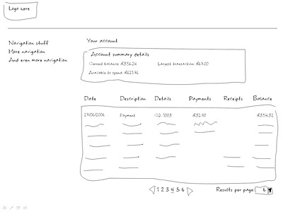
Creating a lo-fi prototype or wireframes in PowerPoint can be a time consuming pain. Lining things up, getting the widgets to look “just right” is not time well spent. Lo-fi is supposed to be just that, “low- fidelity”. Trouble is, once the client have seen something that looks rather polished they have high expectations, even expect the lo-fi to resemble what they might expect in production. This is clearly not a good state to be in, but sadly often happens. So here’s an example of a basic wireframe all nicely lined up…

banking wireframe nicely lined up

Anyway, inspired by http://napkinlaf.sourceforge.net/ and remembering the essence of lo-fi being “paper prototyping”, I downloaded a hand written font and used the line tool in powerpoint to knock out some lo-fi that is precisely that. It takes no time at all (needs a steady hand with the line tool I’ll admit), conveys everything that the more formal lo-fi gives but reminds the audience that it is a “sketch” of the screen, not design or anything like that. (And actually I think it looks a lot better than some of the screen mock-ups I’ve churned out in the past!)

cartoon wireframe

8 of 8
12345678