interaction design

Pictures and narative

Every night I try to get home in time to read my daughter a bed time story. Currently her favourite is Cinderella. The story is short, it could easily be fit onto one sheet of A4 paper (the plot in Wikipedia is just under 800 words). I could even decompose it down to a number of bullet points to fit into a couple pf PowerPoint slides. Somehow I doubt this would engage my daughter. I read Cinderella from a picture book. There are only a few words on each page, I read those whilst she looks at the illustrations. It is from these pictures that her imagination is fired. They bring my words of princesses and castles and fairy godmothers and balls to life.

Similarly when building new propositions, I’m much more interested in drawing pictures that articulate the user journey story. But this blog entry is not so much about pictures to articulate the process of building products. It’s about PowerPoint.

I have a bit of reputation as a PowerPoint monkey. Whilst our developers build code, I spend a lot of time building presentations on how they will do it. All to often I see slides that have been crammed full of words. There is often an unwritten rule that considers 20 slides to be a maximum number in a presentation. The rationale? An hour long presentation, say three minutes per slide and pow! Time up!

First slide title “Background”. A dozen bullet points on the history of the project.

This is like telling Cinderella from an A4 sheet.

I’ve been inspired by the Lessing method; tearing up the 20 slide convention. A PowerPoint presentation should be like telling a story. Just like the picture book of Cinderella engages my daughter and her imagination with pictures, the words being a cue for the narrative, so a successful presentation should have a narrative, supported by images and carefully chosen points. And if that means a slide deck with 100 slides so be it. Take a look at Dick Hardt doing this for real. Awesome!

Clarity in objectives

Too many IT projects have vague buzz-word objectives.

  • “Single sign-on”
  • “Legacy refresh”
  • “Migration”
  • “Porting”
  • “Global Tick database”
  • “Unified platform”
  • “Cross channel integration”
  • “Content mashup”
  • “Real-time la-la”
  • “Streamlined processing”

These aren’t objectives. They are recipee for confusion, lack of clarity and focus. Better to think in terms of customer journeys, what is it that an end user want’s to achieve, end to end, and focus on delivering real value to customers, rather than trying to deliver some amorphous, mamouth “implementation” that does a lot of something mediocre, and little of anything great.

Speed and convenience

I recently picked up an old BT phone at a car boot sale. Using it made me realise how using the phone has radically changed since my youth.

Then: In those days you remembered all your phone numbers- the frequently used ones at least. Others would be in a notepad that was close to the phone.

Now: Phones have memories, the notepad is in the phone. And frequently used numbers can be set as speed dial. (It’s an interesting question whether the move to from analogue to digital phones has had an impact on memory…)

Then: To make a phone call with x digits would take y seconds. Oooooh how slow and painful! The pleasure of the retro experience using the old phone soon turned to frustration. How long to dial a number? And if the number was engaged there was no such thing as a rapid redial.

Now: the fingers fly accross the keypad. Engaged? wait a few minutes and press redial.

Two words articulate the new experience; speed and convenience. The old BT phone sits in the lounge. It sounds cool when it rings. I may pick it up. But use it to dial numbers? I’ll stick with the modern experience of speed and convenience.

Old BT phone

Ditch the feature shopping list. Think customer journeys.

Let’s imagine a mobile phone provider that that has an on-line presence as well as a high street retail network. Their current website was built several years back on legacy technology; it is slow and has a conversion rate lower than industry norms. Along with having poor usability, the current shopping cart functionality does not support the concurrent usage figures that are hitting the site. The business takes the output from their web metrics and throw these at IT and demand improvements. And a new IT project is born. Rebuild the existing site on a new platform. They get a design agency to handle the look and feel. The functional requirements are built upon the existing functionality and chunked into functional silos:

  • Content managed brochureware site
  • Phone selection
  • Tariff selection
  • Shopping cart
  • Order management

A typical project process. That is flawed. It is starting with a functional premise. An alternative is to think in terms of the customer and customer journeys.

We can start by asking who the customers are. Almost certainly the marketing department has a customer segmentation model – this is a good place to start. That may give us basic attitudinal and behavioural details on customers, but we need richer data. How do customers shop for phones? So we go and spend time in the stores and observe how people buy them. It soon becomes clear that the choose phone – choose tariff buy model is a journey that is only taken by a certain number of customers. Other customers come into the store with intentions – they don’t know what phone or tariff they want, but they know what they want a mobile phone for. Other customers come into the store asking lots of questions, they are doing research; they leave the store with the sales guy’s number, and costs for a couple of phones and tariffs. We look at the competition and see how they sell phones. We look at Amazon and eBay and expedia and see how other retailers sell products and experiences on the web. We synthesise our research and suddenly we have a whole bunch of new requirements. Gasp! Scope creep. Indeed if we list them out into functional silos again:

  • Content managed brochureware site
  • Lifestyler phone selection wizard
  • Save a quote
  • In-store quote save for on-line fulfilment
  • On-line purchase for store fulfilment
  • Phone selection
  • Tariff selection
  • Shopping cart
  • Order management
  • Etc

The business is excited and IT is despondent. When the business announce the date all this must go live by, the letters of resignation land on the IT directors desk and they start looking for contractors. It does have to be this way. You can have your cake and eat it.
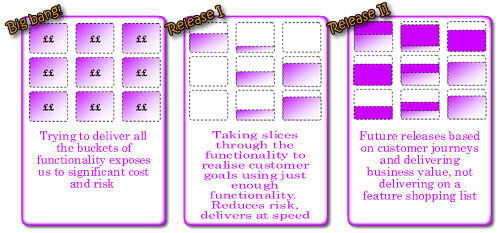
Rather than thinking about vertical functional silos, we should think about horizontal slices through the functionality. Slices that support customer journeys. We can start with simple journeys to start and build complexity as we prove our process and new platform, mitigating technical risk as we progress.

don't functionally silo, slice by customer journey

The first release probably needs to demonstrate the new platform works: we can deliver on time; that a new shopping cart interfaces with our legacy warehouse order management system; etc. What’s the bare minimum we can do that does this and delivers business value. How about a microsite that sells a single product. Customers are directed to the microsite via a URL published on a flyer handed out in the stores.

As a customer who has picked up a special offer N80 deal flyer, I want to buy a Nokia N80 on a pay as you go contract

Our acceptance criteria:

Given I enter my personal details and credit card details When my credit card details are validated Then send order to warehouse to dispatch phone and activate contract.

We can decompose this requirement into discrete requirements, “stories” of sufficiently small size and estimate them. We’ll soon get a project velocity and because it is only a small release expectations, risks and dependencies will be easy to manage. We’ve not had to wait for months to get something out, everybody is happy.

We identify that a profitable segment of the market are the aspirationally clueless. People who want a mobile phone, realise they are a minority who don’t have one but are too afraid to admit they have no idea what they want. So we build a new customer journey.

As an aspirationally clueless I want say what I do and how I live my life and have a suitable phone selected for me.

OK, not the finest story, but you get the point. This story might take elements of the phone selection and tariff selection functional silos, but just enough to realise the required functionality. Because we are building around customer journeys, just enough to realise customer intentions that support those journeys we build only what is required. We are not building by feature list. We don’t over promise and under-deliver. We are building trust with all stakeholders. Surely this is the better way to build software, thinking about customer intentions and incrementally delivering to support more complex customer goals. Sadly, people all too often get fixated by feature lists. Because that is what they are used to. Because that is how products are sold. But isn’t there a marketing 2.0 where we sell experiences and go beyond the product. Isn’t that what Virgin does? But I’m probably off on a tangent.

Port my functionality

Once upon-a-time there was no such thing as “legacy” in IT. It was a time when systems were shiny and new and development was Greenfield (and green-screen). We’ve moved on, IT has grown up and legacy systems are abound. Version numbers increase, licenses expire, software is no longer supported. “Upgrade” and “migrate” become priorities on the CIOs agenda.Because upgrades and migration projects have an IT focus, they generally remain in the ownership of, and funded by IT with the business only playing a peripheral role. After all, the requirements are already known; just move (aka “port”) everything that is “as-is” to the new “to-be”.

The reality is all too often slightly different.

It is a common misconception that “porting functionality” is a simple re-write. Here’s an example of a bank who was engaged in migrating its legacy applications onto a new, single stack environment. There were 39 legacy applications that supported 280 processes.

The original business case conducted by the IT organisation was built upon the assumption that 100% of the functionality could be ported. When these figures were shared with the business they baulked. They were incredulous that IT could be building something new, and building all that was wrong in the existing processes on the new platform. What they didn’t have was a business case that articulated what the cost “wrong” was. So the project was put on hold, no longer could it be soley in the ownership of IT, the business needed to ratify the requirements.

The business took an enlightened approach to requirement ratification (they got me involved!) We ran a series of focus groups with key stakeholders, then went into the field undertaking what I could pompously call ethnographic research. We spent time shadowing staff on the ground, observing staff-customer interactions, watching how they interacted with the technology, what applications they used, how long they spent on them and what bank processes they touched. It rapidly became clear that much of what IT was proposing to “straight port” was not fit for purpose. Simple, core bank processes took up significant customer time. For new staff to get up to speed with the basket of applications, it took weeks, if not months.

What soon became apparent, (as expected by the business), only a fraction of the overall functionality offered to the bank users was actually used. Indeed of the thirty nine applications that users had access to, five were redundant; their functionality was never used or was replicated elsewhere. When looking at banking processes that the applications covered, almost a quarter were ripe for redesign. Initially there was resistance to this figure; after all, the processes existed “as-is” and the bank was working with them. The original business case did not justify the significant additional cost that redesign over port would offer. But the ethnographic research gave grounds to challenge this. We could point to the time that users spent interacting with the technology rather than interacting with the customer. The underlining processes were not necessarily broken, but their technical implementation hindered staff work effectively. For example, on opening an account for a new customer the bank employee more time keying data into the application than talking to the customer. This prevented a conversation; the first personal touch point the bank had with a customer was a poor experience. And focussing upon form filling rather than the needs of the customer left both parties potentially unfulfilled.

Worse for the bank, when an existing customer informed the employee of a change of name and address (i.e. just got married), the employee would visibly sink in their chair. Again. rather than engaging in a conversation, congratulating the customer, talking about their new financial needs following their change of life, they had to update the same information in six different places. The technology was an impedance. And thus a cost.

What if we could reduce the time spent entering data into the system? What if there was time for conversation? Time to probe the customers financial needs…? We could model different scenarios whereby this initial customer meeting could drive revenue with cross sell opportunities. Furthermore, if we could reduce the time spent with each customer and thus increase footfall there would be an opportunity to reduce costs. For example, assume the request for a change of address generates a new home insurance lead, model different conversion rate scenarios and we have a business case for improving the change of address process.

To demonstrate the art of the possible, we created a functional prototype. This started with lo-fi sketches, testing these with users before moving to an HTML prototype that supported different journeys through key processes. This was tested with users in a usability lab. We got bank staff to come in, gave them tasks to complete in a role playing scenario (e.g. Here’s Jon, he is a new customer. He wants to open a current account…) With no training, everyone who played with the prototype was able to accomplish their goals, something that was impossible on the current applications (that remember, IT just wanted port). For the most data-entry intensive process, that of completing a new customer account opening, we were able to reduce the time taken by more than 30%. And this was for novice users who had never used the system before. We now had metrics that we could input into the business case, to further strengthen the case for redesign.

And that’s when I left the project. Some functionality was still ported, but the focus shifted from an IT owned project to a business owned programme of work.

This case study demonstrated the fallacy that porting functionality should ever be a simple task that can be driven by IT. It provides an excellent opportunity to audit what you have got and make things better. Almost undoubtedly there will be a compelling business case for doing something more drastic than an IT owned project to make changes to the underlying technology. And the best way to demonstrate this? Ask the people whose lives are impacted by the technology. Use prototypes to test ideas of change. And take measurements.

(I’ve been on holiday, hence the ability to write long blog entries. In case you were wondering!)

Give me results according to my refine

I know there’s a book out there. I know the author’s name begins with M. I know it’s a historical book. So I go to Amazon and for once I don’t search, I browse. I follow the site hierarchy: books> history > general and am presented with 32,5882 results. By default they are ordered by “bestselling” (best selling on Amazon – not always a helpful guide. Today’s number 27 on the list is “IEE on Site Guide (BS 7671: 2001 16th Edition Wiring Regulations Including Amendment 2: 2002)”. Mmmmm. Gripping).

Anyway, so I’ve got 32,5882 results to trawl through. Kindly Amazon provide an ascending / descending alphabetic filter. The intuitive way to return alphabetic results would be by letter. Unfortunatly the technically easy thing is done. Pages are returned by number, with up to ten pages accesibile at a time. That’s not very useful if you’ve got more than thirty thousand results.

Amazon search results

I’m on page 13 and I’m only up to AC… The letter M is an infinite number of clicks away. I’m off to Waterstones where I can physically browse the shelves, and hopefully find the book that way.

If you give me something, don’t make me work to use it

My Nokia N80 came with a bunch of software including Nokia PC suite and Lifeblog. the former is for syncing up the phone with the PC, whilst Lifeblog looks after all the photos I take on the phone. Now you’d of thought that two peices of software on the same CD from the same supplier, packaged with their phone would be compatible with each other. Think again! I’ve got PC suite open and I try to upload photos from the phone using Lifeblog. And I get the below message…

nokia1.gif

I get a message asking me to restart my computer and try again (which won’t rectify the problem because PC suite loads in the system tray). Sorry Nokia. Poor customer experience. You’ve given me a couple of cool peices of software, but haven’t bothered to ensure they are compatible. Or maybe you did but it was a bug that was discovered too late. Now what if they’d been thinking in terms of behaviour driven design:

Given: I have PC suite and Lifeblog open at the same time

When: I choose to upload photos using Lifeblog

Then: the photos will upload and appear in the Timeline view

Or is that too obvious?

Prioritising stakeholder emotions

I was recently involved in a prioritisation exercise. The application included a UI that presented large numbers to users in financial institutions. The business owner (sadly there was never any question of acutally talking to end users) had complained about how easy it is to make mistakes when adding loads of noughts to a sum – and pondered that it would be great if when the user tabs away from the field that long number is entered, that comma seperators should appear:
i.e. he types 1435245001.00 and on tabbing away the number appears as 1,435,245,001.00.

Cool! It’s captured as a requirement and we move on.

When we go through our prioritisation, it is considered to be a “nice to have”. With a bulging requirements list and estimates squeezing the list, this requirement is initially an early one to go. After all, what business value does it add? But this is where the planning process must be iterative.

The effort to implement this requirement is nominal. Whilst the “business value” is considered nominal, the value to the stakeholder who requested it is emotionally signficant.

When we showcase the story that demonstrates the ability to work complex financial algorithms based upon the number the user enters, the stakeholder will nod his head and say “great”. It does what he expects. But how good will he feel when he sees the commas appearing? Little cost to implement, zero identifiable business benefit, but significant stakeholder emotional benefit.

As a project, when the key stakeholder leaves the showcase, how would we prefer him to feel?  “yep, that’s what I want?” or “Gee those guys are good”?!

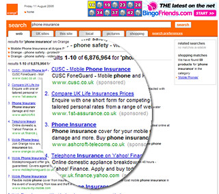
Orange website search

Take a look at the Orange website. Who are you? What is your motivation for visiting it?

I’m an Orange customer and I’m looking for information on thier phone insurance. I’m a Googler, I don’t browse, I search. I enter my query in the search box…

google search box

And I get these results:

orange search results

Eh?

Compare UK Life Insurance prices??

Why would I want to search the web via the Orange website?

I thought we’d moved beyond the Portal concept. Customers generally “jam jar” their experiences. If they want news, they will go to a news provider – bbc.co.uk. If they want search they go to Google..

Clearly their strategy is to move Orange beyond being a provider of phones and tariffs, to become an integral part of their customers life. Regardless of channel you get the same consistent and compelling experience. And if that experience is sufficiently sticky, they’ll drive revenue off the back of it. That’s the motivation. Yet sadly they have forgetten about the simple things. They’ve forgotten about the most of us who want simplicity from our phone provider.

The Orange search box is a good example of a brand that has great aspirations that look great on Customer Strategy PowerPoints (“We’ll be our customers information gate, regardless of channel”) but overstretches itself by forgetting what customers actually want (“how much will phone insurance cost me”).

Organisational convergence

Success is rarely delivered by one part of the organisation; it requires the collaboration of different departments working together. Yet there is all too often a separation of responsibilities that can hinder the efficient development of ideas. Worse, there is no single owner of the business case resulting in business value being lost.

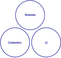
A crude model illustrates this. The “business” holds the business case. They are focussed upon the benefits case. IT are treated a factory to build the mechanisms that will support proposition and are thus focussed upon the costs. The customers (who ultimately use the proposition) are held at arms length and not involved in the development of the proposition.

business, IT and customers seperated

There can often be a tension between the business benefits case and the IT cost to deliver. The cynical view of the waterfall approach is that Business want it all, IT promise it all and their relationship deteriorates as the project nears its scheduled completion; IT cannot deliver on time or budget, the business has to make unplanned compromises and ultimately the customer suffers. The Agile approach goes some way to mitigating the risk of relationship breakdown. Painful messages about what can or cannot be delivered are communicated early on, enabling informed decisions to be made. However if the organisation is structured with clearly defined boundaries it is far harder to make truly informed decisions. As soon as scope changes, the business case will change. What often happens is that IT adjusts the numbers on the cost side, but the benefits case remains unchanged. If the business has spent many months working on the benefits case it is difficult to make changes on the back of an afternoon’s reprioritisation exercise. There is a solution to this. Taking an inclusive approach to proposition development and delivery; having all parties involved from the outset.

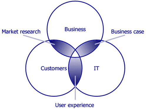
Here’s another crude model. Rather than being separated, the different stakeholders converge. There is a cross-pollination of ideas and understanding. The business case is shared, iteratively and incrementally developed. Customers are engaged in the process; providing market insight and testing the user experience. There is nothing new in this model, although I rarely see it working from the project outset. Often two of the three circles converge; the challenge is to get all three overlapping. I’m pleased to say at ThoughtWorks, increasingly when we initiate projects we are doing this.

Convergence of IT, customers and business
7 of 8
12345678