interaction design

Where are the missing floors?

Lift panel with numbers missing

It is fairly standard practice in Hong Kong for buildings to have no thirteenth or fourteenth floors. They are considered unlucky numbers. Not sure what happened to the first, second and fifth floor here. And back-to-front button numbering that is neither in the telephone format nor the phone format. There’s a couple of lessons to learn here; when designing human-technology interactions consider cultural norms and existing design stereotypes. (Sorry, its the Human Factors conditioning in me that notices such things).

Front of wallet

Credit card companies talk about “front of wallet”. With customers having a number of cards at their disposal, how does a credit card issuer ensure that their card is the customer’s card of choice; the card they will pull out first because it is at the front of the customer’s wallet?

How do you make sure that your website is “front of wallet”? One solution is to become the wallet. In Web 1.0 many organisations tried this, branding themselves as “portals” trying to be a one stop shop to do everything. The reality was that people liked to “jam jar” their experiences. They didn’t trust one one provider who did one thing well to sell them unrelated products; that just didn’t fit in their mental jam jar. They buy insurance from an insurance site, cars from a car site. So if they wanted to buy a car they would go to Autotrader. It was not a banks place to offer car sales in their portal offering. (The value proposition to the bank of course looked good on PowerPoint, sell people cars on the banks portal web and there was a ripe market for cross selling finance and insurance at the same time).

Web 2.0 brings a new “portal” to the playground. A concept rather than a product. Thus we have iGoogle and netvibes and mash-ups. No company can become the wallet, they must resign themselves to being the cards inside. They can do this by offering rss feeds and widgets. Making their content and functionality promiscuous, divorcing it from their site and allowing the customer to consume it how and when they want it. Sadly the banks have yet to grasp this concept. Their technically savvy customers would love to have their balances and recent transactions displayed on a widget or as a feed. Sadly they listen to the masses and their inherent conservatism prevents them from such offerings, killing it with what-ifs and unfounded security concerns (“what if a husband and wife shared the home computer and the wife saw suspicious transactions…” yawn).

Anyway, so there’s Twitter. I’ve signed up to it and for a long time it just sat there I had a subscription, but out of sight and out of mind. It wasn’t at the front of my wallet. It wasn’t even in my wallet. Until I got round to putting it on iGoogle. Suddenly it is visible to me. I see it every time I log in. I get bothered by the inane, uninteresting tweets that most of the people I follow burble, but I also update my status on it (and it updates my facebook status as well). Twitter is now part of my on-line experience. It is now front of my wallet.

Unlike the banks who I visit periodically to check my balance and pay bills (in-out, no lingering). Now if my bank balance was a feed on iGoogle I’d have more of an interest to drill down into more detail. I could manage my money better. I could establish a better on-line relationship with my bank. If they gave a little away, I’d give them so much more. But for now, they are back of my wallet.

Cross cultural considerations at the Sandwich bar

In their paper Content preparation for cross-cultural e-commerce: a review and a model, Liao et al. conclude that (1) Westerners pay more attention to information about product components or contents than East Asians and (2) East Asians pay more attention to information about price… than westerners. This is in the context of eCommerce in “present[ing] appropriate information content to facilitate consumers’ decision making”.

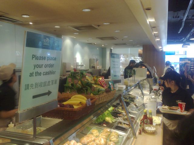
A practical example of this in the bricks and morter world can be seen at this Sandwich bar in Hong Kong.

Sandwich bar counter

Clearly modeled on the western way of buying sandwiches, the counter layout supports the customer selecting the product (sandwiches and fillings on display) moving on to the cashier at the end of the counter to pay.

This isn’t the way things are done in Hong Kong where money comes first before the product. “Please place your order at the cashier”… before dwelling in front of the display cabinet. This results is congestion around the cashier counter and poor workflow and a slow and tedious customer experience.

Sandwich bar or internet offering, consider cultural differences before transferring the concept and content.

The scourge of Document Driven Design

Documents, or rather words are the scourge of product design. Because words can never convey the true meaning or emotion of what is really required. All to often, software development projects are driven by the documentation – agile projects can be equally guilty of this- driven by words on paper (or card) that convey what the requirement is. Issue #1. Developers don’t read!

Except for a few exceptions, software is all about a user interacting with a system in order to accomplish a goal. Trying to describe that premise in terms of features and functionality is fundamentally flawed as it will be nested in the language of technical implementation, not in the user interaction. “Find” becomes “search”, “buy” becomes “shopping cart”, “check” becomes “validation” and so on. Issue #2. The desired outcomes become lost in a smog of technical jargon.

Solution: Picture Driven Design. Up front. Yeah! I’m all for up front design! A picture tells a thousand words. It has the power to remove ambiguities, clarify the vision, showing what the journey to realise outcomes look like. Start with a day in the life of… scribble out the flow, the user journey. Nothing complicated, boxes and arrows. Then scribble out what the user interface might look like. Done. That’s your up front design. That’s your documentation. That’s your scope. What you do next is up to you, write loads of documents that describe it and produce the software in a waterfall way if you want. I’d prefer you were more lean and adopted agile practices, but whatever you do, start with the picture. I’m convinced it will save much pain later on.

What the customer wants

I’m a strong proponent of engaging the customer in all stages of the design process. But sometimes you need to be careful with what they say and not always believe their first answer.

Ask the customer “what do you want” and the chances are you will get an answer that is rooted in their experiences and expectations. Not what they really want.

I want an intranet portal“.

No, you don’t. You want a place where your employees can share files and documents.

I want a google search appliance“.

No you don’t. You want to be able to find documents quickly and efficiently.

Worse is when vendors try and force products onto the customer…

You want an integrated BI toolset“.

No they don’t. What they really want is to be able to pull some specific data from a legacy application into an excel spreadsheet and insert a graph into a word document.

OK, so it is easy to say that, but how to follow though? How do you actually get the customer to create a vision of what they really want? Well I’d start by not asking them that question. Get them to articulate what their goals are. Then try to understand in what context they will try to accomplish those goals? Think in terms of customer journeys and value outcomes over features. Think about the what, not the how. Start with the “to-be” vision rather than dwelling in the “as-is” quagmire, indeed use a system obituary to kill the as-is thinking. Use visual tools to model your ideas. And don’t get bogged down in detail.

I’ll write more about this in the future…

Web 2.0, retail banks and a Slide Share presentation

This is nothing new, but there are still people out there to whom Web 2.0 is a bit of a mystery. What exactly is it, and more to the point, should our business care about this stuff? Or, as I have heard senior executives argue, is it just another bubble, a distraction to let others waste their time, effort and money on. In an attempt to challenge this assumption, I’ve used a model with a few sceptical clients to hang some structure on. This is central to the below presentation that I’ve given to a few financial services organisations. It discusses what Web 2.0 is, and towards the end describes what it could mean for their on-line retail bank website. (Thanks to Duncan Cragg and Prashant Gandhi for some insights).

[slideshare id=377944&doc=web20public-1209431680446543-9&w=425]

Does enterprise IT know what Google is?

Imagine an investment bank, a trader has a requirement for a tool to screen stocks. The requirement is to select stocks based upon different parameters, so for example find companies with a market capitalisation between a selected range, and a P/E ratio, Dividend Yield and Net Profit Margin between other selected ranges. And maybe the ability to add additional parameters.

Typically the process will be for these requirements to be captured by the Business Analyst who acts as the conduit to the development team. Nowhere is the user interface explicitly referenced – it will almost certainly be articulated in the reality of the current systems; what the BA knows and understands. Despite the iterface being delivered through a browser, the developers are not web developers. Inevitably the finished product will be functionally correct, it meets the requirements, but it will be clunky: select parameters > search > results… because it reflects the requirements as the trader put them “I want to do this and this and this, press a button and get a list back“.

So what are the chances of an internally developed investment bank application looking like Google finance’s Stock Screener? And what would your trader rather have?

Real world forms

In the real world, when I get an application form I’ll flick through the pages and have a look at what is required. I can choose which fields I complete in whatever order I like. If I want to take a break half way through I can. I can complete it when I like and how I like.

So why aren’t web forms like that?

The usual format for a web form starts with some copy that describes the form (which people skim through at best). The user clicks to the next page and the form commences. There may be a step indicator showing progress through the form, but almost certainly progress through it will be linear. You have to complete each page before progressing to the next. If you are lucky you’ll be able to click to previous completed steps. But the experience is nothing like a real-world form. And when was the last time a real-world paper form “timed out” half way through, demanding the user to start over again if they left it idle for ten minutes?

The web forms we see today are a relic of their tecnological past. There is no reason why they must be linear, (and if there is logic in the form, there is no reason why the user can’t explore the different routes – you do that with a paper based form). There is no reason why the user can’t click to whatever page in the process they like (just like with the paper form). There is no reason why a page must be completed before progressing to the next. There is no reason why the form should time out and forget everything the user has entered. Fields can be saved as they are completed against an anonymous user, until the user wants to provide personal credentials.

Bottom line – the web has moved on. Instead of reflecting technical constraints of yesterday, it can adopt more real-world metaphors. But do we have the courage to start introducing new paradigms? Are users, information architects and usability experts so ingrained with broken web metaphors that they will shun a new model, (a real world model) of completing a form?

So here’s a rough example. It’s an application form for a savings account. Ignore the content, field labels etc, it is more the model that is illustrated.

1. The user can move between the sections (tabs) to see the fields that are required. There is clear feedback on each tab that it has not been completed. The “Direct Debit” section is optional hence no indicator. The ability to save the application is seperate.
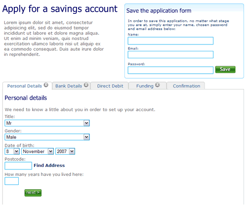
Application form, step 1, nothing filled out

2. The user selects “Bank details”. They’ve not filled out all the fields on the first tab “Personal details”, but it doesn’t matter. There is clear feedback that this tab is yet to be completed.
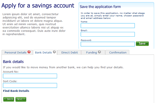
Second tab on the application form, the first tab has not been completed

3. The user clicks right through to the confirmation tab. There is nothing to confirm so the page remains blank, with a prompt to fill out other sections.
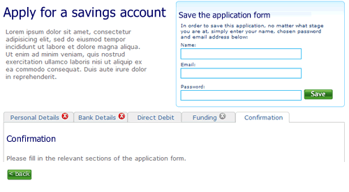
Step 3 of the application form

4. When sections are completed the indicator on the tab changes to show completion. Here the user has completed step two ahead of step one.
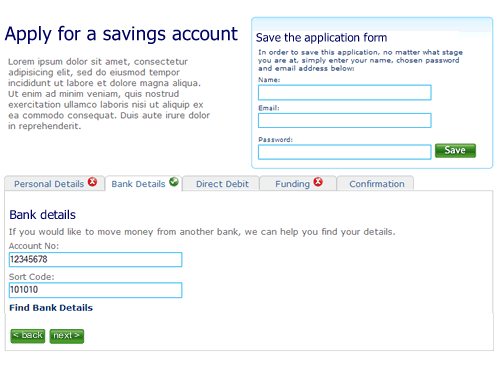
almost there

5. Finally, when all sections are completed the user can review the entire form.

Confirmation screen

I’m not saying this is perfect, it’s a start. A start to re-thinking the way we design forms on the web and think about modelling them on real world behaviour instead of technical constraints of the past.

Will corporate websites remain spotty teenagers or will they grow up to be beautiful?

In the corporate webspace most design is little more than mediocre. Interaction design has changed little since coporations first realised that this is a channel thery should exploit. Web 2.0 is slowly making in-roads with basic use of Ajax functionality, but there is nothing that is really breaking the mould. Despite its infancy (for most organisations ‘e’ is barely 10 years old, Amazon, the granddaddy of eBuisiness is only 13, born in 1995), conservatism rules; the corporate web is just not growing up. It would be easy to blame the technologists for being risk adverse- for having invested in architectures and frameworks that do not allow innovation. REST and all that declarative goodness may be great, but of little interst if you have invested in a propiertary framework that does not support it. But the business is also responsible for tardy innovation.

It doesn’t know what is possible. A miss-understanding of accesibility clobbers rich interactions; “no javascript” becomes the mantra, despite the guidance being “provide alternatives” and progressive enhancements making basic and rich interactions possible with the same code. And maybe as usability testing becomes the norm, and testing concepts with consumers throughout the product lifecycle is baked into the process, this is acutally the final nail in the creative coffin. Let me explain.

When you are developing new features or propositions it is only right that you should conduct market research, talk to your customers and get feedback to refine your ideas. But sometimes you need to ignore what you are being told and challenge the perceived wisdom. Imagine the scenario; you are developing a social networking site. You recruit a bunch of consumers to participate in user testing sessions. They match the socio-demographic profile of your target audience, they use the internet more than five hours a week. You let them loose on your concept boards and prototype. They like what they see, they like the blogs… but commenting? The feedback is that none of them would leave comments. So what do you do? Kill the commenting on the basis that the users who matched your “average” profile would not use this feature.

I’m not saying that if you are building a conventional, transactional experience; a retail shop, a financial services provider, you should not test the proposition with users that match the target profile. But beware that they will steer your thinking into the realm of the ordinary, the expected and the average. Try testing it with trend setters, gamers, teens, mybe even anti-personas to push the boundries and harvest real innovation insights.

And maybe testing the proposition is not needed at all. But don’t leave the design to the comittee or the accountants. Sometimes it is more important to have a real visionary driving the product development. Apple is a great example of this, no more so than with the iPhone bounce. When you scroll down a list, when you come to the end, the last item “bounces”. Where’s the “business value” in this? Isn’t this gold plating in the extreme? The development of this bounce will not have been for free, it will have come at a cost. This could have been a financial (more development effort) it could have been at the expense of another feature, or it could have been time. In most organisations this would not get get through the design by commitee. Apple can do such great things with their UI because they’ve got a visionary at the helm who understands the importance of good design and is passionate about it, and their customers become to expect it.

Christmas eve

There once was a time that on Christmas eve that I’d be crawling round the pubs getting the worse for wear.  Older and a maybe a little wiser; I’ve just committed a major fraud – I’ve downed the sherry, nibbled at the carrot and filled my daughters stockings with presents – Santa exists.  Honest.

And now I can’t help myself.  I check my mail and scan the blogs I subscribe to and I read something that makes me nod my head in agreement – Robert Hoekman laying into user centred design.  He is so right – most projects don’t have the time for the luxury of doing user-centred design properly.  That is not to say that it can’t be done.  Thirty days to develop personas?  How about thirty minutes?  You can be agile and do user-centred design, at ThoughtWorks we do it all the time.  I’m looking forward to his follow up posts.

3 of 8
12345678